10 Modern Paint Ideas for Wood Paneling
That dark paneling is still doing what it was built to do. It adds texture, warmth, and a little insulation. The problem is that in a lot of Seattle, Kent, and Tacoma homes, it also makes a room feel heavy. In offices and tenant improvement spaces, it can read more dated than intentional. Many people stand in front of it and assume the only real fix is demolition.
Usually, it isn’t.
Wood paneling became a major part of American interiors in the 1950s, peaked in the 1970s, and then fell hard out of favor as tastes moved toward cleaner, lighter spaces, according to Hunker’s overview of paint colors that go with wood paneling. That’s why so many Puget Sound properties still have solid wood, veneer, MDF, or laminate panels that are structurally fine but visually tired.
Painting is often the smarter move. The same source notes average professional painting costs of $1,500 to $3,000 for a 12×12 room, compared with $5,000 to $10,000 for removal and drywall replacement. For homeowners and property managers, that difference matters.
At Wheeler Painting, we see this all the time. A living room in Kent needs light. A paneled office in Seattle needs to look current. A commercial space between Tacoma and Seattle needs a finish that can handle daily wear without turning into a maintenance problem. Good prep, the right primer, and a finish that suits the space make the difference between a clean update and a peeling mess.
If you're collecting paint ideas for wood paneling, start with looks that work in real buildings, not just in design photos. If you want broader inspiration for lighter, breezier interiors, these coastal home decor ideas can help you think through the overall room. Below are ten approaches we recommend most often, along with the trade-offs that people should know before they open a paint can.
1. Matte or Eggshell Finish Over Wood Paneling
A simple solid-color paint job in matte or eggshell is still the safest update for most paneled rooms. It keeps the panel profile, hides a lot of age, and doesn’t try too hard. In Seattle living rooms and Kent bedrooms, this is often the finish that gives old paneling a clean reset without making the wall look plastic.
Matte looks softer. It cuts glare and helps grooves and seams recede. Eggshell reflects a little more light and is easier to wipe down. In houses with kids, pets, or busy hallways, eggshell usually holds up better.
Where this works best
This approach fits spaces where the paneling itself isn’t special enough to preserve as wood, but still adds useful texture. I’d use it in:
- Living rooms and dens: Soft whites, warm grays, and muted greige tones calm down dark paneling fast.
- Home offices: Eggshell gives a more finished look without the shine of satin.
- Commercial offices: Matte can look sharp in conference rooms, but only if the walls won’t be touched often.
CertaPro states that interior latex paint in a satin finish is the top recommendation for painted wood paneling and cites 98% coverage efficiency on properly prepped surfaces. Even when clients choose matte or eggshell for appearance, that durability benchmark is a good reminder that prep is doing the heavy lifting.
Practical rule: If the paneling is glossy, fake wood, or old veneer, primer matters more than color.
What works and what doesn’t
Light sanding helps. For slick surfaces, the verified data points to products like Insl-X Stix Primer for difficult adhesion, with 95% adhesion success on challenging glossy veneers. After that, use thin coats. Thick paint builds up in grooves and can make paneling look muddy.
If your paneling has stain bleed, smoke residue, or old waxy polish, don’t skip cleaning and testing. The best finish in the world won’t save a bad substrate. If you’re dealing with stained wood and wondering how the prep changes, Wheeler’s guide on painting over wood stain is a useful starting point.
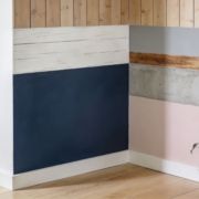
2. Accent Wall or Color Blocking
Not every paneled room needs all four walls painted the same way. Sometimes the smartest move is restraint. One paneled accent wall can keep the room’s character while letting the rest of the space breathe.
This is one of the better paint ideas for wood paneling when the room already has good natural light. In Tacoma dens, Seattle studies, and commercial reception areas, a darker feature wall can feel intentional instead of outdated.
Strong color without a heavy room
Deep navy, muted forest green, charcoal, and warm clay tones all work well on paneling because the grooves add shadow and depth. A flat drywall wall in the same color can feel plain. Paneled texture gives it more presence.
For open-plan homes, color blocking can also help separate uses. A paneled dining nook in a warmer tone can feel distinct from an adjacent living room painted in a soft neutral. In offices, one brand-color wall often does more than painting everything bold.
The verified data notes that in today’s paneling projects, 75% opt for lighter hues to brighten spaces by reflecting up to 80% more light. That tracks with what we see locally. If a room is already dark, keep the bold color limited to one wall.
Clean lines matter here
With color blocking, sloppy edge work ruins the effect. Tape carefully, test samples on the actual paneling, and watch how the color changes from morning to evening. Grooves can throw shadows that make a color feel deeper than it looked on a swatch.
A couple of combinations that tend to work:
- Soft white with charcoal: Good for family rooms and modern farmhouse updates.
- Warm beige-gray with deep green: Strong in libraries, dens, and office spaces.
- Light greige with muted blue: Safer for commercial interiors where you want personality but not drama.
If you want more combinations before choosing a feature wall, Wheeler has a helpful page on accent wall color ideas.
Bold paneling works when the rest of the room gives it room to breathe. If every surface is shouting, the paneling usually loses.
3. Whitewashing or Limewash Finish
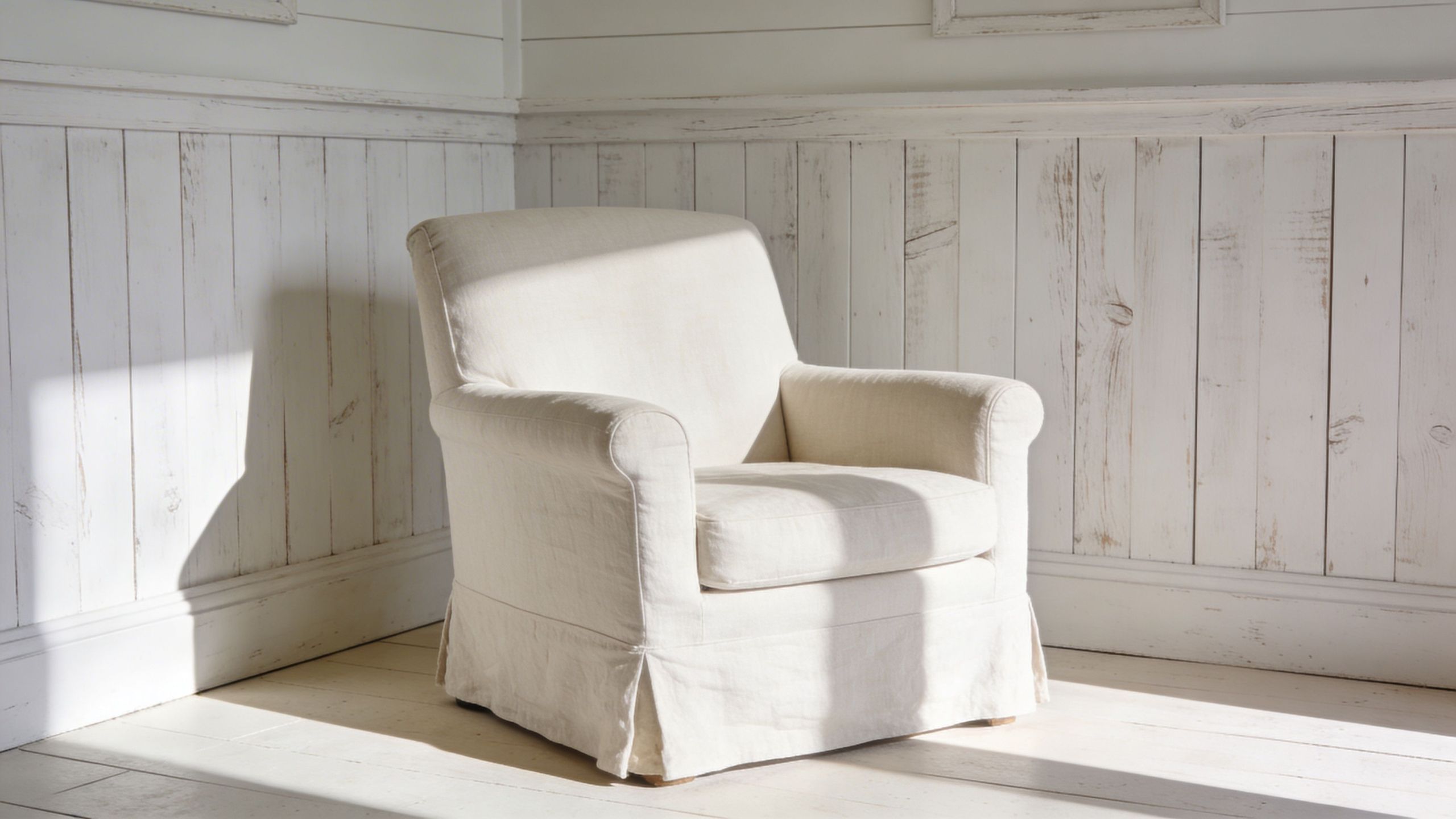
Whitewash is for people who don’t hate the wood. They hate the darkness. That’s an important difference.
Instead of burying the grain under a full solid coat, whitewashing softens the brown or orange tone and lets some of the wood character stay visible. In Puget Sound homes that lean farmhouse, coastal, cottage, or rustic-modern, it can look honest and relaxed.
Best fit for real wood character
This technique looks best when the paneling has actual grain worth seeing. On cheap printed laminate, it rarely looks convincing. On solid wood or decent veneer, it can be a beautiful compromise.
Use it in:
- Bedrooms and sunrooms: It keeps the walls light without making them sterile.
- Cottages and older homes: It preserves age and texture.
- Spaces with natural fibers and soft textiles: Linen, oak, and matte black accents all pair well with it.
The global wood-based panel market reached USD 217.9 billion in 2024 and is projected to grow at a CAGR of 4.8% from 2025 to 2034. That matters because engineered panel products remain common, and not every surface is a good candidate for a translucent finish. Know what’s on your wall before you commit.
The trade-off
Whitewash is more forgiving stylistically, but less forgiving technically. Lap marks, uneven wiping, and inconsistent transparency show up fast. You need to work in manageable sections and keep a wet edge.
For higher-wear rooms, a protective topcoat may be worth discussing. That’s especially true if the paneling sits in a hallway, commercial common area, or kids’ space where hands are constantly on the wall.
What doesn’t work is trying to force a limewash look onto paneling with heavy stain bleed, slick laminate, or water damage. In that case, a solid paint system gives a cleaner result and fewer surprises.
4. Staining Over Paneling Toning or Glazing
Some paneling doesn’t need to be painted at all. It needs to be corrected.
That’s where toning and glazing come in. If the wood feels too orange, too red, or too shiny, a translucent stain or glaze can shift the color while keeping the grain visible. This is a better move than opaque paint when the architecture still benefits from a wood finish.
When preserving the wood makes sense
I’d look at this in executive offices, studies, libraries, and higher-end homes where the paneling has some substance. It can also work in commercial interiors that want warmth without the full 1970s look.
A glaze can mute yellow undertones. A darker toner can pull washed-out wood toward walnut or espresso. The result is quieter and provides a more custom appearance than a full repaint.
This is also the point where people realize paneling can support a broader design style. If you’re after a warmer, more natural room, a rustic kitchen palette often translates well to paneled dens, offices, and built-ins too.
Why DIY gets risky fast
This is one of the least DIY-friendly options on the list. Uneven absorption, streaking, and lap marks are common. Old clear coats, wax, smoke residue, and sun fading all affect how a toner sits on the wall.
A few realities worth knowing:
- Gel stains give more control: They tend to sit more evenly than very thin liquid products.
- Sample areas are mandatory: What looks good on one board can shift on the next.
- Protection matters: A clear topcoat is often needed once the color is right.
If your paneling ties into cabinetry, built-ins, or trim, consistency gets even harder. That’s why cabinet stain work is usually a good reference point. Wheeler’s guide on how to stain wood cabinets shows the level of prep and finish control this kind of work takes.
What doesn’t work is rushing cure time. Toning systems can look dry on the surface while still being vulnerable underneath.
5. Ombré or Gradient Painting
Ombré on wood paneling isn’t for every property, but in the right setting it can be memorable. Restaurants, boutique offices, creative studios, and statement walls in modern homes are the usual candidates.
Panel grooves help this effect. They break up the transition and give the gradient more rhythm. On a flat wall, ombré can sometimes feel like a mural experiment. On paneling, it can read more architectural.
Where a gradient earns its keep
This is strongest when the wall is meant to be noticed. Think a reception area in Seattle, a café wall, or a single media-room feature in a Tacoma home. It’s not the choice for every bedroom or every leased office suite.
The best gradients stay in one family. A smoky blue fading into a pale blue-gray works. A clay tone fading into sand can work. Hard contrast usually looks accidental unless the painter is very experienced.
Projected design reporting for 2026 says modern slat designs are seeing 35% to 50% higher adoption in urban lofts and minimalist interiors. That’s a projection, not a current universal rule, but it points to the same broader trend: people are treating wall paneling as a design feature again, not just background.
What has to go right
The challenge isn’t choosing colors. The challenge is blending them before edges flash off. Humidity helps open time a bit in our region, but it can also slow curing and expose poor technique.
This kind of finish usually works best when:
- The wall is simple: Fewer windows, outlets, and interruptions.
- The palette is tight: Neighboring tones blend better than opposites.
- The room supports it: Minimal furnishings help the wall stand out.
If you want ombré to look refined, use fewer colors than you think you need.
On rental turnovers and standard resale prep, I’d skip it. On the right feature wall with the right client, it can look excellent.
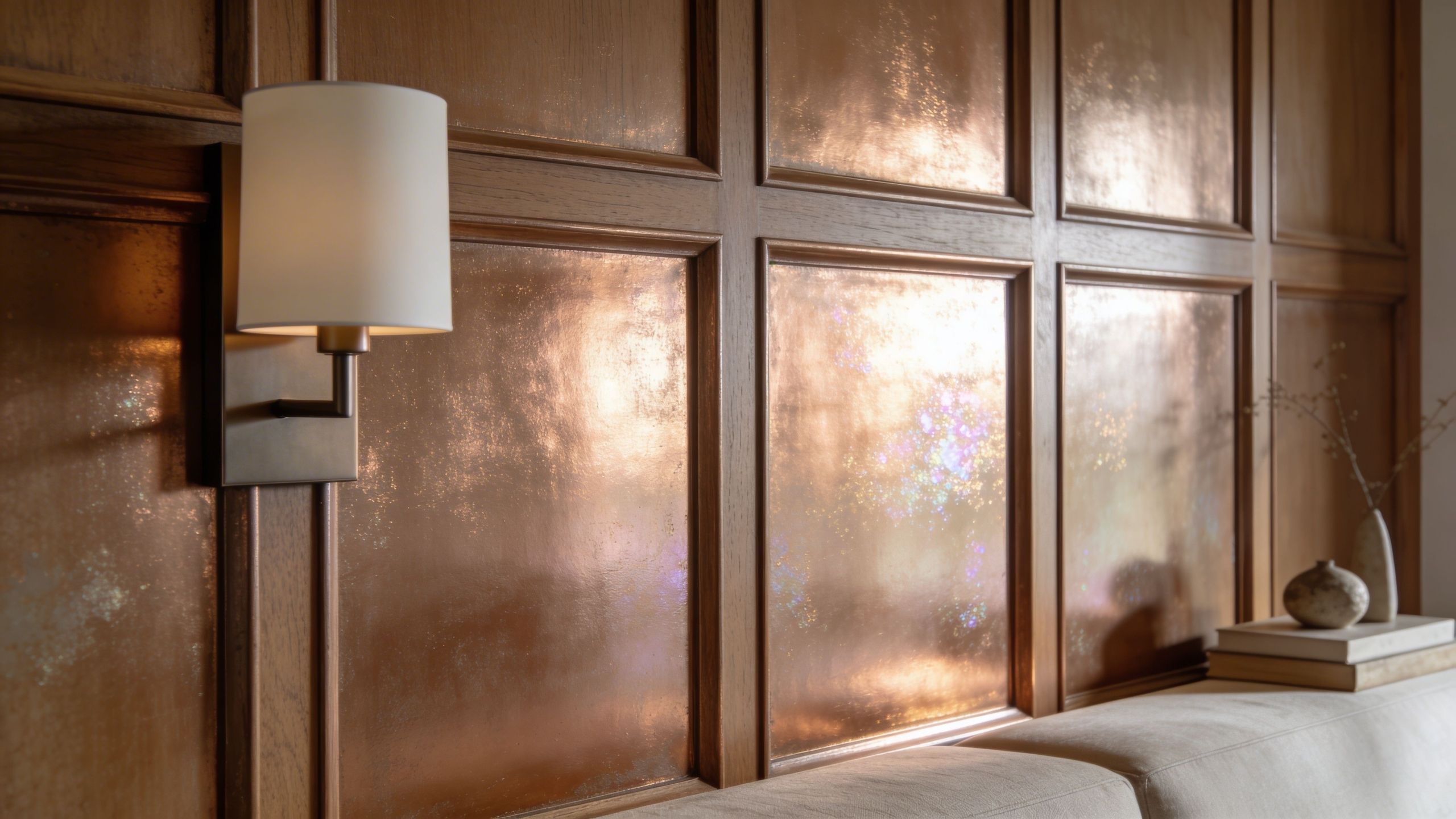
6. Decorative Glazing or Faux Finishes
Decorative finishes live or die on execution. There’s no middle ground. A good faux finish can make paneled walls feel custom. A bad one can make the whole room look themed.
This is why I rarely recommend it for full rooms. For one statement wall, a restaurant niche, a reception backdrop, or a high-end powder room, it can be a smart move.
Good uses for specialty finishes
Glazes can soften a base color and add depth. Metallic washes can bring movement to a paneled wall without full sparkle. Leathered, stone-inspired, or brushed effects can help old paneling feel more like an intentional surface treatment than a leftover finish.
In Seattle commercial interiors, this can work well in hospitality and retail. In homes, it usually fits one of two approaches: either very refined and muted, or intentionally dramatic.
If you want a quick visual reference for decorative technique, this type of application helps show why hand skill matters:
Why this is usually a contractor job
The verified data notes an underserved issue in humid climates like Puget Sound. High moisture contributes to tannin bleed, mold growth, and paint peeling, and 70% of paint failures in damp areas stem from inadequate vapor barriers. A decorative finish layered over unstable prep just fails in a fancier way.
That is the primary trade-off. Specialty finishes look premium, but they’re less forgiving of substrate problems.
Before approving a faux finish, I’d want to know:
- What is the paneling made of
- Has it been painted or sealed before
- Is there moisture or movement in the wall
- Will the wall take frequent cleaning
If the answer to that last point is yes, especially in commercial spaces, choose a simpler finish with a more serviceable topcoat.
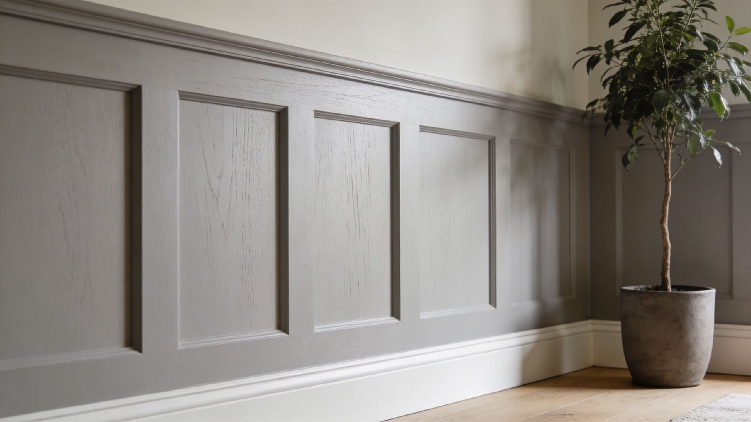
7. Two-Tone or Color Split Painting
Two-tone paneling is one of the most practical updates on this list. It gives old paneling a custom look without requiring a specialty artist. It also solves a common problem. Full-height dark paneling can make a room feel squat.
Paint the lower section darker and the upper section lighter, and the wall usually feels better proportioned right away.
Why this works so well on paneling
Panel grooves already divide the wall visually, so a horizontal color split feels natural. In dining rooms, offices, and hallways, it can mimic the effect of wainscoting even when the original paneling wasn’t installed for that purpose.
This can be especially effective in Seattle and Tacoma homes with lower ceilings. Verified data notes that two-tone methods can enhance room height perception by up to 20%. That lines up with what clients react to. The room feels taller because the upper wall reads lighter and less heavy.
Smart pairings
A few combinations that work consistently:
- Warm white over charcoal: Crisp but not cold.
- Greige over muted navy: Good in offices and dining areas.
- Soft gray over deep green: Nice in studies, libraries, and bedrooms.
For lower walls, I prefer a finish that can take more abuse. Satin or a durable eggshell is usually a safer choice there than dead-flat paint.
What doesn’t work is placing the split at an awkward height. If it cuts through window trim, built-ins, or furniture lines badly, the wall looks accidental. Snap a level line and step back before you paint.
The lower half should ground the room. The upper half should lighten it.
8. Metallic or Pearl Paint Finishes
Metallic and pearl finishes can make paneling feel expensive fast. They can also make it feel overdone fast. The difference usually comes down to restraint, lighting, and surface prep.
On grooves and raised details, metallic pigments catch light in a way flat paint can’t. That can be beautiful in a powder room, bar area, boutique retail space, or hospitality setting. It’s less useful on every wall of a family room.
Best applications
I like metallics most when they stay secondary. Bronze, pewter, champagne, and soft pearl tones usually work better than bright gold or silver. They should shift with the light, not shout at you from across the room.
This kind of finish can complement:
- Feature walls with good sconce or pendant lighting
- Commercial reception areas
- Small residential spaces where drama is welcome
The key is smooth prep. Metallic products magnify roller lines, patched seams, and groove buildup. Any flaw in the paneling tends to show more, not less.
Durability and maintenance considerations
For commercial settings, finish selection matters as much as color. Verified data notes that commercial spaces see 2x paint wear from abrasion and that epoxy topcoats over latex can deliver 5x scratch resistance. That’s a real consideration for paneled feature walls in tenant improvements, lobbies, and common areas.
At the same time, not every metallic wall needs a heavy topcoat. In a low-touch residential room, the extra layer may be unnecessary and may alter the sheen.
What doesn’t work is forcing a metallic finish into a room that already has busy flooring, heavy grain, bold countertops, and reflective furniture. Paneling should add depth. It shouldn’t compete with every other finish in the room.
9. Textured Paint or Specialty Surface Treatments
Textured coatings are usually a last resort or a deliberate design choice. Sometimes they help old paneling disappear. Sometimes they create a fresh architectural finish. Sometimes they just make future repairs harder.
That’s why I’d only recommend texture when there’s a clear reason for it.
When texture earns the extra work
If the paneling is extensively grooved, uneven, or visually cheap, texture can help break the pattern and move the wall away from “wood paneling” altogether. In commercial settings, certain textured systems can also soften sound and hide wear better than a perfectly smooth finish.
Projected trend data for 2026 says ultra-matte, low-VOC water-based finishes with scrub resistance above 200 cycles per ASTM D2486 are gaining favor in panel applications. That’s a projection source, but the practical takeaway is useful. If you texture a wall, choose a finish system that can still be cleaned.
What people underestimate
Texture is messy. Overspray gets everywhere. Repairs are never invisible unless the original application was documented and matched carefully.
Before using any specialty surface treatment, think through the long term:
- Can this wall be patched later without obvious flashing
- Will the owner repaint in a few years
- Does the room need easy wipe-down maintenance
- Is the paneling stable enough to support added material
For leased commercial spaces, I usually lean toward simpler systems unless the tenant specifically wants texture as part of the build-out design. For residential remodels, subtle texture can work, but heavy faux stucco over old paneling often feels like a workaround, not a finish choice.
If the main goal is modernizing the wall, smooth paint usually ages better.
10. Modern Minimalist or Monochromatic Approach
This is the finish approach I recommend most often when clients want the paneling to feel current and not trendy. Paint the whole room, or most of it, in a related family of warm whites, soft grays, beige-grays, or muted earth neutrals. Let the grooves read as texture, not contrast.
It’s simple, but simple doesn’t mean basic.
Why it works in Puget Sound spaces
Light quality in the Seattle-Tacoma corridor changes all day. A stark white that looked clean at noon can feel cold and flat by late afternoon. Warmer neutrals tend to stay livable across changing cloud cover and lower winter light.
Verified data says neutrals such as soft whites and light grays are used in 60% of professional paneling applications for timeless appeal. That makes sense. They don’t date the room quickly, and they support everything from Scandinavian-inspired homes to clean office remodels.
The maintenance side matters too
In our climate, finish selection can’t be separated from durability. The verified data notes that satin latex offers mildew resistance lasting 5 to 7 years in humid climates like Western Washington. Even if a minimalist look leans softer in sheen, this is why I still look closely at room use before defaulting to dead-flat paint.
For a monochromatic result that lasts, keep these priorities in order:
- Choose the right undertone: Warm whites and soft greiges are easier to live with than stark bright whites.
- Prime for the material: MDF, veneer, and laminate don’t all behave the same.
- Match sheen to use: Lower-sheen for low-touch rooms, more washable finishes where hands and scuffs are constant.
A minimalist paneling update isn’t trying to hide the wall. It’s treating paneling as architecture.
10 Wood-Paneling Paint Ideas: Comparison
| Option | Implementation complexity | Resource requirements | Expected outcomes | Ideal use cases | Key advantages |
|---|---|---|---|---|---|
| Matte or Eggshell Finish Over Wood Paneling | Low–Moderate (prep and priming) | Primer, interior paint, basic tools | Modern low-sheen look; hides minor flaws | Budget renovations, general residential rooms | Cost-effective, easy touch-ups, extends paneling life |
| Accent Wall or Color Blocking | Moderate (precise edge work) | Paints, painter's tape, samples | High visual impact; defined focal areas | Defining zones, highlighting features, creative updates | Low-cost transformation, flexible design choices |
| Whitewashing or Limewash Finish | Moderate (technique-sensitive) | Diluted paint or limewash, brushes/rags, optional sealer | Bright, airy semi-transparent finish; visible grain | Farmhouse/coastal styles, heritage restorations | Preserves wood character, forgiving on imperfections |
| Staining Over Paneling (Toning/Glazing) | Moderate–High (skill for even application) | Semi-transparent stains/glazes, sealer, ventilation | Natural wood tone update; upscale, unified appearance | High-end homes, unifying varied panel tones | Maintains natural grain, professional refined finish |
| Ombré or Gradient Painting | High (advanced blending skills) | Multiple paints, blending tools or sprayer, skilled labor | Refined gradient depth; strong focal statement | Artistic feature walls in residential or commercial spaces | Highly distinctive, hides imperfections through variation |
| Decorative Glazing or Faux Finishes | Very High (artisan technique) | Specialty glazes, experienced decorative painter, sealant | Custom surfaces that mimic marble/stone/metal | Luxury projects, showrooms, statement walls | Designer-quality look, unique and customizable results |
| Two-Tone or Color Split Painting | Moderate (precise dividing line) | Two paints, tape, level or laser | Balanced, proportioned visual effect | Transitional homes, dining rooms, children's rooms | Timeless approach, creates cohesion and balance |
| Metallic or Pearl Paint Finishes | Moderate–High (consistent application needed) | Metallic/pearlescent paints, specialty rollers/brushes | Shimmering, light-reflective focal surfaces | Accent walls, luxury interiors, hospitality venues | Luxurious, brightens space, contemporary appeal |
| Textured Paint or Specialty Surface Treatments | Moderate–High (equipment and skill) | Texture compounds, spray equipment, masking materials | Three-dimensional surfaces; hides joints and flaws | Concealing damage, adding dimension, acoustic uses | Effectively hides imperfections; adds depth and interest |
| Modern Minimalist or Monochromatic Approach | Low–Moderate (color selection critical) | High-quality neutral paints, good lighting | Timeless, calm surfaces that emphasize texture | Contemporary homes, corporate interiors, galleries | Timeless and versatile; highlights architectural details |
Your Next Step Choosing the Right Finish for Your Puget Sound Property
Painting old paneling is one of the few interior updates that can change a room quickly without tearing the space apart. That’s why it keeps coming up in both residential remodeling and commercial renovation work. The paneling is already there. The question is whether you fight it, hide it, or use it well.
Some of these paint ideas for wood paneling are straightforward. Matte neutrals, monochromatic schemes, and simple accent walls are usually accessible for a handy homeowner with patience. If the paneling is in decent shape, the room is dry, and you’re using the right primer and finish, a DIY project can succeed.
Others are much less forgiving.
Whitewashing has to be controlled. Toning and glazing can go sideways fast if the existing clear coat, stain, or wood species isn’t behaving the way you expected. Metallic finishes show every flaw. Faux finishes depend heavily on technique. Two-tone work sounds simple until the split line lands in the wrong place or the darker lower section starts showing every scuff because the wrong sheen was used.
That’s where a contractor earns their keep.
In the Puget Sound area, paneling projects come with a few local realities. Humidity changes dry times. Older homes can have smoke residue, waxes, or hidden moisture issues. Commercial spaces need finishes that can be cleaned and maintained. Tenant improvements often need a finish system that looks sharp without creating a headache for the next turnover. A paint idea that works in a photo online may not be the right move for a living room in Kent or a property manager’s office update in Seattle.
The biggest mistake people make is choosing color first and surface system second. It should be the other way around. Start with the substrate. Is it solid wood, veneer, MDF, or laminate? Is there tannin bleed? Is there sheen? Does the room stay dry? Will people touch the wall every day? Once those answers are clear, color and style become much easier decisions.
That’s also why hiring a trusted local residential contractor or commercial construction partner often saves time and money even when painting seems simple on the surface. Good prep isn’t glamorous, but it’s the part that determines whether the finish still looks good down the road. In homes, that means fewer callbacks and fewer repaints. In businesses, that means less disruption and a cleaner result that supports the rest of the renovation.
At Wheeler Painting, we help homeowners, property managers, and business owners across Seattle, Tacoma, Kent, and the communities in between sort through those decisions without overcomplicating the job. Sometimes the answer is a bright neutral eggshell. Sometimes it’s a durable satin system for a commercial wall. Sometimes the best move is to preserve the wood with toning instead of covering it.
If you’re comparing house painting near me, residential contractor near me, commercial painting services near me, or commercial construction near me, look for a team that can do more than just put paint on the wall. You want clear prep standards, realistic guidance, and a finish plan that fits the space, the schedule, and the budget.
If your paneling is making a room feel stuck in another decade, you probably don’t need demolition. You need the right finish and the right process.
If you're ready to update wood paneling in a home, office, retail suite, or tenant improvement project, Wheeler Painting & Restoration Services can help you plan it properly from the start. We serve Seattle, Kent, Tacoma, and the surrounding communities with residential remodeling, commercial renovations, interior painting, specialty finishes, and practical color guidance that fits the space, the schedule, and the budget. Reach out for a detailed proposal and a straightforward conversation about what will work best for your property.