Tag Archive for: interior painting Seattle

Mold and Mildew Resistant Paint Guide for WA Homes

If you live or manage property in Tacoma, Seattle, Bellevue, or anywhere around Puget Sound, you already know how this usually starts. A bathroom ceiling gets a few dark specks. A basement corner smells stale after a wet stretch. Paint near a window or exterior wall starts looking tired even though the room was painted not that long ago.

That's when people start searching for mold and mildew resistant paint and hoping a better coating will solve it.

Sometimes it helps a lot. Sometimes it doesn't fix the underlying issue at all.

In Western Washington, damp air, condensation, slow-drying surfaces, and hidden leaks all work against paint. A resistant coating can absolutely be part of a smart plan, especially in bathrooms, kitchens, laundry rooms, breakrooms, and commercial restrooms. But paint is only one layer of defense. If moisture keeps feeding the problem, even a premium product will struggle.

Your Guide to Mold Resistant Paint in Western Washington

A common call in this area goes something like this: “We cleaned the mildew, repainted, and now it's coming back.” In many homes and commercial spaces, the visible staining is only the symptom. The underlying issue is trapped humidity, poor airflow, condensation, or a leak that never got addressed.

A cozy living room featuring a light gray sectional sofa, a fireplace, and large windows with natural scenery.

That's why a straight answer matters. Mold-resistant paint is useful, but it isn't a magic cure. Independent guidance from Dunn-Edwards makes the point clearly: the right sequence is clean, dry, repair, then coat, because mildewcide-treated paints are meant to inhibit new growth on the paint film, not remove an existing moisture problem or contamination inside the surface (Dunn-Edwards mildew guidance).

What Tacoma area property owners usually need

In this climate, the right approach often includes more than paint:

  • Moisture diagnosis first. Bathrooms may need better exhaust use, basements may need waterproofing review, and exterior-facing walls may need leak investigation.
  • Proper cleanup. Painting over staining without full cleaning usually leads to disappointment.
  • A coating matched to the room. A guest bedroom and a commercial restroom don't need the same finish or product chemistry.
  • A realistic maintenance plan. High-moisture rooms need periodic inspection even after a quality repaint.

Local rule of thumb: If the room still feels damp, smells musty, or shows repeat staining, the paint choice is not the first problem to solve.

That honesty matters more than a sales pitch. In Seattle, Issaquah, Kirkland, and Tacoma, a lasting result usually comes from treating mold and mildew resistant paint as one part of a broader moisture-control strategy.

How Mold and Mildew Resistant Paint Actually Works

Mold and mildew resistant paint works like a protective shield on the surface, not a medicine that cures the wall behind it. That distinction clears up most of the confusion.

An infographic explaining how mold and mildew resistant paint protects home surfaces using specialized chemical components.

Manufacturers formulate these coatings with a moisture-tolerant acrylic binder plus additives such as mildewcides or fungicides. Those additives help suppress growth on the paint film itself, not on the drywall, wood, or masonry underneath. Rust-Oleum and Dunn-Edwards both stress the same practical point: if the moisture source isn't fixed and the surface isn't properly cleaned and dried, mildew-related paint failure can still happen (Rust-Oleum technical explanation).

What the paint is doing

Think of the coating as creating a less hospitable outer skin.

  • The acrylic binder helps the film hold together in damp-prone conditions.
  • The antimicrobial additives help discourage fungal growth on the finished surface.
  • The final film can be easier to wipe down and maintain than a standard wall paint in problem areas.

That's why these products are commonly used in bathrooms, kitchens, laundry rooms, basements, and utility spaces.

What the paint is not doing

It's important that expectations stay grounded.

  • It's not killing mold buried inside drywall.
  • It's not stopping a roof leak or plumbing leak.
  • It's not drying out a chronically wet substrate.
  • It's not a substitute for proper cleaning and prep.

If spores are feeding on dust, soap residue, or ongoing condensation, the coating alone won't win that fight for long.

In practice, mold and mildew resistant paint performs best after the messy part of the job is done right. The room has to be dry. The old contamination has to be removed. Damaged material has to be evaluated. Then the coating can do what it's designed to do, which is protect the finished surface from new growth more effectively than ordinary paint.

That's why experienced painters in Western Washington spend so much time on diagnosis and prep. The product matters, but the condition of the room matters more.

The Real Benefits and Critical Limitations

There's a reason these coatings remain popular in damp climates. Used in the right place and over the right substrate, they can make a room easier to maintain and help the finish stay cleaner longer. Used as a shortcut, they often disappoint.

Where mold and mildew resistant paint earns its keep

For homeowners, facility managers, and small commercial properties, the practical benefits are straightforward:

  • Cleaner-looking surfaces. These coatings can help reduce visible mildew growth on the paint film in bathrooms, kitchens, laundry rooms, and similar spaces.
  • Easier upkeep. In many cases, the finish is more washable than a basic flat wall paint, which matters in active rooms.
  • Better fit for moisture-prone areas. They're designed for spaces where steam, splashing, and uneven airflow are part of normal use.
  • A useful preventive layer after repairs. Once leaks, condensation, or ventilation issues are addressed, the coating can help protect the final surface.

Where people get misled

The biggest problem is warranty language and retail marketing. A paint can sound like a complete fix when the guarantee only applies to the paint film.

One retail listing for a Zinsser interior product promotes a 5-year mold and mildew-proof paint film guarantee, but that kind of protection is conditional. It depends on formulation, substrate preparation, and continued moisture control, and it does not cover the underlying moisture problem itself (Zinsser product listing with paint film guarantee).

What that means in plain language: If the bathroom fan is weak, the wall was still damp, or mildew was never fully cleaned, the warranty wording won't rescue the result.

A few limitations are worth keeping in mind:

  • It won't replace ventilation. A steamy room still needs air exchange.
  • It won't repair damaged materials. Soft drywall, swollen trim, and stained sheathing need evaluation.
  • It won't hide chronic moisture for long. Repeated condensation usually shows up again through staining, peeling, or odor.
  • It may cost more than standard paint. That premium only makes sense when the conditions support it.

For many Tacoma and Bellevue property owners, the right question isn't “Does this paint work?” It's “Is this room ready for this paint to work?”

How to Choose the Right Paint for Your Space

Choosing mold and mildew resistant paint isn't just about grabbing the can with the boldest label. The room, the surface condition, the finish, and how the space is used all matter.

In general, higher-moisture rooms benefit from coatings that clean easily and don't hold onto moisture the way a flatter, more porous-looking finish can. For many interiors, that points people toward satin or semi-gloss rather than flat in bathrooms, kitchens, and utility areas. In commercial settings, washability often becomes just as important as resistance.

Match the paint to the room

A powder room that gets light use has different demands than a family bathroom with daily showers. The same goes for an office breakroom versus a commercial restroom in a high-traffic building.

If you're sorting through bathroom-specific options, this guide to the best paint for bathrooms is a useful starting point for comparing finish and performance.

Room / Area Recommended Paint Type Ideal Finish Reasoning
Bathroom Mold and mildew resistant interior paint Satin or semi-gloss Handles repeated humidity better and is easier to wipe down
Kitchen Moisture-resistant interior paint with mildew-resistant properties Satin Stands up better to cooking moisture and routine cleaning
Basement Mold and mildew resistant coating after moisture issues are addressed Satin Helps protect the finish in cooler, damper spaces
Commercial Restroom Durable moisture-resistant coating designed for repeated cleaning Semi-gloss Better cleanability for frequent maintenance
Office Breakroom Washable interior paint with moisture resistance Satin Good balance of appearance and cleanability
Laundry Room Mold and mildew resistant interior paint Satin Useful where warm, damp air and condensation are common

What to look at before you buy

A few decision points make selection easier:

  • Room use. Daily shower steam, limited airflow, and frequent cleaning all push you toward a more durable finish.
  • Existing surface condition. If there's staining, old paint failure, or prior mildew, prep and primer matter as much as the finish coat.
  • Substrate type. Drywall, wood trim, masonry, and previously painted surfaces all behave differently.
  • Maintenance expectations. In rentals, shared facilities, and commercial spaces, scrub resistance often matters more than a perfectly low-sheen look.

A good product choice can improve performance. A bad room condition can still defeat it.

For residential remodeling and commercial renovations in Seattle, West Seattle, and Newcastle, paint selection should follow the moisture assessment, not replace it.

Surface Preparation and Application Best Practices

The product can only perform as well as the surface underneath it. That's true with every coating, but it matters even more with mold and mildew resistant paint.

Start with the wall, ceiling, or trim itself. If there's active moisture, staining, peeling, soft drywall, or previous mildew growth, the prep process determines whether the finish holds up or fails early.

A six-step infographic detailing best practices for surface preparation and application of mold resistant paint.

The prep sequence that actually works

A professional process usually follows this order:

  1. Find the moisture source. That may be condensation, a plumbing issue, failed caulking, exterior intrusion, or poor ventilation.
  2. Clean the contamination. The surface has to be free of mildew, dirt, residue, and loose paint before coating.
  3. Let the substrate dry fully. Painting too soon traps the problem.
  4. Repair the damaged areas. Patch, sand, replace soft materials where needed, and stabilize the surface.
  5. Prime when appropriate. On repaired areas, porous surfaces, or stain-prone spots, primer often makes the finish system more reliable.

If you want a homeowner-friendly walkthrough on cleaning contaminated walls before repainting, this mould remediation guide is a useful reference for the cleanup side of the job.

Primer is another place people try to save time and regret it later. On fresh repairs or bare drywall, the coating system usually performs better when the surface is sealed correctly first. This overview of whether you have to prime sheetrock before painting covers why that step matters.

A short visual can help if you want to see the process in action:

Application details that affect performance

Application instructions aren't filler text on a label. They are part of the product system.

Rust-Oleum's technical data for one mold- and mildew-resistant coating calls for two coats, applied only between 50-90°F and with relative humidity below 80%. The same sheet specifies an airless spray tip of 0.017 inch and a dry film thickness of 0.875-1.25 mils. If the film goes on too thin or the conditions are off, the protective layer can be compromised (Rust-Oleum interior technical data sheet).

That's why a rushed one-coat repaint in a damp bathroom often fails earlier than expected.

For owners who want one contractor to handle the broader repair scope, Wheeler Painting & Restoration Services works on the paint side as well as related needs such as drywall repair, waterproofing, and facility maintenance. That matters when the issue is bigger than a simple repaint.

Maintaining Your Paint in Our Humid Climate

Once the room is repaired and painted, maintenance decides how long that coating stays effective. In Western Washington, the biggest mistake is assuming the new paint means the problem is gone for good.

The durability range can vary quite a bit depending on room conditions. A published maintenance guide notes that anti-mold paint typically lasts 5 to 6 years under normal conditions, often 3 to 5 years in high-humidity rooms such as bathrooms and kitchens, and up to 10 years in low-humidity, well-ventilated spaces. The same guidance ties performance to moisture control, and it cites EPA guidance that wet materials should be dried within 24 to 48 hours and indoor relative humidity should ideally stay between 30% and 50% (anti-mold paint longevity guide with EPA-linked moisture targets).

Habits that help the coating last

Most of the useful maintenance steps are simple:

  • Run the exhaust fan during showers and after heavy steam.
  • Wipe down condensation on windows, sills, and cold wall areas.
  • Check caulking and grout around tubs, showers, and sinks.
  • Watch for small warning signs like recurring spotting, bubbling paint, or a musty smell.
  • Keep air moving in basements, laundry rooms, and storage areas.

Humidity control matters more than people think

A coating holds up better when the room dries out quickly after normal use. If indoor humidity stays high for long periods, paint becomes the last line of defense instead of part of a balanced system.

For homeowners looking at broader moisture-control habits, these Airtight Spray Foam Insulation strategies offer practical ideas for reducing indoor humidity between painting cycles.

In this climate, paint maintenance isn't just about scrubbing walls. It's about helping the room dry out faster every day.

That's especially true in Tacoma, Snoqualmie, and North Bend, where seasonal dampness can linger and small ventilation problems become big finish problems over time.

Signs You Need More Than Paint Professional Help

Some situations have already moved past the point where a better coating will solve them. If the mold or mildew keeps returning, if the wall feels soft, or if the smell never leaves, the project has shifted from painting to diagnosis and repair.

Warning signs that point to a deeper problem

Look more closely when you notice any of the following:

  • Growth that comes back quickly after cleaning or repainting
  • Persistent musty odor even when the visible staining looks minor
  • Peeling, bubbling, or warped surfaces around the affected area
  • Water staining on ceilings, trim, drywall, or around windows
  • Repeated issues in the same location every wet season or after normal room use

Those are all signs that the substrate, the ventilation, or the building envelope may need attention.

If you're trying to sort out whether discoloration is tied to hidden leaks, this guide to signs of water damage in walls can help you spot what paint alone won't fix.

When the issue may be outside the room itself

Sometimes the wall isn't the original source. Moisture problems can involve ducting, bathroom fan exhaust, roof leaks, failed sealants, window assemblies, or hidden HVAC contamination. If odors seem to spread through the building or return even after surface cleanup, it's worth reviewing HVAC mold detection tips so you're not repainting the symptom while the source stays active.

Paint is the finish layer. If the building is still introducing moisture, the finish layer can only do so much.

For owners managing tenant improvements, facility maintenance, bath remodel work, drywall repairs, or waterproofing concerns, that distinction saves time and money. A room may need leak repair, damaged drywall replacement, ventilation correction, or substrate restoration before any finish coat goes on.

If you're in Tacoma, Seattle, Bellevue, Kirkland, Issaquah, West Seattle, Newcastle, North Bend, or Snoqualmie and you're seeing repeat moisture problems, the next step shouldn't be another quick repaint. It should be a site evaluation that identifies why the area stays wet and what level of repair is needed.


If you're dealing with recurring mildew, suspicious wall staining, peeling paint, or moisture issues in a home or commercial space, Wheeler Painting & Restoration Services can help you determine whether the fix is a straightforward repaint, substrate repair, waterproofing work, or a broader restoration scope. A clear inspection and practical plan usually prevent repeated paint failures and help you solve the root cause instead of covering it up.

Seattle & Tacoma Home Interior Paint Color Guide

Standing in a paint aisle with a fan deck in one hand and six nearly identical whites in the other is a familiar kind of frustration. One chip looks soft and clean in the store. Then you get home to Seattle, Kent, or Tacoma, hold it up in your living room, and suddenly it looks blue, yellow, or flat.

That’s normal. Choosing a home interior paint color is rarely about picking the prettiest chip. It’s about choosing the color that works with your light, your flooring, your trim, and the way the room gets used.

That’s also why generic advice often falls short around Puget Sound. Our homes deal with overcast daylight, long gray stretches in winter, and green reflections coming in from trees and landscaping. A color that looks balanced in a sunny showroom can shift fast once it’s on a wall here.

Your Guide to Choosing the Perfect Paint Color

A lot of homeowners start in the same place. They want “a warm white,” “a better beige,” or “a gray that doesn’t turn weird.” Then they discover there are dozens of versions of each, and none of them seem clearly right.

That confusion makes sense. The paint market is large, and homeowners have more choices than ever. The 2025 interior paint color trends overview notes that architectural paints accounted for over $82 billion of the global market in 2023, and a 2024 survey found that 68% of U.S. homeowners favor warm earth tones. You can feel that shift in real homes. Cooler grays haven’t disappeared, but warmer neutrals, earthy greens, and softer browns are taking over because they’re easier to live with.

Why homeowners get stuck

The challenge isn't a deficit in color sense. They’re trying to make a permanent decision using a tiny sample under the wrong light.

Common pain points usually look like this:

  • Too many similar choices: One white is creamy, one is gray, one is slightly green, and the labels don’t tell you how they’ll behave in your room.
  • Conflicting opinions: Family members often react to a color based on personal taste, not how it works with the house.
  • Lighting surprises: A neutral that looked calm at noon can look muddy by late afternoon.
  • Fear of making an expensive mistake: Repainting a room because the color feels off is frustrating and avoidable.

Practical rule: The best paint color isn’t the one that looked best under store lighting. It’s the one that still looks right in your home on a cloudy morning and under your lamps at night.

A good color process takes the guesswork down to size. Start with the room, then the light, then the undertone, and only then the final shade. When that order gets reversed, people usually end up chasing a chip they loved in theory but not on the wall.

Color Theory Fundamentals for Your Home

Color theory sounds more complicated than it is. For interior painting, it really comes down to a few practical ideas. You don’t need to think like a designer. You just need to know how colors behave when they sit next to wood floors, countertops, cabinets, and natural light.

A diagram explaining five essential color theory fundamentals for home interior design and wall painting projects.

The five ideas that matter most

  • Hue: This is the basic family. Blue, green, red, yellow, and everything in between.
  • Value: This tells you whether a color is light or dark. A pale beige and a deep mocha can share a similar base, but their value changes the whole feel of the room.
  • Saturation: This is intensity. A muted sage feels quieter than a vivid green.
  • Warm and cool: Warm colors lean toward red, yellow, and brown. Cool colors lean toward blue, green, and violet.
  • Harmony: This is how colors relate to each other across a home.

Warm vs cool in real rooms

The easiest way to think about warm and cool is this. Warm colors feel like lamp light. Cool colors feel like an overcast afternoon.

In a Puget Sound home, that difference matters. A warm neutral can soften a north-facing room and make it feel more welcoming. A cool neutral can feel crisp in the right setting, but it can also go cold fast if the room already gets blue-gray light.

If you want a deeper look at how color affects mood and perception, this piece on color psychology in interior design is a useful companion. It’s helpful when you’re trying to decide whether a room should feel calm, grounded, energetic, or quiet.

Harmony matters more than trendiness

Homeowners often ask for a single perfect color. In practice, what works better is a coordinated palette.

A good palette usually has:

  • A main wall color that can carry most of the house
  • A supporting neutral for nearby spaces
  • One deeper color for contrast, built-ins, or an accent wall
  • A trim and ceiling white that doesn’t fight the wall color

A house feels finished when the colors relate to one another, not when each room tries to stand alone.

That’s the difference between a home that feels smooth and intentional and one that feels like every room was chosen in isolation.

Why Light and Undertones Are Your Most Important Guides

Most paint mistakes don’t happen because the color was ugly. They happen because the undertone was wrong for the room.

A paint can read beige, gray, white, or greige at first glance. Underneath that main impression, though, it may lean pink, green, yellow, blue, or violet. That hidden bias is what shows up once the paint meets your flooring, your cabinets, and your lighting.

A living room interior featuring a wall sample test with gray and blue paint swatches on the floor.

What undertones actually do

Undertones explain why two grays can behave completely differently. One gray looks soft and balanced. Another turns green by dinner time. One white reads creamy and inviting. Another feels stark next to warm trim.

You’ll see this most clearly with neutrals:

  • Gray with blue undertones can feel crisp, but it can also go cold in overcast rooms
  • Gray with green undertones often reacts strongly to trees, lawns, and landscaping outside
  • Warm beige or greige usually feels steadier in homes with softer daylight and warm interior finishes
  • Off-whites can look either clean or dingy depending on the cabinet, countertop, and bulb temperature beside them

Why Puget Sound homes are different

Homes in Seattle, Kent, Tacoma, and the communities in between don’t get the same kind of light you see in many national design articles. Our daylight is often cooler and flatter. North-facing rooms already lean blue-gray. Add evergreen reflections outside the windows, and some neutrals pick up a green cast that never showed in the store.

That’s why local color selection needs more restraint. The wrong cool neutral can feel lifeless here. The right warm neutral can still feel clean without turning yellow.

If a homeowner says, “This color looked fine on the sample card but strange on my wall,” lighting is usually the reason.

How LRV helps you choose better

Light Reflectance Value, or LRV, measures how much light a paint color reflects on a scale from 0 to 100. It’s one of the most practical tools for selecting a home interior paint color because it tells you how heavy or bright a color may feel once it covers the full room.

The LRV guide for interior paint notes that for dimly lit Puget Sound interiors, choosing a color with an LRV of 65 to 75 can make a space feel 15% to 25% brighter without the yellowing that can happen with very high-LRV paints under artificial light.

That range works well in a lot of local homes because it balances brightness with control. Too dark, and the room feels flat. Too bright, and the color can bounce warm lamp light in a way that changes the whole look.

A practical way to read a room

Use this as a quick filter before you fall in love with a color chip:

Room condition What usually works better
North-facing room with limited sun Warm neutral or soft off-white with enough body to avoid looking cold
Room surrounded by trees Neutrals that resist going green
Open-concept main floor Mid-light neutrals that connect spaces without sharp color breaks
Small room with weak daylight Balanced colors with enough LRV to keep the room from closing in

Undertones decide whether the color belongs. LRV decides whether it has the right weight in the room. You need both.

Selecting the Right Paint Finish for Every Surface

Color gets most of the attention, but finish changes how that color performs. The sheen affects durability, washability, and how much wall texture shows after the paint dries. The same color in matte and semi-gloss can look like two different products.

A comparison of four different wall paint finishes including matte, eggshell, satin, and semi-gloss sheen levels.

The finish spectrum in plain English

Finish Look Best use Watch for
Flat or matte Soft, low sheen Ceilings, low-traffic adult spaces Less washable
Eggshell Slight glow Living rooms, bedrooms, halls Can still show prep flaws if wall repair is rough
Satin Noticeably smoother Family rooms, kids’ rooms, some commercial interiors Highlights patches and roller marks more than eggshell
Semi-gloss Reflective and durable Trim, doors, kitchens, baths Shows surface defects clearly
High-gloss Very shiny Specialty accents, select millwork Demands excellent prep

What works in everyday homes

Flat paint hides imperfections well, which is why many ceilings still get a low-sheen finish. If you’re trying to minimize surface flaws overhead, that’s usually the safe choice. For more detail on that specific decision, this guide on choosing the right finish for ceiling paint is worth a look.

For walls, eggshell is a dependable middle ground. It has enough softness to keep walls from looking shiny, but it’s easier to maintain than a dead-flat finish. Satin can work well too, especially in active households, but it puts more pressure on the prep work. Uneven texture, drywall patches, and lap marks show up faster as sheen goes up.

Rooms that need tougher finishes

Bathrooms, laundry rooms, mudrooms, and kitchens ask more from paint. Moisture, wiping, and frequent use change the equation.

A simple rule set helps:

  • Trim and doors: Semi-gloss is still a strong choice because it cleans well and gives crisp separation from the wall color.
  • Bathrooms: Use a finish that handles moisture better than flat wall paint.
  • Busy hallways: Eggshell or satin usually gives a better balance of appearance and durability.
  • Commercial interiors or tenant spaces: Choose finish based on traffic, cleaning needs, and how perfect the walls are.

The shinier the finish, the better the cleanup. The trade-off is that every patch, dent, and sanding miss becomes easier to see.

That trade-off matters. A beautiful color can still disappoint if it’s put in the wrong sheen.

Room-by-Room Palettes for Puget Sound Homes

A color palette works best when it respects how each room functions. The right home interior paint color for a bedroom may not be the right move for an entry, a kitchen, or an open living room. Around Puget Sound, the strongest palettes usually lean warm, grounded, and flexible.

There’s also a resale argument for keeping things steady. Zillow’s 2023 analysis of over 250,000 home sales found that homes with warm neutral interiors sold for an average of 1.5% more according to the Benjamin Moore color trend reference. That doesn’t mean every room should be beige. It means buyers tend to respond well to interiors that feel warm, livable, and easy to picture as their own.

Living room and main area palettes

In many Seattle and Tacoma homes, the living room does a lot of work. It connects to the kitchen, receives mixed daylight, and needs to feel comfortable in both summer and winter.

A reliable direction is:

  • Main wall color: warm neutral or soft greige
  • Trim: a white that doesn’t read icy
  • Accent option: muted green, earthy clay, or soft brown
  • Textiles and decor: natural wood, woven textures, black accents used sparingly

If you like richer contrast, a brown and blue scheme can work beautifully when the blue stays controlled and the brown adds warmth. This guide to brown and blue interiors gives some helpful visual ideas for that balance.

For more living-room-specific inspiration, this article on interior design paint colors for living room spaces can help narrow the field.

Bedrooms and offices

Bedrooms usually benefit from quieter color movement. That doesn’t always mean pale. It means the color shouldn’t fight the room.

Good options include:

  • dusty green
  • warm taupe
  • soft beige
  • muted blue used carefully in rooms with decent natural light

Home offices are a little different. They need focus without feeling sterile. Warm neutrals still do a lot of the heavy lifting, especially if the room doubles as a guest room.

Kitchens, baths, and transition spaces

Hallways, entries, and kitchens need colors that connect rooms without causing abrupt shifts. In homes with open layouts, people often overcomplicate color decisions.

A practical approach is to treat the house as one palette:

Space Best palette direction
Entry and hallway Slightly deeper warm neutral to ground the transition
Kitchen Clean but not stark wall color that works with cabinet tone
Bathroom Soft neutral with enough warmth to resist feeling cold under task lighting
Dining area Opportunity for a richer supporting shade if it still ties back to the main neutral

A cohesive house usually has one lead neutral, one or two supporting colors, and a few darker moments for depth.

That’s enough variety to feel intentional without making each doorway a hard reset.

The Professional Method for Sampling and Testing Paint

The fastest way to waste money on paint is to skip proper sampling. Small chips are helpful for narrowing options, but they are not enough for a final decision. Paint covers a large surface, and color changes when it expands across a wall.

A man stands in a bright room, examining six different paint color swatches on a wall.

How to test paint the right way

A good sampling process is simple, but it needs discipline.

  1. Narrow your options first
    Pick two or three strong candidates. More than that usually creates noise.

  2. Use large sample areas
    Don’t rely on a tiny brushout. Paint a large board or a meaningful wall section so you can read the color.

  3. Move the sample around
    If you sample on boards, move them from wall to wall. A color near a window can behave very differently on an interior wall.

  4. Look in morning, afternoon, and evening
    Don’t decide at one time of day. Cloud cover, shadows, and indoor lighting all affect the result.

  5. Check the sample next to fixed finishes
    Flooring, counters, backsplash tile, cabinets, brick, and trim all influence how paint reads.

  6. Remove losing options quickly
    Once a color is clearly wrong, stop giving it attention.

What homeowners often miss

The biggest mistake isn’t choosing the wrong color family. It’s evaluating the sample in isolation.

A warm white may look perfect until it sits beside cool quartz. A soft gray may seem balanced until it reflects green from the yard. Sampling is where those conflicts show up before the whole room gets painted.

This video walks through practical paint-selection thinking and is useful if you want to see the process in action:

When to trust your first reaction

Your first reaction matters, but only after you’ve seen the color in real conditions. If a sample keeps bothering you, there’s usually a reason. Maybe it’s too pink, too gray, too bright, or just disconnected from the room.

Good sampling doesn’t make the decision harder. It removes the colors that were never right in the first place.

That’s what saves time. Not more samples. Better testing.

Why Partnering with a Local Painting Pro Matters

Paint looks simple from the outside. Pick a color, buy the product, put it on the wall. In practice, getting a result that still looks right months later takes more judgment than one might assume.

That’s especially true in this region. The issue isn’t just applying paint cleanly. It’s reading the room correctly before the first gallon gets opened.

Local experience solves local problems

A broad national article can tell you warm neutrals are popular. It can’t stand in your Kent living room and notice the north light, the dark fir floors, the green cast from the backyard, and the way your lamps shift the walls at night.

That kind of judgment matters because color regret is common. A Pacific Northwest paint survey summary reports that 62% of Pacific Northwest homeowners repainted within two years due to color dissatisfaction from lighting mismatches. That’s a costly redo homeowners would rather avoid.

A local pro helps with more than labor:

  • Room-by-room color filtering: narrowing choices based on exposure and existing finishes
  • Surface prep: drywall repair, patch blending, sanding, caulking, and priming
  • Product matching: selecting coatings that fit the room’s use and moisture conditions
  • Execution: consistent cut lines, proper coverage, and finish selection that suits the surface

It’s also about process

Homeowners often search for interior painters near me when their true need is confidence. They want someone who can spot problems early and keep the project from turning into a series of expensive guesses.

Facility managers and property owners have the same concern on a larger scale. In tenant improvements, office repainting, and occupied commercial spaces, the color has to work, the finish has to hold up, and the schedule has to be realistic. A local contractor who understands smaller to mid-size projects can often make those moving parts feel much more manageable.

Paint is cheap compared to repainting. Expertise is what keeps a color choice from becoming a correction job.

That’s the value. Not just coating walls, but reducing risk.

Frequently Asked Questions About Interior Painting

A few questions come up on almost every interior painting project, especially when homeowners are trying to balance looks, durability, and air quality.

Common questions and practical answers

Question Short Answer
What’s the safest color family if I don’t want surprises? Warm neutrals are usually the safest starting point because they tend to be steadier in Puget Sound light.
Should every room be the same color? Not necessarily. It’s better to use a coordinated palette than force one color into every room.
Is flat paint ever a good choice for walls? Yes, in low-traffic spaces or where hiding surface flaws matters more than washability.
What finish is best for trim? Semi-gloss remains a dependable choice for trim and doors because it cleans well and separates nicely from wall finishes.
Do ceilings have to be bright white? No. A ceiling color should relate to the wall and the room’s light, not just default to the brightest white available.

Are low-VOC and zero-VOC paints durable enough

Usually, yes, but product selection and prep matter.

The undertone and paint behavior guide notes that post-2024 EPA regulations have driven a 28% market shift to zero-VOC formulas. It also notes an important trade-off in humid climates like Puget Sound. Some dark neutrals may yellow 15% faster in high humidity without proper primers and sealant application.

That means low-VOC and zero-VOC paints can perform well, but they shouldn’t be treated like all formulas behave exactly the same.

What’s the best paint for bathrooms and other humid rooms

Use a product and finish suited for moisture, and make sure the surface is properly prepared before paint goes on. Bathrooms fail early when there’s poor ventilation, weak prep, or the wrong sheen for the conditions.

How do I choose a ceiling color

Most ceilings look best when they support the wall color instead of competing with it. In some rooms, that means a soft white. In others, it means a toned-down version of the wall color or a neutral that keeps the room from feeling chopped up.

How many colors should I test

Two or three final contenders is usually enough. If you’re testing eight or ten, the problem usually isn’t lack of options. It’s lack of filtering.

Fewer, better candidates lead to better decisions than a wall full of maybes.

If you're planning a home update, remodel, tenant improvement, or repaint in Seattle, Kent, Tacoma, or the communities in between, Wheeler Painting & Restoration Services can help you sort through color, finish, prep, and project scope with a clear local perspective. Whether you need interior painting, drywall repair, restoration work, or a broader residential or commercial renovation partner, their team brings practical Puget Sound experience that helps projects run smoothly from estimate to final walkthrough.

Kitchen Colors With Dark Cabinets: Expert Guide

You’re probably standing in your kitchen with a few paint chips in hand, looking at your dark cabinets and thinking two things at once. They look beautiful, and choosing the wrong wall color could make the whole room feel too heavy.

That tension is common in homes across Seattle, Kent, Tacoma, and the towns in between. Dark cabinets can look polished and grounded, but in the Puget Sound region, our softer daylight changes how every wall color reads. A white that looked clean in the store can turn cold at home. A greige that seemed safe can go flat by late afternoon.

The good news is that dark cabinetry gives you a strong starting point, not a problem to solve. Once you understand how undertones, light, flooring, and sheen work together, kitchen colors with dark cabinets become much easier to narrow down.

Why Dark Cabinets Are a Great Choice for Your Home

A lot of homeowners second-guess dark cabinets right after installation. The room suddenly has more contrast, more presence, and more personality than it did before. That can feel risky for a day or two.

In practice, dark cabinets are one of the easier foundations to design around. They already bring visual structure to the room, so the rest of the palette can do one of two jobs. It can either lighten and balance the kitchen, or lean into the mood and make the space feel bespoke.

A modern, minimalist kitchen featuring dark wood cabinetry, a light stone island, and sleek integrated appliances.

Why homeowners keep choosing dark cabinetry

Dark cabinetry has stayed popular because it does more than look dramatic. Dark finishes hide dirt, smudges, and scratches better than lighter cabinets, and darker hues including matte black, deep greens, and navy blues are identified as projected 2025 must-have color trends in this dark cabinet trend overview.

That matters in real kitchens, not showroom kitchens. If you cook often, have kids, entertain, or move quickly through the space every day, dark lower cabinets usually wear daily life better.

A few practical upsides homeowners notice right away:

  • Less visible wear: Fingerprints, minor scuffs, and day-to-day marks don’t jump out as quickly.
  • Stronger contrast: Light counters, tile, and trim read cleaner against a dark cabinet line.
  • Flexible styling: Dark finishes work with brass, chrome, black hardware, wood accents, and stone surfaces.
  • Longer design life: Dark cabinets usually don’t feel trendy in the wrong way. They tend to age better than highly specific novelty colors.

What dark cabinets do to the room

Dark cabinets make a kitchen feel more grounded. Sometimes they also make it feel a little smaller, especially in homes where natural light is indirect most of the year.

That’s not automatically a downside. In many Puget Sound homes, especially in older neighborhoods around Seattle and Tacoma, that slight visual compression can make a kitchen feel cozier and more intentional. The key is balance. You don’t want the room to feel dim, boxed in, or muddy.

Practical rule: If the cabinets are the heavy visual element, the walls, counters, ceiling, and lighting need to do the lifting.

That’s why color selection matters so much after cabinet installation. The cabinet color is only half the decision. The room around it decides whether the final result feels rich or oppressive.

Understanding Color Principles for Dark Cabinets

Most paint mistakes with dark cabinets come from one problem. Homeowners choose a wall color by itself instead of choosing a wall color in relation to the cabinet undertone.

Start there first. Ask whether your cabinets read warm or cool.

Warm dark cabinets usually include espresso, walnut, mahogany, and dark brown stains with red or golden undertones. Cool dark cabinets usually include charcoal, slate, deep gray, navy, and some black finishes.

Match the wall to the cabinet undertone

When undertones fight each other, the room feels off even if every individual material is attractive.

One way to simplify it:

  • Cool cabinets: Pair well with light gray, soft white, and cooler off-white walls.
  • Warm cabinets: Usually look better with beige, taupe, creamy white, and warmer greige walls.
  • Mixed finishes: Need a reference point. If your counters are warm but the cabinets are cool, the backsplash or floor often has to bridge the gap.

If you have navy or charcoal cabinets, a yellow-beige wall usually looks disconnected. If you have espresso cabinets with warm brown depth, a stark blue-white can feel harsh.

Use LRV to avoid a heavy room

Homeowners don’t need to become paint chemists, but one measurement does help. Light Reflectance Value, or LRV, tells you how much light a color reflects.

For kitchen colors with dark cabinets, wall colors in the 60–75 LRV range are often the safest place to start. Soft grays, taupes, and warm off-whites in that range help balance dark cabinetry and keep the room from feeling heavy, especially in kitchens with moderate natural light, as noted in this guidance on light and dark cabinet color balance.

A graphic design titled Mastering Kitchen Color with Dark Cabinets outlining three tips for balanced interior design.

That range gives you enough reflectivity to brighten the room without creating a jarring showroom-white contrast.

Contrast should feel intentional, not loud

A lot of homeowners think they need maximum contrast. They don’t. They need the right contrast.

Here’s what usually works better in lived-in homes:

Contrast level What it looks like When it works
Low contrast Warm off-white or soft greige with espresso cabinets Traditional, transitional, and cozy kitchens
Medium contrast Soft gray or light taupe with navy or charcoal cabinets Most Puget Sound homes
High contrast Crisp white walls with black or near-black cabinets Modern kitchens with strong light and simple finishes

A balanced kitchen usually has one dramatic element, not five. If the cabinets already command attention, the wall color should support them.

A quick test before you commit

Tape large samples on multiple walls. Then check them in morning light, late afternoon, and after your overhead lights are on.

If the sample suddenly looks green, pink, or dingy at night, that’s not a small issue. In a kitchen, you’ll notice it every day. The right color should hold together across changing conditions, especially here in Western Washington where daylight shifts more than people expect.

Proven Paint Color Palettes for Your Kitchen

Once you know whether your cabinets lean warm or cool, choosing a palette gets easier. The goal isn’t to find a “perfect” paint color in isolation. The goal is to choose a wall color that makes the cabinets look intentional, the counters look cleaner, and the room feel brighter than the weather outside.

Sample boards are important. A color that looks excellent in a paint deck can completely change next to a dark stained cabinet door or a slab backsplash.

Three palette directions that usually work

Some homeowners want a lighter kitchen without repainting cabinets. Others want a moodier result that still feels clean. Most successful kitchens with dark cabinets fall into one of these directions:

  • Crisp and clean neutrals: Good for black, charcoal, and navy cabinets when you want contrast.
  • Warm and inviting tones: Better for espresso, chocolate, or brown-black cabinetry that needs softness.
  • Cool and refined hues: Useful when you want a composed, designer-led look without going sterile.

If you’re collecting inspiration before you buy samples, this roundup of blue kitchen visuals for designers can help you see how cooler hues behave with cabinetry and metal finishes.

Paint color ideas for dark kitchen cabinets

Palette Type Paint Color Example Notes
Crisp and clean Sherwin-Williams Alabaster SW 7008 Softer than stark white. Good with charcoal, black, and navy cabinets.
Crisp and clean Benjamin Moore White Dove OC-17 A dependable off-white for kitchens that need brightness without a cold cast.
Crisp and clean Sherwin-Williams Crushed Ice SW 7647 A light gray that can work with cool dark cabinets in moderate daylight.
Warm and inviting Sherwin-Williams Accessible Beige SW 7036 Useful with espresso or dark brown cabinets when you want warmth without yellowing the room.
Warm and inviting Benjamin Moore Pale Oak OC-20 A soft greige that often bridges warm wood tones and lighter counters well.
Warm and inviting Sherwin-Williams Agreeable Gray SW 7029 A flexible greige, but it needs testing because local light can shift it.
Cool and tailored Benjamin Moore Classic Gray OC-23 Very light, subtle, and often cleaner than many beige-leaning neutrals.
Cool and tailored Sherwin-Williams Sea Salt SW 6204 Best used carefully. It can look calm and refined, but test it hard in overcast light.
Cool and tailored Benjamin Moore Gray Owl OC-52 A soft gray choice for cool cabinet finishes and simple backsplash materials.

What works and what usually doesn’t

A few practical calls from jobsite experience in the Puget Sound area:

  • Works well: Off-whites with a little softness. They brighten the room without fighting dark cabinets.
  • Often works: Light greiges that can connect wood floors, stone counters, and cabinet color in one move.
  • Risky: Bright, stark whites in kitchens that don’t get direct sun. They can look cold fast.
  • Also risky: Muddy mid-tone grays. Against dark cabinets, they often flatten the whole room.

If your kitchen has a lot of fixed finishes already, don’t choose the paint first. Choose the paint last. Cabinets, counters, flooring, and backsplash lock in the undertone story. Paint is the adjustment layer.

For homeowners comparing cabinet and wall combinations from the same brand family, this guide to Sherwin-Williams kitchen cabinet colors is a useful reference point for narrowing compatible directions.

Bring your cabinet sample, countertop sample, and flooring sample together before making a final paint call. Separately, each one can look right. Together, they tell the truth.

Lighting and Finishes for Puget Sound Homes

The same paint color won’t behave the same way in Phoenix and Seattle. That’s why generic kitchen advice often fails here.

Across the Puget Sound region, natural light is softer, cooler, and more diffused for much of the year. In a kitchen with dark cabinets, that means color depth increases quickly. A soft gray can become dull. A warm white can lose warmth. A dark blue cabinet can suddenly dominate the room by late afternoon.

A modern kitchen featuring dark cabinets, light marble countertops, stainless steel appliances, and a beautiful window view.

Good lighting keeps paint honest

For kitchens with dark cabinetry, layered lighting works best at 3000 K to 3500 K with a CRI of 90+, because higher CRI helps off-white, beige, and soft gray walls keep their intended hue instead of turning muddy under artificial light, according to this article on lighting for dark cabinet color schemes.

That sounds technical, but the practical takeaway is simple. Cheap bulbs can make a well-chosen paint color look wrong.

Use layers instead of relying on one overhead fixture:

  • Ambient lighting: Recessed lights or ceiling fixtures for general visibility
  • Task lighting: Under-cabinet strips over work surfaces
  • Accent lighting: Pendants, sconces, or interior cabinet lighting for depth

When all three are working together, dark cabinets look richer and more dimensional.

Sheen matters more than people think

Paint sheen changes how much light a surface throws back into the room. In kitchens around Kent, Seattle, and Tacoma, that matters because winter daylight is limited and often gray.

A few practical rules hold up well:

  • Walls in matte or eggshell: Usually the safest choice. They soften reflections and hide surface imperfections.
  • Trim in satin or semi-gloss: Adds definition and reflectivity around doors and windows.
  • Ceilings with a touch of sheen when needed: In darker kitchens, a little extra reflectivity overhead can help.

If your project includes stained wood elements, matching the depth and finish of those surfaces matters too. This guide on how to stain wood cabinets is useful for understanding how stain tone and finish affect the final color balance in the room.

In Western Washington, light quality is part of the color palette. If you ignore that, the paint can still be “right” on paper and wrong in the room.

What fails most often

The most common lighting mistake is combining dark cabinets with cool, low-quality bulbs and a flat middle-gray wall. That combination tends to kill contrast, flatten surfaces, and pull strange undertones out of otherwise decent paint colors.

The better move is warm-neutral lighting, cleaner wall color, and enough layered light to keep corners from disappearing.

Coordinating Floors, Ceilings, and Backsplashes

A kitchen doesn’t read wall color by itself. It reads the whole room at once.

That’s why many homeowners still feel stuck even after narrowing down paint. The walls may be fine, but the floor is too close to the cabinet value, the ceiling absorbs light, or the backsplash introduces a competing undertone. Good kitchen colors with dark cabinets depend on hierarchy. Something needs to be dark, something needs to be light, and the in-between materials need to connect them.

A modern galley kitchen featuring dark charcoal cabinets, white marble countertops, patterned tile backsplash, and light flooring.

Floors should support the cabinets, not disappear into them

In Western Washington, a slightly lighter floor finish like light oak can bounce useful light back into a room with dark cabinets, and ceiling finishes with more sheen can increase perceived brightness even when the ceiling color isn’t a pure white, as discussed in this article on color schemes for kitchens with dark cabinets.

That doesn’t mean every floor needs to be pale. It means the floor should make a deliberate contribution.

Three common floor directions:

  • Lighter wood or wood-look flooring: Often the safest move in Seattle-area homes with softer daylight.
  • Mid-tone flooring: Works if the undertone clearly relates to the cabinetry and counters.
  • Dark flooring with dark cabinets: Can work, but only if ceilings, walls, and counters are doing enough to keep the room from closing in.

If you’re comparing wood and gray-toned floor directions, this 2026 grey kitchen flooring guide is a helpful visual resource for seeing how gray flooring shifts the mood of a kitchen.

Ceilings and backsplashes do more than fill space

Ceilings are often treated as an afterthought. They shouldn’t be. In darker kitchens, the ceiling is one of your biggest light-management tools.

A few good approaches:

Surface Safer choice Bolder choice
Ceiling Soft white with a bit of reflectivity Very light greige if trim and walls stay bright
Backsplash Warm white tile or soft stone Patterned tile with controlled contrast
Grout Mid-light neutral Slightly darker grout for definition

For ceiling finish questions, this overview of the right finish for ceiling paint helps clarify where flat works and where a touch of sheen helps more.

The whole-room hierarchy that usually works

When a kitchen feels professionally pulled together, it usually follows a simple order:

  1. Cabinets anchor the room
  2. Counters and backsplash create contrast
  3. Walls soften the transition
  4. Flooring stabilizes the palette
  5. Ceilings and trim restore light

That’s the sequence many online guides miss. They focus only on wall paint, but the room works as a system. If one finish is too dark, too yellow, too gray, or too shiny, it changes how every other finish feels.

From Plan to Paint Your Next Steps with Wheeler Painting

A lot of Puget Sound homeowners hit the same point. The dark cabinets look right, but the wall color still feels uncertain once you bring home samples and see them on a gray Seattle morning or under warm light at dinner.

That hesitation is normal. Dark cabinets give a kitchen structure, but they also make color mistakes easier to see. The good news is that the final decision usually gets clearer once you narrow the room down to its fixed surfaces and test paint in the actual space.

A simple way to make the final call

Start with the finishes that are expensive or inconvenient to change. In most kitchens, that means cabinets, counters, flooring, and often the backsplash. Wall color comes after that, not before.

Then test with discipline:

  • Use large samples: Paint sample boards or peel-and-stick sheets need enough size to show undertone. A tiny chip will not tell you much next to dark cabinetry.
  • Move the sample around the room: North-facing kitchens in Seattle, Kent, and Tacoma often read cooler along one wall and noticeably warmer under artificial light.
  • Check the sample at more than one time of day: Morning cloud cover, a break of afternoon sun, and evening task lighting can all shift the same color.
  • Compare it beside every fixed finish: Cabinets matter, but so do the floor, counter edge, tile, and trim.

If flooring is still part of the decision, this guide to flooring color considerations is useful because floor tone often decides whether dark cabinets feel grounded or too heavy.

When to bring in a contractor

Some kitchens only need paint. Others need wall repair, trim work, cabinet touch-up, lighting updates, or better coordination between trades. That is where projects tend to drift off course.

I see it often in older Puget Sound homes. A homeowner picks a wall color that looked balanced in the store, then the existing drywall texture, yellowed ceiling paint, or outdated can lights throw everything off once the work starts. Fixing that late costs more than sorting it out at the front end.

Wheeler Painting & Restoration Services handles color consultation, interior painting, drywall work, cabinet-related finishing, and broader remodel coordination across the Puget Sound area.

The right kitchen color holds up in real life. It still works on a dark winter afternoon, under under-cabinet lighting, and during the few bright summer hours when the room gets full sun.

What to do next

Pull together your cabinet, counter, backsplash, and floor samples first. Narrow your paint choices to a short list. Then test them where you live, with your lighting, in your kitchen.

That slower process usually prevents the expensive mistake. It also gives you a kitchen that feels calm, consistent, and right for the way homes in this part of Washington look through the year.

Best Paint for Bathrooms in Puget Sound Homes

If you're staring at peeling paint above the shower, brownish drip lines on the ceiling, or those little black specks that keep coming back no matter how often you wipe them down, you're not dealing with a simple paint problem. You're dealing with a bathroom system problem.

That matters in Puget Sound homes. A bathroom in Kent, Seattle, or Tacoma doesn't live in the same conditions as one in a dry climate. We get long damp seasons, older housing stock, and a lot of bathrooms that were built before ventilation was treated like a real priority. So when people ask about the best paint for bathrooms, the honest answer isn't just a brand name. It's the right mix of prep, primer, paint, sheen, and moisture control.

Why Your Bathroom Paint Fails in the Puget Sound Climate

A common local scenario goes like this. The bathroom got painted a few years ago. It looked fine at first. Then the ceiling started spotting near the shower, the corners turned gray, and the wall by the tub began to bubble.

That doesn't always mean the painter used the wrong product. In many Puget Sound bathrooms, the bigger issue is trapped moisture. During showers, bathroom humidity can spike fast, and in our region that moisture often hangs around longer because the house already starts from a damp baseline.

A person touching peeling paint and mold on a bathroom wall near a bathtub.

Older homes between Tacoma and Seattle make this worse. A lot of them have undersized fans, no fan at all, or bathrooms that rely on a small window that barely helps in winter. That's why paint selection is critical in this market. One useful regional point from this bathroom moisture guidance for high-moisture areas is that bathroom exhaust fans can reduce humidity by 30-50%, which changes how hard the paint has to work.

Moisture beats weak systems

If the wall wasn't cleaned well, if mildew was painted over, or if the room stays damp for hours after every shower, even decent paint can fail early. The finish softens. Moisture gets behind it. Then you see peeling, blistering, or recurring mildew.

Practical rule: In a Puget Sound bathroom, paint isn't the first line of defense. It's one layer in the defense system.

That's also why it's smart to rule out hidden damage before repainting. If stains keep returning or the drywall feels soft, check for bigger moisture issues such as the warning signs covered in these wall water damage indicators.

What actually changes the outcome

The bathrooms that hold up usually have three things working together:

  • Better airflow: A fan that gets used after showers.
  • Correct surface prep: Clean, dry, solid walls with any mildew properly addressed.
  • A moisture-resistant coating system: Primer and finish paint matched to the room's conditions.

People often want one magic can of paint. In real bathrooms around Kent and the South Sound, that's not how long-term results happen.

Choosing the Right Paint Formula for Moisture and Mold

The label matters more than the color chip. For bathrooms, the key phrase to look for is 100% acrylic. That's the formula type that tends to hold up better when steam hits the walls day after day.

A strong bathroom coating also needs mildew resistance built into the formula. That doesn't mean you can paint over active mold and call it done. It means the dried paint film is better equipped to resist the conditions that help mildew take hold on the surface.

What a good bathroom formula is doing

In plain English, a quality bathroom paint should do four jobs:

  1. Resist moisture absorption
  2. Stand up to repeated cleaning
  3. Slow mildew growth on the paint film
  4. Keep its bond when the room cycles between damp and dry

Benjamin Moore Aura Bath & Spa is a clear example of that type of specialty formula. According to this product overview of bathroom paint performance, it uses a 100% acrylic formula and anti-microbial additives that achieved a 99.9% reduction in mold colony formation under ASTM D5590 testing. In a bathroom, that matters because condensation often settles on cooler walls and ceilings first.

Premium paint earns its keep in bathrooms

This is one room where bargain paint usually turns into expensive paint. Cheap interior wall paint may look fine on day one, but bathrooms punish weak coatings fast. They see steam, splashing, soap residue, and frequent wiping.

Here’s the practical difference between a standard interior paint and a bathroom-specific formula:

  • Standard wall paint: More likely to absorb moisture, mark up during cleaning, and fail sooner in a steamy room.
  • Bathroom-specific acrylic paint: Built for repeated humidity exposure and cleanup.
  • Premium specialty bathroom paint: Better fit when the room has poor ventilation, frequent use, or a history of mildew.

If you're also comparing options for ceilings, this guide to waterproof ceiling paint for bathroom areas is useful because the ceiling usually takes the first hit from rising steam.

Formula matters, but sanitation still matters

Even the right paint won't fix dirt, soap film, or hidden growth behind trim and caulk lines. Before repainting a commercial restroom, rental unit, or heavily used family bath, it helps to think beyond the visible wall surface. For cleanup habits and overlooked trouble spots, the WipesBlog tips for commercial cleanliness are a helpful outside reference.

A bathroom paint can resist a harsh environment. It can't compensate for a wall that was never properly cleaned, dried, or stabilized before coating.

One other practical note. A premium coating is often worth the upcharge in a bathroom because repainting this room is disruptive. You usually have tight spaces, lots of cut-in work, fixtures in the way, and family schedules to work around. If a better formula buys you a longer-lasting result, that's often the cheaper path overall.

Decoding Paint Sheens from Matte to High-Gloss

One simple rule was traditionally taught. Bathroom equals semi-gloss. That advice isn't wrong, but it's incomplete.

Sheen affects how the paint looks, how easily it cleans, and how much wall texture it reveals. In bathrooms, it also changes how the surface handles repeated moisture exposure. The right answer depends on whether you're painting walls, trim, ceiling areas, or cabinetry, and whether the room is a bright primary bath or a small dim space in an older house.

An infographic chart displaying five different paint sheens suitable for bathrooms, ranging from matte to high-gloss finishes.

Traditional choice versus newer options

Semi-gloss has stayed popular for a reason. Sherwin-Williams Duration Home® is often recommended in semi-gloss for bathrooms, and this bathroom paint reference notes its 100% acrylic latex base and scrub resistance of more than 1,000 cycles per ASTM D2486. That kind of durability is useful when a family bathroom gets wiped down often.

But modern bathroom paint technology has changed the conversation. Some premium matte and low-sheen products now perform far better than old flat paints ever did. So the question isn't just "how shiny should it be?" It's "how much protection do you need, and how much texture are you willing to see?"

Paint sheen comparison for bathrooms

Sheen Durability & Moisture Resistance Hides Imperfections Best For
Matte Lower with standard paint, better only in specialty bathroom formulas Excellent Ceiling or walls when using a premium bathroom-specific product
Eggshell Moderate in lower-moisture baths Very good Powder rooms or bathrooms with lighter moisture load
Satin Strong balance of cleanability and softer appearance Good Most bathroom walls
Semi-gloss Very good for moisture and repeated cleaning Fair Family bathrooms, kids' baths, trim, doors
High-gloss Excellent surface toughness Poor Cabinets, vanities, selected trim

What works well in real bathrooms

A practical breakdown looks like this:

  • Use satin on walls when you want durability without a noticeably shiny look.
  • Use semi-gloss in harder-working bathrooms, especially where ventilation isn't ideal.
  • Use high-gloss selectively on cabinets or trim, not typically on every wall.
  • Use matte carefully and only when the product is specifically made for bathrooms.

The shinier the finish, the more it tends to show patches, sanding marks, and old wall repairs.

That's the trade-off many homeowners discover too late. They choose the most moisture-resistant sheen they can find, then hate how every seam and roller mark shows in daylight. In older Kent and Tacoma homes, where bathroom walls are rarely perfectly flat, satin or a specialty low-sheen bathroom paint often gives the better balance.

Proper Prep Work for a Lasting Bathroom Paint Job

Most failed bathroom paint jobs don't fail because the topcoat was terrible. They fail because the surface under it was dirty, damp, chalky, glossy, or unstable.

Prep is the part people rush because it isn't fun and it doesn't feel visible. But a long-lasting result is won or lost at this stage.

A professional painter applies masking tape to a wall above bathroom tiles to prepare for painting.

Start with cleaning, not painting

Bathrooms collect more than steam. They also collect hairspray, soap film, body oils, dust, and invisible residue that keeps new paint from bonding well.

A solid prep sequence usually includes:

  • Wash the surfaces: Remove soap scum and residue, especially near the vanity and shower.
  • Treat mildew correctly: Clean and address affected areas before any primer goes on.
  • Let the room dry fully: Paint over trapped moisture and you'll regret it.
  • Dull glossy surfaces: Light sanding gives the new coating something to grip.
  • Repair defects: Patch nail holes, soft drywall spots, and old failed areas.

Primer is not optional on problem walls

A good primer bridges the gap between the old surface and the new finish coat. In bathrooms with prior mildew staining, repairs, or patched drywall, skipping primer is one of the fastest ways to waste good paint.

The prep system matters even more in wet zones and heavy-moisture spaces. If your bathroom design includes areas that need stronger moisture protection, wet room waterproofing guidance is worth reviewing before the finish stage.

Here’s a useful visual on detailed prep and coating technique:

Where DIY jobs usually go sideways

The most common mistakes aren't dramatic. They're small shortcuts.

  • Painting over mildew stains: The spot comes back and the homeowner blames the paint.
  • Using a deglosser-free shortcut on glossy walls: The new coat doesn't bond as well.
  • Skipping repairs around failed caulk lines or soft drywall: The finish looks bad even if the color is nice.
  • Rushing recoat timing in a damp room: The film doesn't build the way it should.

Field note: If the wall feels cool and damp after cleaning, it's not ready. Wait. Bathroom painting rewards patience more than speed.

For homeowners, that's the point where hiring a drywall contractor or painter starts making sense. For facility managers, it's also why a repaint should be treated as maintenance work, not just decoration.

Smart Color Strategies for Small or Low-Light Bathrooms

A lot of bathrooms in older Puget Sound homes are short on natural light. Some have no window at all. Others have one frosted window that does almost nothing for half the year. In those rooms, color choice matters almost as much as product choice.

Lighter colors usually make the room feel cleaner and more open. Soft whites, warm off-whites, pale gray-greens, and muted blue tones tend to work well because they reflect available light without feeling harsh. In a small bathroom, that can make the room feel less boxed in.

Keep contrast under control

Heavy contrast can chop up a small bathroom. Dark walls with a bright white ceiling often make the ceiling feel lower. Painting the walls and ceiling in the same color family can make the room feel taller and calmer.

That doesn't mean every bathroom should be white. It means the visual transitions should be gentle. In a Seattle or Kent hallway bath with limited light, softer contrast usually reads better than bold color blocking.

Use sheen to help the room, not fight it

A little reflectivity can brighten a bathroom. Too much can make it feel cold and show every flaw in the drywall.

Good design choices often look like this:

  • Satin on walls when you want a clean, soft lift in low light
  • Semi-gloss on trim and vanity areas where durability matters
  • A coordinated ceiling color to reduce the chopped-up look
  • Simpler palettes in small footprints so the room feels quieter

In a small bathroom, color doesn't just set the mood. It changes the perceived size of the room.

If you're torn between warm and cool tones, look at the fixed finishes first. Tile, countertop, floor color, and lighting temperature should drive the paint decision. The best bathroom color is the one that makes those permanent materials look intentional.

Long-Term Maintenance and Cleaning Tips

A fresh bathroom paint job lasts longer when people treat it like a finish, not like tile. Painted walls need gentler care.

Start with ventilation habits. Run the fan during showers and keep it going after the room is empty. In homes where the fan is weak, leaving the door open after bathing also helps the room dry out faster.

Simple habits that protect the finish

  • Wipe splashes early: Water spots, soap, and toothpaste are easier to remove before they harden.
  • Use mild cleaners: Soft cloths and gentle soap are safer than abrasive pads.
  • Watch corners and ceilings: Those are usually the first places where moisture problems show up.
  • Check caulk lines: Failed caulk lets water get where paint can't protect it.

For commercial bathrooms and shared residential spaces, routine cleaning matters even more because the room doesn't get much downtime between uses. A maintenance mindset protects the paint and helps catch bigger issues before they spread.

Know the warning signs

If you see recurring spotting, persistent staining, bubbling, or a musty smell that doesn't go away, don't assume it just needs touch-up paint. Those clues often point to a moisture source, failed ventilation, or hidden deterioration behind the surface.

A good bathroom finish should be durable. It still needs dry conditions and reasonable care to stay that way.

Ensuring a Perfect Finish When to Hire a Pro

Some bathroom painting jobs are straightforward. Others are really repair projects wearing a paint-project label.

If the room has recurring mildew, peeling around the ceiling line, soft drywall, old water staining, or layers of previous paint failure, the smartest move is often to bring in a pro. The same goes for tall ceilings, occupied commercial restrooms, or bathrooms where downtime needs to be tightly managed.

A professional contractor in white overalls discussing renovation plans with a homeowner in a bright bathroom.

Why pro work holds up better

A professional approach usually catches the things that homeowners and maintenance staff are most likely to miss:

  • Moisture diagnosis: Is this steam, a leak, failed caulk, or damaged substrate?
  • Surface correction: Can the wall be painted, or does it need repair first?
  • Product matching: Which coating fits this exact room condition?
  • Application control: Proper film build, clean cut lines, and realistic dry times

That matters in Puget Sound because bathrooms here often sit in older structures with uneven walls, limited airflow, and a long history of patchwork fixes. What looks like "bad paint" is often a sign that the full assembly needs attention.

A realistic call on mold and mildew

If mildew is light and limited to the surface, cleanup may be manageable. If it keeps returning, covers larger areas, or seems tied to damaged drywall, it needs a more careful response. For general household guidance on cleanup methods, best way to clean mould is a useful outside resource.

Wheeler Painting & Restoration Services handles residential and commercial painting, repairs, waterproofing, and related construction work in Kent, Seattle, Tacoma, and nearby communities, which makes it a practical option when the bathroom needs more than a simple repaint.

A clean-looking finish isn't the same as a stable finish. The goal is a bathroom that still looks good after months of steam, not just the day the paint dries.

If you're comparing house painting near me, commercial painting services near me, or a residential contractor near me for a bathroom update, the right choice is the one that can evaluate the whole problem. Not just sell you a gallon of paint.


If your bathroom paint keeps failing, Wheeler Painting & Restoration Services can help you sort out whether the issue is paint choice, prep, ventilation, water damage, or a combination of all four. Reach out for an estimate or consultation if you want a clear plan for a bathroom that looks better and holds up in Puget Sound conditions.

2026 Interior design paint colors for living room: A Local Guide

Choosing the right interior design paint colors for your living room is one of the most impactful decisions you can make for your home. It’s also one of the most overwhelming. Walk into any paint store, and you’re faced with a wall of seemingly infinite shades. Do you go with a calming neutral or a bold, statement-making hue? As a local contractor serving Kent, Seattle, and Tacoma, Wheeler Painting is here to help you make that choice with confidence.

Your Guide to 2026 Living Room Paint Colors

Picking a paint color is the first real step toward creating a living room that feels like you. Whether you’re a homeowner in Kent, a facilities manager in Seattle, or a property owner in Tacoma, the right shade does more than just cover the walls. It sets a mood, influences how you feel in the space, and can even make a small room feel open and airy.

Think of this guide as a conversation with an expert, designed to give you the confidence to get that color choice right the first time.

A modern living room wall displaying color samples of soft greige, muted olive green, and warm terracotta.

The secret isn’t just finding a color you love on a paint chip; it’s understanding how that color will truly live in your specific room. We’ve all been there—that perfect greige from the store suddenly looks purple on your wall. It's a common frustration! To get a handle on the fundamentals, a resource like Critelli Furniture's paint guide can be a great starting point.

What This Guide Covers

We’ve structured this guide to walk you through the entire process, from big-picture ideas to the nitty-gritty details, so you feel totally prepared for your painting project.

We'll dig into:

  • Color Psychology: How do you want your living room to feel? We’ll explore how different colors can create a specific energy or atmosphere.
  • Trending Palettes: Get inspired with a look at the top color trends for 2026, from versatile new neutrals to gorgeous nature-inspired hues.
  • Light and Finish: This is a big one. We'll show you how natural light, artificial light, and even the sheen of your paint can completely change a color’s appearance.
  • Professional Insights: Learn why bringing in a trusted local painting contractor like Wheeler Painting is the surest way to get a durable, flawless finish for your residential home improvement or commercial renovation.

Our goal is simple: to take the mystery out of choosing paint. We believe that with a bit of solid advice, any homeowner or property manager can select a color that not only looks great today but continues to enhance their space for years to come.

So whether you’re planning a simple refresh, a major home remodel, or a commercial tenant improvement project, you’re in the right place. Let's get started on creating a living room that’s not just beautiful, but perfectly and uniquely yours.

How Color Psychology Shapes Your Living Room's Mood

Picking a paint color for your living room is about so much more than just covering the walls; you're essentially choosing the mood for the heart of your home. Color speaks a language all its own, quietly influencing our energy and emotions from the moment we walk into a room. As your local painting experts, Wheeler Painting can help you speak that language and create a space that doesn’t just look right, but feels right.

At its core, color psychology breaks down into two distinct temperaments: warm and cool. Each brings a completely different personality to a space, shaping how you and your guests feel.

The Cozy Embrace of Warm Colors

Think of the energy and connection you feel around a campfire. That’s the power of warm colors—the reds, oranges, and yellows. These hues seem to advance toward you, physically making a room feel more intimate and pulling people together.

  • Reds: This is the color of conversation and passion. You don’t need a fire-engine red; a deep, muted crimson or a rich burgundy can bring a sophisticated, energizing feel to a living room where you love to entertain.
  • Oranges: Nothing says "welcome" quite like orange. We once used a warm terracotta in a client’s north-facing living room in Kent, and it completely transformed the space from chilly to irresistibly cozy.
  • Yellows: This is pure optimism in a can. A soft, buttery yellow is a fantastic choice for battling those gray Puget Sound days, making any room feel instantly brighter and more cheerful.

If your living room is the main hub for family game nights or lively chats with friends, a warm palette will naturally encourage that vibrant, social atmosphere. For a commercial space like a retail build-out, these tones create a welcoming and energetic environment.

The Calming Presence of Cool Colors

Now, shift your mindset to a quiet morning walk along the shores of Puget Sound. That’s the feeling you get from cool colors like blues, greens, and purples. These shades tend to recede from the eye, which creates a sense of depth and can make a room feel larger and more open.

Cool tones are your go-to for creating a personal sanctuary. They help lower blood pressure and create a feeling of peace, making them perfect for a living room designed for relaxation, reading, and unwinding after a long day.

  • Blues: Known for being incredibly calming. A soft, airy blue can feel like a breath of fresh air, while a deep, moody navy offers a sense of stability and drama.
  • Greens: Green connects us directly to the outdoors, promoting a feeling of balance and harmony. Sage and olive greens are wonderfully versatile, bringing the restful vibe of the Pacific Northwest forests right into your Tacoma home.
  • Purples: Often tied to creativity and even a bit of luxury. A soft lavender can be surprisingly serene, while a rich plum adds an immediate touch of regal elegance.

Ultimately, though, the "rules" of color psychology are just a starting point. Your personal connection to a color trumps everything. One 2023 analysis by interior designer Julie Ann Rachelle noted that while 72% of people favor warm tones for energizing spaces, what truly matters is individual preference. At Wheeler Painting, our color consultation process focuses on finding the colors you love, not just the ones you're "supposed" to use. You can read more about finding your unique interior design style on her blog.

The Hidden Power of a Neutral Living Room Palette

When homeowners start thinking about interior design paint colors for a living room, the conversation almost always turns to neutrals. And for good reason. Choosing a neutral isn't playing it safe—it's the secret to a sophisticated, timeless design that feels both calm and welcoming.

But let's be clear: "neutral" is so much more than just beige. The most interesting neutrals we see today are layered and complex. Think of greige (that perfect blend of gray and beige), a warm mushroom brown, or a soft, creamy off-white. These are the shades that act as a perfect canvas, making your furniture, artwork, and decor the real stars of the show.

A minimalist living room featuring a plush brown sofa, wooden coffee table, and a potted plant.

Why Complex Neutrals Work So Well

A truly great neutral is like a perfectly tailored suit. It looks simple from a distance, but up close, you notice the incredible craftsmanship. In the Pacific Northwest, a neutral with a hint of green can beautifully echo the lush landscapes outside your window. On a classic overcast Seattle day, a warm off-white can make your space feel infinitely brighter and cozier.

There’s a reason these colors remain the go-to choice for designers and homeowners alike:

  • They Create a Sense of Space: Want to make a room feel bigger? A light neutral is the oldest and most effective trick in the book. Studies have shown they can make rooms feel 15-20% larger.
  • They Have Timeless Appeal: Bold, trendy colors come and go, but a well-chosen neutral foundation ensures your living room looks stylish for years to come.
  • They're Incredibly Versatile: Whether your style is modern minimalist or rustic farmhouse, neutrals provide a flexible backdrop that can change as your tastes evolve.

It’s no surprise that neutrals still make up 67% of living room paint selections in major markets. Here in the Puget Sound area, Wheeler Painting has seen a huge increase in the popularity of mocha brown neutrals for both home remodels and commercial projects. As we've seen in thousands of projects, these colors just work. You can even see this trend reflected in national publications like this 2010 report from House Beautiful.

Finding the Right Neutral for Your Puget Sound Home

Choosing a neutral isn't a one-size-fits-all process, especially in Western Washington where our unique light plays a huge role. The table below highlights a few tried-and-true favorites that we at Wheeler Painting often recommend to clients from Tacoma to Seattle.

Top Neutral Paint Shades for Puget Sound Living Rooms

Neutral Shade Family Popular Example Undertone Best For
Warm Off-White Benjamin Moore Swiss Coffee Yellow, creamy North-facing rooms or spaces needing a cozy, sunlit feel.
Greige Sherwin-Williams Agreeable Gray Beige, gray Any room. It's the ultimate chameleon, adapting to your light.
Soft Gray Benjamin Moore Gray Owl Blue, green Rooms with ample natural light to feel airy and modern.
Mushroom/Taupe Farrow & Ball Elephant's Breath Pink, lilac Creating a warm, sophisticated, and slightly dramatic space.

This is just a starting point, of course. The best way to find your perfect neutral is to see how these subtle undertones interact with the light in your own home.

Why a Flawless Finish Is Non-Negotiable

Here’s something most people don’t realize about neutrals: they are surprisingly unforgiving. While they may seem simple, every tiny flaw in the wall, every uneven brushstroke, and every slight color variation will stand out against a subtle backdrop.

A professional painter knows that the magic of a neutral wall is in its perfection. The goal is a seamless, uniform surface that feels calm and cohesive, not blotchy or rushed.

This is where true craftsmanship comes in. Expert drywall repair, meticulous sanding, and using the right high-quality primer aren't just extra steps—they are essential for making the final color look rich and even. For homeowners and facility managers in the Kent area, hiring a pro like Wheeler Painting ensures these powerful colors are applied with the care they demand, whether it's for interior painting or a tenant improvement project.

For a deeper dive into how different undertones work together, especially with the ever-popular grays, check out our guide on what colors go well with grey.

Ultimately, whether for a home or a business, a polished neutral palette communicates quality and attention to detail. It creates an environment that feels both professional and inviting—turning a simple paint job into a truly refined space.

Using Earthy and Bold Colors with Confidence

Are you ready to move beyond the safety of beige and gray? While neutrals will always have their place, embracing a richer, bolder color palette is where a living room’s personality truly comes to life. Think of deep olive greens, warm terracottas, and moody blues—these hues don't just decorate a room; they create a feeling. It's about crafting an inviting, grounded atmosphere that feels both personal and luxurious.

Making the leap to a dramatic color can feel intimidating, but it doesn't mean you have to paint every wall a deep, saturated shade. The real secret is strategy. As a trusted local contractor, Wheeler Painting can help you plan a bold design that adds incredible depth and character without ever feeling like the walls are closing in.

Bringing the Pacific Northwest Inside

Here in Western Washington, we’re surrounded by inspiration. Why not bring some of that natural beauty indoors? A deep, earthy olive green can instantly call to mind the lush forests around Seattle and Tacoma, creating a sense of tranquility. A moody, blue-gray can capture the quiet, contemplative feel of a morning on Puget Sound.

These nature-inspired colors just work here. They feel authentic and create a seamless connection between your home and the stunning environment outside, turning your living room into a true sanctuary.

We’re seeing a major shift towards these warmer, more grounded colors. A 2020 Global Color Trend Report found that 78% of homeowners in major markets were gravitating towards warm earth tones like chocolate brown, wine red, and olive green. We’ve seen this firsthand at Wheeler Painting—a deep olive green, especially when set against the natural wood accents so common in local homes, can boost a room's perceived warmth by up to 40%, according to our clients. For a deeper dive, check out these stunning examples of color trends in this inspiration book.

Smart Strategies for Bold Color Application

Going bold doesn’t have to be an all-or-nothing decision. It's all about strategic placement. Here are a few ways to introduce a rich color with confidence:

  • The Statement Accent Wall: It’s a classic for a reason. Painting a single wall in a deep hue creates an instant focal point without overwhelming the space.
  • Painted Custom Cabinets or Built-ins: Have built-in shelving? Painting it a bold color transforms a simple storage feature into a stunning piece of architecture. This is a popular choice for both residential remodeling and office space renovation.
  • A Dramatic Entryway: Try a saturated color in the entryway or a small hallway leading to the living room. It makes a powerful first impression and, by contrast, can make the living room feel even brighter and more open.

A Pro Tip from Wheeler Painting: Deep, saturated colors are gorgeous, but they are also less forgiving. Every imperfection on the wall can show. Proper surface preparation and expert application are non-negotiable for achieving that rich, even finish that looks and feels luxurious. This is true for all interior painting, from a single room to full facility maintenance.

If you’re looking for more ideas on how to make one wall the star of the show, explore our full guide on accent wall color ideas.

Ultimately, a bold paint color is a reflection of your personal style. Whether it's for your home in Kent or a commercial property update, a well-chosen, well-executed pop of color shows confidence and a keen eye for detail. It tells a story and turns an ordinary room into a space people remember.

How Paint Finish and Light Transform Your Color Choice

So, you’ve sifted through dozens of paint chips and finally landed on a color you love. That’s a huge step, but it’s not the last one. The truth is, that little paper square tells only part of the story. The real magic—or mishap—happens when you introduce paint finish and your room’s unique lighting into the equation.

Think of it this way: a paint color is like a musical note. The finish and lighting are the instruments and the room's acoustics. That same note can sound bright and crisp coming from a trumpet or warm and mellow from a cello. In the same way, a single paint color can look wildly different depending on its sheen and the light that fills your home. This is especially true with the one-of-a-kind light we get here in the Puget Sound region.

The Practical Role of Paint Sheen

Let’s talk about sheen. It’s simply the industry term for how much light your paint reflects, and getting it right is a balancing act between style and durability. Each finish has its own personality and its own job.

  • Matte/Flat: With virtually no sheen, matte finishes are the masters of disguise, hiding small dings and texture flaws on your walls. This makes them a fantastic choice for older homes with character. The trade-off? They're the least scrubbable, so they’re best for a more formal, low-traffic living room.
  • Eggshell: This is the crowd-pleaser for a reason. With just a whisper of sheen (like its namesake), it strikes a perfect balance. You get a sophisticated, low-reflection look with more durability and washability than a true flat paint.
  • Satin: Step up the shine a bit and you get satin. It has a soft, almost velvety glow that’s also incredibly durable and easy to clean. For a busy family living room in Kent or Tacoma, where life happens, a satin finish is your best friend.
  • Semi-Gloss: Noticeably shiny and tough as nails, this finish is typically the go-to for trim, doors, and custom cabinets. In a living room, we can use it to make architectural details pop or add a touch of drama to a feature wall.

Making a bold color statement isn’t just about the hue; it’s about pulling all the elements together for a polished result, as this guide shows.

A four-step infographic guide on how to confidently use bold interior paint colors for home design.

As you can see, getting the application and finish right is what makes a daring color choice look intentional and professional.

How Puget Sound Light Changes Everything

The light in Western Washington has a mind of its own. We all know it—a color that looks cozy and inviting on a classic gray Seattle morning can feel loud and intense during a rare sun-drenched afternoon.

North-facing rooms get cool, indirect light all day, which can pull the blue tones out of a color and make it feel darker. South-facing rooms, on the other hand, are flooded with warm, direct light that can completely wash out lighter colors. It's a constant dance between the color and the sky.

Our Most Important Pro Tip: Always, always test your paint before you commit. Paint large swatches on at least two different walls (one that gets direct light and one that doesn't). Watch how the color changes throughout the day—in the morning, at noon, and at night with the lights on. This is the only way to know for sure if you'll love it in your home, not just in the store.

This one step will save you from so much painter's remorse. It takes the guesswork out of the equation and ensures the color you end up with is one you truly love, no matter what our moody skies are doing. And don't forget the "fifth wall"—for more advice on that often-neglected surface, see our guide on choosing the right finish for ceiling paint.

Why a Professional Painter Ensures a Perfect Result

Choosing the perfect paint colors for your living room is definitely the fun part. But all that effort in picking a shade can fall flat if the application itself isn't up to par. This is exactly where a professional painting and construction contractor like Wheeler Painting turns your vision into a stunning, long-lasting reality.

While a weekend DIY project can seem tempting, achieving that truly polished, durable finish involves a level of detail that goes way beyond just rolling some color on a wall. The difference between an "okay" paint job and a beautiful one is all in the painstaking process that happens long before a can of paint is even cracked open.

The Power of Meticulous Preparation

Ask any seasoned painter, and they'll tell you the secret to a paint job that lasts for years isn't just the paint—it's the prep work. This is the one step that's so easy to rush on a DIY project, but for us, it's the most important part of the entire job. You simply can't get a flawless finish without a flawless surface to start with.

Our prep work is what sets the stage for a perfect result, and it always involves a few non-negotiable steps:

  • Scrutinizing Every Surface: We start by hunting down all the little imperfections—tiny nail holes, hairline drywall cracks, and subtle dings that would absolutely ruin the final look.
  • Performing Expert Drywall Repair: As an experienced drywall contractor, we take care of everything from minor touch-ups to more significant wall damage, ensuring the surface is perfectly smooth and sound. After all, even the highest-quality paint can't hide a flaw underneath.
  • Sanding and Cleaning Meticulously: Once the repairs are done, every surface gets sanded to a uniform smoothness. We then clean everything thoroughly to get rid of any dust or grime that could prevent the primer and paint from sticking properly.

This is the hard work that prevents peeling, bubbling, and other imperfections down the line. It's the sturdy foundation that a beautiful, durable finish is built on.

The Art of a Crisp, Clean Application

With the walls perfectly prepped, our focus shifts to the application itself. This is where technical skill, a steady hand, and professional-grade tools come together to create the sharp, clean lines that are the hallmark of true craftsmanship.

A professional painter’s worth is measured in clean lines and even coats. Those crisp edges around trim, windows, and ceilings are what immediately separate a high-quality job from a rushed one.

Using the right brushes and rollers for the specific wall texture and paint type, we apply each coat with precision to get a uniform, streak-free finish. We're also careful to allow for proper drying times between coats—a small but critical detail for achieving the paint's true color and intended sheen. For any homeowner or property manager, this attention to detail results in a space that just looks and feels professional.

Your Single Partner from Consultation to Completion

Taking on a painting project, whether for your home or a commercial property, can feel like a lot to coordinate. Juggling color choices, scheduling, and making sure the quality is there can be overwhelming. That’s why working with a single, accountable partner like Wheeler Painting makes all the difference.

From the moment we step into your Kent or Tacoma home for an on-site consultation to the final walkthrough, Wheeler Painting handles every last detail. We serve homeowners and facility managers across the Seattle area, offering a streamlined process that takes the stress off your shoulders. Our job is to manage the complexities so you can simply step back and enjoy a beautifully finished space that you'll love for years to come.

Your Living Room Painting Questions, Answered

Deciding to paint your living room is a big step, and of course, you're going to have questions. As a residential and commercial contractor who has worked in countless properties across the Seattle area, we’ve heard just about all of them. Here are the answers to the most common questions we get from homeowners and property managers just like you.

How Long Does It Take to Paint a Living Room?

This is usually the first thing people ask! For a living room of average size, a professional crew can typically get the job done in 2-4 days.

That timeframe gives us the space to do things right: carefully moving furniture, prepping the walls for a perfectly smooth finish (including minor drywall fixes), and applying primer plus two coats of top-quality paint. We lay out a clear schedule in our proposal, so you’ll know exactly what to expect and when.

What Is the Most Popular Paint Color for Selling a House in Washington?

If you’re painting to sell, you can’t go wrong with a neutral. We've seen firsthand what works in the Puget Sound market, and soft, warm neutrals are always the winner. Think greige (that perfect blend of grey and beige), soft off-whites, and light, airy tans.

These shades do two critical things: they make rooms feel bigger and brighter, and they let potential buyers easily imagine their own furniture and life in the space.

A well-chosen neutral acts as a blank canvas, making it easier for buyers to fall in love with the home itself, not just the paint color. It’s a simple move that can seriously boost a home's appeal.

Can You Help Me Choose a Paint Color If I'm Overwhelmed?

Absolutely. We know that a wall of paint chips can be daunting, and choosing the right color is often the hardest part of the whole process. That's why Wheeler Painting offers color consultations.

We can come to your home, see the space for ourselves, and talk through your ideas. We’ll look at the room’s natural light, your flooring, and your furniture to help you find a color that pulls everything together. We even use large sample swatches and test patches to make sure you’re 100% confident in the color before a single gallon is opened.

How Much Does It Cost to Hire a Painter for a Living Room Near Tacoma?

The price for painting a living room really depends on the specifics of the job. Things like the room’s size, ceiling height, how much prep work is needed, and the type of paint you choose all play a part.

The best way to get a firm number is with an on-site consultation. Wheeler Painting provides a detailed, no-obligation proposal after seeing the room. That way, you get a completely transparent and accurate quote with no surprises. It’s how we’ve built our reputation as a trusted commercial and residential contractor through clear communication.


Ready to see how a professional paint job can bring your living room to life? The team at Wheeler Painting has been proudly serving homeowners and businesses from Seattle to Tacoma with quality interior painting and residential home improvement services. Let’s talk about your project.

Schedule Your Free Estimate with Wheeler Painting

Best Sunroom Paint Colors for Puget Sound Homes

A lot of Puget Sound homeowners have the same experience. The sunroom looks cheerful in a listing photo or on a bright summer afternoon, but on a gray Seattle morning it suddenly feels flat, chilly, or oddly dull. Property managers see it too in tenant spaces and shared amenity rooms. The windows are large, the light is real, and yet the room still doesn’t feel inviting.

That usually isn't a furniture problem. It’s a paint color problem.

Generic advice often says to pick a crisp white and call it done. In our region, that can backfire. In high-humidity areas like Puget Sound, which averages 150-200 rainy days annually, standard bright white recommendations often fail because cool, indirect light can wash colors out or make them look dingy, according to this sunroom paint guide focused on moisture and light challenges. That’s why sunroom paint colors that look perfect in a store or in a warmer climate can feel off in Kent, Seattle, Tacoma, and the towns in between.

The good news is that a better result usually comes from a few practical adjustments, not from guessing harder. When you match color to the room’s direction, the quality of light, and the damp local climate, the space starts working the way homeowners hoped it would in the first place.

Brighten Your Home with the Perfect Sunroom Paint Color

A sunroom should feel like a place you want to walk into with your coffee, not a room you keep passing by because it looks cold half the year. That’s the frustration many homeowners run into after choosing paint from a tiny sample chip under store lighting. Once the color lands on the wall, the room can feel darker, greener, grayer, or more washed out than expected.

A split view showing the same sunroom with gloomy gray walls versus cheerful bright yellow walls.

Why Puget Sound sunrooms are different

Homes around Seattle, Kent, and Tacoma don’t get the same kind of sunlight as homes in drier climates. We deal with overcast skies, fog, shifting cloud cover, and moisture that can linger near glass and trim. That changes how paint reads on the wall.

A bright white that feels clean in a showroom can turn stark or lifeless in a north-facing sunroom here. A pale pastel can disappear. Some warm creams can drift too yellow under gray daylight. That’s why smart sunroom paint colors in Western Washington often strike a balance between light reflection, undertone control, and moisture resistance.

Pick the color for the light you actually have, not the light you wish you had.

What homeowners usually get wrong

The most common mistake is choosing paint before studying the room. People often focus on the sofa, the flooring, or a favorite online photo and skip the bigger question. What kind of daylight does this room receive from morning to evening?

A better approach is to think about three things together:

  • Direction of light helps you decide whether the room needs visual warmth or cooling.
  • Local climate affects how bright, clean, or muddy a color will feel on cloudy days.
  • Surface conditions matter because sunrooms often deal with condensation, mildew risk, and stronger UV exposure than other interior spaces.

When those pieces line up, house painting near me searches become a lot less stressful, because you’re no longer picking from endless swatches. You’re narrowing in on colors that fit the room.

Understanding How Light and Direction Shape Your Color Choice

The same paint can look calm in one sunroom and completely wrong in another. The reason is simple. Natural light changes color. It brings out undertones, softens some shades, and exaggerates others.

A visual guide illustrating how natural light direction, light intensity, and color reflectance affect sunroom paint choices.

North and south exposures

North-facing sunrooms receive cool, diffused light. That kind of light can make a room feel bluish or gray. Warm tones can help correct that. According to guidance on choosing paint for sunrooms based on exposure, warm tones such as honey yellows like Benjamin Moore Hawthorne Yellow HC-4 can increase perceived warmth by 20-30%, while south-facing rooms with intense light often do better with soft blues or greens such as Benjamin Moore Palladian Blue HC-144, which help reduce glare. The same source notes that UV-inhibiting paints can extend repaint cycles by 2-3 years in high-exposure spaces.

That’s the part many people miss. A warm shade in a cool room can feel balanced. That same shade in a hot, bright room may feel too heavy by midday.

East and west exposures

East-facing sunrooms usually get pleasant morning light and cooler light later in the day. West-facing rooms often stay flatter earlier, then become warmer and more intense in the afternoon. If your sunroom has windows on more than one side, pay attention to the wall that gets the strongest light for the longest stretch.

When homeowners compare samples, they sometimes say, “This one changed on me.” It didn’t change. The room did.

Morning light and afternoon light can make the same wall color look like two different paint chips.

Why LRV matters more than most people think

LRV means Light Reflectance Value. In plain language, it tells you how much light a paint color reflects. In a sunroom, that matters a lot.

A higher LRV generally helps a dim room feel more open. A lower LRV can create a cozy mood, but it may also make a shaded room feel smaller or heavier. That doesn’t mean every low-light sunroom needs plain white walls. It means the reflectance level should be part of the decision.

When glass needs help too

Sometimes paint alone won’t solve glare, heat, or fading. In especially bright rooms with large south or west exposures, homeowners may also look into professional home window film installation to soften harsh sunlight without giving up the benefit of the windows. That can make color choices more forgiving and improve comfort in rooms used all day.

A simple way to read your room

Use this quick field test before choosing sunroom paint colors:

  • Stand in the room at 9 a.m. Notice whether the light feels blue, yellow, or neutral.
  • Check again in midafternoon. This is when glare and washout show up.
  • Look at trim, floor, and furniture together. Undertones bounce off each other.
  • Watch a cloudy day on purpose. In the Puget Sound area, that’s often the truest test.

That small bit of homework saves a lot of repainting.

Matching Paint Colors to Your Sunroom Style and Mood

Once the lighting makes sense, the fun part starts. Sunroom paint colors don’t just control brightness. They shape how the room feels when you sit down, work, read, or gather with people.

A split-screen comparison showing a sunroom painted in vibrant blue and green versus warm yellow and orange.

If you want calm

Soft blue-greens and muted sages tend to create a quiet, settled feeling. They work well in sunrooms used for reading, plants, or slower mornings. In many Puget Sound homes, these shades also sit nicely against wet greenery outside the windows.

If the room already has a lot of visual movement from window grids, wicker, tile, or patterned cushions, a quieter wall color keeps the space from feeling busy.

If you want energy

Warm yellows, peachy tones, and lively corals can make a sunroom feel cheerful even when the weather doesn’t cooperate. These choices often work best when the color is controlled. One wall, a softer version of the shade, or a balanced trim color can keep the room from feeling overly sweet.

Homeowners sometimes get nervous. They like the idea of color but worry the room will feel loud. Usually the fix isn’t abandoning color. It’s choosing a version with the right undertone.

A sunroom doesn’t need to be white to feel bright.

If your home has historic character

Classic homes around Tacoma, Seattle, and older neighborhoods in between often look best when the sunroom respects the age of the house. Historic color choices can still feel fresh if they’re used thoughtfully.

According to this overview of paint colors through the decades, the 1920s leaned into Art Deco pastels, the 1930s shifted toward muted earth tones, and the post-war 1950s brought back vibrant pastels like turquoise and pink. That same source notes that mid-century modern design increased sunroom glass area by 30-50%, and that restoring historic spaces with authentic palettes can boost value by 5-10%.

Matching the mood to the architecture

Here’s a practical way to pair style and mood:

  • Craftsman or traditional homes often look grounded with muted green, clay, soft gold, or warm neutral tones.
  • Mid-century homes can carry clearer color, including turquoise-inspired shades, crisp trim contrast, and playful accents.
  • Contemporary additions usually benefit from restrained palettes, especially if the flooring, window frames, or furniture already make a strong statement.

If you’re torn between two directions, choose the mood first. It’s easier to narrow colors when you know whether the room should feel restful, social, cozy, or crisp.

Top Paint Palettes for Puget Sound Sunrooms

Most homeowners don’t need fifty options. They need a few reliable directions that fit local light. These palettes are built for the cool, shifting conditions common in Kent, Seattle, Tacoma, and nearby communities.

A triptych showing a sunroom with vaulted ceilings painted in dark green, light blue, and warm terracotta.

The gray-day brightener

This palette works well in north-facing or heavily shaded rooms.

  • Wall color with a warm, light feel, such as Benjamin Moore Hawthorne Yellow HC-4
  • Trim color with very high reflectance, such as Sherwin-Williams Extra White SW7006
  • Accent idea in natural wood, wicker, or muted tan textiles

The goal here isn’t a loud yellow room. It’s a controlled warmth that keeps the walls from looking icy when the sky is overcast. For indirect-light spaces, this approach can make the room feel friendlier without fighting the architecture.

The coastal balance palette

This one suits south-facing rooms or spaces that get strong daylight for much of the day.

A soft blue or green wall color, like Benjamin Moore Palladian Blue HC-144 or Saybrook Sage HC-114, can calm the light and help the room feel less glaring. Pairing it with bright trim keeps things from going murky. This is often a good fit for homeowners who want a serene look rather than a sunny one.

For anyone refining adjacent spaces, especially living rooms or hallways that connect to the sunroom, this guide to colors that go with grey can help keep the transition smooth.

The shaded jewel-tone palette

Some low-light sunrooms don’t improve when you keep trying lighter and lighter paint. They improve when you stop fighting the mood and lean into it.

According to guidance for indirect-light rooms and sunrooms, many Puget Sound sunrooms receive 40-60% less light, and rooms like these often do best either with high-LRV paint such as Sherwin-Williams Extra White SW7006 or with bold jewel tones that appear to glow in low light. That gives homeowners two valid paths. Reflect more light, or use depth on purpose.

A deep green, rich sapphire tone, or moody blue can feel dramatic in a good way if the furnishings and trim support it.

Here’s a quick visual on how bold and light choices can both work in a sunroom:

The warm natural palette

This option works especially well for sunrooms that connect to decks, patios, or garden views. Think soft terracotta influence, warm beige, muted clay, and off-white trim. It feels grounded and comfortable, especially in homes with wood floors, rattan furniture, or earth-toned textiles.

Choose this route if you want the room to feel relaxed year-round instead of seasonally bright.

Selecting the Best Paint Finish for Durability

Color gets the attention, but finish decides a lot of the day-to-day performance. In a sunroom, that matters because walls and trim often deal with changing temperature, moisture near windows, and frequent wipe-downs around sills and doors.

What each finish actually does

Sunroom Paint Finish Comparison Appearance Durability Best For
Matte Soft, low-shine look Lower washability Ceilings or low-contact walls in dry, stable areas
Eggshell Slight softness with a bit more life Good for everyday use Main walls in many residential sunrooms
Satin Noticeable soft sheen Stronger cleanability and moisture resistance Walls, trim, and active family spaces
Semi-gloss Sharper shine and crisp contrast Very durable and easy to clean Trim, window casings, doors, and high-contact surfaces

A practical rule for sunrooms

Most sunroom walls do well in eggshell or satin, depending on how the room is used. If kids, pets, plants, or commercial traffic are part of the picture, satin often makes more sense. It stands up better to wiping and tends to tolerate damp conditions more gracefully.

Trim is different. Window trim, stool areas, and door casings usually benefit from a tougher finish, often semi-gloss, because those surfaces get touched and cleaned more often.

Practical rule: Put more durability where hands, condensation, and sunlight hit hardest.

Don’t ignore UV and moisture

A finish won’t solve every problem by itself. Product selection matters too. In a room with lots of glass, it helps to use coatings designed to stand up to sunlight. This overview of UV-resistant paint options is useful if you’re comparing products for fade resistance.

For homes and commercial spaces with existing water staining, drywall softness, or mildew around trim, the surface may need repair and sealing before any finish goes on. That’s one reason residential contractor near me and commercial painting services near me searches often lead people to full-service teams instead of a simple paint-only approach. The prep work decides whether the finish lasts.

Test Your Paint Colors Like a Professional

Paint chips lie. Not because the color is wrong, but because the sample is too small and the lighting is too controlled. Sunrooms change by the hour, so your testing process has to match real conditions.

Use movable sample boards

Buy sample pots and paint them onto large poster boards or foam boards. Don’t paint test squares directly onto every wall unless you’re comfortable doing extra sanding and priming later. A movable board lets you test one color in several spots without marking up the room.

Check the room in real life

Move each board around and watch it under different conditions:

  1. Morning light shows whether the color turns too cold or too sugary.
  2. Afternoon light reveals glare and washout.
  3. Cloudy-day light is the big one for Western Washington.
  4. Evening light helps you see what happens when lamps take over.

According to this decade-by-decade color trend review, color preferences shifted quickly over time. The 2000s saw cooler grays and tinted neutrals rise 50% by 2010, and by the 2010s, cool grays made up 60% of selections. That quick change is a good reminder that trend photos don’t know your room. Testing does.

Look beyond the wall

A sample can look perfect until it sits beside your floor, trim, ceiling, and furniture. Hold the board next to those surfaces on purpose. If the room has dark wood trim, aluminum framing, or tile with a strong undertone, that will influence the final result.

Test fewer colors, but test them better. Three well-chosen samples usually teach you more than ten rushed ones.

Why Hiring a Professional Painter Delivers Better Results

Sunrooms look simple from a distance. Then the work proves more involved. Tall glass walls, tricky cut lines, moisture-prone trim, patched drywall, peeling sills, and hard-to-read lighting can turn a weekend project into a string of expensive do-overs.

A professional painter helps most when the room has conditions that punish small mistakes. That includes vaulted ceilings, stained drywall, older wood trim, condensation damage, or a connected remodel where the sunroom has to flow into nearby living space, office space, or a commercial tenant improvement.

Where DIY usually runs into trouble

  • Prep work gets underestimated when old caulk, minor water damage, or surface chalking are present.
  • Glass cleanup becomes risky if paint lands on window panes and someone reaches for the wrong scraper. If that’s already happened, this guide on how to efficiently remove paint from window glass is a helpful reference.
  • Detail work slows everything down around mullions, trim transitions, and door frames. Homeowners comparing techniques often benefit from these tips for painting trim.

Why it matters for homes and commercial spaces

For homeowners, the payoff is a cleaner finish and a room that feels right in every season. For building owners and facility managers, the payoff is consistency, durability, and less disruption. That matters in office space renovation, retail build-outs, and smaller commercial construction near me projects where the sunroom or enclosed patio functions as a visible tenant-facing area.

Good painting is less about getting color on the wall and more about solving the room.

Your Sunroom Painting Questions Answered

Can you paint a sunroom with vinyl or aluminum framing nearby

Yes, but those materials need the right prep and the right product. Frames, adjacent trim pieces, and transition areas often require careful cleaning, scuffing, masking, and coating selection. This is one of those details that affects how professional the room looks when it’s finished.

What if my sunroom has dark wood trim

You have two paths. Keep it and choose wall colors that support it, or paint it and fully change the feel of the room. Dark wood often works well with muted greens, earthy neutrals, and some historic palettes. If you paint over it, the prep has to be thorough or the finish won’t hold up well.

Is white ever a good choice in a Puget Sound sunroom

Yes, but not every white. Undertones matter. Some whites lean blue and can feel cold. Others lean creamy and can look too yellow in gray light. Testing is the only safe way to know which white works in your exact space.

How do you prevent mold and mildew in a sunroom

Start with the room itself, not just the paint. Check for condensation, failed seals, leaks, and poor airflow. Then use coatings suited to damp conditions and make sure the surface is clean, sound, and dry before painting. In some spaces, waterproofing or repairs should happen first.

Are bold colors a bad idea in small sunrooms

Not always. In some shaded rooms, a bold color looks richer and more intentional than a washed-out pale color. The key is to choose it because it fits the light, not just because it looked dramatic online.

What if the sunroom connects to a kitchen, office, or commercial common area

Treat it as part of a larger color plan. The sunroom should have its own identity, but it shouldn’t feel disconnected from the rest of the property. That’s especially important in residential remodeling and commercial renovations where sightlines matter.


If you’re planning a sunroom refresh, a full residential remodel, or a smaller commercial upgrade in Kent, Seattle, Tacoma, or nearby communities, Wheeler Painting & Restoration Services can help you make confident choices and get the work done right. Their team handles residential and commercial construction, interior painting, exterior painting, drywall, waterproofing, tenant improvements, facility maintenance, and restoration work across the Puget Sound region. Reach out for a consultation if you want a practical plan, clear communication, and a finish built for local light and weather.

Sherwin Williams Kitchen Cabinet Colors: A Puget Sound Guide

A lot of homeowners in Seattle, Kent, and Tacoma stand in their kitchen and have the same reaction. The layout still works. The cabinets are solid. But the room feels tired, darker than it should, and harder to update than expected.

A full remodel isn’t always necessary to change that feeling. Cabinet painting can shift the whole room, especially when the color is chosen for Pacific Northwest light instead of copied from a bright, sun-heavy kitchen in another part of the country. In this region, overcast skies, common wood tones, and moisture from daily cooking all affect how cabinet paint looks and how long it lasts.

That’s why sherwin williams kitchen cabinet colors deserve more thought than a quick trip to the paint store. The right white can soften a dim kitchen and make it feel larger. The wrong greige can go flat. A dramatic navy or black can look polished in one home and heavy in another.

Your Guide to a Kitchen Transformation

A dated kitchen usually doesn’t fail all at once. It happens in layers. Yellowed cabinet finishes, busy wood grain, older hardware, and a color that absorbs more light than you realized. Before long, the whole room feels older than the rest of the house.

A man stands in a vintage kitchen with worn yellow cabinets, looking out a window at a scenic mountain landscape.

Cabinet painting is often the point where a kitchen starts feeling manageable again. You keep the footprint, avoid the disruption of a full tear-out, and put your budget where it changes the room most. For many properties between Seattle and Tacoma, that’s the practical middle ground between living with a dated kitchen and committing to a full renovation.

The part that overwhelms people isn’t usually the painting itself. It’s the color decision. White sounds simple until you see ten whites. Beige sounds safe until it turns pink or muddy. Black looks sharp online, then feels too heavy in a kitchen that doesn’t get much daylight.

A cabinet color never lives by itself. It always shows up next to countertops, flooring, backsplash tile, lighting, and the weather outside your window.

A smart starting point is to separate the visual change from the storage problem. If your kitchen also feels cluttered, this guide on how to organize kitchen cabinets helps homeowners think through function before they repaint around a layout that still isn’t working.

The payoff is real when the color is chosen well. Cabinets become the clean backdrop the room was missing, and the kitchen starts to feel brighter, calmer, and easier to maintain day to day.

Fundamentals of Choosing the Right Cabinet Color

Most cabinet color mistakes come from choosing by name instead of performance. "White," "greige," and "navy" don’t tell you enough. The better approach is to judge each color by how it handles light, what undertone sits under it, and what sheen will look right after real daily use.

A helpful infographic showing four key factors to consider when choosing the right kitchen cabinet color.

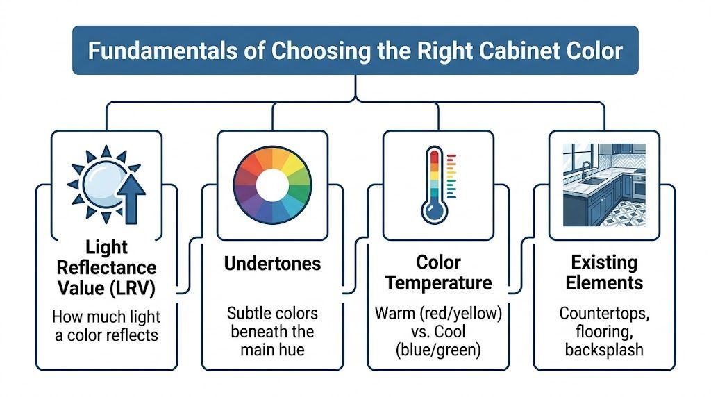
Light reflectance matters more than most people think

LRV, or Light Reflectance Value, tells you how much light a paint color reflects. Visualize the difference between wearing a black jacket and a white shirt on a cloudy day. One holds onto light. The other throws it back into the room.

In Puget Sound kitchens, that matters. A higher-LRV cabinet color can help a room feel more open and less compressed during darker parts of the year. A lower-LRV color can look rich and grounded, but it needs the right setting.

Sherwin-Williams trends have also shifted away from cool grays toward warmer greige neutrals, bleached blondes, and bold matte navies, according to Sherwin-Williams Industrial Wood’s look at kitchen cabinetry trends. That move makes sense locally because warmer cabinet colors usually read more comfortably under overcast skies than sharp, icy grays.

Undertones decide whether a color works or fights the room

A cabinet color can look white at the store and still lean yellow, gray, green, or beige once it’s installed. That hidden bias is the undertone, and it’s often what creates the "something feels off" reaction.

Here’s what to check before committing:

  • Countertops first: If the counters have warm veining or creamy tones, a stark cool cabinet color can feel disconnected.
  • Flooring second: Orange-toned wood floors and some older fir trim can make cool cabinet colors look harsher.
  • Backsplash and wall color last: These can support the cabinet color, but they rarely fix a mismatch created by the larger fixed finishes.

For a broader comparison of common cabinet tones, this article on good colors for kitchen cabinets is useful as a secondary reference point when clients are trying to narrow down style direction before sampling.

If your existing cabinets are wood and you're trying to predict how paint and undertones will behave over the substrate, it also helps to understand the species you're working with. Wheeler has a practical overview of types of kitchen cabinet woods that can help you identify what’s already in the room.

Practical rule: Never judge a cabinet color from a tiny chip alone. Sample it beside the countertop, floor, and backsplash in both morning and evening light.

Sheen changes both the look and the maintenance

Color gets most of the attention, but sheen changes how cabinets wear. For most kitchens, satin and semi-gloss are the finishes worth considering.

Semi-gloss is easier to wipe down and usually gives you a crisper, more reflective look. Satin is slightly softer and can be more forgiving on older cabinet doors that have minor texture, grain telegraphing, or repair marks.

There’s also a trade-off with darker colors. Sherwin-Williams notes that matte and low-sheen finishes on darker cabinet colors can hide fingerprints up to 40% better than gloss finishes in high-traffic kitchens, based on its industrial cabinetry trend guidance linked above. That can be helpful on islands or lower cabinets where hands constantly hit the surface.

What usually works and what usually doesn’t

A few patterns show up again and again in the field:

  • What works: Warm whites in dim kitchens, balanced greiges with mixed metal finishes, and darker accent colors used with restraint.
  • What struggles: Cool gray cabinets in already gray rooms, very glossy dark finishes on busy family kitchens, and trendy colors chosen without testing them in local light.
  • What deserves patience: Two-tone kitchens. They can look excellent, but they need stronger coordination between counters, wall color, and hardware.

People don’t need hundreds of paint names. They need a filter for making fewer, better choices.

Top Sherwin-Williams Cabinet Color Palettes

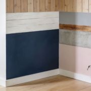
Not every kitchen needs the same answer. Some need light. Some need warmth. Some need contrast so the room stops looking flat. The strongest sherwin williams kitchen cabinet colors usually fall into three practical groups: bright whites, softer neutrals, and bold statement colors.

A useful gallery of ideas for side-by-side comparison is Wheeler’s collection of kitchen cabinets paint color ideas. It helps clients narrow the conversation before moving into physical samples.

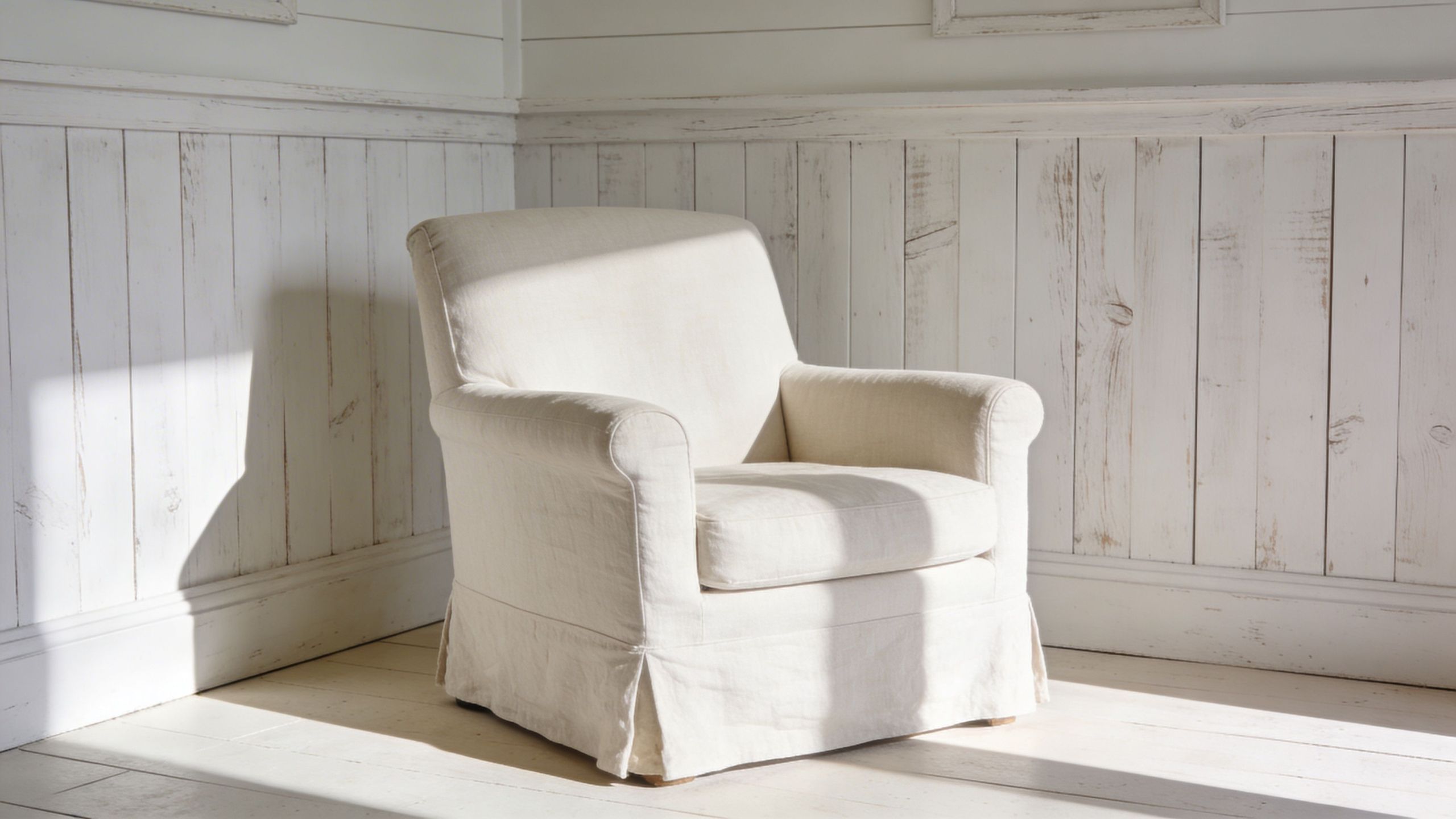
Timeless and airy whites

Pure White (SW 7005) is one of the safest recommendations for cabinet painting when the goal is to brighten the room without making it feel sterile. It has an LRV of 84 and reflects substantial light, which is part of why it remains a top cabinet choice in design roundups focused on Sherwin-Williams whites, as noted by Designing Vibes. It also sits warmer than many people expect, which helps it avoid that hard, clinical look.

Alabaster (SW 7008) is another strong option when a kitchen needs softness. Verified trend guidance for Sherwin-Williams cabinetry notes Alabaster (LRV 82) as a brightening choice that reflects 80%+ light and works well in smaller kitchens where space feels compressed. It tends to be easier with warmer counters and wood floors than a cooler white would be.

These whites work well with:

  • Quartz with soft veining
  • Subway tile or handmade-look backsplash
  • Brushed nickel, polished nickel, or unlacquered brass
  • Natural wood accents on shelves, stools, or flooring

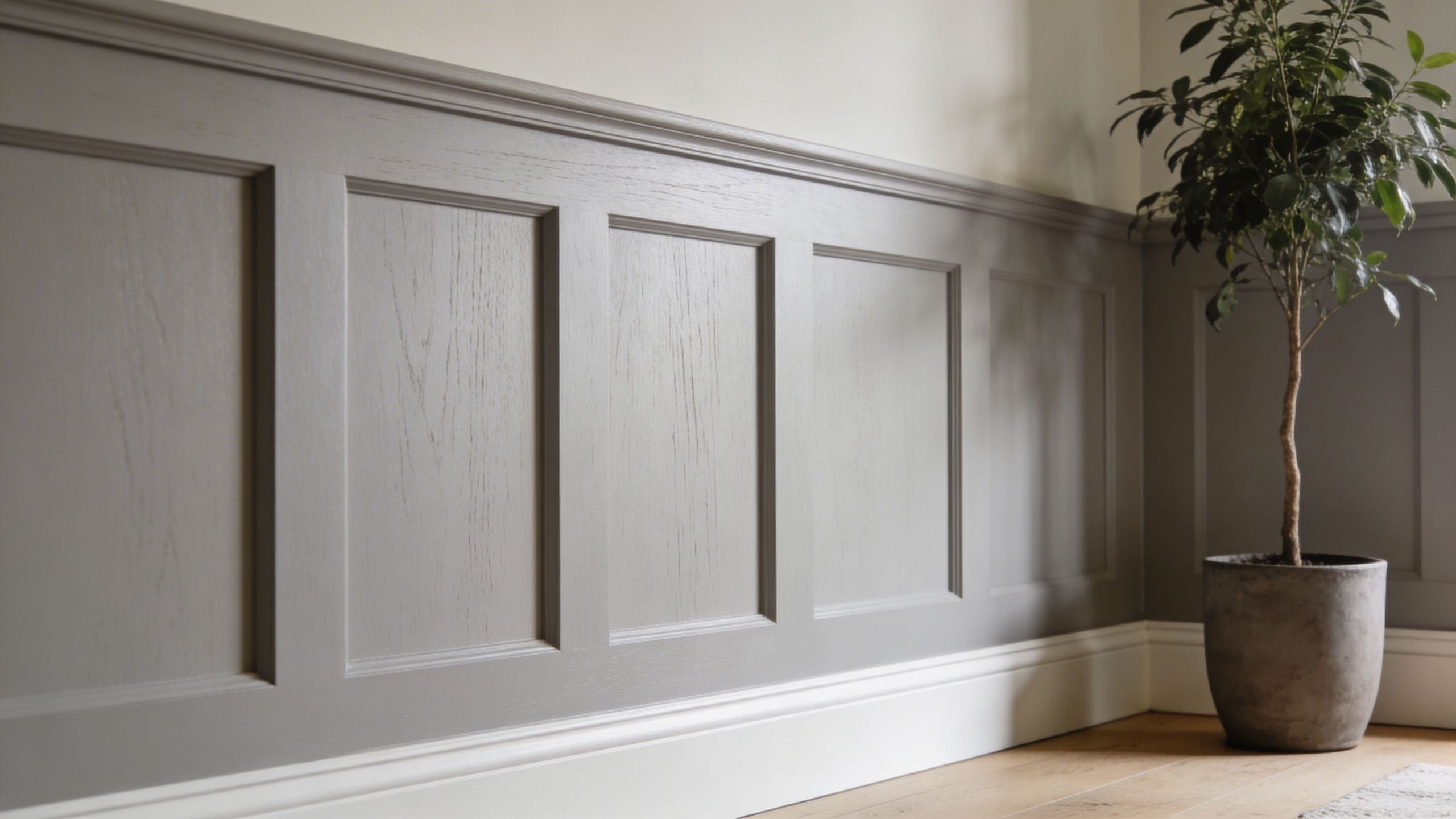
Sophisticated neutrals and greiges

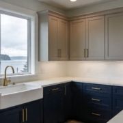
Not every kitchen wants white cabinets. In many Seattle-area homes, a white cabinet can feel too sharp against warmer flooring, natural wood trim, or existing stone surfaces.

Accessible Beige (SW 7036) is a dependable direction when the room needs warmth more than brightness. It sits in that neutral zone where it can work with both black and brass hardware and usually feels more grounded than off-white. In homes with alder or fir tones, that warmth often reads more intentional than a cool gray.

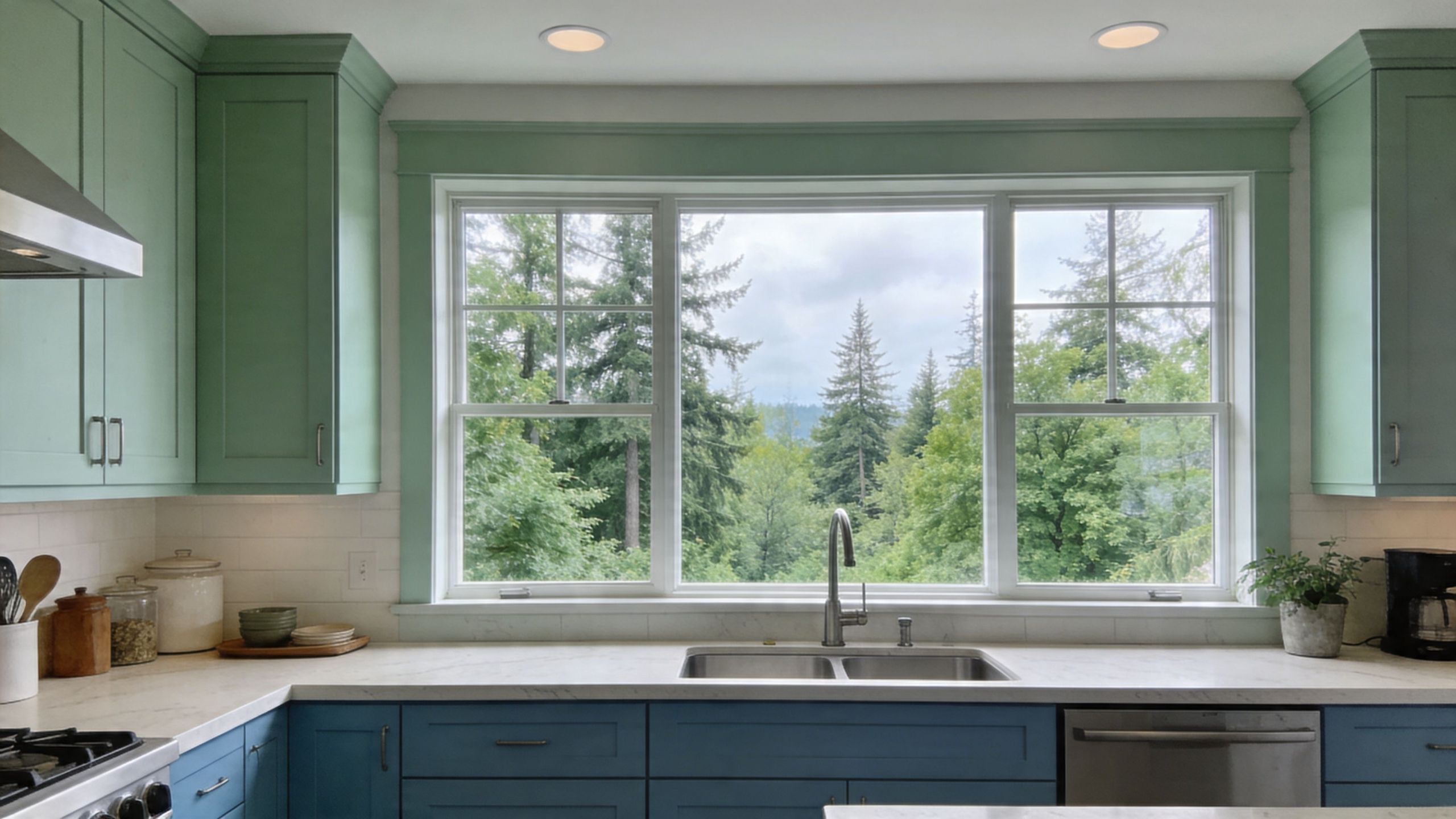
Evergreen Fog (SW 9130) fits homeowners who want a color but don’t want the kitchen to feel loud. Sherwin-Williams trend guidance places it in the warmer cabinet movement and describes it in the LRV 30-40 range, which gives it enough body to read as a muted statement without going dark. It can work nicely on islands or full cabinetry when the kitchen has decent natural light and simple counters.

Neutrals and greiges pair best with:

Cabinet direction Best supporting finishes
Warm greige Creamy quartz, stone-look backsplash, aged brass
Beige-neutral White counters, warm wood flooring, matte black hardware
Muted green-greige White oak accents, simple tile, mixed metals

If a kitchen has a lot of fixed warm material already, a slightly warmer cabinet color usually looks more expensive than forcing in a cooler trend color.

Bold and dramatic statements

Dark cabinets can look outstanding, but they’re less forgiving. They need enough light, enough contrast, and enough restraint.

Tricorn Black (SW 6258) is the cleanest black in this group. It was featured in Sherwin-Williams’ 2021 Colormix® Tapestry palette and has grown into a major statement option. Verified data notes that it now makes up 25% of top designer picks in inspiration galleries after that palette feature, making it one of the better-established dark cabinet choices rather than a short-lived novelty. Its strength is that it reads as a true black without obvious brown or gray drag.

Dark cabinet colors often work best in one of these layouts:

  • Island only: Strong contrast without taking over the room
  • Lower cabinets only: Keeps weight low and preserves brightness above
  • Full set in larger kitchens: Works when the space has strong lighting, lighter counters, and enough visual breathing room

For navy-leaning kitchens, Sherwin-Williams industrial trend guidance also points to colors such as In the Navy SW 9178 and Needlepoint Navy SW 0032 in the broader move toward bold matte navies. These are good candidates for people who want depth without going all the way to black.

Sherwin-Williams recommended cabinet colors

Color Name (SW #) LRV Undertone/Family Pairs Well With
Pure White (SW 7005) 84 Warm white Quartz counters, brass, nickel, light backsplash
Alabaster (SW 7008) 82 Soft warm white Warm woods, creamy counters, classic tile
Shoji White (SW 7042) 74 Off-white, warmer neutral Stone counters, softer backsplashes, warmer flooring
Accessible Beige (SW 7036) Qualitatively warm neutral Beige-greige Alder tones, black hardware, mixed metals
Evergreen Fog (SW 9130) 30-40 Warm green-greige White oak, simple tile, understated stone
Tricorn Black (SW 6258) Qualitatively very dark True black White counters, brass, concrete, wood accents

One note on color codes: Sherwin-Williams identifies cabinet colors by SW numbers, and that’s the most reliable way to specify them on a project. Because no verified HEX or RGB values were provided in the approved source material, it’s better not to rely on unofficial digital color conversions when making a final paint decision.

Color Strategies for Pacific Northwest Homes

National cabinet advice often misses what happens in a Seattle or Tacoma kitchen in February. Light is flatter. Shadows stay longer. Colors that looked balanced online can feel cooler, heavier, or duller once they’re installed in a real Puget Sound home.

A modern kitchen featuring two-tone cabinetry with green upper cabinets and blue lower cabinets under a window.

The region averages 40% less sunlight than national norms, and one survey cited a 62% regret rate for non-neutral cabinets in dim climates, which is why warmer beiges and higher-LRV whites are often the safer long-term choice in local homes, according to this Studio McGee discussion of neutral kitchen cabinet color. That doesn’t mean bold colors are a mistake. It means they need better planning here than they might in a brighter market.

Use brightness deliberately, not automatically

A brighter cabinet color can help in kitchens with limited daylight, but brightness alone isn’t the goal. The goal is balance.

In north-facing kitchens or rooms blocked by neighboring homes, warm whites and soft neutrals usually hold up better than sharp cool whites. They bounce light without making the room feel washed out. In open-concept homes, they also tend to transition more naturally into adjacent living spaces.

Work with local wood tones instead of fighting them

A lot of homes between Kent and Tacoma still have natural wood floors, fir trim, alder cabinetry in nearby rooms, or wood accents that aren’t changing with the kitchen project. That matters.

Cabinet paint should support those materials, not argue with them. In practice, that usually means:

  • Warm whites for homes with honey or amber wood notes
  • Greige or beige-leaning neutrals when flooring has visible warmth
  • Muted greens or navies only when there’s enough contrast from counters and wall color

If the kitchen includes prominent wood elements, bring those samples into the color decision early. A paint color that looks calm on a sample board can go muddy next to warm fir or turn colder than expected against stone with gray veining.

Most PNW kitchens look better when the cabinet color relates to the wood tone somewhere in the house, even if it doesn't match it exactly.

Moisture changes the paint conversation

Puget Sound kitchens also deal with moisture differently. Daily cooking, cooler outdoor weather, and seasonal dampness create conditions where lower-quality products show their weaknesses faster.

That affects both color and finish. Dark colors can reveal failure sooner if the coating wasn’t built correctly. Lighter colors can yellow or get blotchy if the wrong product was used. A proper cabinet system matters more here because the environment is less forgiving.

For homeowners and facility managers, that means thinking beyond the paint chip. The right sherwin williams kitchen cabinet colors still need the right prep, primer, and topcoat system to stay attractive in a kitchen that sees steady use.

The Professional Process for a Flawless Finish

A cabinet finish earns its keep after the kitchen goes back to normal. Doors open and close hundreds of times. Pulls get grabbed with wet hands. Steam hangs in the room on dark winter mornings. In Seattle, Tacoma, and Kent, that daily moisture exposure is part of the job, so the process has to be built for wear from the start.

A professional painter uses a spray gun to apply fresh off-white paint to a kitchen cabinet door.

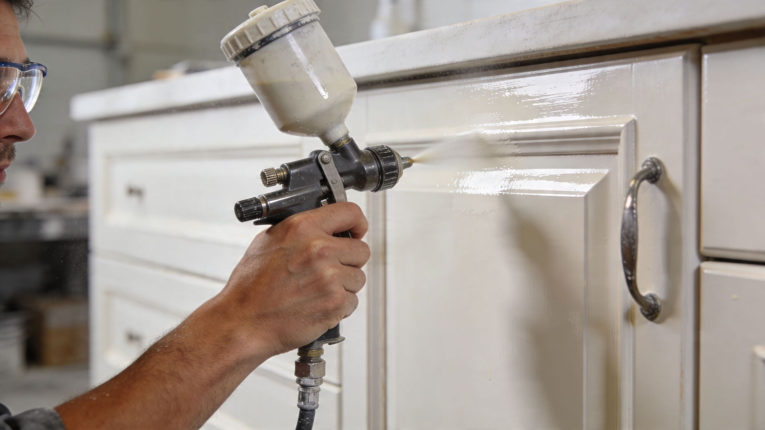
Prep does most of the hard work

Cabinets carry layers of contamination that homeowners rarely see. Grease near the range, polish residue on rail profiles, hand oils around pulls, and old cleaners all interfere with adhesion. If those contaminants stay in place, the new finish is more likely to chip at corners, fisheye during application, or wear prematurely around high-touch areas.

A proper prep sequence usually includes:

  1. Removing doors, drawers, and hardware so each piece can be coated cleanly.
  2. Labeling every part to keep reinstallation accurate.
  3. Cleaning and degreasing with extra attention near cooking zones and handles.
  4. Sanding or scuffing to create mechanical adhesion.
  5. Priming repaired areas and slick surfaces so the topcoat bonds evenly.

This is also the stage where old cabinet problems show up. Swollen MDF edges, failed caulk lines, hinge wear, and grain that needs filling are easier to correct before finish coats go on than after the color is applied.

Product choice matters more on cabinets than on walls

Cabinets need an enamel made for repeated contact and routine cleaning. Standard wall paint can look acceptable for a short time, but it usually does not hold up well on doors, drawer fronts, and face frames that get touched all day.

Sherwin-Williams Emerald Urethane Trim Enamel is a common choice for cabinet work because it levels well and cures to a harder finish than typical wall coatings. That matters in PNW kitchens, where moisture, cooking residue, and cooler indoor conditions can expose weak coating systems faster.

For homeowners weighing a full repaint against a more limited scope, Wheeler has a useful page on painting kitchen cabinet doors and drawer fronts. That decision affects labor, downtime, and how uniform the final result looks across the whole kitchen.

Field note: If a painter treats cabinet work like wall work, expect callbacks.

Application quality decides whether the finish looks factory-made or obviously repainted

Good spraying is only part of the job. Film thickness has to stay consistent. Dust has to be controlled. Recoat timing matters. So does temperature and humidity, especially during damp stretches common around Puget Sound. If the schedule gets rushed, the finish may dry unevenly, block when doors close, or show texture differences between frames and doors.

Cure time is where patience pays off. Cabinets can feel dry well before they are ready for full service, and that gap matters. I tell clients the same thing on nearly every project. A coating that gets handled too hard in the first few days can dent, print, or lose sheen before it fully hardens.

A general contractor with cabinet painting capability, such as Wheeler Painting & Restoration Services, can also be useful on broader kitchen projects because cabinet work often overlaps with drywall repair, trim updates, flooring protection, and schedule coordination with other trades.

Why Hire a Local Pro for Your Cabinet Project

Cabinet painting looks simple from a distance. Once the doors come off, the project becomes a finish-control job. Color selection, prep, dust management, dry time, hardware reinstallation, and protection of the rest of the home all have to line up.

That’s where DIY projects usually get expensive. The paint itself isn’t the only risk. The bigger risk is choosing a color that doesn’t work in local light, then applying it over a surface that wasn’t properly cleaned or primed. By the time those mistakes show up, the kitchen is already disrupted and the fix is rarely quick.

Local experience changes the recommendation

A contractor who works regularly in Seattle, Kent, Tacoma, and the communities in between sees the same recurring conditions:

  • Overcast light that cools colors down
  • Warm existing wood tones that affect undertones
  • Daily moisture and cooking residue that stress coatings
  • Older cabinet boxes and doors that need repair before paint

A local pro can spot these issues early and steer the project toward a practical result instead of a trendy one that won’t wear well.

Accountability matters on cabinet work

Cabinet painting is detailed work done in one of the busiest rooms in the property. Homeowners want the kitchen back. Facility managers want predictable scheduling. Property owners want the finish to hold up without constant touch-ups.

That’s why local accountability matters. If something needs adjustment, you’re not dealing with an out-of-area crew that has already moved on. You’re working with a contractor who serves this market and understands the expectations here.

The right hire doesn’t just apply paint. They protect the schedule, the surrounding finishes, and the long-term look of the kitchen.

It also helps on larger renovation projects

Some cabinet jobs stay small. Others turn into broader updates once the homeowner sees the opportunity. New flooring, drywall repair, backsplash replacement, tenant improvements, small retail refreshes, or office breakroom updates often tie into cabinet refinishing decisions.

Working with a contractor that handles both painting and broader residential or commercial construction can simplify those moving parts. Instead of coordinating several separate vendors, you have one point of contact who can keep the sequence organized.

For many property owners, that reduction in friction is just as valuable as the paint color itself.

Frequently Asked Questions About Cabinet Painting

How much does it cost to have kitchen cabinets professionally painted in the Seattle area

The exact price depends on the number of doors and drawers, the condition of the existing finish, how much prep is required, whether the boxes and interiors are included, and whether the project is part of a larger remodel. A small, straightforward repaint is very different from a kitchen with heavy grease, damaged doors, or layout-related carpentry work.

The most reliable way to price it is with an on-site estimate. That lets the contractor inspect the surface condition and confirm the scope before anyone promises a number that won’t hold.

How long does the cabinet painting process take

Most cabinet projects take several days from prep through reinstallation, and some take longer depending on drying conditions, complexity, and whether other work is happening in the kitchen at the same time. The timeline is driven less by how fast paint can be sprayed and more by how carefully the surfaces are prepared and how much cure protection is built into the schedule.

If someone promises an unusually fast turnaround, ask what they’re skipping.

Can I still use my kitchen during the project

Usually, yes, but not normally. Expect disruption. Doors and drawers may be removed, access may be limited, and parts of the kitchen may be off-limits during prep, spraying, or curing.

Most homeowners do best when they set up a temporary kitchen zone in another room with coffee supplies, a microwave, and a few everyday dishes. That takes the pressure off the main kitchen while the work is underway.

How durable are painted cabinets over the long term

Painted cabinets can be very durable when the project uses the right prep, primer, and cabinet-grade enamel. Long-term durability depends on the system, not just the color. Cabinets painted with a product designed for trim and cabinetry, and allowed to cure properly, will hold up much better than cabinets coated with ordinary wall paint.

Daily care matters too. Use gentle cleaners, avoid slamming doors, and give fresh paint time to harden before treating it like a fully cured factory finish.


If you're planning cabinet painting, a kitchen refresh, or a larger residential or commercial improvement project in Seattle, Kent, Tacoma, or the communities in between, Wheeler Painting & Restoration Services can help you sort through color selection, surface prep, and project scope with a clear on-site consultation and estimate.

10 Modern Paint Ideas for Wood Paneling

That dark paneling is still doing what it was built to do. It adds texture, warmth, and a little insulation. The problem is that in a lot of Seattle, Kent, and Tacoma homes, it also makes a room feel heavy. In offices and tenant improvement spaces, it can read more dated than intentional. Many people stand in front of it and assume the only real fix is demolition.

Usually, it isn’t.

Wood paneling became a major part of American interiors in the 1950s, peaked in the 1970s, and then fell hard out of favor as tastes moved toward cleaner, lighter spaces, according to Hunker’s overview of paint colors that go with wood paneling. That’s why so many Puget Sound properties still have solid wood, veneer, MDF, or laminate panels that are structurally fine but visually tired.

Painting is often the smarter move. The same source notes average professional painting costs of $1,500 to $3,000 for a 12×12 room, compared with $5,000 to $10,000 for removal and drywall replacement. For homeowners and property managers, that difference matters.

At Wheeler Painting, we see this all the time. A living room in Kent needs light. A paneled office in Seattle needs to look current. A commercial space between Tacoma and Seattle needs a finish that can handle daily wear without turning into a maintenance problem. Good prep, the right primer, and a finish that suits the space make the difference between a clean update and a peeling mess.

If you're collecting paint ideas for wood paneling, start with looks that work in real buildings, not just in design photos. If you want broader inspiration for lighter, breezier interiors, these coastal home decor ideas can help you think through the overall room. Below are ten approaches we recommend most often, along with the trade-offs that people should know before they open a paint can.

1. Matte or Eggshell Finish Over Wood Paneling

A minimalist room corner featuring grey wood paneling, white baseboards, and a small potted houseplant.

A simple solid-color paint job in matte or eggshell is still the safest update for most paneled rooms. It keeps the panel profile, hides a lot of age, and doesn’t try too hard. In Seattle living rooms and Kent bedrooms, this is often the finish that gives old paneling a clean reset without making the wall look plastic.

Matte looks softer. It cuts glare and helps grooves and seams recede. Eggshell reflects a little more light and is easier to wipe down. In houses with kids, pets, or busy hallways, eggshell usually holds up better.

Where this works best

This approach fits spaces where the paneling itself isn’t special enough to preserve as wood, but still adds useful texture. I’d use it in:

  • Living rooms and dens: Soft whites, warm grays, and muted greige tones calm down dark paneling fast.
  • Home offices: Eggshell gives a more finished look without the shine of satin.
  • Commercial offices: Matte can look sharp in conference rooms, but only if the walls won’t be touched often.

CertaPro states that interior latex paint in a satin finish is the top recommendation for painted wood paneling and cites 98% coverage efficiency on properly prepped surfaces. Even when clients choose matte or eggshell for appearance, that durability benchmark is a good reminder that prep is doing the heavy lifting.

Practical rule: If the paneling is glossy, fake wood, or old veneer, primer matters more than color.

What works and what doesn’t

Light sanding helps. For slick surfaces, the verified data points to products like Insl-X Stix Primer for difficult adhesion, with 95% adhesion success on challenging glossy veneers. After that, use thin coats. Thick paint builds up in grooves and can make paneling look muddy.

If your paneling has stain bleed, smoke residue, or old waxy polish, don’t skip cleaning and testing. The best finish in the world won’t save a bad substrate. If you’re dealing with stained wood and wondering how the prep changes, Wheeler’s guide on painting over wood stain is a useful starting point.

2. Accent Wall or Color Blocking

Not every paneled room needs all four walls painted the same way. Sometimes the smartest move is restraint. One paneled accent wall can keep the room’s character while letting the rest of the space breathe.

This is one of the better paint ideas for wood paneling when the room already has good natural light. In Tacoma dens, Seattle studies, and commercial reception areas, a darker feature wall can feel intentional instead of outdated.

Strong color without a heavy room

Deep navy, muted forest green, charcoal, and warm clay tones all work well on paneling because the grooves add shadow and depth. A flat drywall wall in the same color can feel plain. Paneled texture gives it more presence.

For open-plan homes, color blocking can also help separate uses. A paneled dining nook in a warmer tone can feel distinct from an adjacent living room painted in a soft neutral. In offices, one brand-color wall often does more than painting everything bold.

The verified data notes that in today’s paneling projects, 75% opt for lighter hues to brighten spaces by reflecting up to 80% more light. That tracks with what we see locally. If a room is already dark, keep the bold color limited to one wall.

Clean lines matter here

With color blocking, sloppy edge work ruins the effect. Tape carefully, test samples on the actual paneling, and watch how the color changes from morning to evening. Grooves can throw shadows that make a color feel deeper than it looked on a swatch.

A couple of combinations that tend to work:

  • Soft white with charcoal: Good for family rooms and modern farmhouse updates.
  • Warm beige-gray with deep green: Strong in libraries, dens, and office spaces.
  • Light greige with muted blue: Safer for commercial interiors where you want personality but not drama.

If you want more combinations before choosing a feature wall, Wheeler has a helpful page on accent wall color ideas.

Bold paneling works when the rest of the room gives it room to breathe. If every surface is shouting, the paneling usually loses.

3. Whitewashing or Limewash Finish

A cozy, slipcovered armchair sits in a sunlit room against rustic white wood paneled walls.

Whitewash is for people who don’t hate the wood. They hate the darkness. That’s an important difference.

Instead of burying the grain under a full solid coat, whitewashing softens the brown or orange tone and lets some of the wood character stay visible. In Puget Sound homes that lean farmhouse, coastal, cottage, or rustic-modern, it can look honest and relaxed.

Best fit for real wood character

This technique looks best when the paneling has actual grain worth seeing. On cheap printed laminate, it rarely looks convincing. On solid wood or decent veneer, it can be a beautiful compromise.

Use it in:

  • Bedrooms and sunrooms: It keeps the walls light without making them sterile.
  • Cottages and older homes: It preserves age and texture.
  • Spaces with natural fibers and soft textiles: Linen, oak, and matte black accents all pair well with it.

The global wood-based panel market reached USD 217.9 billion in 2024 and is projected to grow at a CAGR of 4.8% from 2025 to 2034. That matters because engineered panel products remain common, and not every surface is a good candidate for a translucent finish. Know what’s on your wall before you commit.

The trade-off

Whitewash is more forgiving stylistically, but less forgiving technically. Lap marks, uneven wiping, and inconsistent transparency show up fast. You need to work in manageable sections and keep a wet edge.

For higher-wear rooms, a protective topcoat may be worth discussing. That’s especially true if the paneling sits in a hallway, commercial common area, or kids’ space where hands are constantly on the wall.

What doesn’t work is trying to force a limewash look onto paneling with heavy stain bleed, slick laminate, or water damage. In that case, a solid paint system gives a cleaner result and fewer surprises.

4. Staining Over Paneling Toning or Glazing

Some paneling doesn’t need to be painted at all. It needs to be corrected.

That’s where toning and glazing come in. If the wood feels too orange, too red, or too shiny, a translucent stain or glaze can shift the color while keeping the grain visible. This is a better move than opaque paint when the architecture still benefits from a wood finish.

When preserving the wood makes sense

I’d look at this in executive offices, studies, libraries, and higher-end homes where the paneling has some substance. It can also work in commercial interiors that want warmth without the full 1970s look.

A glaze can mute yellow undertones. A darker toner can pull washed-out wood toward walnut or espresso. The result is quieter and provides a more custom appearance than a full repaint.

This is also the point where people realize paneling can support a broader design style. If you’re after a warmer, more natural room, a rustic kitchen palette often translates well to paneled dens, offices, and built-ins too.

Why DIY gets risky fast

This is one of the least DIY-friendly options on the list. Uneven absorption, streaking, and lap marks are common. Old clear coats, wax, smoke residue, and sun fading all affect how a toner sits on the wall.

A few realities worth knowing:

  • Gel stains give more control: They tend to sit more evenly than very thin liquid products.
  • Sample areas are mandatory: What looks good on one board can shift on the next.
  • Protection matters: A clear topcoat is often needed once the color is right.

If your paneling ties into cabinetry, built-ins, or trim, consistency gets even harder. That’s why cabinet stain work is usually a good reference point. Wheeler’s guide on how to stain wood cabinets shows the level of prep and finish control this kind of work takes.

What doesn’t work is rushing cure time. Toning systems can look dry on the surface while still being vulnerable underneath.

5. Ombré or Gradient Painting

Ombré on wood paneling isn’t for every property, but in the right setting it can be memorable. Restaurants, boutique offices, creative studios, and statement walls in modern homes are the usual candidates.

Panel grooves help this effect. They break up the transition and give the gradient more rhythm. On a flat wall, ombré can sometimes feel like a mural experiment. On paneling, it can read more architectural.

Where a gradient earns its keep

This is strongest when the wall is meant to be noticed. Think a reception area in Seattle, a café wall, or a single media-room feature in a Tacoma home. It’s not the choice for every bedroom or every leased office suite.

The best gradients stay in one family. A smoky blue fading into a pale blue-gray works. A clay tone fading into sand can work. Hard contrast usually looks accidental unless the painter is very experienced.

Projected design reporting for 2026 says modern slat designs are seeing 35% to 50% higher adoption in urban lofts and minimalist interiors. That’s a projection, not a current universal rule, but it points to the same broader trend: people are treating wall paneling as a design feature again, not just background.

What has to go right

The challenge isn’t choosing colors. The challenge is blending them before edges flash off. Humidity helps open time a bit in our region, but it can also slow curing and expose poor technique.

This kind of finish usually works best when:

  • The wall is simple: Fewer windows, outlets, and interruptions.
  • The palette is tight: Neighboring tones blend better than opposites.
  • The room supports it: Minimal furnishings help the wall stand out.

If you want ombré to look refined, use fewer colors than you think you need.

On rental turnovers and standard resale prep, I’d skip it. On the right feature wall with the right client, it can look excellent.

6. Decorative Glazing or Faux Finishes

Decorative finishes live or die on execution. There’s no middle ground. A good faux finish can make paneled walls feel custom. A bad one can make the whole room look themed.

This is why I rarely recommend it for full rooms. For one statement wall, a restaurant niche, a reception backdrop, or a high-end powder room, it can be a smart move.

Good uses for specialty finishes

Glazes can soften a base color and add depth. Metallic washes can bring movement to a paneled wall without full sparkle. Leathered, stone-inspired, or brushed effects can help old paneling feel more like an intentional surface treatment than a leftover finish.

In Seattle commercial interiors, this can work well in hospitality and retail. In homes, it usually fits one of two approaches: either very refined and muted, or intentionally dramatic.

If you want a quick visual reference for decorative technique, this type of application helps show why hand skill matters:

Why this is usually a contractor job

The verified data notes an underserved issue in humid climates like Puget Sound. High moisture contributes to tannin bleed, mold growth, and paint peeling, and 70% of paint failures in damp areas stem from inadequate vapor barriers. A decorative finish layered over unstable prep just fails in a fancier way.

That is the primary trade-off. Specialty finishes look premium, but they’re less forgiving of substrate problems.

Before approving a faux finish, I’d want to know:

  • What is the paneling made of
  • Has it been painted or sealed before
  • Is there moisture or movement in the wall
  • Will the wall take frequent cleaning

If the answer to that last point is yes, especially in commercial spaces, choose a simpler finish with a more serviceable topcoat.

7. Two-Tone or Color Split Painting

Two-tone paneling is one of the most practical updates on this list. It gives old paneling a custom look without requiring a specialty artist. It also solves a common problem. Full-height dark paneling can make a room feel squat.

Paint the lower section darker and the upper section lighter, and the wall usually feels better proportioned right away.

Why this works so well on paneling

Panel grooves already divide the wall visually, so a horizontal color split feels natural. In dining rooms, offices, and hallways, it can mimic the effect of wainscoting even when the original paneling wasn’t installed for that purpose.

This can be especially effective in Seattle and Tacoma homes with lower ceilings. Verified data notes that two-tone methods can enhance room height perception by up to 20%. That lines up with what clients react to. The room feels taller because the upper wall reads lighter and less heavy.

Smart pairings

A few combinations that work consistently:

  • Warm white over charcoal: Crisp but not cold.
  • Greige over muted navy: Good in offices and dining areas.
  • Soft gray over deep green: Nice in studies, libraries, and bedrooms.

For lower walls, I prefer a finish that can take more abuse. Satin or a durable eggshell is usually a safer choice there than dead-flat paint.

What doesn’t work is placing the split at an awkward height. If it cuts through window trim, built-ins, or furniture lines badly, the wall looks accidental. Snap a level line and step back before you paint.

The lower half should ground the room. The upper half should lighten it.

8. Metallic or Pearl Paint Finishes

A modern interior wall featuring elegant wood paneling with decorative metallic copper accents and a wall sconce.

Metallic and pearl finishes can make paneling feel expensive fast. They can also make it feel overdone fast. The difference usually comes down to restraint, lighting, and surface prep.

On grooves and raised details, metallic pigments catch light in a way flat paint can’t. That can be beautiful in a powder room, bar area, boutique retail space, or hospitality setting. It’s less useful on every wall of a family room.

Best applications

I like metallics most when they stay secondary. Bronze, pewter, champagne, and soft pearl tones usually work better than bright gold or silver. They should shift with the light, not shout at you from across the room.

This kind of finish can complement:

  • Feature walls with good sconce or pendant lighting
  • Commercial reception areas
  • Small residential spaces where drama is welcome

The key is smooth prep. Metallic products magnify roller lines, patched seams, and groove buildup. Any flaw in the paneling tends to show more, not less.

Durability and maintenance considerations

For commercial settings, finish selection matters as much as color. Verified data notes that commercial spaces see 2x paint wear from abrasion and that epoxy topcoats over latex can deliver 5x scratch resistance. That’s a real consideration for paneled feature walls in tenant improvements, lobbies, and common areas.

At the same time, not every metallic wall needs a heavy topcoat. In a low-touch residential room, the extra layer may be unnecessary and may alter the sheen.

What doesn’t work is forcing a metallic finish into a room that already has busy flooring, heavy grain, bold countertops, and reflective furniture. Paneling should add depth. It shouldn’t compete with every other finish in the room.

9. Textured Paint or Specialty Surface Treatments

Textured coatings are usually a last resort or a deliberate design choice. Sometimes they help old paneling disappear. Sometimes they create a fresh architectural finish. Sometimes they just make future repairs harder.

That’s why I’d only recommend texture when there’s a clear reason for it.

When texture earns the extra work

If the paneling is extensively grooved, uneven, or visually cheap, texture can help break the pattern and move the wall away from “wood paneling” altogether. In commercial settings, certain textured systems can also soften sound and hide wear better than a perfectly smooth finish.

Projected trend data for 2026 says ultra-matte, low-VOC water-based finishes with scrub resistance above 200 cycles per ASTM D2486 are gaining favor in panel applications. That’s a projection source, but the practical takeaway is useful. If you texture a wall, choose a finish system that can still be cleaned.

What people underestimate

Texture is messy. Overspray gets everywhere. Repairs are never invisible unless the original application was documented and matched carefully.

Before using any specialty surface treatment, think through the long term:

  • Can this wall be patched later without obvious flashing
  • Will the owner repaint in a few years
  • Does the room need easy wipe-down maintenance
  • Is the paneling stable enough to support added material

For leased commercial spaces, I usually lean toward simpler systems unless the tenant specifically wants texture as part of the build-out design. For residential remodels, subtle texture can work, but heavy faux stucco over old paneling often feels like a workaround, not a finish choice.

If the main goal is modernizing the wall, smooth paint usually ages better.

10. Modern Minimalist or Monochromatic Approach

This is the finish approach I recommend most often when clients want the paneling to feel current and not trendy. Paint the whole room, or most of it, in a related family of warm whites, soft grays, beige-grays, or muted earth neutrals. Let the grooves read as texture, not contrast.

It’s simple, but simple doesn’t mean basic.

Why it works in Puget Sound spaces

Light quality in the Seattle-Tacoma corridor changes all day. A stark white that looked clean at noon can feel cold and flat by late afternoon. Warmer neutrals tend to stay livable across changing cloud cover and lower winter light.

Verified data says neutrals such as soft whites and light grays are used in 60% of professional paneling applications for timeless appeal. That makes sense. They don’t date the room quickly, and they support everything from Scandinavian-inspired homes to clean office remodels.

The maintenance side matters too

In our climate, finish selection can’t be separated from durability. The verified data notes that satin latex offers mildew resistance lasting 5 to 7 years in humid climates like Western Washington. Even if a minimalist look leans softer in sheen, this is why I still look closely at room use before defaulting to dead-flat paint.

For a monochromatic result that lasts, keep these priorities in order:

  • Choose the right undertone: Warm whites and soft greiges are easier to live with than stark bright whites.
  • Prime for the material: MDF, veneer, and laminate don’t all behave the same.
  • Match sheen to use: Lower-sheen for low-touch rooms, more washable finishes where hands and scuffs are constant.

A minimalist paneling update isn’t trying to hide the wall. It’s treating paneling as architecture.

10 Wood-Paneling Paint Ideas: Comparison

Option Implementation complexity Resource requirements Expected outcomes Ideal use cases Key advantages
Matte or Eggshell Finish Over Wood Paneling Low–Moderate (prep and priming) Primer, interior paint, basic tools Modern low-sheen look; hides minor flaws Budget renovations, general residential rooms Cost-effective, easy touch-ups, extends paneling life
Accent Wall or Color Blocking Moderate (precise edge work) Paints, painter's tape, samples High visual impact; defined focal areas Defining zones, highlighting features, creative updates Low-cost transformation, flexible design choices
Whitewashing or Limewash Finish Moderate (technique-sensitive) Diluted paint or limewash, brushes/rags, optional sealer Bright, airy semi-transparent finish; visible grain Farmhouse/coastal styles, heritage restorations Preserves wood character, forgiving on imperfections
Staining Over Paneling (Toning/Glazing) Moderate–High (skill for even application) Semi-transparent stains/glazes, sealer, ventilation Natural wood tone update; upscale, unified appearance High-end homes, unifying varied panel tones Maintains natural grain, professional refined finish
Ombré or Gradient Painting High (advanced blending skills) Multiple paints, blending tools or sprayer, skilled labor Refined gradient depth; strong focal statement Artistic feature walls in residential or commercial spaces Highly distinctive, hides imperfections through variation
Decorative Glazing or Faux Finishes Very High (artisan technique) Specialty glazes, experienced decorative painter, sealant Custom surfaces that mimic marble/stone/metal Luxury projects, showrooms, statement walls Designer-quality look, unique and customizable results
Two-Tone or Color Split Painting Moderate (precise dividing line) Two paints, tape, level or laser Balanced, proportioned visual effect Transitional homes, dining rooms, children's rooms Timeless approach, creates cohesion and balance
Metallic or Pearl Paint Finishes Moderate–High (consistent application needed) Metallic/pearlescent paints, specialty rollers/brushes Shimmering, light-reflective focal surfaces Accent walls, luxury interiors, hospitality venues Luxurious, brightens space, contemporary appeal
Textured Paint or Specialty Surface Treatments Moderate–High (equipment and skill) Texture compounds, spray equipment, masking materials Three-dimensional surfaces; hides joints and flaws Concealing damage, adding dimension, acoustic uses Effectively hides imperfections; adds depth and interest
Modern Minimalist or Monochromatic Approach Low–Moderate (color selection critical) High-quality neutral paints, good lighting Timeless, calm surfaces that emphasize texture Contemporary homes, corporate interiors, galleries Timeless and versatile; highlights architectural details

Your Next Step Choosing the Right Finish for Your Puget Sound Property

Painting old paneling is one of the few interior updates that can change a room quickly without tearing the space apart. That’s why it keeps coming up in both residential remodeling and commercial renovation work. The paneling is already there. The question is whether you fight it, hide it, or use it well.

Some of these paint ideas for wood paneling are straightforward. Matte neutrals, monochromatic schemes, and simple accent walls are usually accessible for a handy homeowner with patience. If the paneling is in decent shape, the room is dry, and you’re using the right primer and finish, a DIY project can succeed.

Others are much less forgiving.

Whitewashing has to be controlled. Toning and glazing can go sideways fast if the existing clear coat, stain, or wood species isn’t behaving the way you expected. Metallic finishes show every flaw. Faux finishes depend heavily on technique. Two-tone work sounds simple until the split line lands in the wrong place or the darker lower section starts showing every scuff because the wrong sheen was used.

That’s where a contractor earns their keep.

In the Puget Sound area, paneling projects come with a few local realities. Humidity changes dry times. Older homes can have smoke residue, waxes, or hidden moisture issues. Commercial spaces need finishes that can be cleaned and maintained. Tenant improvements often need a finish system that looks sharp without creating a headache for the next turnover. A paint idea that works in a photo online may not be the right move for a living room in Kent or a property manager’s office update in Seattle.

The biggest mistake people make is choosing color first and surface system second. It should be the other way around. Start with the substrate. Is it solid wood, veneer, MDF, or laminate? Is there tannin bleed? Is there sheen? Does the room stay dry? Will people touch the wall every day? Once those answers are clear, color and style become much easier decisions.

That’s also why hiring a trusted local residential contractor or commercial construction partner often saves time and money even when painting seems simple on the surface. Good prep isn’t glamorous, but it’s the part that determines whether the finish still looks good down the road. In homes, that means fewer callbacks and fewer repaints. In businesses, that means less disruption and a cleaner result that supports the rest of the renovation.

At Wheeler Painting, we help homeowners, property managers, and business owners across Seattle, Tacoma, Kent, and the communities in between sort through those decisions without overcomplicating the job. Sometimes the answer is a bright neutral eggshell. Sometimes it’s a durable satin system for a commercial wall. Sometimes the best move is to preserve the wood with toning instead of covering it.

If you’re comparing house painting near me, residential contractor near me, commercial painting services near me, or commercial construction near me, look for a team that can do more than just put paint on the wall. You want clear prep standards, realistic guidance, and a finish plan that fits the space, the schedule, and the budget.

If your paneling is making a room feel stuck in another decade, you probably don’t need demolition. You need the right finish and the right process.


If you're ready to update wood paneling in a home, office, retail suite, or tenant improvement project, Wheeler Painting & Restoration Services can help you plan it properly from the start. We serve Seattle, Kent, Tacoma, and the surrounding communities with residential remodeling, commercial renovations, interior painting, specialty finishes, and practical color guidance that fits the space, the schedule, and the budget. Reach out for a detailed proposal and a straightforward conversation about what will work best for your property.