

Kitchen Colors With Dark Cabinets: Expert Guide
You’re probably standing in your kitchen with a few paint chips in hand, looking at your dark cabinets and thinking two things at once. They look beautiful, and choosing the wrong wall color could make the whole room feel too heavy.
That tension is common in homes across Seattle, Kent, Tacoma, and the towns in between. Dark cabinets can look polished and grounded, but in the Puget Sound region, our softer daylight changes how every wall color reads. A white that looked clean in the store can turn cold at home. A greige that seemed safe can go flat by late afternoon.
The good news is that dark cabinetry gives you a strong starting point, not a problem to solve. Once you understand how undertones, light, flooring, and sheen work together, kitchen colors with dark cabinets become much easier to narrow down.
Why Dark Cabinets Are a Great Choice for Your Home
A lot of homeowners second-guess dark cabinets right after installation. The room suddenly has more contrast, more presence, and more personality than it did before. That can feel risky for a day or two.
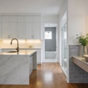
In practice, dark cabinets are one of the easier foundations to design around. They already bring visual structure to the room, so the rest of the palette can do one of two jobs. It can either lighten and balance the kitchen, or lean into the mood and make the space feel bespoke.

Why homeowners keep choosing dark cabinetry
Dark cabinetry has stayed popular because it does more than look dramatic. Dark finishes hide dirt, smudges, and scratches better than lighter cabinets, and darker hues including matte black, deep greens, and navy blues are identified as projected 2025 must-have color trends in this dark cabinet trend overview.
That matters in real kitchens, not showroom kitchens. If you cook often, have kids, entertain, or move quickly through the space every day, dark lower cabinets usually wear daily life better.
A few practical upsides homeowners notice right away:
- Less visible wear: Fingerprints, minor scuffs, and day-to-day marks don’t jump out as quickly.
- Stronger contrast: Light counters, tile, and trim read cleaner against a dark cabinet line.
- Flexible styling: Dark finishes work with brass, chrome, black hardware, wood accents, and stone surfaces.
- Longer design life: Dark cabinets usually don’t feel trendy in the wrong way. They tend to age better than highly specific novelty colors.
What dark cabinets do to the room
Dark cabinets make a kitchen feel more grounded. Sometimes they also make it feel a little smaller, especially in homes where natural light is indirect most of the year.
That’s not automatically a downside. In many Puget Sound homes, especially in older neighborhoods around Seattle and Tacoma, that slight visual compression can make a kitchen feel cozier and more intentional. The key is balance. You don’t want the room to feel dim, boxed in, or muddy.
Practical rule: If the cabinets are the heavy visual element, the walls, counters, ceiling, and lighting need to do the lifting.
That’s why color selection matters so much after cabinet installation. The cabinet color is only half the decision. The room around it decides whether the final result feels rich or oppressive.
Understanding Color Principles for Dark Cabinets
Most paint mistakes with dark cabinets come from one problem. Homeowners choose a wall color by itself instead of choosing a wall color in relation to the cabinet undertone.
Start there first. Ask whether your cabinets read warm or cool.
Warm dark cabinets usually include espresso, walnut, mahogany, and dark brown stains with red or golden undertones. Cool dark cabinets usually include charcoal, slate, deep gray, navy, and some black finishes.
Match the wall to the cabinet undertone
When undertones fight each other, the room feels off even if every individual material is attractive.
One way to simplify it:
- Cool cabinets: Pair well with light gray, soft white, and cooler off-white walls.
- Warm cabinets: Usually look better with beige, taupe, creamy white, and warmer greige walls.
- Mixed finishes: Need a reference point. If your counters are warm but the cabinets are cool, the backsplash or floor often has to bridge the gap.
If you have navy or charcoal cabinets, a yellow-beige wall usually looks disconnected. If you have espresso cabinets with warm brown depth, a stark blue-white can feel harsh.
Use LRV to avoid a heavy room
Homeowners don’t need to become paint chemists, but one measurement does help. Light Reflectance Value, or LRV, tells you how much light a color reflects.
For kitchen colors with dark cabinets, wall colors in the 60–75 LRV range are often the safest place to start. Soft grays, taupes, and warm off-whites in that range help balance dark cabinetry and keep the room from feeling heavy, especially in kitchens with moderate natural light, as noted in this guidance on light and dark cabinet color balance.

That range gives you enough reflectivity to brighten the room without creating a jarring showroom-white contrast.
Contrast should feel intentional, not loud
A lot of homeowners think they need maximum contrast. They don’t. They need the right contrast.
Here’s what usually works better in lived-in homes:
| Contrast level | What it looks like | When it works |
|---|---|---|
| Low contrast | Warm off-white or soft greige with espresso cabinets | Traditional, transitional, and cozy kitchens |
| Medium contrast | Soft gray or light taupe with navy or charcoal cabinets | Most Puget Sound homes |
| High contrast | Crisp white walls with black or near-black cabinets | Modern kitchens with strong light and simple finishes |
A balanced kitchen usually has one dramatic element, not five. If the cabinets already command attention, the wall color should support them.
A quick test before you commit
Tape large samples on multiple walls. Then check them in morning light, late afternoon, and after your overhead lights are on.
If the sample suddenly looks green, pink, or dingy at night, that’s not a small issue. In a kitchen, you’ll notice it every day. The right color should hold together across changing conditions, especially here in Western Washington where daylight shifts more than people expect.
Proven Paint Color Palettes for Your Kitchen
Once you know whether your cabinets lean warm or cool, choosing a palette gets easier. The goal isn’t to find a “perfect” paint color in isolation. The goal is to choose a wall color that makes the cabinets look intentional, the counters look cleaner, and the room feel brighter than the weather outside.
Sample boards are important. A color that looks excellent in a paint deck can completely change next to a dark stained cabinet door or a slab backsplash.
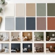
Three palette directions that usually work
Some homeowners want a lighter kitchen without repainting cabinets. Others want a moodier result that still feels clean. Most successful kitchens with dark cabinets fall into one of these directions:
- Crisp and clean neutrals: Good for black, charcoal, and navy cabinets when you want contrast.
- Warm and inviting tones: Better for espresso, chocolate, or brown-black cabinetry that needs softness.
- Cool and refined hues: Useful when you want a composed, designer-led look without going sterile.
If you’re collecting inspiration before you buy samples, this roundup of blue kitchen visuals for designers can help you see how cooler hues behave with cabinetry and metal finishes.
Paint color ideas for dark kitchen cabinets
| Palette Type | Paint Color Example | Notes |
|---|---|---|
| Crisp and clean | Sherwin-Williams Alabaster SW 7008 | Softer than stark white. Good with charcoal, black, and navy cabinets. |
| Crisp and clean | Benjamin Moore White Dove OC-17 | A dependable off-white for kitchens that need brightness without a cold cast. |
| Crisp and clean | Sherwin-Williams Crushed Ice SW 7647 | A light gray that can work with cool dark cabinets in moderate daylight. |
| Warm and inviting | Sherwin-Williams Accessible Beige SW 7036 | Useful with espresso or dark brown cabinets when you want warmth without yellowing the room. |
| Warm and inviting | Benjamin Moore Pale Oak OC-20 | A soft greige that often bridges warm wood tones and lighter counters well. |
| Warm and inviting | Sherwin-Williams Agreeable Gray SW 7029 | A flexible greige, but it needs testing because local light can shift it. |
| Cool and tailored | Benjamin Moore Classic Gray OC-23 | Very light, subtle, and often cleaner than many beige-leaning neutrals. |
| Cool and tailored | Sherwin-Williams Sea Salt SW 6204 | Best used carefully. It can look calm and refined, but test it hard in overcast light. |
| Cool and tailored | Benjamin Moore Gray Owl OC-52 | A soft gray choice for cool cabinet finishes and simple backsplash materials. |
What works and what usually doesn’t
A few practical calls from jobsite experience in the Puget Sound area:
- Works well: Off-whites with a little softness. They brighten the room without fighting dark cabinets.
- Often works: Light greiges that can connect wood floors, stone counters, and cabinet color in one move.
- Risky: Bright, stark whites in kitchens that don’t get direct sun. They can look cold fast.
- Also risky: Muddy mid-tone grays. Against dark cabinets, they often flatten the whole room.
If your kitchen has a lot of fixed finishes already, don’t choose the paint first. Choose the paint last. Cabinets, counters, flooring, and backsplash lock in the undertone story. Paint is the adjustment layer.
For homeowners comparing cabinet and wall combinations from the same brand family, this guide to Sherwin-Williams kitchen cabinet colors is a useful reference point for narrowing compatible directions.
Bring your cabinet sample, countertop sample, and flooring sample together before making a final paint call. Separately, each one can look right. Together, they tell the truth.
Lighting and Finishes for Puget Sound Homes
The same paint color won’t behave the same way in Phoenix and Seattle. That’s why generic kitchen advice often fails here.
Across the Puget Sound region, natural light is softer, cooler, and more diffused for much of the year. In a kitchen with dark cabinets, that means color depth increases quickly. A soft gray can become dull. A warm white can lose warmth. A dark blue cabinet can suddenly dominate the room by late afternoon.

Good lighting keeps paint honest
For kitchens with dark cabinetry, layered lighting works best at 3000 K to 3500 K with a CRI of 90+, because higher CRI helps off-white, beige, and soft gray walls keep their intended hue instead of turning muddy under artificial light, according to this article on lighting for dark cabinet color schemes.
That sounds technical, but the practical takeaway is simple. Cheap bulbs can make a well-chosen paint color look wrong.
Use layers instead of relying on one overhead fixture:
- Ambient lighting: Recessed lights or ceiling fixtures for general visibility
- Task lighting: Under-cabinet strips over work surfaces
- Accent lighting: Pendants, sconces, or interior cabinet lighting for depth
When all three are working together, dark cabinets look richer and more dimensional.
Sheen matters more than people think
Paint sheen changes how much light a surface throws back into the room. In kitchens around Kent, Seattle, and Tacoma, that matters because winter daylight is limited and often gray.
A few practical rules hold up well:
- Walls in matte or eggshell: Usually the safest choice. They soften reflections and hide surface imperfections.
- Trim in satin or semi-gloss: Adds definition and reflectivity around doors and windows.
- Ceilings with a touch of sheen when needed: In darker kitchens, a little extra reflectivity overhead can help.
If your project includes stained wood elements, matching the depth and finish of those surfaces matters too. This guide on how to stain wood cabinets is useful for understanding how stain tone and finish affect the final color balance in the room.
In Western Washington, light quality is part of the color palette. If you ignore that, the paint can still be “right” on paper and wrong in the room.
What fails most often
The most common lighting mistake is combining dark cabinets with cool, low-quality bulbs and a flat middle-gray wall. That combination tends to kill contrast, flatten surfaces, and pull strange undertones out of otherwise decent paint colors.
The better move is warm-neutral lighting, cleaner wall color, and enough layered light to keep corners from disappearing.
Coordinating Floors, Ceilings, and Backsplashes
A kitchen doesn’t read wall color by itself. It reads the whole room at once.
That’s why many homeowners still feel stuck even after narrowing down paint. The walls may be fine, but the floor is too close to the cabinet value, the ceiling absorbs light, or the backsplash introduces a competing undertone. Good kitchen colors with dark cabinets depend on hierarchy. Something needs to be dark, something needs to be light, and the in-between materials need to connect them.

Floors should support the cabinets, not disappear into them
In Western Washington, a slightly lighter floor finish like light oak can bounce useful light back into a room with dark cabinets, and ceiling finishes with more sheen can increase perceived brightness even when the ceiling color isn’t a pure white, as discussed in this article on color schemes for kitchens with dark cabinets.
That doesn’t mean every floor needs to be pale. It means the floor should make a deliberate contribution.
Three common floor directions:
- Lighter wood or wood-look flooring: Often the safest move in Seattle-area homes with softer daylight.
- Mid-tone flooring: Works if the undertone clearly relates to the cabinetry and counters.
- Dark flooring with dark cabinets: Can work, but only if ceilings, walls, and counters are doing enough to keep the room from closing in.
If you’re comparing wood and gray-toned floor directions, this 2026 grey kitchen flooring guide is a helpful visual resource for seeing how gray flooring shifts the mood of a kitchen.
Ceilings and backsplashes do more than fill space
Ceilings are often treated as an afterthought. They shouldn’t be. In darker kitchens, the ceiling is one of your biggest light-management tools.
A few good approaches:
| Surface | Safer choice | Bolder choice |
|---|---|---|
| Ceiling | Soft white with a bit of reflectivity | Very light greige if trim and walls stay bright |
| Backsplash | Warm white tile or soft stone | Patterned tile with controlled contrast |
| Grout | Mid-light neutral | Slightly darker grout for definition |
For ceiling finish questions, this overview of the right finish for ceiling paint helps clarify where flat works and where a touch of sheen helps more.
The whole-room hierarchy that usually works
When a kitchen feels professionally pulled together, it usually follows a simple order:
- Cabinets anchor the room
- Counters and backsplash create contrast
- Walls soften the transition
- Flooring stabilizes the palette
- Ceilings and trim restore light
That’s the sequence many online guides miss. They focus only on wall paint, but the room works as a system. If one finish is too dark, too yellow, too gray, or too shiny, it changes how every other finish feels.
From Plan to Paint Your Next Steps with Wheeler Painting
A lot of Puget Sound homeowners hit the same point. The dark cabinets look right, but the wall color still feels uncertain once you bring home samples and see them on a gray Seattle morning or under warm light at dinner.
That hesitation is normal. Dark cabinets give a kitchen structure, but they also make color mistakes easier to see. The good news is that the final decision usually gets clearer once you narrow the room down to its fixed surfaces and test paint in the actual space.
A simple way to make the final call
Start with the finishes that are expensive or inconvenient to change. In most kitchens, that means cabinets, counters, flooring, and often the backsplash. Wall color comes after that, not before.
Then test with discipline:
- Use large samples: Paint sample boards or peel-and-stick sheets need enough size to show undertone. A tiny chip will not tell you much next to dark cabinetry.
- Move the sample around the room: North-facing kitchens in Seattle, Kent, and Tacoma often read cooler along one wall and noticeably warmer under artificial light.
- Check the sample at more than one time of day: Morning cloud cover, a break of afternoon sun, and evening task lighting can all shift the same color.
- Compare it beside every fixed finish: Cabinets matter, but so do the floor, counter edge, tile, and trim.
If flooring is still part of the decision, this guide to flooring color considerations is useful because floor tone often decides whether dark cabinets feel grounded or too heavy.
When to bring in a contractor
Some kitchens only need paint. Others need wall repair, trim work, cabinet touch-up, lighting updates, or better coordination between trades. That is where projects tend to drift off course.
I see it often in older Puget Sound homes. A homeowner picks a wall color that looked balanced in the store, then the existing drywall texture, yellowed ceiling paint, or outdated can lights throw everything off once the work starts. Fixing that late costs more than sorting it out at the front end.
Wheeler Painting & Restoration Services handles color consultation, interior painting, drywall work, cabinet-related finishing, and broader remodel coordination across the Puget Sound area.
The right kitchen color holds up in real life. It still works on a dark winter afternoon, under under-cabinet lighting, and during the few bright summer hours when the room gets full sun.
What to do next
Pull together your cabinet, counter, backsplash, and floor samples first. Narrow your paint choices to a short list. Then test them where you live, with your lighting, in your kitchen.
That slower process usually prevents the expensive mistake. It also gives you a kitchen that feels calm, consistent, and right for the way homes in this part of Washington look through the year.





 “Like” us on Facebook!