Tag Archive for: commercial painting seattle

8 Ceiling Paint Color Trends for 2026

Are you still painting every ceiling flat white just because that is what the last owner, the last tenant, or the last contractor did?

I see that habit all over the Puget Sound, from Seattle offices to Tacoma retail suites to homes in Kent and the smaller communities in between. Property owners will weigh wall color, flooring, cabinet finish, lighting temperature, and furniture placement, then treat the ceiling like an afterthought. Around here, that choice has bigger consequences than people expect because our natural light is different.

Western Washington light stays cool and diffused for much of the year. Under gray skies, a ceiling color that looks crisp in a sunnier market can read harsh, flat, or slightly dingy here. A warmer white can soften that effect. A deeper color can add shape and intimacy. The wrong finish or sheen can also telegraph every patch, roller mark, and seam, especially in large commercial spaces with long sightlines.

Ceiling color trends have shifted for that reason. Owners are using ceilings more deliberately now, as part of the room’s lighting plan, mood, and proportions instead of as the last coat at the end of a project.

That applies to both houses and commercial properties.

In a bungalow with low winter light, the goal may be to keep the room open without making it feel cold. In a lobby, restaurant, office, or tenant improvement project, the ceiling often has to do more. It may need to hide imperfections, support brand colors, reduce glare, or tie exposed elements together. Some looks are straightforward to paint. Others, especially dark colors, metallics, precise color matching, and specialty matte finishes over repaired drywall, are where a professional contractor earns the money.

If you are planning a remodel, turnover, office refresh, or one-room update, the ceiling is one of the fastest ways to change how a space feels without changing the footprint. It can also work alongside clever room design ideas when you want a smaller room to feel more balanced or open.

1. Moody Dark Ceilings

Could a dark ceiling make your room feel sharper and more intentional, or would it just make a gray Puget Sound day feel heavier? That depends on the room, the light, and the finish.

Deep charcoal, navy, forest green, and soft black can add structure in a way plain white often does not. I see this work especially well in Seattle lofts, dining rooms with focused pendant lighting, and commercial spaces with exposed ducts or beams where the goal is to make the overhead plane feel designed instead of ignored. Designers also keep coming back to darker, mood-driven palettes in broader interiors coverage, including Lewis and Sheron's design playbook, and ceilings are part of that shift.

A modern, minimalist living room featuring a striking black painted ceiling and warm terracotta accent wall

Where dark ceilings work best

Dark ceilings perform best when the room has enough volume, enough lighting, or a clear reason for the added depth.

These are usually the safest bets:

  • Tall residential spaces: Living rooms, entry halls, and dining rooms with good ceiling height can carry charcoal or navy without feeling squeezed.
  • Hospitality and gathering spaces: Restaurants, lounges, lobbies, and club rooms often benefit from the more intimate feel of a darker overhead color.
  • Home offices and media rooms: Dark ceilings can cut visual glare and help the room feel calmer and more grounded.
  • Commercial interiors with exposed elements: In office renovations and retail build-outs, a dark ceiling can visually pull sprinklers, conduits, and structure into one cleaner composition.

A simple field rule helps. If the room already feels low, dim, and boxed in, a dark ceiling usually makes that more obvious.

That caution matters more here than it does in sunnier markets. In Tacoma, Everett, or along the water, our daylight is often cool and diffused for long stretches of the year. A sample that reads rich and balanced online can turn flat, muddy, or overly heavy by midafternoon in a north-facing room. I always recommend checking large samples on the ceiling itself, not just on a wall board, and looking at them in both daylight and evening artificial light.

What tends to go wrong

Dark paint is less forgiving overhead. Roller lines, flashing over patches, uneven cut lines, and slight sheen changes show up fast, especially across broad ceilings with side light from large windows.

The practical trade-off is maintenance and execution. A dark ceiling can look excellent when the substrate is clean, the repairs are feathered properly, and the finish is applied evenly. It can also highlight every drywall seam and every shortcut.

For that reason, this is one of the trends where hiring a professional contractor often makes sense. That is especially true for occupied homes, multi-tenant commercial properties, restaurants, and offices where containment, scheduling, lift work, and coordination with fixtures all affect the result. Property managers also need a plan for sprinkler heads, diffusers, speakers, access panels, and lighting trims. If those stay bright white against a near-black ceiling, the room can look unfinished rather than intentional.

2. Soft White and Warm Neutral Ceilings

Want a ceiling color that still feels current five years from now? In a lot of Puget Sound properties, soft white and warm neutrals are still the safest answer, and they are getting more refined, not less relevant.

Flat bright white used to be the default. Now owners and property managers are asking for whites with a little warmth built in. Soft whites, light greiges, pale taupes, and off-whites keep the ceiling bright while making the room feel less stark.

That shift matters here. In Seattle, Tacoma, Everett, and shoreline neighborhoods, our light is often cool and filtered for long stretches of the year. A sharp blue-white ceiling can look crisp on a sunny day, then feel cold and slightly clinical by late afternoon. A warmer white usually holds up better under gray daylight and evening LED lighting.

I steer a lot of clients toward this range when they want the room to feel clean without that hard commercial glare. The goal is a ceiling that stays quiet and flattering while still reflecting light.

A few places where this trend works especially well:

  • Residential kitchens and open living areas: Warm ceiling whites sit more comfortably with wood floors, painted cabinetry, and mixed metal finishes.
  • Professional offices and common areas: Soft neutrals reduce the stark contrast that can show up under rows of overhead fixtures.
  • Healthcare, wellness, and tenant improvement spaces: Gentle off-whites feel calmer and more finished than a cold stock white.
  • Turnover units and mixed-use properties: Neutral ceilings coordinate with a wider range of wall colors, which helps simplify future repaint decisions.

Undertone matters more than the label on the paint chip. A white that reads creamy in a showroom can turn yellow next to cool gray walls, and a greige ceiling can look flat if the room already gets limited daylight. If you are pairing the ceiling with feature walls, trim, or nearby finishes, it helps to review accent wall color ideas for cohesive room palettes and compare them against your actual lighting. Broader interior guidance like Lewis and Sheron's design playbook can help narrow the palette, but final choices should always be tested on site.

A good ceiling white does its job subtly.

Best use case

Warm neutral ceilings are a strong fit for resale prep, tenant turnover, and commercial spaces that need broad appeal. They age well, they work with more wall colors, and touch-ups are usually easier to blend than with darker or more saturated ceiling colors.

This is also one of the more forgiving trends for occupied properties, but finish quality still matters. On older ceilings with patchwork, stains, texture repairs, or long runs of side light, I would still bring in a professional crew. Uniform coverage overhead takes skill, especially in offices, retail suites, and larger homes where inconsistent rolling or flashing can spoil an otherwise simple color choice.

3. Ceiling as Fifth Wall Art

What if the ceiling carried the design instead of fading into the background?

That idea is showing up more often in Puget Sound homes and commercial spaces, especially in rooms that need a clear identity. Under our gray skies and softer daylight, a painted ceiling can read richer and more intentional than it would in harsher sun. A pattern, mural, or color-blocked treatment overhead often feels less glaring here, which gives owners a little more freedom to be creative.

A modern dining room featuring a geometric triangle patterned ceiling painted in blue and gold tones.

The best results come from rooms with a defined purpose. Dining rooms, powder rooms, boutique retail, lobby areas, children’s spaces, and creative offices all make sense because the ceiling helps shape the experience of the room. In larger open plans, I’m more selective. A decorative ceiling can look great, but it needs enough architecture or furnishing below it to feel grounded.

For property managers, this trend works best in spaces where visual identity supports the use of the building. A restaurant private room, leasing office, salon, or reception area can benefit from a ceiling treatment that people remember. In a standard apartment turnover or a generic office suite, it usually adds cost without adding much practical value.

If you’re already planning stronger wall features, the ceiling should relate to them instead of competing with them. Wheeler has shared useful inspiration on accent wall color ideas that can pair well with a more intentional overhead treatment.

The trade-offs are real. Ceiling art asks for accurate layout, clean masking, and careful planning around lights, diffusers, sprinklers, access panels, and framing that may not be perfectly square. I’ve seen good concepts fall apart because nobody checked the fixture spacing before the pattern was laid out. On older homes, patched texture and uneven drywall joints can also telegraph through crisp geometric designs.

This is usually the point where a professional crew earns its keep. Murals, striping, metallic accents, repeated patterns, and any finish that needs exact symmetry are hard to pull off overhead. Commercial properties have another layer to consider. Future maintenance. If electricians, HVAC techs, or fire-sprinkler crews need to open that ceiling later, touch-ups can become expensive unless the original colors, sheen, layout dimensions, and product data are documented.

Moisture matters too. In bathrooms, spa areas, and other humid rooms, decorative work has to start with the right coating system or the finish will age poorly. If that applies to your project, review this guide to waterproof ceiling paint for bathroom applications before choosing the design.

Here’s an example of the style direction many clients are drawn to:

4. Sustainable and Low-VOC Ceiling Finishes

Need to repaint a ceiling without filling the whole building with odor for two days?

That question comes up a lot around Puget Sound, especially in occupied homes, clinics, offices, schools, and tenant improvement work. Sustainable and low-VOC ceiling finishes have become a practical choice because they reduce disruption while still giving owners the finish quality they expect. In our gray, diffused local light, ceilings also need good hide and an even look. A weak product shows every lap mark and missed patch fast.

Low-VOC paint helps with scheduling as much as air quality. Property managers can turn units faster. Homeowners can stay in the house more comfortably. Commercial tenants can often keep operating with less disruption, provided the right product is paired with a realistic phasing plan.

There is still a trade-off. Some low-VOC products cover beautifully, and some do not. I’ve seen green-labeled paints that needed an extra coat overhead because the hide was thin or the dry time ran longer than expected in cool, damp weather. That matters here. Puget Sound conditions can slow curing, especially in bathrooms, laundry areas, and buildings with limited ventilation.

Product selection should match the room, not the marketing on the label. A bedroom ceiling usually does well with a flat low-VOC coating. A clinic corridor, school, or commercial restroom may need better washability, stain resistance, or moisture tolerance. Owners comparing options should also look at the right finish for ceiling paint before choosing by color alone.

Bathrooms and other damp spaces need extra care. If moisture resistance is part of the job, Wheeler has a more specific guide to waterproof ceiling paint for bathroom applications and when a specialty product makes sense.

Professional application matters more with certain low-odor systems. Deep-tint products, ultra-flat finishes, fast-turn commercial repaints, and ceilings with stains or past water damage are the jobs where a contractor usually saves time and callbacks. The crew needs to know how the product flows overhead, how it flashes in soft daylight, and whether primer is needed to keep touch-ups from standing out later.

For both residential owners and commercial managers, the best result usually comes from a simple approach. Choose a proven low-VOC system, match it to the room’s moisture and maintenance demands, and do not assume every eco-friendly label performs the same once it is rolled across a full ceiling.

5. Textured and Matte Ceiling Finishes

Why do so many ceilings that look fine on a paint chip wall fall apart once they are overhead?

Sheen is usually the reason. In Puget Sound light, ceilings read differently than they do in sunnier climates. Our gray skies and diffused daylight are forgiving in one sense, but they also make flashing, patch edges, and roller marks show up in a slow, flat way that property owners notice over time. A matte or very low-sheen finish usually handles that better than anything with noticeable shine.

That matters in both homes and commercial buildings. In a Seattle craftsman with older lid lines, matte helps soften small drywall irregularities. In offices, clinics, and retail suites, it cuts glare from overhead fixtures and window walls without making the ceiling feel dull.

Texture can help too, but only when it is intentional.

A light, uniform texture can disguise minor repairs and keep a broad ceiling plane from looking sterile. Heavy texture is harder to justify now. It tends to date the room, collects dust, and makes later patching more obvious, especially in tenant spaces where lighting or mechanical work may change.

Here are the cases where I still see textured or ultra-flat ceilings work well:

  • Older residential rooms: A subtle profile can downplay uneven patches, old tape lines, and minor surface waviness.
  • Commercial remodels: Matte finishes reduce visual noise under LEDs, which helps in lobbies, waiting rooms, and open work areas.
  • Newer spaces that feel too plain: A restrained texture can add depth without turning the ceiling into the focal point.

Lighting still affects the result. Before choosing a dead-flat white or a tinted matte, it helps to compare the room’s lamp color to daylight using the Conservation Mart LED color chart. That step prevents a ceiling from looking creamy in the afternoon and cold at night.

For owners weighing sheen levels, this guide to the best finish for ceiling paint explains where flat, matte, and low-sheen products each make sense.

The main trade-off is maintenance. The flatter the finish and the deeper the texture, the harder it is to clean evenly. That is usually fine in bedrooms, living rooms, and private offices. It is less practical in corridors, break rooms, busy retail spaces, or anywhere ceiling surfaces may need regular washing.

Some ceilings also need a pro from the start. Sprayed matte black, skim-coated lids, specialty textures, and large commercial ceilings with critical side-lighting are the jobs where application quality shows immediately. If the substrate is uneven, stained, or patched in several places, the crew needs to correct the surface before texture or ultra-flat paint goes on. Otherwise, the finish can make the defects look random instead of finished.

6. Color Matching and Continuity Ceilings

Want a room to feel more settled and better proportioned without adding trim, texture, or a dramatic ceiling color? Start by treating the ceiling as part of the room’s color plan, not a separate plane that has to turn white.

Matching the ceiling to the walls, or keeping it in the same color family, creates a cleaner envelope and cuts the visual break at the top of the room. In Puget Sound homes and commercial spaces, that approach often reads better under our softer gray daylight than a stark white lid that can feel flat or slightly blue for much of the year. I see this work especially well in bedrooms, home offices, conference rooms, boutique retail, and tenant improvement spaces where owners want the room to feel intentional from every angle.

Where continuity works best

Use this approach where calm, focus, or brand consistency matters more than contrast.

Common fits include:

  • Home offices: Wall and ceiling continuity reduces visual breaks and keeps the room quieter.
  • Bedrooms: Matching soft neutrals or muted colors can make the room feel more restful.
  • Retail, salons, and hospitality spaces: A continuous color field often looks more custom and less builder-grade.
  • Commercial tenant improvements: Carrying a brand tone upward can help define a suite or zone without adding more materials.

Lighting changes everything here. A color that feels balanced on the wall can look deeper overhead, especially under cool LEDs or in north-facing rooms. The Conservation Mart LED color chart is a useful reference for comparing lamp color to daylight before you commit.

Exact matching is not always the best call. In a low ceiling, a full wall-to-ceiling match can feel heavy if the color already has a lot of depth. In that case, color-capping usually works better. Keep the ceiling one or two steps lighter than the wall, or shift to the same undertone at a lower intensity. You still get continuity, but with less weight overhead.

Sample placement matters more than owners expect. Test color on the ceiling itself, not only on a wall board leaned in the room. Diffused local light, can lights, skylights, and evening LEDs all change how that finish reads.

Professional help matters on some of these jobs. Double-height foyers, open office ceilings with long sightlines, occupied retail spaces, and projects where the wall and ceiling color must meet cleanly across imperfect drywall usually need a skilled crew. Any lap marks, cut-line wobble, or patch flashing stands out faster when everything is close in color.

7. Reflective and Metallic Ceiling Finishes

Could a reflective ceiling improve the room, or would it just spotlight every flaw overhead? That is the right question to ask before treating a ceiling with pearl, metallic, or high-gloss paint.

These finishes can look sharp in the right setting. Soft champagne, brushed pewter, pale bronze, and low-key pearl all bounce light differently than flat paint. In the Puget Sound, that matters. Our gray skies and diffused daylight usually soften glare, which can make a reflective ceiling feel richer and less harsh than it would in a sunnier climate. Under cool LEDs, though, the same finish can turn cold fast.

A luxurious lounge area featuring a reflective gold ceiling, elegant beige furniture, and modern spherical pendant lighting.

Interest in bolder ceilings has clearly grown, as noted earlier in the article. Reflective and metallic finishes are part of that shift, but they still belong in a narrower lane than standard color trends. I recommend them for spaces where lighting is designed, sightlines are controlled, and the finish supports the use of the room.

Where reflective finishes make sense

Use them selectively.

Good candidates include:

  • Restaurant bars and lounges: Metallic or gloss overhead can work with pendant lighting and backbar glow to build mood.
  • Boutique retail or branded commercial interiors: A reflective ceiling can reinforce a premium identity without adding another wall finish.
  • Residential powder rooms, dining rooms, or entry ceilings: Smaller areas usually carry this look better than large family spaces.
  • Commercial lobbies and reception zones: Property managers can use a metallic accent ceiling to create a stronger first impression in a contained area.

Metallic and high-gloss ceilings do not forgive surface defects. Average prep will show up immediately.

That is the trade-off. A reflective finish highlights taped seams, roller marks, patched fastener holes, uneven texture, and cut lines that would disappear under flat ceiling paint. On older homes around Seattle, Tacoma, and the Eastside, that can mean more skim coating, more sanding, and more labor before the first finish coat goes on.

This is also where hiring a professional contractor stops being optional and starts making financial sense. High-gloss and metallic ceilings need careful substrate repair, lighting checks, consistent application, and clean scheduling with other trades. In occupied restaurants, retail spaces, condo common areas, or homes with tall entries, one late patch or scuff can force a costly repaint of the whole plane.

For most Puget Sound properties, the best use is controlled and intentional. A metallic ceiling in a powder room, lounge nook, or reception area can look custom. A full reflective ceiling across a low-lit living room or large office usually asks too much of the finish, the drywall, and the maintenance team.

8. Biophilic and Nature-Inspired Ceiling Colors

What ceiling color feels right in a region defined by gray skies, evergreen trees, and soft water light?

Biophilic ceiling colors answer that question better than a lot of short-lived trends. Soft sage, muted blue, clay, driftwood, and mossy green can make a room feel settled and connected to the Northwest without turning the ceiling into a gimmick. Around Puget Sound, that reads natural because it matches what property owners already see outside.

I see this work best when the color is restrained. In our diffused light, a ceiling color that looked fresh on a paint chip can lose brightness fast once it goes overhead. A dusty blue in a sunny photo may read cooler and heavier through a Seattle winter. A muted green can feel calm in a daytime office, then turn flat under older commercial lighting. Sample first, and check the color at the times the space is used.

This approach tends to fit a few property types especially well:

  • Homes with wood trim or natural cabinetry: Sage, blue-gray, and softened earth tones usually sit well with fir, oak, walnut, and cedar.
  • Medical, wellness, and hospitality spaces: Nature-based ceilings can soften the clinical feel that plain white sometimes creates.
  • Creative offices and shared workspaces: These colors add identity without the visual push of a saturated accent ceiling.
  • Commercial common areas managed for tenant appeal: A subtle nature-inspired ceiling often feels current longer than a trend color with more punch.

There is a trade-off. The more pigment you add to a ceiling, the more lighting and edge work matter. On upper hallways, open office ceilings, and larger living rooms, uneven cut lines or patch flashing show sooner than owners expect, especially under LED fixtures. Flat finishes still help, but they do not hide poor prep if the color has depth.

Moisture also matters here in ways trend roundups often skip. In bathrooms, mudrooms, covered entry transitions, and some multifamily or commercial settings, color choice is only half the job. Product selection and surface prep need to match the room. If a property manager is repainting a spa area, locker room, or a residence with recurring bath humidity, I recommend bringing in a professional crew that knows which ceiling coatings hold up and how to correct stains, peeling, or mildew history before repainting.

Used with restraint, nature-inspired ceiling colors feel right at home in the Puget Sound. They suit the light, they pair well with local materials, and they give both homes and commercial spaces a calmer look that usually lasts beyond one trend cycle.

8-Point Ceiling Color Trends Comparison

Style Implementation Complexity Resource Requirements Expected Outcomes Ideal Use Cases Key Advantages
Moody Dark Ceilings Medium, requires skilled application and lighting planning Premium high‑coverage paints, multiple coats, professional painters, lighting design Dramatic, intimate feel; highlights architecture and fixtures High ceilings, lofts, home offices, hotel lobbies, dining rooms High‑impact aesthetic; hides imperfections; emphasizes lighting
Soft White & Warm Neutral Ceilings Low, straightforward painting process Quality warm‑neutral paints, sample testing, minimal specialty tools Bright, warm, timeless; preserves perceived space Most residential and commercial spaces, kitchens, offices, healthcare Versatile; easy maintenance; broadly appealing long‑term choice
Ceiling as Fifth Wall Art Very high, custom design and artisan execution Skilled artists/designers, custom paints/finishes, extended labor and prep Unique focal point; strong personality and branding Hotels, restaurants, boutiques, creative studios, luxury homes Memorable, fully customizable, powerful branding opportunity
Sustainable & Low‑VOC Ceiling Finishes Medium, requires sourcing and contractor familiarity Low/zero‑VOC or plant‑based paints, certification checks, possible higher material cost Improved indoor air quality; reduced odor; eco‑friendly appeal Healthcare, schools, LEED projects, wellness‑oriented offices and homes Healthier interiors; supports green certification; narrowing cost gap
Textured & Matte Ceiling Finishes Medium–High, specialized techniques and finish control Texture materials, trained applicators, possible acoustic products Reduced glare, hides flaws, refined contemporary texture Luxury homes, hospitality, offices, studios, open commercial spaces Conceals imperfections; improves acoustics; modern aesthetic
Color Matching & Continuity Ceilings Medium, precise color selection and coordination Color consultation, high‑quality paint, in‑room samples and testing Cohesive, unified interiors; can alter perceived height Open‑plan homes, branded commercial spaces, high‑end residences Cohesive look; customizable; enhances architectural flow
Reflective & Metallic Ceiling Finishes Very high, specialty products and careful lighting study Metallic/pearlescent paints, expert applicators, lighting optimization Luxurious, light‑amplifying, dynamic shimmer Luxury hotels, upscale restaurants, flagship retail, designer lobbies Amplifies light; high‑end visual impact; emphasizes fixtures
Biophilic & Nature‑Inspired Ceiling Colors Medium, careful shade selection and testing Quality nature‑toned paints, samples, design coordination with materials Calming, restorative atmospheres that support wellbeing Wellness centers, healthcare, offices, residences, educational spaces Supports wellbeing; pairs with natural materials; subtly timeless

Choosing the Right Ceiling Trend for Your Puget Sound Property

The best ceiling paint color trends aren’t really about following trend reports. They’re about choosing a finish that fits the room, the light, the use of the space, and the level of maintenance you’re willing to live with. A dramatic charcoal ceiling can look perfect in a Seattle loft with tall ceilings and layered lighting. The same color can feel heavy in a low-ceiling bedroom in Kent. A warm neutral may sound safe, but in the right home or commercial renovation, it can be the most polished choice in the whole project.

That’s the part property owners often underestimate. Ceilings show flaws fast. Miss a seam, leave roller lines, skip prep, choose the wrong sheen, or rush the cut-in work, and the eye goes straight up. That’s why some of these ideas are realistic DIY projects, and some really aren’t.

If you’re painting a straightforward bedroom ceiling in a soft white, a careful DIY job can work. If you’re doing a deep color, a specialty finish, a color-matched ceiling, a textured surface, or a commercial tenant improvement with occupied schedules and multiple trades involved, professional application makes a big difference. The finish quality matters, but so does sequencing, protection, product selection, and clean handoff.

That’s where local experience helps. In the Puget Sound area, ceiling color has to work with cool daylight, long gray seasons, and the practical realities of moisture, ventilation, and mixed-use spaces. Homes in Tacoma don’t read color exactly like homes in sunny inland markets. Retail ceilings in Seattle need a different conversation than a family room in Kent or an office remodel in between.

Wheeler Painting works with both homeowners and commercial clients, so the guidance stays practical. Sometimes the right answer is a timeless warm white that supports resale and makes the room feel clean. Sometimes it’s a dramatic dark tone that gives the space identity. Sometimes it’s a matte finish that hides flaws, or a low-VOC product that makes an occupied remodel easier on everyone in the building.

If you’re comparing house painting near me, commercial painting services near me, residential contractor near me, or commercial construction near me, it helps to work with one team that understands both design and execution. Ceiling decisions are small on paper, but they have an outsized effect on the finished space. A good recommendation saves rework. A good paint crew makes the result look easy.


If you're planning interior painting, a residential remodel, or a commercial tenant improvement anywhere from Tacoma to Seattle, Wheeler Painting & Restoration Services can help you choose a ceiling color and finish that fits your space, lighting, and budget. Reach out for a detailed, transparent proposal and practical guidance from a local team that knows what works in Puget Sound properties.

8 Expert Colors That Go With Grey for Puget Sound Homes

You see this all the time around Puget Sound. A grey swatch looks clean and balanced under store lighting, then it goes on the wall in a Seattle living room or Tacoma office and our cloudy daylight pulls out blue, green, or brown that nobody noticed before. On a wet winter morning, that shift gets stronger.

That is why grey gives people trouble here. Western Washington light is soft, cool, and filtered for much of the year, so grey rarely reads the same way indoors as it did on the sample card. In south-facing rooms, it can still look settled and even. In north-facing rooms, older bungalows, and commercial spaces with limited natural light, the same grey can turn flat fast.

The fix is not abandoning grey. The fix is pairing it with colors that correct for our light instead of fighting it. Some combinations keep a room crisp without feeling cold. Others add warmth, depth, or contrast so the space still has life in January.

I have seen the same pattern in homes from Kent to Tacoma and in tenant improvement work across Seattle. Cool grey beside the wrong white can feel sterile. Warm grey with the wrong beige can look muddy. Get the pairing right, and grey becomes one of the most useful base colors you can put in a Puget Sound home or business.

Wheeler Painting has served local clients since 1991, and this is usually the point where product knowledge and field judgment matter more than showroom trends. If you are also weighing cabinet colors, our guide to kitchen cabinet paint color ideas is a practical place to start. For finishing touches, Black White and Grey Wall Art can help you see how grey palettes carry through decor without making the room feel one-note.

The pairings below are the ones that hold up in real Puget Sound light.
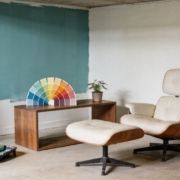
1. Grey and White

A minimalist living room with a white sofa, wooden coffee table, and a green plant near the window.

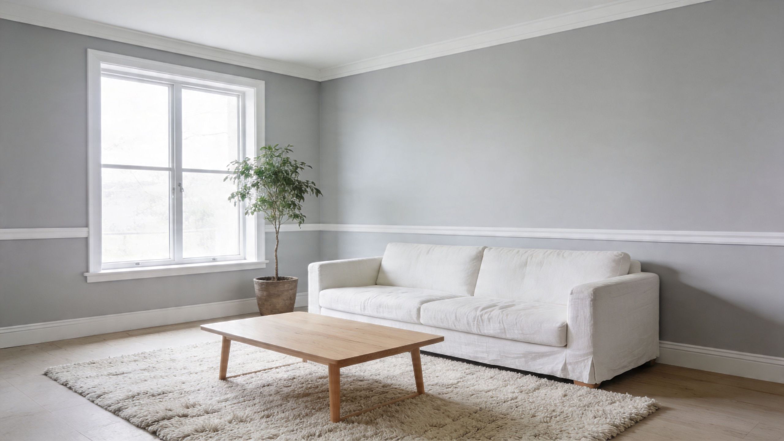
Grey and white is the safest pairing on this list, but safe doesn't have to mean dull. In Puget Sound homes, it works because white gives grey some lift. In commercial interiors, it keeps lines clean and readable.

The mistake people make is going too stark. A bright, icy white next to a cool grey can feel sharp in January light. In a Seattle condo or a Kent kitchen remodel, that can make the whole room read colder than intended.

How to keep it from feeling sterile

Use white to bounce light and grey to anchor the room. That balance works well in kitchens, hallways, offices, and reception areas where you want a clean finish without a clinical look.

A few practical fixes help:

  • Pick a softer white for living spaces: Off-white and cream usually sit better with grey in residential interiors than a hard bright white.
  • Add texture on purpose: Shiplap, textured drywall, matte cabinetry, stone, or wood grain keep the palette from going flat.
  • Break up the vertical surfaces: Grey on lower walls or cabinetry with white above can give a room more shape.

If you're planning cabinets, Wheeler's guide to kitchen cabinet paint color ideas is a good place to compare how white and grey combinations read on millwork instead of just walls.

Practical rule: If the room already has limited natural light, don't rely on color alone. Use texture, trim contrast, and wood tones to keep grey and white from looking washed out.

This pairing also works well with black accents, framed prints, and simple decor. If you want art that reinforces the palette instead of fighting it, Black White and Grey Wall Art shows the kind of restrained contrast that often fits these interiors well.

2. Grey and Warm Beige

A lot of Puget Sound clients land here after living with a cool grey that looked fine on a paint chip and flat on the wall by November. Warm beige fixes that problem. It gives grey some life in our overcast light without pushing the room into a yellow or dated look.

I recommend this pairing most often in Tacoma family rooms, Kent bedrooms, and older Seattle houses with existing wood trim or warmer flooring. Grey still keeps the space current. Beige softens the finish enough that the room feels lived-in instead of chilly.

Undertone does the heavy lifting. In Western Washington light, a beige with too much yellow can turn muddy fast, especially on north-facing walls. A quieter beige, something with a sandy, taupe-leaning base, usually holds up better beside a warm grey.

Where this blend works best

This pairing earns its keep in bedrooms, family rooms, hallways, and open living areas where comfort matters more than contrast. I usually put beige on the larger surfaces and let grey handle the parts of the room that need definition. That could be trim, doors, built-ins, cabinetry, or a single wall that needs more weight.

A few practical rules help:

  • Use beige on the biggest planes: Main walls, large textiles, and window treatments are good candidates.
  • Use grey where you want structure: Trim, millwork, lower cabinets, and shelving read cleaner in grey.
  • Check samples at different times of day: Morning and late afternoon light in Seattle and Tacoma can shift this pairing more than homeowners expect.
  • Bring in natural texture: Linen, oak, jute, clay, and aged metal keep the room from feeling too smooth or one-note.

Warm grey and warm beige also solve a common local problem. They bridge old finishes and newer updates. If the house already has oak floors, alder doors, or stone with beige flecks, this palette usually ties things together better than a cooler grey would.

The result is quiet, steady, and easy to live with. In our grey daylight, that matters.

3. Grey and Navy Blue

If a client wants a room to feel sharper, more professional, and a little more refined, grey and navy is usually where the conversation goes. This pairing works especially well in offices, conference rooms, libraries, dens, and commercial lobbies.

In Seattle-area business spaces, navy gives authority without looking flashy. In residential work, it can make built-ins, accent walls, or lower cabinets feel grounded and expensive.

Why it works in commercial spaces

Neutral grey backgrounds help people focus, and grayscale palettes are widely used for that reason. Surveys cited by Phoenix Strategy Group's article on financial dashboard palettes report that 68 percent of dashboard users prefer grayscale bases for financial reporting, and the same piece recommends deep text on light grey backgrounds that maintain WCAG AA contrast above 4.5:1. Different field, same lesson. Grey is steady. Blue gives direction.

That translates well to paint. A soft grey wall with a navy feature wall, navy doors, or navy casework often reads cleaner than an all-blue room in our local light.

Grey and navy usually look better when navy stays in the supporting role. Too much navy can close a room in fast, especially on the north side of a building.

A few places this pairing earns its keep:

  • Executive and client-facing rooms: Navy adds formality without going dark everywhere.
  • Home offices and dens: Grey keeps the space usable all day, while navy gives it presence.
  • Tenant improvement work: Reception desks, conference walls, and millwork often carry navy better than full walls do.

Add white or warm metallic accents if the room needs more lift. In a darker corridor or office suite, that extra contrast keeps the palette crisp instead of heavy.

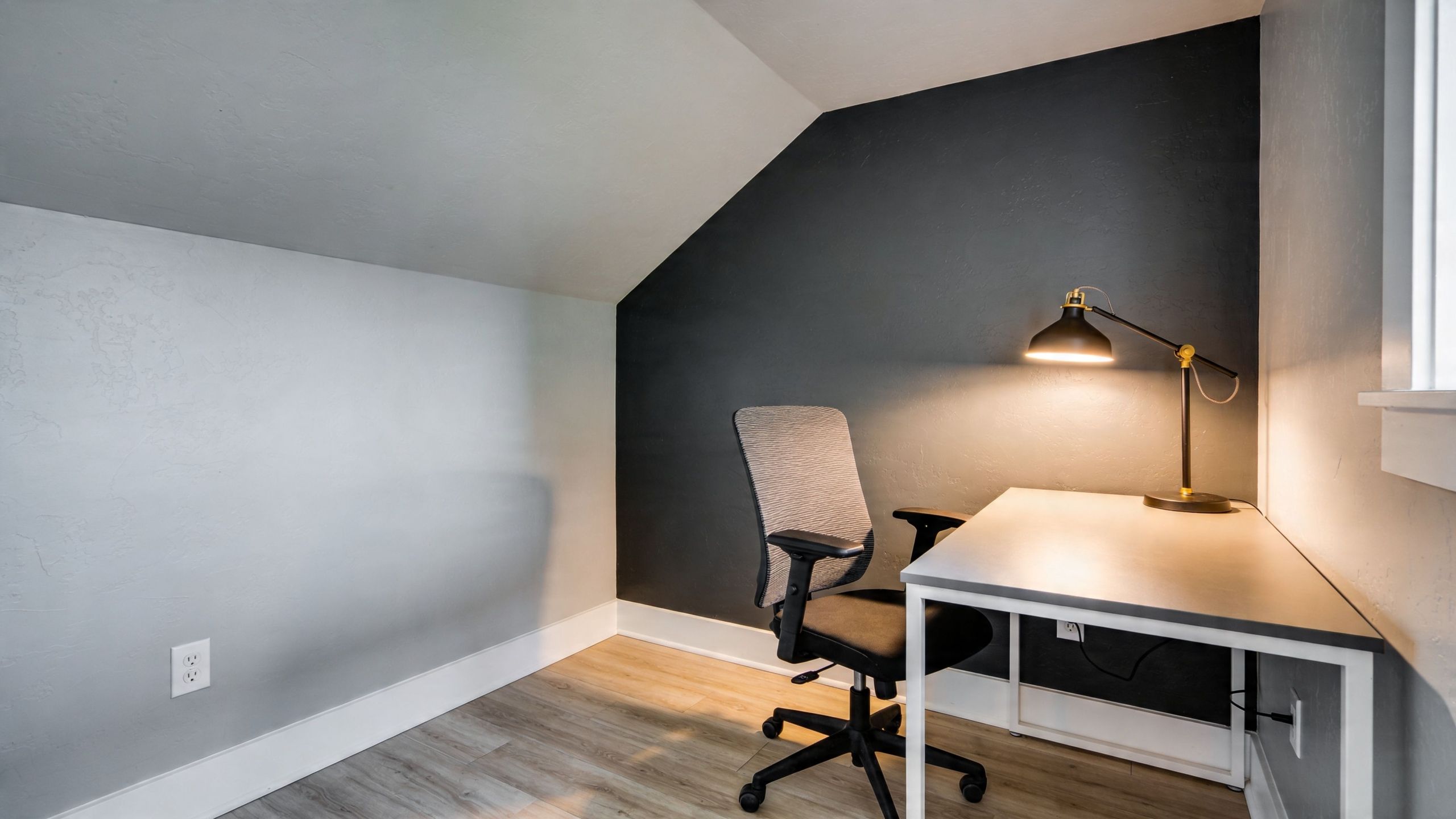
4. Grey and Charcoal

When you don't want another color at all, the answer isn't "just use more grey." The answer is to use grey with intention. Light grey, mid grey, and charcoal can create a strong room, but only if each shade has a job.

This is one of the best colors that go with grey when the project leans modern, industrial, or refined. It works in loft-style interiors, retail spaces, offices, and contemporary homes where texture matters as much as color.

Tone-on-tone needs contrast somewhere

A monochromatic grey scheme can look polished. It can also look lifeless if every surface lands in the same value range. That's why tonal separation matters.

Guidance summarized by Simplified Science Publishing on color palettes for scientific figures and data visualizations recommends grey palettes with 15 to 30 percent saturation differences for distinguishability. That advice comes from visualization standards, but it maps nicely onto interiors. If your light grey wall, medium grey trim, and charcoal accent all sit too close together, the room loses definition.

Use contrast in more than one way:

  • Change the sheen: Matte walls, satin trim, and a lower-sheen charcoal accent can separate surfaces without introducing a new color.
  • Change the material: Concrete, painted drywall, black metal, oak, and stone keep a grey room from feeling one-note.
  • Change the depth: Charcoal belongs on a focal wall, built-in, fireplace surround, or lower cabinet run, not necessarily everywhere.

If you're considering this kind of layered neutral palette outside as well as in, Wheeler's article on how to choose exterior paint colors helps sort out where tonal contrast matters most on a building.

The best monochromatic rooms don't depend on color variety. They depend on discipline.

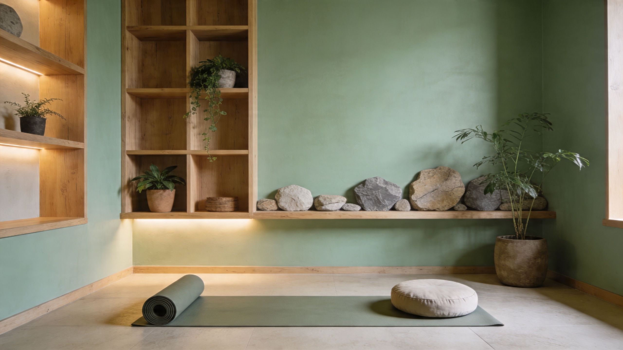
5. Grey and Soft Green

A minimalist bedroom featuring dark grey linen bedding against a calming sage green wall with wooden furniture.

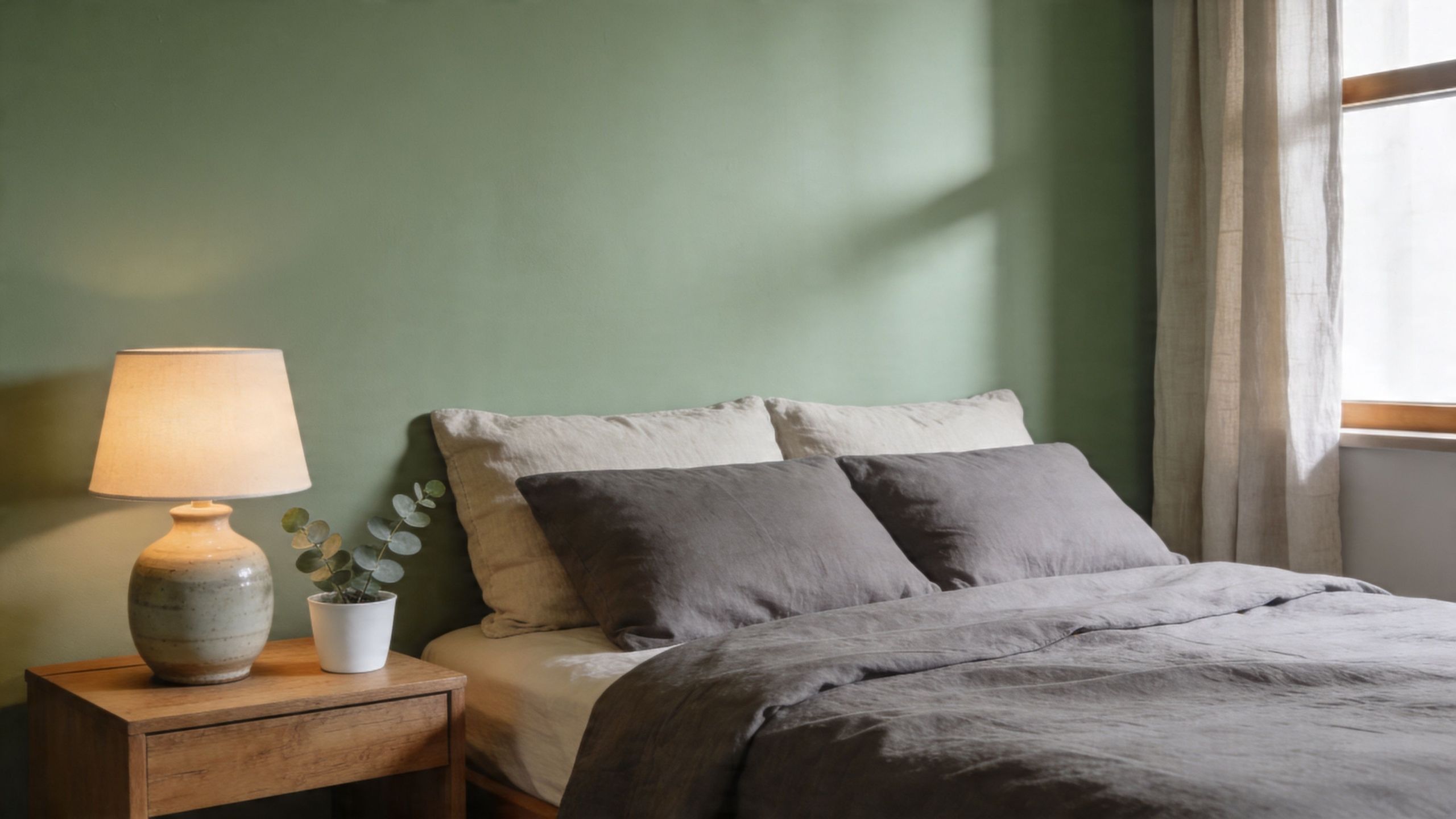
A Tacoma bedroom can look balanced on a paint chip and still turn cold by 3 p.m. under cloud cover. Grey and soft green usually avoid that problem. In Puget Sound light, a muted green gives grey enough life to keep the room from feeling flat, but it stays quiet enough to read as a near-neutral.

That matters in Western Washington homes and commercial spaces. Our daylight is often cool, indirect, and low contrast for much of the year. Colors that look clean and fresh in bright Southern light can read weak here. Soft sage, eucalyptus, and mossy greens tend to hold their shape better.

Keep the green muted and a little dirty

The best soft greens for grey are usually grayed-off greens, not clear bright ones. If the green is too crisp, the pairing can start to feel juvenile or overly minty, especially next to cool concrete, tile, or north-facing windows. A softer, earthier green has more tolerance for Seattle weather and for the blue cast many grey paints pick up indoors.

I see this work well in bedrooms, baths, therapy offices, waiting rooms, and home offices. The combination feels calm without going sleepy if you bring in one warming material, usually white oak, walnut, brass, or off-white textiles.

One caution. A soft green that seems barely there on a sample can take over a room once it is on four walls. Test it in the morning, then check it again at dusk and under lamps. In our area, that evening read matters.

Practical ways to use the pairing:

  • Bedrooms and bathrooms: Grey tile, vanity, or bedding paired with soft green walls and warm wood accents.
  • Home offices: Grey on the larger surfaces, green on a built-in, back wall, or alcove to soften the work feel.
  • Commercial interiors: Grey as the base finish, with soft green in reception areas, treatment rooms, or quiet zones where clients need to relax.

Plants, stone, linen, and unfinished wood usually help this palette feel settled instead of styled. Around Puget Sound, grey and soft green work because they already belong to the view outside.

6. Grey and Warm Copper or Bronze

Metal isn't a wall color, but it changes how grey reads. Copper and bronze are especially useful when a grey room needs warmth without adding another paint color to the walls.

This pairing is common in kitchens, powder rooms, apartment upgrades, and higher-finish commercial interiors where hardware and lighting do a lot of visual work. In Seattle and Tacoma, it can rescue a cool grey palette that otherwise feels too flat under cloud cover.

Let the metal do the warming

Grey gives you a steady background. Copper and bronze add glow, especially under interior lighting in the late afternoon and evening, when natural daylight is doing less for the room.

The trick is restraint. One metal finish across the space usually looks more deliberate than a mix of brass, copper, black, chrome, and bronze all competing for attention.

A modern kitchen featuring grey cabinets, copper hardware, a wooden shelf, and a copper pendant light.

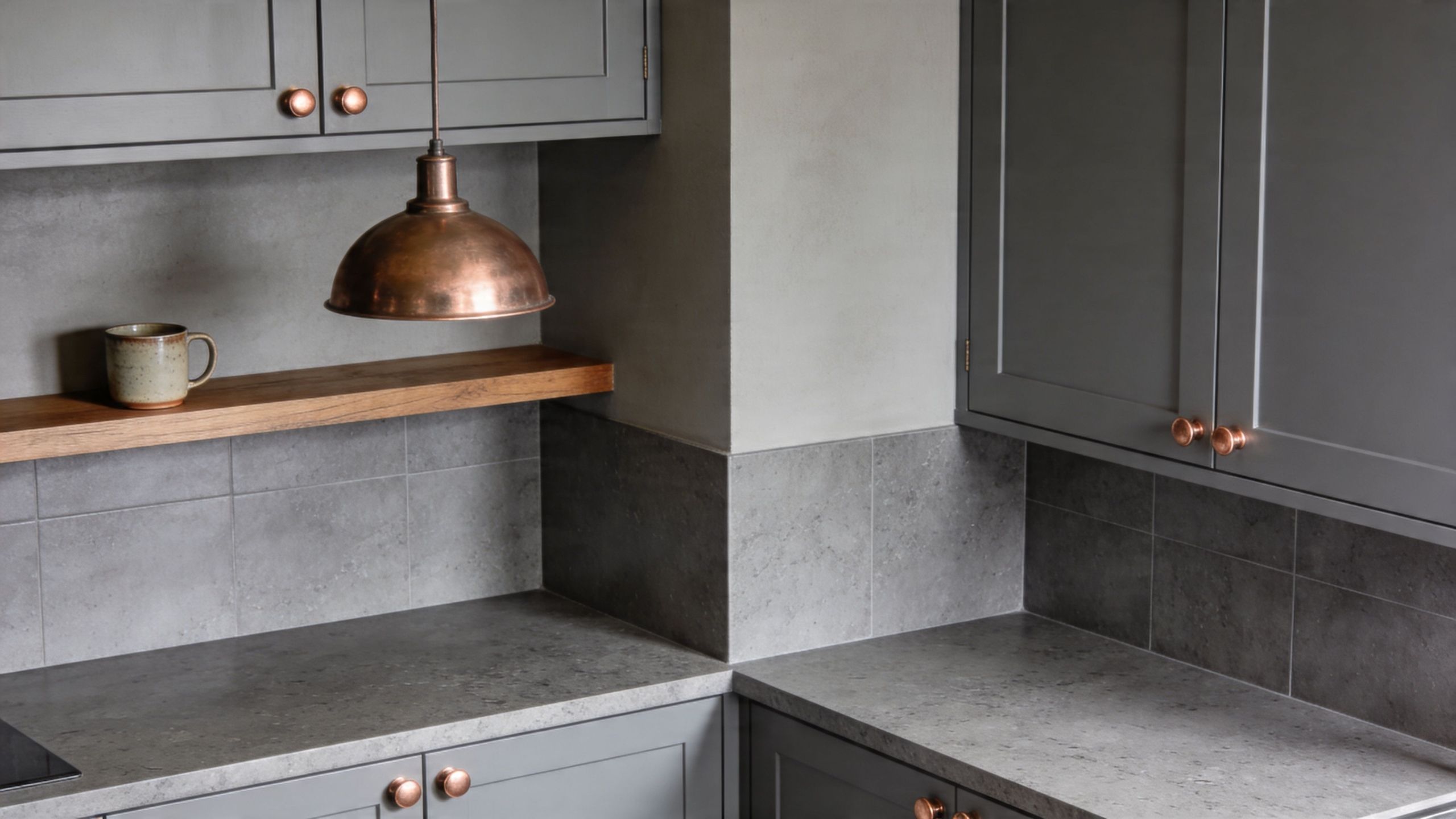
Good places to use this approach:

  • Cabinet hardware: Grey cabinetry with bronze pulls is a dependable combination.
  • Lighting: Pendants, sconces, and chandeliers can warm the room faster than repainting everything.
  • Plumbing and mirror details: Bathrooms often benefit from this most because tile and paint both tend to skew cool.

This works best when the grey isn't already fighting another undertone. If the paint has a cool blue cast and the metal is very orange, the contrast can be sharp. Sometimes that's intentional. Sometimes it just feels off. Sample boards help sort that out before the finish materials are installed.

Done right, this pairing feels current without chasing trends.

7. Grey and Warm Taupe

Taupe is one of the most useful answers for people who are tired of plain grey but don't want to abandon it. It sits between grey and brown, which makes it easier to live with in spaces that need softness and polish at the same time.

This combination works especially well in living rooms, dining rooms, bedrooms, and offices where you want a more settled look than white and grey can provide. It also handles mixed materials well, including wood floors, stone counters, and warm upholstery.

Taupe solves a common grey problem

A lot of grey rooms fail because everything leans cool. In Puget Sound light, that can leave a home feeling drained of warmth. Taupe gives grey a partner that isn't yellow, isn't flashy, and doesn't fight for attention.

The underserved part of the conversation is durability and maintenance in real Western Washington conditions. Guidance summarized in Furn's discussion of colours that go with grey points to warm neutrals like taupe, beige, and cream as useful counters to grey's coolness, while also noting that homeowners often don't get enough advice on long-term performance in damp climates. That's a real issue here. A color can look great on day one and still be the wrong call if it shows every scuff in a busy hallway or feels dingy through a long winter.

A solid way to use this pairing:

  • Taupe on the main walls: It softens the envelope of the room.
  • Grey on trim or built-ins: It adds edge and architectural definition.
  • Warm wood and fabric nearby: That keeps the room from drifting back into a cool mood.

Taupe doesn't create instant drama. What it does create is staying power.

8. Grey and Soft Blush Pink

Blush pink with grey sounds risky to some clients until they see the right version of it. The key word is soft. Not bubblegum. Not sugary. A dusty blush can take the edge off grey and make a room feel more livable.

This is mostly a residential move, but it can work in boutique commercial settings too. Bedrooms, nurseries, powder rooms, dressing areas, and some home offices all benefit from that slight warmth.

The undertone has to be right

Grey's biggest trap is undertone mismatch. A 2025 Color Marketing Group study referenced by House Beautiful's article on colors that go with gray found that 42 percent of failed schemes came from undertone blindness. That's a useful warning for any layered paint project. If the grey leans cool and the pink leans peachy in the wrong way, the room can go muddy fast.

A muted blush works best when it stays in the accent role.

  • Use blush on smaller surfaces: Accent wall sections, decor, textiles, or an adjacent niche often work better than four full walls.
  • Pair it with a warmer grey or greige: That usually looks more natural than pairing it with a cold steel grey.
  • Add cream or white: Those lighter notes keep the palette from feeling too sweet.

If you're weighing whether pink belongs on an actual painted feature instead of only in decor, Wheeler's roundup of accent wall color ideas can help narrow down where a softer statement makes sense.

For bedding and styling direction, Styling Pink and Grey Bedding gives a good sense of how the palette stays balanced when pink remains muted.

Blush and grey isn't for every project. But when a room needs softness and still has to feel grown-up, it can be the best answer on the board.

8 Grey Color Pairings Comparison

In Puget Sound light, the wrong grey pairing can look fine on a fan deck and dull on the wall by midafternoon. This side by side view helps narrow the field based on how these combinations usually perform in Seattle and Tacoma homes, offices, and tenant spaces.

Palette Implementation complexity Resource requirements Expected outcomes Ideal use cases Key advantages
Grey & White: The Classic Minimalist Pairing Low, straightforward painting and trim work Minimal, two paints, decent natural or artificial light, added texture where needed Clean, bright, timeless, rooms often feel more open Kitchens, offices, minimalist residential interiors Versatile, helps bounce limited daylight, gives accents room to stand out
Grey & Warm Beige: The Inviting Neutral Blend Low to medium, requires careful undertone matching Paint selection, natural textiles, wood finishes Warm, approachable, comfortable without feeling yellow Living rooms, bedrooms, family spaces Takes the edge off cool grey, ages well, easy for many homeowners to live with
Grey & Navy Blue: The Professional Power Pairing Medium, contrast and light levels need to stay balanced Paint, accent furnishings, metallic finishes, strong lighting Rich, grounded, professional presence Corporate offices, executive suites, dens, built-ins Conveys trust, creates strong focal points, holds up well in commercial settings
Grey & Charcoal: The Monochromatic Depth Strategy Medium to high, tonal layering and lighting are critical Multiple grey tones, varied textures, strategic lighting Polished depth, cohesive modern or industrial look Modern lofts, feature walls, contemporary commercial spaces Adds depth without bringing in another hue, shows off texture and material changes
Grey & Soft Green: The Calming Natural Pairing Low to medium, shade choice shifts a lot with available light Paint, plants, natural materials, soft textiles Calm, restorative, natural feel Bedrooms, bathrooms, wellness spaces, biophilic offices Brings life to grey, feels easier in cloudy Northwest light than many pastels
Grey & Warm Copper/Bronze: The Metallic Accent Strategy Medium, finishes need coordination and decent fixture quality Quality metallic hardware or lighting, paint, warm bulbs Warm focal points, stronger contrast, more visual interest Kitchens, bathrooms, upscale residential and commercial spaces Adds warmth without repainting large color fields, works well with wood and stone
Grey & Warm Taupe: The Comfort Blend Medium, taupe selection has to be precise Paint, warm woods, subtle metallics, good lighting Comfortable, timeless, quietly upscale High-end residences, primary suites, polished offices Balanced warmth, flexible with natural materials, steadier than beige in many grey schemes
Grey & Soft Blush Pink: The Modern Residential Softening Strategy Low to medium, balance matters so it does not turn sugary Accent paint, textiles, metallics, controlled lighting Soft warmth with a gentle contemporary feel Bedrooms, nurseries, accent walls, modern homes Adds warmth and contrast in small doses, works best as an accent rather than a full-room commitment

Bring Your Perfect Grey Palette to Life in Tacoma and Seattle

Choosing colors that go with grey is only part of the job. The ultimate test happens after the sample hits your wall, your trim, your flooring, and your lighting. That's where people in Seattle, Kent, Tacoma, and the towns in between usually find out that a color they liked online doesn't behave the same way in a north-facing bedroom or under office LEDs.

Puget Sound light is forgiving in some ways and unforgiving in others. It softens harsh colors, but it also exposes weak pairings fast. A cool grey with the wrong white can feel chilly all day. A warm greige with the wrong beige can go muddy by afternoon. In commercial spaces, the stakes are a little different, but the problem is the same. Facility managers and property owners need a palette that holds up in daylight, artificial light, and day-to-day use.

That's why sample placement matters. Test on more than one wall. Look at the paint in the morning, late afternoon, and evening. Check it next to flooring, counters, cabinets, and trim. In offices and tenant improvement work, check it under the actual lighting plan, not just by the window. A color that looks balanced in daylight can turn flat once overhead fixtures take over.

Grey still earns its place because it remains versatile. It can read modern, classic, residential, or commercial depending on what you pair with it. White keeps it crisp. Beige and taupe warm it up. Navy sharpens it. Soft green makes it feel natural here in Western Washington. Charcoal adds depth. Bronze and copper bring back warmth. Blush softens it in the right setting.

The common thread is undertone discipline. That matters more than trend. If the base grey is cool, give it a partner that supports that direction or intentionally contrasts with it in a controlled way. If the grey is warm, lean into that warmth instead of fighting it with something too icy. That one decision prevents a lot of expensive repainting.

For homeowners, that can mean a smoother kitchen remodel, bedroom refresh, or whole-house repaint. For commercial clients, it can mean a cleaner office renovation, a more polished lobby, or a tenant improvement package that gets approved without a lot of second-guessing. Wheeler Painting & Restoration Services handles both residential and commercial work across Puget Sound, and color consultation is part of making sure the final result looks right in the actual building, not just on a fan deck.


If you're planning interior painting, a remodel, or a tenant improvement project in Seattle, Kent, Tacoma, or nearby communities, Wheeler Painting & Restoration Services can help you narrow down the right grey palette, test it in your actual lighting, and turn it into a finished result that fits the space.

8 Top Basement Paint Color Ideas for 2026

Your basement holds more potential than is often recognized. In Kent, Seattle, Tacoma, and the communities in between, we see the same pattern all the time. A basement starts as the dim part of the house that stores old boxes, leftover flooring, or exercise equipment that never found a real home. Then life changes. You need a family room, a guest space, a home office, a playroom, or a cleaner tenant area that doesn’t feel like an afterthought.

Paint is one of the fastest ways to change that feeling. The right basement paint color ideas can make a lower level feel brighter, calmer, warmer, and more finished. But in the Puget Sound region, color alone doesn’t solve the whole problem. Our basements deal with limited natural light, cool artificial light, and moisture conditions that can punish the wrong product or the wrong prep.

That’s why basement color decisions need to be practical, not just stylish. A color that looks great online can turn flat, greenish, or muddy once it hits a below-grade wall. A finish that works upstairs can fail fast downstairs. And if the walls haven’t been properly sealed, repaired, and primed, even the best paint won’t hold up the way it should.

A lot of homeowners also want color help that connects mood with function. If that’s you, this overview of colour psychology in interior design is a useful companion to the contractor-side advice below.

At Wheeler Painting, we approach basements as real living and working spaces, not secondary rooms. These are the colors and color families that consistently work well, along with the trade-offs that matter if you want a finish that looks right and lasts.

1. Cool Gray and Charcoal The Sophisticated Neutral

A modern home office setup featuring a desk, chair, and desk lamp against a dark accent wall.

Cool gray still shows up on a lot of basement projects because it gives a clean, modern look without feeling busy. Charcoal takes that same idea and adds more depth. In a finished basement office, media room, or tenant improvement space, these tones can feel polished and controlled.

They also hide a lot better than bright whites. Minor drywall waves, patched areas, and the occasional old mark on foundation-adjacent walls tend to show less in a medium to dark neutral than they do in a stark pale color.

Where gray works and where it can disappoint

Gray is strongest when the room already has a decent lighting plan. If the basement relies on a couple of cool LED fixtures and not much else, some grays can turn flat fast. In Western Washington basements with high indoor humidity and cool lighting, cool tones can also shift in ways homeowners don’t expect.

One regional note matters here. A Puget Sound-focused color discussion points out that Western Washington homes often deal with average indoor humidity in the 70 to 80 percent range, and cooler tones can read greenish or chalky under common basement LED lighting in damp spaces, especially if they aren’t balanced carefully with the rest of the room’s finishes and equipment choices (Pacific Northwest basement paint observations).

Cool gray can look sharp in one corner and almost dead in another. Basement lighting exposes that difference more than upstairs rooms do.

How to make gray look intentional

A few field-tested moves help:

  • Use warm lighting: Bulbs in the warmer range help a cool gray feel balanced instead of clinical.
  • Add white trim: Crisp trim gives the wall color a clean edge and lifts the room visually.
  • Choose the right sheen: In a basement, satin or semi-gloss often makes more sense than flat paint on lower wall sections because it cleans up more easily.
  • Prime first: If there’s any history of dampness, start with moisture-focused prep and a quality primer.

If your basement has ever felt damp, color selection should come after the moisture discussion. A good place to start is this guide on how to waterproof basement walls.

For a homeowner in Seattle using the basement as a home office, charcoal on one wall behind the desk can look more finished than painting the whole room dark. For a property manager updating a small tenant lounge in Tacoma, a mid-tone gray can create broad appeal without locking the next user into a strong style.

2. Warm White and Cream The Light Maximizer

A modern minimalist basement living room featuring white walls, a beige sofa, and recessed tray ceiling lighting.

A basement in Everett or West Seattle often has the same problem. Good square footage, low daylight, and a room that feels a little closed in by midafternoon. Warm white and cream are often the simplest fix because they brighten the space without making it feel stark.

Undertone does the heavy lifting here. In Puget Sound basements, a white with a soft cream, beige, or muted yellow base usually looks more settled than a blue-white. The cleaner, colder whites that look sharp in a showroom can turn a lower level flat and unfinished once they hit concrete-adjacent walls and limited natural light.

Why this palette works so often

White and cream reflect more of the light you already have. That matters in below-grade rooms with smaller windows, deep overhangs, and long stretches of cloudy weather. If the goal is to make a family room, guest suite, or rental basement feel open, this color family gives you margin for error with furniture, flooring, and future updates.

It also ties lower levels back to the rest of the house. That matters in split-level and daylight-basement homes common around the Sound, where a basement can feel disconnected if the color shift is too abrupt.

Where warm whites go wrong

These colors show every shortcut. Uneven patching, old water marks, roller lap lines, and rough texture stand out fast on a white wall.

That is why prep matters more than the color chip.

A basement with new drywall repairs should be primed correctly before finish paint. If you are patching or repainting sheetrock, this guide on whether you have to prime sheetrock before painting covers the basics. In older basements, I also look for past moisture stains around window wells, baseboards, and exterior-facing corners before recommending any light color.

How to make white feel finished instead of cold

A few choices make a big difference:

  • Choose a warm undertone: Creamy whites and soft off-whites usually read better than bright, icy whites in Northwest basements.
  • Use the right finish: Eggshell or satin is often the better call for rec rooms, hallways, and play spaces because it cleans more easily than flat.
  • Carry the color thoughtfully: Painting walls and ceiling in the same white can reduce visual chop in low-ceiling areas.
  • Add contrast through materials: Wood shelving, black hardware, natural oak, and warm textiles keep the room from feeling washed out.

Practical rule: Warm white makes a basement look brighter, but only if the surfaces underneath are clean, sound, and evenly primed.

For a homeowner in Kent turning the basement into a playroom, a cream-based white usually gives the room a softer, more lived-in feel than a crisp decorator white. For a property manager repainting a small lower-level unit, warm white is also a safe reset. It appeals to a wide range of tenants and makes older basement layouts feel cleaner without calling attention to every architectural flaw.

3. Soft Greens and Sage The Natural Retreat

A serene yoga studio with green walls, wooden shelving, floor mat, and natural stone decor elements.

Soft green is one of the better basement paint color ideas for homeowners who want color without noise. Sage, eucalyptus, and other muted greens feel grounded. They fit the Pacific Northwest well, and they can make a basement office, yoga room, guest bedroom, or reading space feel calmer than a standard beige.

This palette also works when the rest of the home already has natural wood, stone, or warm white finishes. The room doesn’t feel disconnected. It feels intentional.

Why muted greens are gaining traction

There’s a practical reason greens are getting more attention in remodel conversations. A trend summary tied to Washington’s remote-work shift notes growing interest in biophilic, wellness-oriented basement colors, including earthy greens for office and gym use, because homeowners are asking more from lower levels than storage and overflow space (basement color trend discussion for 2025 and 2026).

In plain terms, people want basements that feel better to spend time in. Soft green helps with that. It has more personality than beige, but it doesn’t fight the room.

How to keep green from going cold

The danger with basement green is choosing one that’s too minty, too blue, or too clean. In low light, that can feel chilly. In a damp space, it can read more washed out than expected.

A better approach is to keep it muted and a little gray.

  • Choose a softened sage: Dusty, gray-green tones usually age better than bright greens.
  • Warm up the room: Wood accents, warm metal finishes, and softer lighting make a big difference.
  • Sample on multiple walls: One wall may pull earthy. Another may pull dull.
  • Prime repaired drywall properly: Green doesn’t hide surface inconsistency well.

Before any finish coat goes on new or repaired basement walls, proper prep matters. This guide on whether you have to prime sheetrock before painting explains why skipping primer is one of the easiest ways to get an uneven final color.

For a walk-out basement in Tacoma, sage can feel especially strong when it faces a yard or patio and ties into the outside surroundings. In an enclosed Seattle basement office, it often works best as the main wall color with cream trim and warm lamps, rather than pairing it with cooler lighting that makes the room feel sterile.

4. Deep Blue and Navy The Dramatic Cocoon

Navy changes the mood of a basement fast. Done right, it feels refined, quiet, and rich. That makes it a strong choice for media rooms, home bars, libraries, and den-style basements where the goal isn’t maximum brightness. It’s atmosphere.

This is one of the few basement paint color ideas that benefits from lower light. A darker room can help the color feel enveloping instead of overwhelming.

Best uses for navy downstairs

Navy is especially good when you want the room to feel separate from the main floor. In a home theater, it reduces visual distraction. In a basement lounge, it creates contrast with lighter furniture, brass fixtures, or wood shelving.

The trade-off is obvious. Dark color absorbs light. If the room is already poorly lit and you don’t plan to upgrade fixtures, a full navy treatment can turn handsome into heavy.

A balanced approach often works best:

  • Use navy on one focal wall: Behind a TV, bar, or built-in shelf is a common smart move.
  • Keep the ceiling lighter: White or off-white overhead surfaces prevent the room from closing in.
  • Plan layered lighting: Ambient, task, and accent lighting all matter more in dark rooms.
  • Expect more prep and more coats: Dark paint shows flaws, lap marks, and patchiness.

A navy basement can feel high-end very quickly. It can also expose every drywall imperfection just as quickly.

What fails first in a dark basement paint job

Most dark-color failures are prep failures. Bubbling, peeling, patch flashing, and uneven sheen become much more visible with saturated paint. If the basement has any moisture history, address that before committing to navy.

If you’ve seen blistering or raised spots before, this breakdown of what causes paint to bubble on walls is worth reviewing before the project starts.

For a Seattle homeowner building a basement theater, deep blue on walls with a lighter ceiling can create the cocoon effect people want without making the room feel sealed shut. For a commercial lounge or office breakout area, navy often works best in controlled zones rather than across every wall, especially if the space needs broad tenant appeal.

5. Warm Earth Tones and Terracotta The Cozy Foundation

A basement that feels cold in November usually needs more than extra lumens. Color has to do some of the warming up. Soft clay, mushroom, camel, sand, and restrained terracotta can make a lower level feel settled instead of damp and disconnected.

These shades fit Puget Sound homes particularly well. We see them work in Craftsman basements, mid-century daylight basements, and older homes with brick, knotty wood, or concrete that already carries some visual weight. They also suit rooms people want to use for a while, such as rec rooms, guest areas, hobby spaces, and casual hangouts.

Why warmth often wins in Puget Sound basements

Our local light runs cool for much of the year, and many basements already have gray concrete, shaded windows, or north-facing exposure. Add a cool wall color on top of that, and the room can feel flatter than it did before painting. A warmer neutral corrects for those conditions. It does not have to be dark to feel grounded.

This matches what we hear from homeowners after the job is done. Warmth often makes a basement feel more usable before the furniture even goes back in.

There is a trade-off, though. If the room has very little natural light and a low ceiling, going too brown or too red can shrink it visually. In those cases, I usually steer people toward lighter earth colors with a soft undertone, then use deeper terracotta or clay in smaller doses.

Using terracotta without making the room too dark

Terracotta can look excellent downstairs, but only in the right version. Muted, dusty tones usually hold up better under LED lighting and cloudy-day daylight. Bright orange terracotta often turns harsh at night, especially in basements with basic can lights or cooler bulbs.

A few rules keep it under control:

  • Choose a softened version: Clay, adobe, and dusty cinnamon are usually safer than saturated orange.
  • Watch the lighting temperature: Warm bulbs help earth tones read richer and less chalky.
  • Keep the ceiling and trim light: Cream or warm off-white gives the walls contrast without making the room feel chopped up.
  • Sample on multiple walls: Basements shift color more from corner to corner than main-floor rooms do.
  • Use the right sheen: Flat or matte usually looks better on basement walls because it hides patches and surface irregularities.

Prep matters here too. Earth tones can be forgiving, but they will still highlight moisture stains, old patchwork, and uneven texture if the walls are not sealed and repaired first. In Puget Sound basements, that step matters as much as the color choice.

For a Tacoma basement with an old brick fireplace, warm earth tones often help the original materials feel intentional. In a Seattle Craftsman remodel, mushroom or clay can bridge older wood trim with a cleaner updated finish. For property managers, these colors also tend to photograph well and feel more inviting than colder grays without locking the space into a strong theme.

This palette is a good fit for homeowners who want warmth, comfort, and a little character, but do not want the basement to feel trendy or overdesigned.

6. Soft Neutral Beige and Taupe The Versatile Classic

If you want a basement color that doesn’t fight future furniture, flooring, or tenant turnover, beige and taupe still do the job better than most options. They’re practical. They’re adaptable. And when they’re chosen well, they don’t feel dated at all.

This is often the best answer for multi-use basements. A room that serves as a guest space now and a teenager’s hangout later needs flexibility. So does a small commercial renovation or lower-level office area where broad appeal matters.

Why greige and taupe stay relevant

Market data referenced in the verified materials says 70% of basement remodels in major markets choose greige tones, with colors like Agreeable Gray SW 7029 and Collingwood 2116-60 favored for versatility across spaces such as play areas, offices, and theater zones (Samplize basement paint color market summary).

That makes sense on the ground. Soft taupe and beige sit in the middle. They don’t wash out like some whites, and they don’t commit you to a bolder personality the way navy or terracotta might.

Keeping beige from looking flat

The biggest risk with beige is boredom. That usually happens when the room has no contrast, no texture, and no lighting variety.

A beige basement looks much better when the design has some depth:

  • Mix textures: Upholstery, rugs, wood grain, tile, and matte metal all help.
  • Use intentional trim color: White works, but a related deeper neutral can look more custom.
  • Add one accent: Art, cabinetry, or a darker wall can keep the room from going sleepy.
  • Choose lighting carefully: Beige shifts a lot between daylight, warm LED, and cool LED.

For a property manager updating a lower-level office in Kent, taupe is often easier to maintain and touch up than a more expressive color. For a family basement in Seattle, beige gives you a clean base for toys, workout gear, a sectional, and changing décor over time.

Beige isn’t boring when the room has contrast. It’s boring when every surface is trying not to be noticed.

7. Light Purple and Lavender The Creative Accent

Lavender is not a mainstream basement choice, which is exactly why it can work. In the right shade, it feels soft, creative, and quiet rather than sugary. The basement is often the best place to try it because these lower-level rooms already lend themselves to studios, guest rooms, hobby spaces, and meditation corners.

The trick is restraint. You’re not looking for bright purple. You want a toned-down version with gray in it.

Where lavender makes sense

A muted lavender can work especially well in a basement bedroom, art room, or reading nook. It adds personality without the heaviness of navy or the predictability of beige. In homes with cooler stone or tile finishes, it can also bridge warm and cool materials better than people expect.

What usually doesn’t work is a highly saturated purple in a low-light room. That can read juvenile, harsh, or just disconnected from the rest of the home.

How to use it without regret

Most homeowners are happiest when lavender stays in a supporting role.

  • Go gray-based: Dustier purples read more elegant in basement light.
  • Pair with white or pale greige trim: Clean trim keeps the room feeling crisp.
  • Use warm bulbs: Warm light reduces the chilly side of purple undertones.
  • Try an accent application first: Behind a bed or desk is easier to live with than wrapping the whole room.

For a Seattle homeowner turning part of the basement into a creative studio, lavender can create a more personal atmosphere than standard office gray. In a guest room, it often works best paired with light wood furniture and neutral bedding so the space stays calm rather than thematic.

This is one of those color families where testing matters more than trend. A beautiful sample can still fail under basement lighting, so larger swatches are worth the effort before committing.

8. Dramatic Black The Modern Feature Wall

Painting an entire basement black is rarely the right move. Using black on one wall, though, can look outstanding. It adds depth, sharpens contrast, and creates a focal point in a way very few colors can.

This approach works well in media areas, basement bars, game zones, and industrial-style remodels. In commercial settings, it can also define a branded wall or break area without repainting the entire space in a dark tone.

To see the effect in action, this short video gives a sense of how dark walls can create a more finished, modern mood in lower-level spaces.

Why black works best in a controlled dose

Black excels as a feature because it creates visual depth. It can make shelving, art, metal finishes, and lighting stand out. It also helps define one use zone from another in an open basement.

What it won’t do is forgive bad workmanship. Black paint shows roller marks, uneven repairs, texture mismatch, and poor cut lines immediately.

Here’s where we steer clients:

  • Use black on one wall: Let the other walls stay in a lighter neutral.
  • Choose matte carefully: A low-sheen finish often gives the best soft, velvety look.
  • Build the lighting into the design: Wall washers, sconces, or directional fixtures help the wall read intentional.
  • Make sure the substrate is right: Every patch, seam, and sanding mark matters.

Best real-world applications

A black feature wall behind a basement bar can make brass hardware and wood shelves stand out. Behind a TV, it minimizes distraction and helps screens disappear visually when the room is dim. In a modern tenant build-out, it can create a focal area that feels custom without overcommitting the whole suite.

This is a contractor-favorite move when the room needs one memorable element but the overall palette still has to feel controlled. It’s bold, but it’s a manageable kind of bold.

Basement Paint Color Comparison: 8 Options

Color Palette Implementation Complexity Resource Requirements Expected Outcomes Ideal Use Cases Key Advantages
1. Cool Gray & Charcoal Medium, sample testing and lighting balance Moisture-blocking primer, satin/semi-gloss lower walls, quality paint Sophisticated modern look, masks minor flaws, adds depth Home offices, media rooms, modern rec spaces, commercial TI Versatile neutral, hides dust, balances artificial light
2. Warm White & Cream Low–Medium, needs good prep to avoid stains Stain-blocking primer, eggshell/satin finish, layered lighting Brighter, larger-feeling, welcoming atmosphere Family rooms, playrooms, basement apartments, guest suites Maximizes light, timeless backdrop, widely versatile
3. Soft Greens & Sage Medium, test across different light conditions Quality paint, warm-toned lighting, natural wood/stone accents Calming, nature-connected retreat that soothes and focuses Yoga/wellness rooms, home gyms, creative studios, offices Biophilic appeal, promotes tranquility, pairs with natural materials
4. Deep Blue & Navy High, requires layered lighting and careful finishing Tinted primer, multiple coats, professional application, layered lighting Dramatic, immersive cocooning effect; reduces light reflection Home theaters, bars, lounges, libraries, sophisticated offices Luxurious, immersive, minimizes screen glare, elegant
5. Warm Earth Tones & Terracotta Medium, light-dependent, test large swatches Matte finish, texture layering, possible color consultation Cozy, grounded, naturally warm spaces Wine cellars, rustic family rooms, craftsman basements Warmth and stability, hides imperfections, complements natural materials
6. Soft Neutral Beige & Taupe Low, straightforward and forgiving Standard primer/paint, add textures or trim variation Calm, versatile backdrop with broad appeal General basements, rental units, family rooms, home gyms Universally compatible, resale-friendly, cost-effective
7. Light Purple & Lavender Medium, choose muted tones and warm lighting Quality paint, warm (2700K) lighting, natural grounding materials Serene, creative, slightly luxurious ambiance Creative studios, meditation rooms, bedrooms, wellness spaces Distinctive yet soft, balances cool and warm undertones
8. Dramatic Black (Accent) High, demands flawless execution and lighting Matte black paint, professional finish, accent lighting Strong visual depth and focal definition; high drama Accent walls for theaters, bars, galleries, modern lofts Powerful depth, defines zones, bold modern statement

Your Plan for a Perfect Basement From Color to Completion

You pick a color chip in the store, get it on the walls, and then the basement feels darker, colder, or harder to keep clean than you expected. That happens all the time in Puget Sound basements. The color usually is not the problem. Light levels, moisture conditions, and prep work are.

Basements in Kent, Seattle, Tacoma, and nearby areas rarely behave like the main floor. Natural light is limited, ceiling heights are often lower, and our long damp season puts more stress on coatings. A color that looks balanced upstairs can turn flat or muddy downstairs. That is why we plan basement paint with the room’s lighting, wall condition, and use in mind from the start.

Lighting should be decided alongside color. Warm white and cream need enough illumination to stay clean instead of yellow. Gray and charcoal can look sharp, but cool bulbs can push them too blue. Sage and taupe usually settle in better under layered lighting, with overhead fixtures for general use and lamps or sconces to soften shadows in corners.

Paint finish also changes how the room performs. For family rooms, offices, and guest spaces, eggshell or satin usually gives the best balance of appearance and washability. In laundry rooms, basement bathrooms, and utility-adjacent areas, I often recommend satin or semi-gloss because those surfaces are easier to wipe down and hold up better when humidity rises.

Moisture needs a straightforward plan. If a basement has musty air, minor staining, peeling paint, or past water marks, the answer is not to cover it and hope for the best. We inspect the surfaces first, identify whether the issue is humidity, seepage, failed patching, or poor adhesion, and then build the coating system around that condition. In many Western Washington basements, that means better ventilation, the right primer, and a mildew-resistant acrylic paint rated for damp-prone spaces.

Prep decides how long the finish lasts.

Fresh drywall, patched areas, repaired texture, concrete walls, and stained surfaces all need different treatment. A general primer is fine in some rooms, but not on water stains, slick existing coatings, or masonry that has a history of moisture movement. We handle those details before finish paint starts, which is one reason repaired basement walls look more even and wear better over time.

Color choice should follow the job the room needs to do. A theater or media room can carry navy, charcoal, or a black feature wall without feeling too heavy if the lighting is controlled. A rental unit or multipurpose family basement often benefits from warm white, beige, or taupe because those colors stay flexible for future tenants and furniture changes. In older Puget Sound homes with lower ceilings or limited window wells, soft greens and warm neutrals often do a better job than stark white because they add lightness without making the room feel cold.

At Wheeler Painting & Restoration Services, we look at the whole basement, not just the paint color. We check for moisture warning signs, drywall damage, failed coatings, trim condition, and how the space is used day to day. That matters in this region, where below-grade rooms can shift quickly from comfortable to clammy if the materials and prep are wrong.

If you’re weighing basement paint color ideas and want more than a guess, we’re happy to help you narrow the options and build a plan that makes sense for your home or property. The right color helps. The right prep, primer, finish, and lighting plan keep it looking good.

If you're planning a basement refresh, a full residential remodeling project, or a lower-level tenant improvement, Wheeler Painting & Restoration Services can help you get the color, prep, and moisture strategy right from the start. Reach out for a consultation and detailed estimate, and let’s turn that basement into a space that looks better, works harder, and holds up in the Puget Sound climate.