Tag Archive for: wheeler painting

Best Sunroom Paint Colors for Puget Sound Homes

A lot of Puget Sound homeowners have the same experience. The sunroom looks cheerful in a listing photo or on a bright summer afternoon, but on a gray Seattle morning it suddenly feels flat, chilly, or oddly dull. Property managers see it too in tenant spaces and shared amenity rooms. The windows are large, the light is real, and yet the room still doesn’t feel inviting.

That usually isn't a furniture problem. It’s a paint color problem.

Generic advice often says to pick a crisp white and call it done. In our region, that can backfire. In high-humidity areas like Puget Sound, which averages 150-200 rainy days annually, standard bright white recommendations often fail because cool, indirect light can wash colors out or make them look dingy, according to this sunroom paint guide focused on moisture and light challenges. That’s why sunroom paint colors that look perfect in a store or in a warmer climate can feel off in Kent, Seattle, Tacoma, and the towns in between.

The good news is that a better result usually comes from a few practical adjustments, not from guessing harder. When you match color to the room’s direction, the quality of light, and the damp local climate, the space starts working the way homeowners hoped it would in the first place.

Brighten Your Home with the Perfect Sunroom Paint Color

A sunroom should feel like a place you want to walk into with your coffee, not a room you keep passing by because it looks cold half the year. That’s the frustration many homeowners run into after choosing paint from a tiny sample chip under store lighting. Once the color lands on the wall, the room can feel darker, greener, grayer, or more washed out than expected.
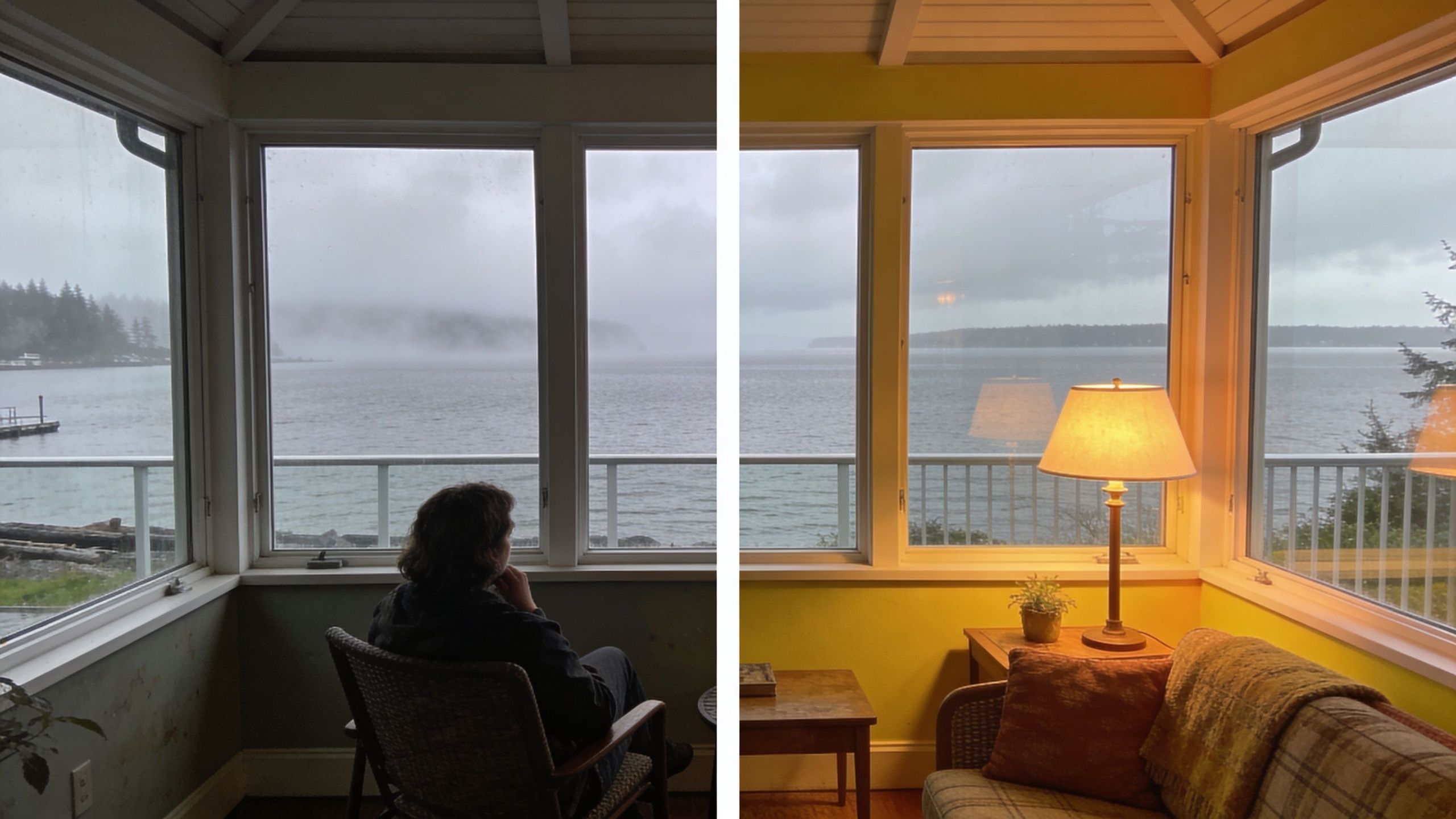
A split view showing the same sunroom with gloomy gray walls versus cheerful bright yellow walls.

Why Puget Sound sunrooms are different

Homes around Seattle, Kent, and Tacoma don’t get the same kind of sunlight as homes in drier climates. We deal with overcast skies, fog, shifting cloud cover, and moisture that can linger near glass and trim. That changes how paint reads on the wall.

A bright white that feels clean in a showroom can turn stark or lifeless in a north-facing sunroom here. A pale pastel can disappear. Some warm creams can drift too yellow under gray daylight. That’s why smart sunroom paint colors in Western Washington often strike a balance between light reflection, undertone control, and moisture resistance.

Pick the color for the light you actually have, not the light you wish you had.

What homeowners usually get wrong

The most common mistake is choosing paint before studying the room. People often focus on the sofa, the flooring, or a favorite online photo and skip the bigger question. What kind of daylight does this room receive from morning to evening?

A better approach is to think about three things together:

  • Direction of light helps you decide whether the room needs visual warmth or cooling.
  • Local climate affects how bright, clean, or muddy a color will feel on cloudy days.
  • Surface conditions matter because sunrooms often deal with condensation, mildew risk, and stronger UV exposure than other interior spaces.

When those pieces line up, house painting near me searches become a lot less stressful, because you’re no longer picking from endless swatches. You’re narrowing in on colors that fit the room.

Understanding How Light and Direction Shape Your Color Choice

The same paint can look calm in one sunroom and completely wrong in another. The reason is simple. Natural light changes color. It brings out undertones, softens some shades, and exaggerates others.
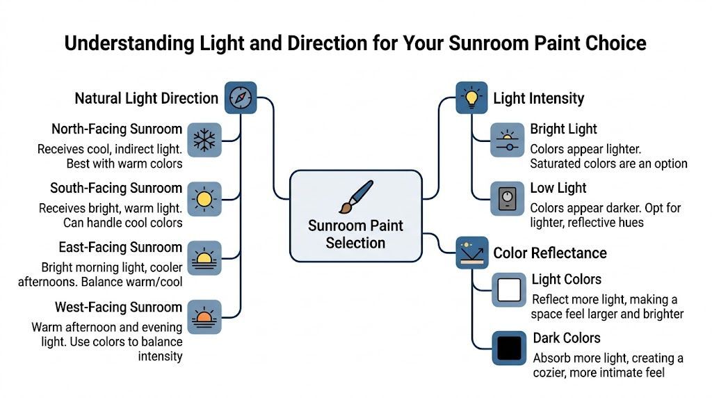
A visual guide illustrating how natural light direction, light intensity, and color reflectance affect sunroom paint choices.

North and south exposures

North-facing sunrooms receive cool, diffused light. That kind of light can make a room feel bluish or gray. Warm tones can help correct that. According to guidance on choosing paint for sunrooms based on exposure, warm tones such as honey yellows like Benjamin Moore Hawthorne Yellow HC-4 can increase perceived warmth by 20-30%, while south-facing rooms with intense light often do better with soft blues or greens such as Benjamin Moore Palladian Blue HC-144, which help reduce glare. The same source notes that UV-inhibiting paints can extend repaint cycles by 2-3 years in high-exposure spaces.

That’s the part many people miss. A warm shade in a cool room can feel balanced. That same shade in a hot, bright room may feel too heavy by midday.

East and west exposures

East-facing sunrooms usually get pleasant morning light and cooler light later in the day. West-facing rooms often stay flatter earlier, then become warmer and more intense in the afternoon. If your sunroom has windows on more than one side, pay attention to the wall that gets the strongest light for the longest stretch.

When homeowners compare samples, they sometimes say, “This one changed on me.” It didn’t change. The room did.

Morning light and afternoon light can make the same wall color look like two different paint chips.

Why LRV matters more than most people think

LRV means Light Reflectance Value. In plain language, it tells you how much light a paint color reflects. In a sunroom, that matters a lot.

A higher LRV generally helps a dim room feel more open. A lower LRV can create a cozy mood, but it may also make a shaded room feel smaller or heavier. That doesn’t mean every low-light sunroom needs plain white walls. It means the reflectance level should be part of the decision.

When glass needs help too

Sometimes paint alone won’t solve glare, heat, or fading. In especially bright rooms with large south or west exposures, homeowners may also look into professional home window film installation to soften harsh sunlight without giving up the benefit of the windows. That can make color choices more forgiving and improve comfort in rooms used all day.

A simple way to read your room

Use this quick field test before choosing sunroom paint colors:

  • Stand in the room at 9 a.m. Notice whether the light feels blue, yellow, or neutral.
  • Check again in midafternoon. This is when glare and washout show up.
  • Look at trim, floor, and furniture together. Undertones bounce off each other.
  • Watch a cloudy day on purpose. In the Puget Sound area, that’s often the truest test.

That small bit of homework saves a lot of repainting.

Matching Paint Colors to Your Sunroom Style and Mood

Once the lighting makes sense, the fun part starts. Sunroom paint colors don’t just control brightness. They shape how the room feels when you sit down, work, read, or gather with people.
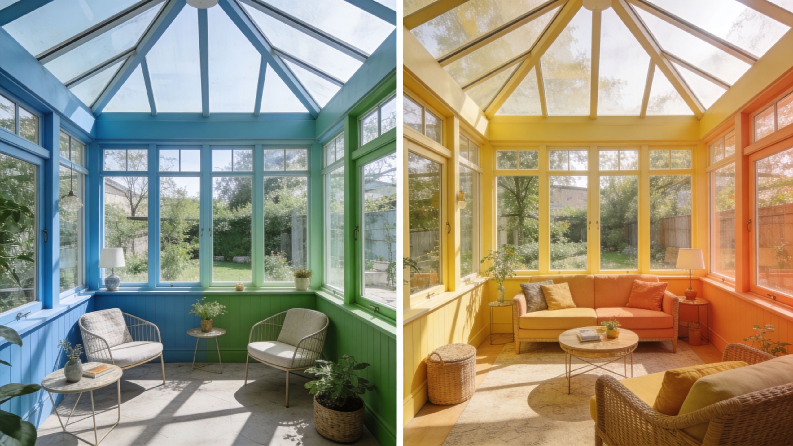
A split-screen comparison showing a sunroom painted in vibrant blue and green versus warm yellow and orange.

If you want calm

Soft blue-greens and muted sages tend to create a quiet, settled feeling. They work well in sunrooms used for reading, plants, or slower mornings. In many Puget Sound homes, these shades also sit nicely against wet greenery outside the windows.

If the room already has a lot of visual movement from window grids, wicker, tile, or patterned cushions, a quieter wall color keeps the space from feeling busy.

If you want energy

Warm yellows, peachy tones, and lively corals can make a sunroom feel cheerful even when the weather doesn’t cooperate. These choices often work best when the color is controlled. One wall, a softer version of the shade, or a balanced trim color can keep the room from feeling overly sweet.

Homeowners sometimes get nervous. They like the idea of color but worry the room will feel loud. Usually the fix isn’t abandoning color. It’s choosing a version with the right undertone.

A sunroom doesn’t need to be white to feel bright.

If your home has historic character

Classic homes around Tacoma, Seattle, and older neighborhoods in between often look best when the sunroom respects the age of the house. Historic color choices can still feel fresh if they’re used thoughtfully.

According to this overview of paint colors through the decades, the 1920s leaned into Art Deco pastels, the 1930s shifted toward muted earth tones, and the post-war 1950s brought back vibrant pastels like turquoise and pink. That same source notes that mid-century modern design increased sunroom glass area by 30-50%, and that restoring historic spaces with authentic palettes can boost value by 5-10%.

Matching the mood to the architecture

Here’s a practical way to pair style and mood:

  • Craftsman or traditional homes often look grounded with muted green, clay, soft gold, or warm neutral tones.
  • Mid-century homes can carry clearer color, including turquoise-inspired shades, crisp trim contrast, and playful accents.
  • Contemporary additions usually benefit from restrained palettes, especially if the flooring, window frames, or furniture already make a strong statement.

If you’re torn between two directions, choose the mood first. It’s easier to narrow colors when you know whether the room should feel restful, social, cozy, or crisp.

Top Paint Palettes for Puget Sound Sunrooms

Most homeowners don’t need fifty options. They need a few reliable directions that fit local light. These palettes are built for the cool, shifting conditions common in Kent, Seattle, Tacoma, and nearby communities.
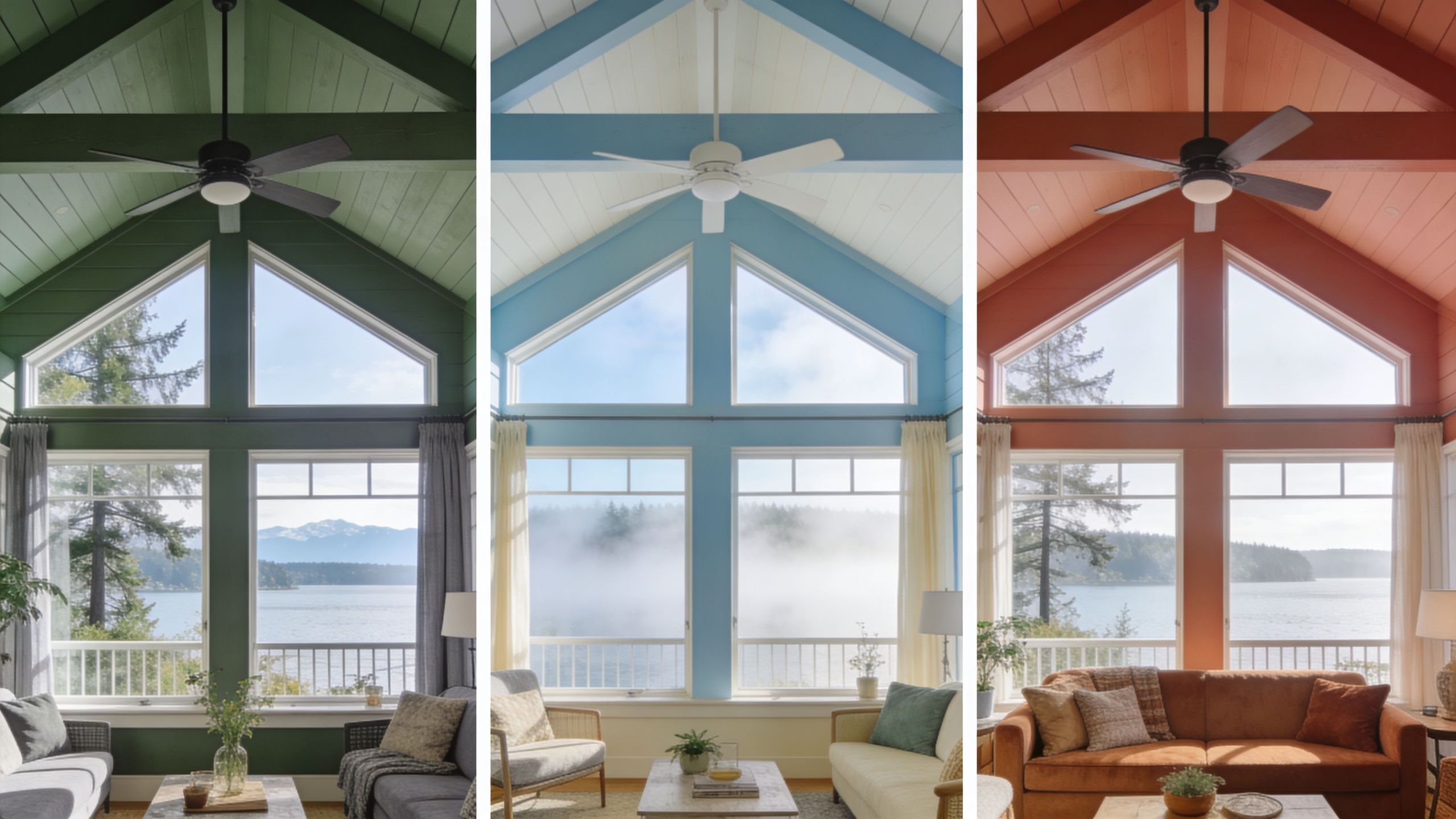
A triptych showing a sunroom with vaulted ceilings painted in dark green, light blue, and warm terracotta.

The gray-day brightener

This palette works well in north-facing or heavily shaded rooms.

  • Wall color with a warm, light feel, such as Benjamin Moore Hawthorne Yellow HC-4
  • Trim color with very high reflectance, such as Sherwin-Williams Extra White SW7006
  • Accent idea in natural wood, wicker, or muted tan textiles

The goal here isn’t a loud yellow room. It’s a controlled warmth that keeps the walls from looking icy when the sky is overcast. For indirect-light spaces, this approach can make the room feel friendlier without fighting the architecture.

The coastal balance palette

This one suits south-facing rooms or spaces that get strong daylight for much of the day.

A soft blue or green wall color, like Benjamin Moore Palladian Blue HC-144 or Saybrook Sage HC-114, can calm the light and help the room feel less glaring. Pairing it with bright trim keeps things from going murky. This is often a good fit for homeowners who want a serene look rather than a sunny one.

For anyone refining adjacent spaces, especially living rooms or hallways that connect to the sunroom, this guide to colors that go with grey can help keep the transition smooth.

The shaded jewel-tone palette

Some low-light sunrooms don’t improve when you keep trying lighter and lighter paint. They improve when you stop fighting the mood and lean into it.

According to guidance for indirect-light rooms and sunrooms, many Puget Sound sunrooms receive 40-60% less light, and rooms like these often do best either with high-LRV paint such as Sherwin-Williams Extra White SW7006 or with bold jewel tones that appear to glow in low light. That gives homeowners two valid paths. Reflect more light, or use depth on purpose.

A deep green, rich sapphire tone, or moody blue can feel dramatic in a good way if the furnishings and trim support it.

Here’s a quick visual on how bold and light choices can both work in a sunroom:

The warm natural palette

This option works especially well for sunrooms that connect to decks, patios, or garden views. Think soft terracotta influence, warm beige, muted clay, and off-white trim. It feels grounded and comfortable, especially in homes with wood floors, rattan furniture, or earth-toned textiles.

Choose this route if you want the room to feel relaxed year-round instead of seasonally bright.

Selecting the Best Paint Finish for Durability

Color gets the attention, but finish decides a lot of the day-to-day performance. In a sunroom, that matters because walls and trim often deal with changing temperature, moisture near windows, and frequent wipe-downs around sills and doors.

What each finish actually does

Sunroom Paint Finish Comparison Appearance Durability Best For
Matte Soft, low-shine look Lower washability Ceilings or low-contact walls in dry, stable areas
Eggshell Slight softness with a bit more life Good for everyday use Main walls in many residential sunrooms
Satin Noticeable soft sheen Stronger cleanability and moisture resistance Walls, trim, and active family spaces
Semi-gloss Sharper shine and crisp contrast Very durable and easy to clean Trim, window casings, doors, and high-contact surfaces

A practical rule for sunrooms

Most sunroom walls do well in eggshell or satin, depending on how the room is used. If kids, pets, plants, or commercial traffic are part of the picture, satin often makes more sense. It stands up better to wiping and tends to tolerate damp conditions more gracefully.

Trim is different. Window trim, stool areas, and door casings usually benefit from a tougher finish, often semi-gloss, because those surfaces get touched and cleaned more often.

Practical rule: Put more durability where hands, condensation, and sunlight hit hardest.

Don’t ignore UV and moisture

A finish won’t solve every problem by itself. Product selection matters too. In a room with lots of glass, it helps to use coatings designed to stand up to sunlight. This overview of UV-resistant paint options is useful if you’re comparing products for fade resistance.

For homes and commercial spaces with existing water staining, drywall softness, or mildew around trim, the surface may need repair and sealing before any finish goes on. That’s one reason residential contractor near me and commercial painting services near me searches often lead people to full-service teams instead of a simple paint-only approach. The prep work decides whether the finish lasts.

Test Your Paint Colors Like a Professional

Paint chips lie. Not because the color is wrong, but because the sample is too small and the lighting is too controlled. Sunrooms change by the hour, so your testing process has to match real conditions.

Use movable sample boards

Buy sample pots and paint them onto large poster boards or foam boards. Don’t paint test squares directly onto every wall unless you’re comfortable doing extra sanding and priming later. A movable board lets you test one color in several spots without marking up the room.

Check the room in real life

Move each board around and watch it under different conditions:

  1. Morning light shows whether the color turns too cold or too sugary.
  2. Afternoon light reveals glare and washout.
  3. Cloudy-day light is the big one for Western Washington.
  4. Evening light helps you see what happens when lamps take over.

According to this decade-by-decade color trend review, color preferences shifted quickly over time. The 2000s saw cooler grays and tinted neutrals rise 50% by 2010, and by the 2010s, cool grays made up 60% of selections. That quick change is a good reminder that trend photos don’t know your room. Testing does.

Look beyond the wall

A sample can look perfect until it sits beside your floor, trim, ceiling, and furniture. Hold the board next to those surfaces on purpose. If the room has dark wood trim, aluminum framing, or tile with a strong undertone, that will influence the final result.

Test fewer colors, but test them better. Three well-chosen samples usually teach you more than ten rushed ones.

Why Hiring a Professional Painter Delivers Better Results

Sunrooms look simple from a distance. Then the work proves more involved. Tall glass walls, tricky cut lines, moisture-prone trim, patched drywall, peeling sills, and hard-to-read lighting can turn a weekend project into a string of expensive do-overs.

A professional painter helps most when the room has conditions that punish small mistakes. That includes vaulted ceilings, stained drywall, older wood trim, condensation damage, or a connected remodel where the sunroom has to flow into nearby living space, office space, or a commercial tenant improvement.

Where DIY usually runs into trouble

  • Prep work gets underestimated when old caulk, minor water damage, or surface chalking are present.
  • Glass cleanup becomes risky if paint lands on window panes and someone reaches for the wrong scraper. If that’s already happened, this guide on how to efficiently remove paint from window glass is a helpful reference.
  • Detail work slows everything down around mullions, trim transitions, and door frames. Homeowners comparing techniques often benefit from these tips for painting trim.

Why it matters for homes and commercial spaces

For homeowners, the payoff is a cleaner finish and a room that feels right in every season. For building owners and facility managers, the payoff is consistency, durability, and less disruption. That matters in office space renovation, retail build-outs, and smaller commercial construction near me projects where the sunroom or enclosed patio functions as a visible tenant-facing area.

Good painting is less about getting color on the wall and more about solving the room.

Your Sunroom Painting Questions Answered

Can you paint a sunroom with vinyl or aluminum framing nearby

Yes, but those materials need the right prep and the right product. Frames, adjacent trim pieces, and transition areas often require careful cleaning, scuffing, masking, and coating selection. This is one of those details that affects how professional the room looks when it’s finished.

What if my sunroom has dark wood trim

You have two paths. Keep it and choose wall colors that support it, or paint it and fully change the feel of the room. Dark wood often works well with muted greens, earthy neutrals, and some historic palettes. If you paint over it, the prep has to be thorough or the finish won’t hold up well.

Is white ever a good choice in a Puget Sound sunroom

Yes, but not every white. Undertones matter. Some whites lean blue and can feel cold. Others lean creamy and can look too yellow in gray light. Testing is the only safe way to know which white works in your exact space.

How do you prevent mold and mildew in a sunroom

Start with the room itself, not just the paint. Check for condensation, failed seals, leaks, and poor airflow. Then use coatings suited to damp conditions and make sure the surface is clean, sound, and dry before painting. In some spaces, waterproofing or repairs should happen first.

Are bold colors a bad idea in small sunrooms

Not always. In some shaded rooms, a bold color looks richer and more intentional than a washed-out pale color. The key is to choose it because it fits the light, not just because it looked dramatic online.

What if the sunroom connects to a kitchen, office, or commercial common area

Treat it as part of a larger color plan. The sunroom should have its own identity, but it shouldn’t feel disconnected from the rest of the property. That’s especially important in residential remodeling and commercial renovations where sightlines matter.


If you’re planning a sunroom refresh, a full residential remodel, or a smaller commercial upgrade in Kent, Seattle, Tacoma, or nearby communities, Wheeler Painting & Restoration Services can help you make confident choices and get the work done right. Their team handles residential and commercial construction, interior painting, exterior painting, drywall, waterproofing, tenant improvements, facility maintenance, and restoration work across the Puget Sound region. Reach out for a consultation if you want a practical plan, clear communication, and a finish built for local light and weather.
Sherwin Williams Kitchen Cabinet Colors: A Puget Sound Guide

A lot of homeowners in Seattle, Kent, and Tacoma stand in their kitchen and have the same reaction. The layout still works. The cabinets are solid. But the room feels tired, darker than it should, and harder to update than expected.

A full remodel isn’t always necessary to change that feeling. Cabinet painting can shift the whole room, especially when the color is chosen for Pacific Northwest light instead of copied from a bright, sun-heavy kitchen in another part of the country. In this region, overcast skies, common wood tones, and moisture from daily cooking all affect how cabinet paint looks and how long it lasts.

That’s why sherwin williams kitchen cabinet colors deserve more thought than a quick trip to the paint store. The right white can soften a dim kitchen and make it feel larger. The wrong greige can go flat. A dramatic navy or black can look polished in one home and heavy in another.

Your Guide to a Kitchen Transformation

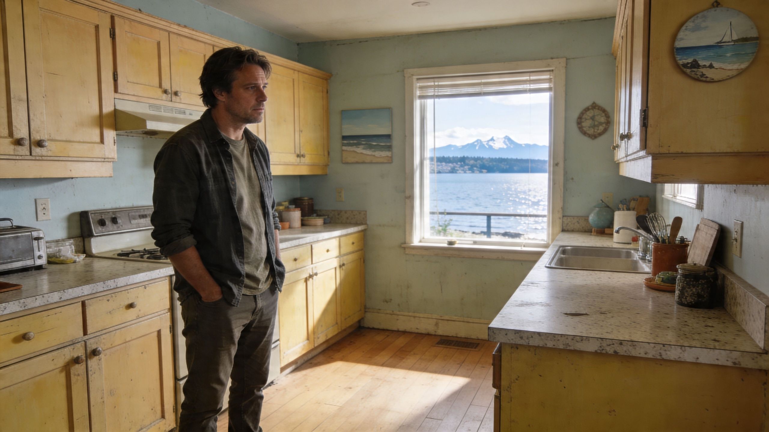
A dated kitchen usually doesn’t fail all at once. It happens in layers. Yellowed cabinet finishes, busy wood grain, older hardware, and a color that absorbs more light than you realized. Before long, the whole room feels older than the rest of the house.

A man stands in a vintage kitchen with worn yellow cabinets, looking out a window at a scenic mountain landscape.

Cabinet painting is often the point where a kitchen starts feeling manageable again. You keep the footprint, avoid the disruption of a full tear-out, and put your budget where it changes the room most. For many properties between Seattle and Tacoma, that’s the practical middle ground between living with a dated kitchen and committing to a full renovation.

The part that overwhelms people isn’t usually the painting itself. It’s the color decision. White sounds simple until you see ten whites. Beige sounds safe until it turns pink or muddy. Black looks sharp online, then feels too heavy in a kitchen that doesn’t get much daylight.

A cabinet color never lives by itself. It always shows up next to countertops, flooring, backsplash tile, lighting, and the weather outside your window.

A smart starting point is to separate the visual change from the storage problem. If your kitchen also feels cluttered, this guide on how to organize kitchen cabinets helps homeowners think through function before they repaint around a layout that still isn’t working.

The payoff is real when the color is chosen well. Cabinets become the clean backdrop the room was missing, and the kitchen starts to feel brighter, calmer, and easier to maintain day to day.

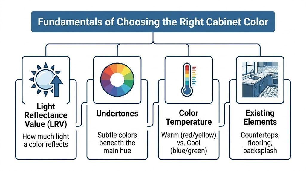
Fundamentals of Choosing the Right Cabinet Color

Most cabinet color mistakes come from choosing by name instead of performance. "White," "greige," and "navy" don’t tell you enough. The better approach is to judge each color by how it handles light, what undertone sits under it, and what sheen will look right after real daily use.

A helpful infographic showing four key factors to consider when choosing the right kitchen cabinet color.

Light reflectance matters more than most people think

LRV, or Light Reflectance Value, tells you how much light a paint color reflects. Visualize the difference between wearing a black jacket and a white shirt on a cloudy day. One holds onto light. The other throws it back into the room.

In Puget Sound kitchens, that matters. A higher-LRV cabinet color can help a room feel more open and less compressed during darker parts of the year. A lower-LRV color can look rich and grounded, but it needs the right setting.

Sherwin-Williams trends have also shifted away from cool grays toward warmer greige neutrals, bleached blondes, and bold matte navies, according to Sherwin-Williams Industrial Wood’s look at kitchen cabinetry trends. That move makes sense locally because warmer cabinet colors usually read more comfortably under overcast skies than sharp, icy grays.

Undertones decide whether a color works or fights the room

A cabinet color can look white at the store and still lean yellow, gray, green, or beige once it’s installed. That hidden bias is the undertone, and it’s often what creates the "something feels off" reaction.

Here’s what to check before committing:

  • Countertops first: If the counters have warm veining or creamy tones, a stark cool cabinet color can feel disconnected.
  • Flooring second: Orange-toned wood floors and some older fir trim can make cool cabinet colors look harsher.
  • Backsplash and wall color last: These can support the cabinet color, but they rarely fix a mismatch created by the larger fixed finishes.

For a broader comparison of common cabinet tones, this article on good colors for kitchen cabinets is useful as a secondary reference point when clients are trying to narrow down style direction before sampling.

If your existing cabinets are wood and you're trying to predict how paint and undertones will behave over the substrate, it also helps to understand the species you're working with. Wheeler has a practical overview of types of kitchen cabinet woods that can help you identify what’s already in the room.

Practical rule: Never judge a cabinet color from a tiny chip alone. Sample it beside the countertop, floor, and backsplash in both morning and evening light.

Sheen changes both the look and the maintenance

Color gets most of the attention, but sheen changes how cabinets wear. For most kitchens, satin and semi-gloss are the finishes worth considering.

Semi-gloss is easier to wipe down and usually gives you a crisper, more reflective look. Satin is slightly softer and can be more forgiving on older cabinet doors that have minor texture, grain telegraphing, or repair marks.

There’s also a trade-off with darker colors. Sherwin-Williams notes that matte and low-sheen finishes on darker cabinet colors can hide fingerprints up to 40% better than gloss finishes in high-traffic kitchens, based on its industrial cabinetry trend guidance linked above. That can be helpful on islands or lower cabinets where hands constantly hit the surface.

What usually works and what usually doesn’t

A few patterns show up again and again in the field:

  • What works: Warm whites in dim kitchens, balanced greiges with mixed metal finishes, and darker accent colors used with restraint.
  • What struggles: Cool gray cabinets in already gray rooms, very glossy dark finishes on busy family kitchens, and trendy colors chosen without testing them in local light.
  • What deserves patience: Two-tone kitchens. They can look excellent, but they need stronger coordination between counters, wall color, and hardware.

People don’t need hundreds of paint names. They need a filter for making fewer, better choices.

Top Sherwin-Williams Cabinet Color Palettes

Not every kitchen needs the same answer. Some need light. Some need warmth. Some need contrast so the room stops looking flat. The strongest sherwin williams kitchen cabinet colors usually fall into three practical groups: bright whites, softer neutrals, and bold statement colors.

A useful gallery of ideas for side-by-side comparison is Wheeler’s collection of kitchen cabinets paint color ideas. It helps clients narrow the conversation before moving into physical samples.

Timeless and airy whites

Pure White (SW 7005) is one of the safest recommendations for cabinet painting when the goal is to brighten the room without making it feel sterile. It has an LRV of 84 and reflects substantial light, which is part of why it remains a top cabinet choice in design roundups focused on Sherwin-Williams whites, as noted by Designing Vibes. It also sits warmer than many people expect, which helps it avoid that hard, clinical look.

Alabaster (SW 7008) is another strong option when a kitchen needs softness. Verified trend guidance for Sherwin-Williams cabinetry notes Alabaster (LRV 82) as a brightening choice that reflects 80%+ light and works well in smaller kitchens where space feels compressed. It tends to be easier with warmer counters and wood floors than a cooler white would be.

These whites work well with:

  • Quartz with soft veining
  • Subway tile or handmade-look backsplash
  • Brushed nickel, polished nickel, or unlacquered brass
  • Natural wood accents on shelves, stools, or flooring

Sophisticated neutrals and greiges

Not every kitchen wants white cabinets. In many Seattle-area homes, a white cabinet can feel too sharp against warmer flooring, natural wood trim, or existing stone surfaces.

Accessible Beige (SW 7036) is a dependable direction when the room needs warmth more than brightness. It sits in that neutral zone where it can work with both black and brass hardware and usually feels more grounded than off-white. In homes with alder or fir tones, that warmth often reads more intentional than a cool gray.

Evergreen Fog (SW 9130) fits homeowners who want a color but don’t want the kitchen to feel loud. Sherwin-Williams trend guidance places it in the warmer cabinet movement and describes it in the LRV 30-40 range, which gives it enough body to read as a muted statement without going dark. It can work nicely on islands or full cabinetry when the kitchen has decent natural light and simple counters.

Neutrals and greiges pair best with:

Cabinet direction Best supporting finishes
Warm greige Creamy quartz, stone-look backsplash, aged brass
Beige-neutral White counters, warm wood flooring, matte black hardware
Muted green-greige White oak accents, simple tile, mixed metals

If a kitchen has a lot of fixed warm material already, a slightly warmer cabinet color usually looks more expensive than forcing in a cooler trend color.

Bold and dramatic statements

Dark cabinets can look outstanding, but they’re less forgiving. They need enough light, enough contrast, and enough restraint.

Tricorn Black (SW 6258) is the cleanest black in this group. It was featured in Sherwin-Williams’ 2021 Colormix® Tapestry palette and has grown into a major statement option. Verified data notes that it now makes up 25% of top designer picks in inspiration galleries after that palette feature, making it one of the better-established dark cabinet choices rather than a short-lived novelty. Its strength is that it reads as a true black without obvious brown or gray drag.

Dark cabinet colors often work best in one of these layouts:

  • Island only: Strong contrast without taking over the room
  • Lower cabinets only: Keeps weight low and preserves brightness above
  • Full set in larger kitchens: Works when the space has strong lighting, lighter counters, and enough visual breathing room

For navy-leaning kitchens, Sherwin-Williams industrial trend guidance also points to colors such as In the Navy SW 9178 and Needlepoint Navy SW 0032 in the broader move toward bold matte navies. These are good candidates for people who want depth without going all the way to black.

Sherwin-Williams recommended cabinet colors

Color Name (SW #) LRV Undertone/Family Pairs Well With
Pure White (SW 7005) 84 Warm white Quartz counters, brass, nickel, light backsplash
Alabaster (SW 7008) 82 Soft warm white Warm woods, creamy counters, classic tile
Shoji White (SW 7042) 74 Off-white, warmer neutral Stone counters, softer backsplashes, warmer flooring
Accessible Beige (SW 7036) Qualitatively warm neutral Beige-greige Alder tones, black hardware, mixed metals
Evergreen Fog (SW 9130) 30-40 Warm green-greige White oak, simple tile, understated stone
Tricorn Black (SW 6258) Qualitatively very dark True black White counters, brass, concrete, wood accents

One note on color codes: Sherwin-Williams identifies cabinet colors by SW numbers, and that’s the most reliable way to specify them on a project. Because no verified HEX or RGB values were provided in the approved source material, it’s better not to rely on unofficial digital color conversions when making a final paint decision.

Color Strategies for Pacific Northwest Homes

National cabinet advice often misses what happens in a Seattle or Tacoma kitchen in February. Light is flatter. Shadows stay longer. Colors that looked balanced online can feel cooler, heavier, or duller once they’re installed in a real Puget Sound home.

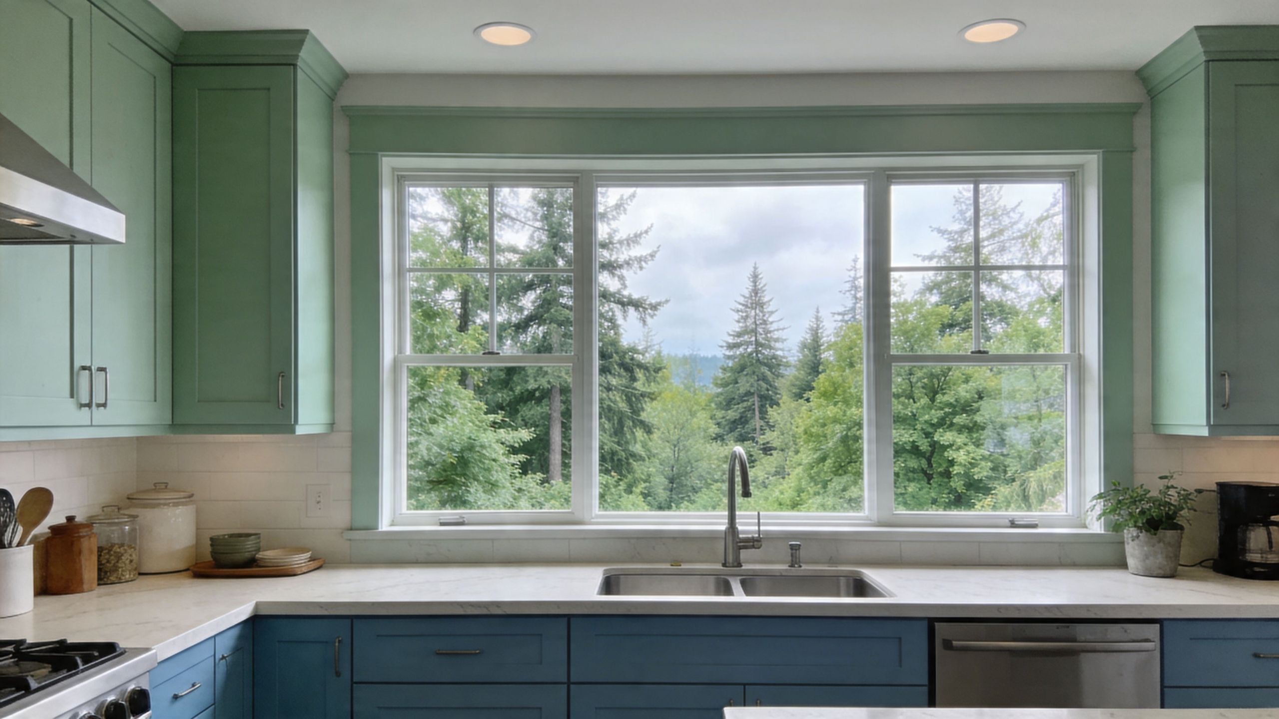
A modern kitchen featuring two-tone cabinetry with green upper cabinets and blue lower cabinets under a window.

The region averages 40% less sunlight than national norms, and one survey cited a 62% regret rate for non-neutral cabinets in dim climates, which is why warmer beiges and higher-LRV whites are often the safer long-term choice in local homes, according to this Studio McGee discussion of neutral kitchen cabinet color. That doesn’t mean bold colors are a mistake. It means they need better planning here than they might in a brighter market.

Use brightness deliberately, not automatically

A brighter cabinet color can help in kitchens with limited daylight, but brightness alone isn’t the goal. The goal is balance.

In north-facing kitchens or rooms blocked by neighboring homes, warm whites and soft neutrals usually hold up better than sharp cool whites. They bounce light without making the room feel washed out. In open-concept homes, they also tend to transition more naturally into adjacent living spaces.

Work with local wood tones instead of fighting them

A lot of homes between Kent and Tacoma still have natural wood floors, fir trim, alder cabinetry in nearby rooms, or wood accents that aren’t changing with the kitchen project. That matters.

Cabinet paint should support those materials, not argue with them. In practice, that usually means:

  • Warm whites for homes with honey or amber wood notes
  • Greige or beige-leaning neutrals when flooring has visible warmth
  • Muted greens or navies only when there’s enough contrast from counters and wall color

If the kitchen includes prominent wood elements, bring those samples into the color decision early. A paint color that looks calm on a sample board can go muddy next to warm fir or turn colder than expected against stone with gray veining.

Most PNW kitchens look better when the cabinet color relates to the wood tone somewhere in the house, even if it doesn't match it exactly.

Moisture changes the paint conversation

Puget Sound kitchens also deal with moisture differently. Daily cooking, cooler outdoor weather, and seasonal dampness create conditions where lower-quality products show their weaknesses faster.

That affects both color and finish. Dark colors can reveal failure sooner if the coating wasn’t built correctly. Lighter colors can yellow or get blotchy if the wrong product was used. A proper cabinet system matters more here because the environment is less forgiving.

For homeowners and facility managers, that means thinking beyond the paint chip. The right sherwin williams kitchen cabinet colors still need the right prep, primer, and topcoat system to stay attractive in a kitchen that sees steady use.

The Professional Process for a Flawless Finish

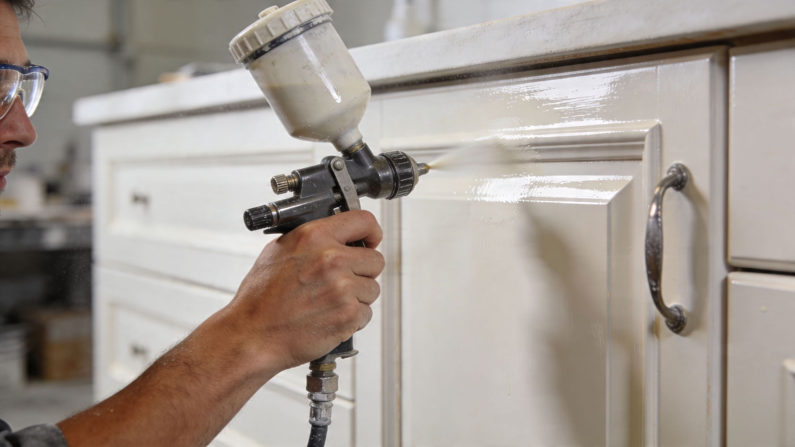
A cabinet finish earns its keep after the kitchen goes back to normal. Doors open and close hundreds of times. Pulls get grabbed with wet hands. Steam hangs in the room on dark winter mornings. In Seattle, Tacoma, and Kent, that daily moisture exposure is part of the job, so the process has to be built for wear from the start.

A professional painter uses a spray gun to apply fresh off-white paint to a kitchen cabinet door.

Prep does most of the hard work

Cabinets carry layers of contamination that homeowners rarely see. Grease near the range, polish residue on rail profiles, hand oils around pulls, and old cleaners all interfere with adhesion. If those contaminants stay in place, the new finish is more likely to chip at corners, fisheye during application, or wear prematurely around high-touch areas.

A proper prep sequence usually includes:

  1. Removing doors, drawers, and hardware so each piece can be coated cleanly.
  2. Labeling every part to keep reinstallation accurate.
  3. Cleaning and degreasing with extra attention near cooking zones and handles.
  4. Sanding or scuffing to create mechanical adhesion.
  5. Priming repaired areas and slick surfaces so the topcoat bonds evenly.

This is also the stage where old cabinet problems show up. Swollen MDF edges, failed caulk lines, hinge wear, and grain that needs filling are easier to correct before finish coats go on than after the color is applied.

Product choice matters more on cabinets than on walls

Cabinets need an enamel made for repeated contact and routine cleaning. Standard wall paint can look acceptable for a short time, but it usually does not hold up well on doors, drawer fronts, and face frames that get touched all day.

Sherwin-Williams Emerald Urethane Trim Enamel is a common choice for cabinet work because it levels well and cures to a harder finish than typical wall coatings. That matters in PNW kitchens, where moisture, cooking residue, and cooler indoor conditions can expose weak coating systems faster.

For homeowners weighing a full repaint against a more limited scope, Wheeler has a useful page on painting kitchen cabinet doors and drawer fronts. That decision affects labor, downtime, and how uniform the final result looks across the whole kitchen.

Field note: If a painter treats cabinet work like wall work, expect callbacks.

Application quality decides whether the finish looks factory-made or obviously repainted

Good spraying is only part of the job. Film thickness has to stay consistent. Dust has to be controlled. Recoat timing matters. So does temperature and humidity, especially during damp stretches common around Puget Sound. If the schedule gets rushed, the finish may dry unevenly, block when doors close, or show texture differences between frames and doors.

Cure time is where patience pays off. Cabinets can feel dry well before they are ready for full service, and that gap matters. I tell clients the same thing on nearly every project. A coating that gets handled too hard in the first few days can dent, print, or lose sheen before it fully hardens.

A general contractor with cabinet painting capability, such as Wheeler Painting & Restoration Services, can also be useful on broader kitchen projects because cabinet work often overlaps with drywall repair, trim updates, flooring protection, and schedule coordination with other trades.

Why Hire a Local Pro for Your Cabinet Project

Cabinet painting looks simple from a distance. Once the doors come off, the project becomes a finish-control job. Color selection, prep, dust management, dry time, hardware reinstallation, and protection of the rest of the home all have to line up.

That’s where DIY projects usually get expensive. The paint itself isn’t the only risk. The bigger risk is choosing a color that doesn’t work in local light, then applying it over a surface that wasn’t properly cleaned or primed. By the time those mistakes show up, the kitchen is already disrupted and the fix is rarely quick.

Local experience changes the recommendation

A contractor who works regularly in Seattle, Kent, Tacoma, and the communities in between sees the same recurring conditions:

  • Overcast light that cools colors down
  • Warm existing wood tones that affect undertones
  • Daily moisture and cooking residue that stress coatings
  • Older cabinet boxes and doors that need repair before paint

A local pro can spot these issues early and steer the project toward a practical result instead of a trendy one that won’t wear well.

Accountability matters on cabinet work

Cabinet painting is detailed work done in one of the busiest rooms in the property. Homeowners want the kitchen back. Facility managers want predictable scheduling. Property owners want the finish to hold up without constant touch-ups.

That’s why local accountability matters. If something needs adjustment, you’re not dealing with an out-of-area crew that has already moved on. You’re working with a contractor who serves this market and understands the expectations here.

The right hire doesn’t just apply paint. They protect the schedule, the surrounding finishes, and the long-term look of the kitchen.

It also helps on larger renovation projects

Some cabinet jobs stay small. Others turn into broader updates once the homeowner sees the opportunity. New flooring, drywall repair, backsplash replacement, tenant improvements, small retail refreshes, or office breakroom updates often tie into cabinet refinishing decisions.

Working with a contractor that handles both painting and broader residential or commercial construction can simplify those moving parts. Instead of coordinating several separate vendors, you have one point of contact who can keep the sequence organized.

For many property owners, that reduction in friction is just as valuable as the paint color itself.

Frequently Asked Questions About Cabinet Painting

How much does it cost to have kitchen cabinets professionally painted in the Seattle area

The exact price depends on the number of doors and drawers, the condition of the existing finish, how much prep is required, whether the boxes and interiors are included, and whether the project is part of a larger remodel. A small, straightforward repaint is very different from a kitchen with heavy grease, damaged doors, or layout-related carpentry work.

The most reliable way to price it is with an on-site estimate. That lets the contractor inspect the surface condition and confirm the scope before anyone promises a number that won’t hold.

How long does the cabinet painting process take

Most cabinet projects take several days from prep through reinstallation, and some take longer depending on drying conditions, complexity, and whether other work is happening in the kitchen at the same time. The timeline is driven less by how fast paint can be sprayed and more by how carefully the surfaces are prepared and how much cure protection is built into the schedule.

If someone promises an unusually fast turnaround, ask what they’re skipping.

Can I still use my kitchen during the project

Usually, yes, but not normally. Expect disruption. Doors and drawers may be removed, access may be limited, and parts of the kitchen may be off-limits during prep, spraying, or curing.

Most homeowners do best when they set up a temporary kitchen zone in another room with coffee supplies, a microwave, and a few everyday dishes. That takes the pressure off the main kitchen while the work is underway.

How durable are painted cabinets over the long term

Painted cabinets can be very durable when the project uses the right prep, primer, and cabinet-grade enamel. Long-term durability depends on the system, not just the color. Cabinets painted with a product designed for trim and cabinetry, and allowed to cure properly, will hold up much better than cabinets coated with ordinary wall paint.

Daily care matters too. Use gentle cleaners, avoid slamming doors, and give fresh paint time to harden before treating it like a fully cured factory finish.


If you're planning cabinet painting, a kitchen refresh, or a larger residential or commercial improvement project in Seattle, Kent, Tacoma, or the communities in between, Wheeler Painting & Restoration Services can help you sort through color selection, surface prep, and project scope with a clear on-site consultation and estimate.

8 Top Basement Paint Color Ideas for 2026

Your basement holds more potential than is often recognized. In Kent, Seattle, Tacoma, and the communities in between, we see the same pattern all the time. A basement starts as the dim part of the house that stores old boxes, leftover flooring, or exercise equipment that never found a real home. Then life changes. You need a family room, a guest space, a home office, a playroom, or a cleaner tenant area that doesn’t feel like an afterthought.

Paint is one of the fastest ways to change that feeling. The right basement paint color ideas can make a lower level feel brighter, calmer, warmer, and more finished. But in the Puget Sound region, color alone doesn’t solve the whole problem. Our basements deal with limited natural light, cool artificial light, and moisture conditions that can punish the wrong product or the wrong prep.

That’s why basement color decisions need to be practical, not just stylish. A color that looks great online can turn flat, greenish, or muddy once it hits a below-grade wall. A finish that works upstairs can fail fast downstairs. And if the walls haven’t been properly sealed, repaired, and primed, even the best paint won’t hold up the way it should.

A lot of homeowners also want color help that connects mood with function. If that’s you, this overview of colour psychology in interior design is a useful companion to the contractor-side advice below.

At Wheeler Painting, we approach basements as real living and working spaces, not secondary rooms. These are the colors and color families that consistently work well, along with the trade-offs that matter if you want a finish that looks right and lasts.

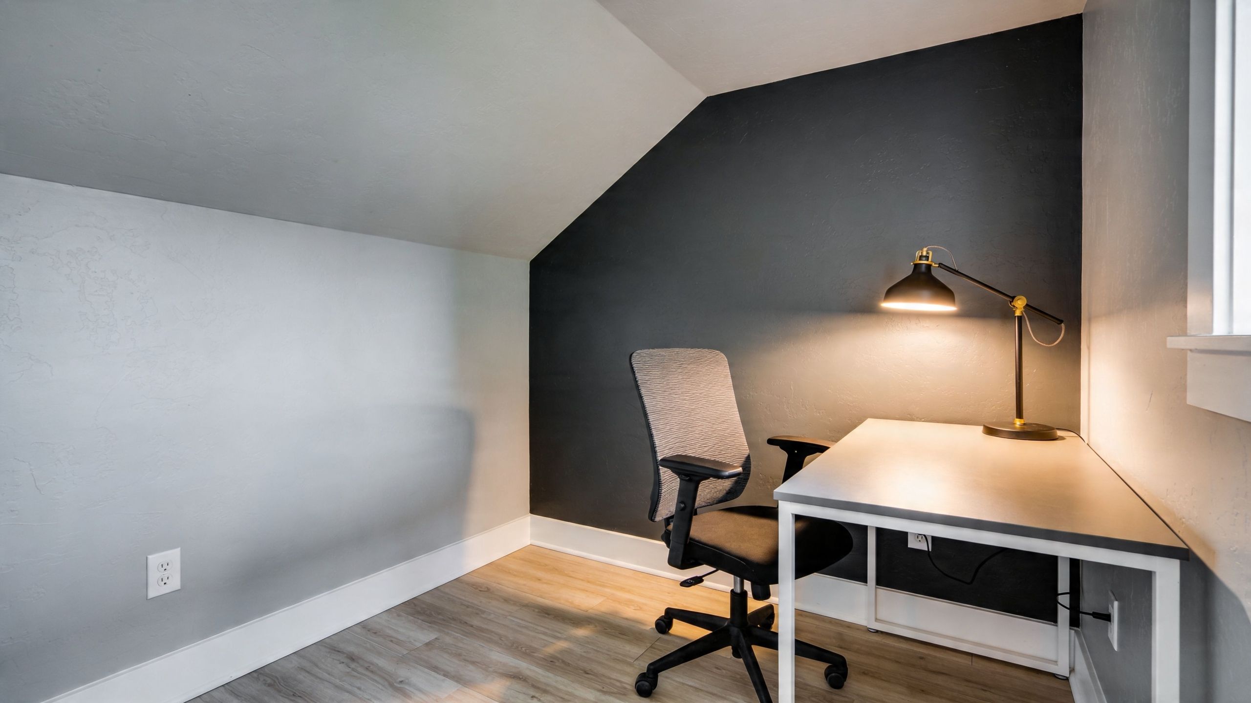
1. Cool Gray and Charcoal The Sophisticated Neutral

A modern home office setup featuring a desk, chair, and desk lamp against a dark accent wall.

Cool gray still shows up on a lot of basement projects because it gives a clean, modern look without feeling busy. Charcoal takes that same idea and adds more depth. In a finished basement office, media room, or tenant improvement space, these tones can feel polished and controlled.

They also hide a lot better than bright whites. Minor drywall waves, patched areas, and the occasional old mark on foundation-adjacent walls tend to show less in a medium to dark neutral than they do in a stark pale color.

Where gray works and where it can disappoint

Gray is strongest when the room already has a decent lighting plan. If the basement relies on a couple of cool LED fixtures and not much else, some grays can turn flat fast. In Western Washington basements with high indoor humidity and cool lighting, cool tones can also shift in ways homeowners don’t expect.

One regional note matters here. A Puget Sound-focused color discussion points out that Western Washington homes often deal with average indoor humidity in the 70 to 80 percent range, and cooler tones can read greenish or chalky under common basement LED lighting in damp spaces, especially if they aren’t balanced carefully with the rest of the room’s finishes and equipment choices (Pacific Northwest basement paint observations).

Cool gray can look sharp in one corner and almost dead in another. Basement lighting exposes that difference more than upstairs rooms do.

How to make gray look intentional

A few field-tested moves help:

  • Use warm lighting: Bulbs in the warmer range help a cool gray feel balanced instead of clinical.
  • Add white trim: Crisp trim gives the wall color a clean edge and lifts the room visually.
  • Choose the right sheen: In a basement, satin or semi-gloss often makes more sense than flat paint on lower wall sections because it cleans up more easily.
  • Prime first: If there’s any history of dampness, start with moisture-focused prep and a quality primer.

If your basement has ever felt damp, color selection should come after the moisture discussion. A good place to start is this guide on how to waterproof basement walls.

For a homeowner in Seattle using the basement as a home office, charcoal on one wall behind the desk can look more finished than painting the whole room dark. For a property manager updating a small tenant lounge in Tacoma, a mid-tone gray can create broad appeal without locking the next user into a strong style.

2. Warm White and Cream The Light Maximizer

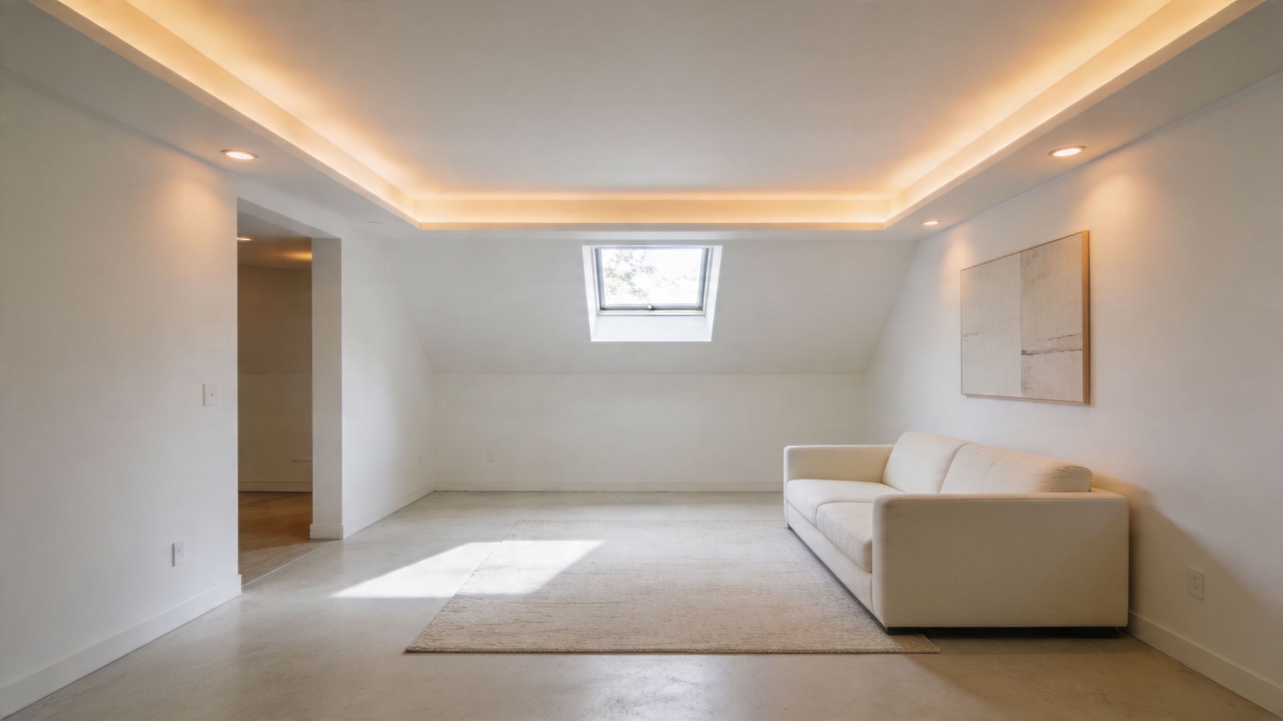
A modern minimalist basement living room featuring white walls, a beige sofa, and recessed tray ceiling lighting.

A basement in Everett or West Seattle often has the same problem. Good square footage, low daylight, and a room that feels a little closed in by midafternoon. Warm white and cream are often the simplest fix because they brighten the space without making it feel stark.

Undertone does the heavy lifting here. In Puget Sound basements, a white with a soft cream, beige, or muted yellow base usually looks more settled than a blue-white. The cleaner, colder whites that look sharp in a showroom can turn a lower level flat and unfinished once they hit concrete-adjacent walls and limited natural light.

Why this palette works so often

White and cream reflect more of the light you already have. That matters in below-grade rooms with smaller windows, deep overhangs, and long stretches of cloudy weather. If the goal is to make a family room, guest suite, or rental basement feel open, this color family gives you margin for error with furniture, flooring, and future updates.

It also ties lower levels back to the rest of the house. That matters in split-level and daylight-basement homes common around the Sound, where a basement can feel disconnected if the color shift is too abrupt.

Where warm whites go wrong

These colors show every shortcut. Uneven patching, old water marks, roller lap lines, and rough texture stand out fast on a white wall.

That is why prep matters more than the color chip.

A basement with new drywall repairs should be primed correctly before finish paint. If you are patching or repainting sheetrock, this guide on whether you have to prime sheetrock before painting covers the basics. In older basements, I also look for past moisture stains around window wells, baseboards, and exterior-facing corners before recommending any light color.

How to make white feel finished instead of cold

A few choices make a big difference:

  • Choose a warm undertone: Creamy whites and soft off-whites usually read better than bright, icy whites in Northwest basements.
  • Use the right finish: Eggshell or satin is often the better call for rec rooms, hallways, and play spaces because it cleans more easily than flat.
  • Carry the color thoughtfully: Painting walls and ceiling in the same white can reduce visual chop in low-ceiling areas.
  • Add contrast through materials: Wood shelving, black hardware, natural oak, and warm textiles keep the room from feeling washed out.

Practical rule: Warm white makes a basement look brighter, but only if the surfaces underneath are clean, sound, and evenly primed.

For a homeowner in Kent turning the basement into a playroom, a cream-based white usually gives the room a softer, more lived-in feel than a crisp decorator white. For a property manager repainting a small lower-level unit, warm white is also a safe reset. It appeals to a wide range of tenants and makes older basement layouts feel cleaner without calling attention to every architectural flaw.

3. Soft Greens and Sage The Natural Retreat

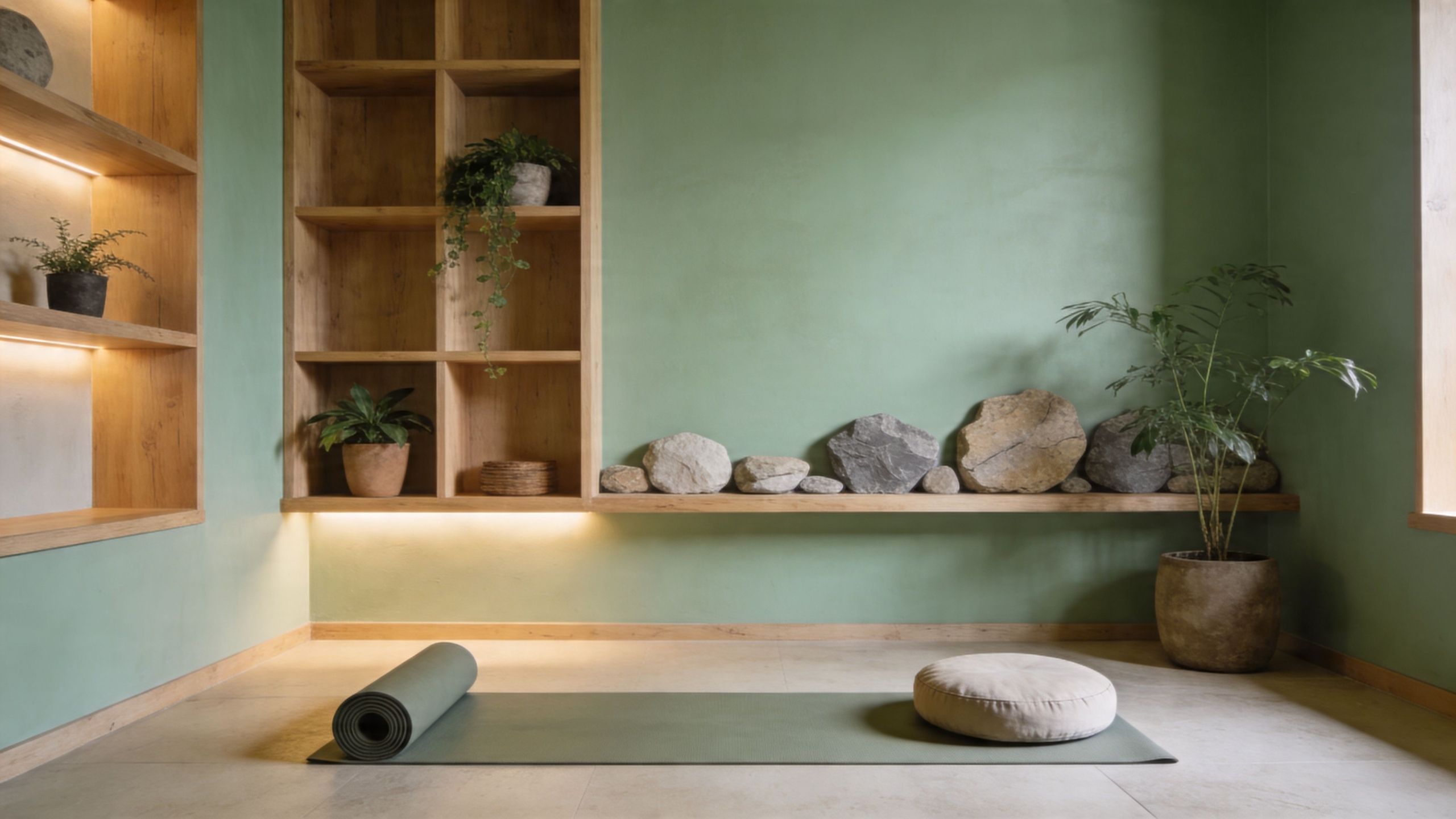
A serene yoga studio with green walls, wooden shelving, floor mat, and natural stone decor elements.

Soft green is one of the better basement paint color ideas for homeowners who want color without noise. Sage, eucalyptus, and other muted greens feel grounded. They fit the Pacific Northwest well, and they can make a basement office, yoga room, guest bedroom, or reading space feel calmer than a standard beige.

This palette also works when the rest of the home already has natural wood, stone, or warm white finishes. The room doesn’t feel disconnected. It feels intentional.

Why muted greens are gaining traction

There’s a practical reason greens are getting more attention in remodel conversations. A trend summary tied to Washington’s remote-work shift notes growing interest in biophilic, wellness-oriented basement colors, including earthy greens for office and gym use, because homeowners are asking more from lower levels than storage and overflow space (basement color trend discussion for 2025 and 2026).

In plain terms, people want basements that feel better to spend time in. Soft green helps with that. It has more personality than beige, but it doesn’t fight the room.

How to keep green from going cold

The danger with basement green is choosing one that’s too minty, too blue, or too clean. In low light, that can feel chilly. In a damp space, it can read more washed out than expected.

A better approach is to keep it muted and a little gray.

  • Choose a softened sage: Dusty, gray-green tones usually age better than bright greens.
  • Warm up the room: Wood accents, warm metal finishes, and softer lighting make a big difference.
  • Sample on multiple walls: One wall may pull earthy. Another may pull dull.
  • Prime repaired drywall properly: Green doesn’t hide surface inconsistency well.

Before any finish coat goes on new or repaired basement walls, proper prep matters. This guide on whether you have to prime sheetrock before painting explains why skipping primer is one of the easiest ways to get an uneven final color.

For a walk-out basement in Tacoma, sage can feel especially strong when it faces a yard or patio and ties into the outside surroundings. In an enclosed Seattle basement office, it often works best as the main wall color with cream trim and warm lamps, rather than pairing it with cooler lighting that makes the room feel sterile.

4. Deep Blue and Navy The Dramatic Cocoon

Navy changes the mood of a basement fast. Done right, it feels refined, quiet, and rich. That makes it a strong choice for media rooms, home bars, libraries, and den-style basements where the goal isn’t maximum brightness. It’s atmosphere.

This is one of the few basement paint color ideas that benefits from lower light. A darker room can help the color feel enveloping instead of overwhelming.

Best uses for navy downstairs

Navy is especially good when you want the room to feel separate from the main floor. In a home theater, it reduces visual distraction. In a basement lounge, it creates contrast with lighter furniture, brass fixtures, or wood shelving.

The trade-off is obvious. Dark color absorbs light. If the room is already poorly lit and you don’t plan to upgrade fixtures, a full navy treatment can turn handsome into heavy.

A balanced approach often works best:

  • Use navy on one focal wall: Behind a TV, bar, or built-in shelf is a common smart move.
  • Keep the ceiling lighter: White or off-white overhead surfaces prevent the room from closing in.
  • Plan layered lighting: Ambient, task, and accent lighting all matter more in dark rooms.
  • Expect more prep and more coats: Dark paint shows flaws, lap marks, and patchiness.

A navy basement can feel high-end very quickly. It can also expose every drywall imperfection just as quickly.

What fails first in a dark basement paint job

Most dark-color failures are prep failures. Bubbling, peeling, patch flashing, and uneven sheen become much more visible with saturated paint. If the basement has any moisture history, address that before committing to navy.

If you’ve seen blistering or raised spots before, this breakdown of what causes paint to bubble on walls is worth reviewing before the project starts.

For a Seattle homeowner building a basement theater, deep blue on walls with a lighter ceiling can create the cocoon effect people want without making the room feel sealed shut. For a commercial lounge or office breakout area, navy often works best in controlled zones rather than across every wall, especially if the space needs broad tenant appeal.

5. Warm Earth Tones and Terracotta The Cozy Foundation

A basement that feels cold in November usually needs more than extra lumens. Color has to do some of the warming up. Soft clay, mushroom, camel, sand, and restrained terracotta can make a lower level feel settled instead of damp and disconnected.

These shades fit Puget Sound homes particularly well. We see them work in Craftsman basements, mid-century daylight basements, and older homes with brick, knotty wood, or concrete that already carries some visual weight. They also suit rooms people want to use for a while, such as rec rooms, guest areas, hobby spaces, and casual hangouts.

Why warmth often wins in Puget Sound basements

Our local light runs cool for much of the year, and many basements already have gray concrete, shaded windows, or north-facing exposure. Add a cool wall color on top of that, and the room can feel flatter than it did before painting. A warmer neutral corrects for those conditions. It does not have to be dark to feel grounded.

This matches what we hear from homeowners after the job is done. Warmth often makes a basement feel more usable before the furniture even goes back in.

There is a trade-off, though. If the room has very little natural light and a low ceiling, going too brown or too red can shrink it visually. In those cases, I usually steer people toward lighter earth colors with a soft undertone, then use deeper terracotta or clay in smaller doses.

Using terracotta without making the room too dark

Terracotta can look excellent downstairs, but only in the right version. Muted, dusty tones usually hold up better under LED lighting and cloudy-day daylight. Bright orange terracotta often turns harsh at night, especially in basements with basic can lights or cooler bulbs.

A few rules keep it under control:

  • Choose a softened version: Clay, adobe, and dusty cinnamon are usually safer than saturated orange.
  • Watch the lighting temperature: Warm bulbs help earth tones read richer and less chalky.
  • Keep the ceiling and trim light: Cream or warm off-white gives the walls contrast without making the room feel chopped up.
  • Sample on multiple walls: Basements shift color more from corner to corner than main-floor rooms do.
  • Use the right sheen: Flat or matte usually looks better on basement walls because it hides patches and surface irregularities.

Prep matters here too. Earth tones can be forgiving, but they will still highlight moisture stains, old patchwork, and uneven texture if the walls are not sealed and repaired first. In Puget Sound basements, that step matters as much as the color choice.

For a Tacoma basement with an old brick fireplace, warm earth tones often help the original materials feel intentional. In a Seattle Craftsman remodel, mushroom or clay can bridge older wood trim with a cleaner updated finish. For property managers, these colors also tend to photograph well and feel more inviting than colder grays without locking the space into a strong theme.

This palette is a good fit for homeowners who want warmth, comfort, and a little character, but do not want the basement to feel trendy or overdesigned.

6. Soft Neutral Beige and Taupe The Versatile Classic

If you want a basement color that doesn’t fight future furniture, flooring, or tenant turnover, beige and taupe still do the job better than most options. They’re practical. They’re adaptable. And when they’re chosen well, they don’t feel dated at all.

This is often the best answer for multi-use basements. A room that serves as a guest space now and a teenager’s hangout later needs flexibility. So does a small commercial renovation or lower-level office area where broad appeal matters.

Why greige and taupe stay relevant

Market data referenced in the verified materials says 70% of basement remodels in major markets choose greige tones, with colors like Agreeable Gray SW 7029 and Collingwood 2116-60 favored for versatility across spaces such as play areas, offices, and theater zones (Samplize basement paint color market summary).

That makes sense on the ground. Soft taupe and beige sit in the middle. They don’t wash out like some whites, and they don’t commit you to a bolder personality the way navy or terracotta might.

Keeping beige from looking flat

The biggest risk with beige is boredom. That usually happens when the room has no contrast, no texture, and no lighting variety.

A beige basement looks much better when the design has some depth:

  • Mix textures: Upholstery, rugs, wood grain, tile, and matte metal all help.
  • Use intentional trim color: White works, but a related deeper neutral can look more custom.
  • Add one accent: Art, cabinetry, or a darker wall can keep the room from going sleepy.
  • Choose lighting carefully: Beige shifts a lot between daylight, warm LED, and cool LED.

For a property manager updating a lower-level office in Kent, taupe is often easier to maintain and touch up than a more expressive color. For a family basement in Seattle, beige gives you a clean base for toys, workout gear, a sectional, and changing décor over time.

Beige isn’t boring when the room has contrast. It’s boring when every surface is trying not to be noticed.

7. Light Purple and Lavender The Creative Accent

Lavender is not a mainstream basement choice, which is exactly why it can work. In the right shade, it feels soft, creative, and quiet rather than sugary. The basement is often the best place to try it because these lower-level rooms already lend themselves to studios, guest rooms, hobby spaces, and meditation corners.

The trick is restraint. You’re not looking for bright purple. You want a toned-down version with gray in it.

Where lavender makes sense

A muted lavender can work especially well in a basement bedroom, art room, or reading nook. It adds personality without the heaviness of navy or the predictability of beige. In homes with cooler stone or tile finishes, it can also bridge warm and cool materials better than people expect.

What usually doesn’t work is a highly saturated purple in a low-light room. That can read juvenile, harsh, or just disconnected from the rest of the home.

How to use it without regret

Most homeowners are happiest when lavender stays in a supporting role.

  • Go gray-based: Dustier purples read more elegant in basement light.
  • Pair with white or pale greige trim: Clean trim keeps the room feeling crisp.
  • Use warm bulbs: Warm light reduces the chilly side of purple undertones.
  • Try an accent application first: Behind a bed or desk is easier to live with than wrapping the whole room.

For a Seattle homeowner turning part of the basement into a creative studio, lavender can create a more personal atmosphere than standard office gray. In a guest room, it often works best paired with light wood furniture and neutral bedding so the space stays calm rather than thematic.

This is one of those color families where testing matters more than trend. A beautiful sample can still fail under basement lighting, so larger swatches are worth the effort before committing.

8. Dramatic Black The Modern Feature Wall

Painting an entire basement black is rarely the right move. Using black on one wall, though, can look outstanding. It adds depth, sharpens contrast, and creates a focal point in a way very few colors can.

This approach works well in media areas, basement bars, game zones, and industrial-style remodels. In commercial settings, it can also define a branded wall or break area without repainting the entire space in a dark tone.

To see the effect in action, this short video gives a sense of how dark walls can create a more finished, modern mood in lower-level spaces.

Why black works best in a controlled dose

Black excels as a feature because it creates visual depth. It can make shelving, art, metal finishes, and lighting stand out. It also helps define one use zone from another in an open basement.

What it won’t do is forgive bad workmanship. Black paint shows roller marks, uneven repairs, texture mismatch, and poor cut lines immediately.

Here’s where we steer clients:

  • Use black on one wall: Let the other walls stay in a lighter neutral.
  • Choose matte carefully: A low-sheen finish often gives the best soft, velvety look.
  • Build the lighting into the design: Wall washers, sconces, or directional fixtures help the wall read intentional.
  • Make sure the substrate is right: Every patch, seam, and sanding mark matters.

Best real-world applications

A black feature wall behind a basement bar can make brass hardware and wood shelves stand out. Behind a TV, it minimizes distraction and helps screens disappear visually when the room is dim. In a modern tenant build-out, it can create a focal area that feels custom without overcommitting the whole suite.

This is a contractor-favorite move when the room needs one memorable element but the overall palette still has to feel controlled. It’s bold, but it’s a manageable kind of bold.

Basement Paint Color Comparison: 8 Options

Color Palette Implementation Complexity Resource Requirements Expected Outcomes Ideal Use Cases Key Advantages
1. Cool Gray & Charcoal Medium, sample testing and lighting balance Moisture-blocking primer, satin/semi-gloss lower walls, quality paint Sophisticated modern look, masks minor flaws, adds depth Home offices, media rooms, modern rec spaces, commercial TI Versatile neutral, hides dust, balances artificial light
2. Warm White & Cream Low–Medium, needs good prep to avoid stains Stain-blocking primer, eggshell/satin finish, layered lighting Brighter, larger-feeling, welcoming atmosphere Family rooms, playrooms, basement apartments, guest suites Maximizes light, timeless backdrop, widely versatile
3. Soft Greens & Sage Medium, test across different light conditions Quality paint, warm-toned lighting, natural wood/stone accents Calming, nature-connected retreat that soothes and focuses Yoga/wellness rooms, home gyms, creative studios, offices Biophilic appeal, promotes tranquility, pairs with natural materials
4. Deep Blue & Navy High, requires layered lighting and careful finishing Tinted primer, multiple coats, professional application, layered lighting Dramatic, immersive cocooning effect; reduces light reflection Home theaters, bars, lounges, libraries, sophisticated offices Luxurious, immersive, minimizes screen glare, elegant
5. Warm Earth Tones & Terracotta Medium, light-dependent, test large swatches Matte finish, texture layering, possible color consultation Cozy, grounded, naturally warm spaces Wine cellars, rustic family rooms, craftsman basements Warmth and stability, hides imperfections, complements natural materials
6. Soft Neutral Beige & Taupe Low, straightforward and forgiving Standard primer/paint, add textures or trim variation Calm, versatile backdrop with broad appeal General basements, rental units, family rooms, home gyms Universally compatible, resale-friendly, cost-effective
7. Light Purple & Lavender Medium, choose muted tones and warm lighting Quality paint, warm (2700K) lighting, natural grounding materials Serene, creative, slightly luxurious ambiance Creative studios, meditation rooms, bedrooms, wellness spaces Distinctive yet soft, balances cool and warm undertones
8. Dramatic Black (Accent) High, demands flawless execution and lighting Matte black paint, professional finish, accent lighting Strong visual depth and focal definition; high drama Accent walls for theaters, bars, galleries, modern lofts Powerful depth, defines zones, bold modern statement

Your Plan for a Perfect Basement From Color to Completion

You pick a color chip in the store, get it on the walls, and then the basement feels darker, colder, or harder to keep clean than you expected. That happens all the time in Puget Sound basements. The color usually is not the problem. Light levels, moisture conditions, and prep work are.

Basements in Kent, Seattle, Tacoma, and nearby areas rarely behave like the main floor. Natural light is limited, ceiling heights are often lower, and our long damp season puts more stress on coatings. A color that looks balanced upstairs can turn flat or muddy downstairs. That is why we plan basement paint with the room’s lighting, wall condition, and use in mind from the start.

Lighting should be decided alongside color. Warm white and cream need enough illumination to stay clean instead of yellow. Gray and charcoal can look sharp, but cool bulbs can push them too blue. Sage and taupe usually settle in better under layered lighting, with overhead fixtures for general use and lamps or sconces to soften shadows in corners.

Paint finish also changes how the room performs. For family rooms, offices, and guest spaces, eggshell or satin usually gives the best balance of appearance and washability. In laundry rooms, basement bathrooms, and utility-adjacent areas, I often recommend satin or semi-gloss because those surfaces are easier to wipe down and hold up better when humidity rises.

Moisture needs a straightforward plan. If a basement has musty air, minor staining, peeling paint, or past water marks, the answer is not to cover it and hope for the best. We inspect the surfaces first, identify whether the issue is humidity, seepage, failed patching, or poor adhesion, and then build the coating system around that condition. In many Western Washington basements, that means better ventilation, the right primer, and a mildew-resistant acrylic paint rated for damp-prone spaces.

Prep decides how long the finish lasts.

Fresh drywall, patched areas, repaired texture, concrete walls, and stained surfaces all need different treatment. A general primer is fine in some rooms, but not on water stains, slick existing coatings, or masonry that has a history of moisture movement. We handle those details before finish paint starts, which is one reason repaired basement walls look more even and wear better over time.

Color choice should follow the job the room needs to do. A theater or media room can carry navy, charcoal, or a black feature wall without feeling too heavy if the lighting is controlled. A rental unit or multipurpose family basement often benefits from warm white, beige, or taupe because those colors stay flexible for future tenants and furniture changes. In older Puget Sound homes with lower ceilings or limited window wells, soft greens and warm neutrals often do a better job than stark white because they add lightness without making the room feel cold.

At Wheeler Painting & Restoration Services, we look at the whole basement, not just the paint color. We check for moisture warning signs, drywall damage, failed coatings, trim condition, and how the space is used day to day. That matters in this region, where below-grade rooms can shift quickly from comfortable to clammy if the materials and prep are wrong.

If you’re weighing basement paint color ideas and want more than a guess, we’re happy to help you narrow the options and build a plan that makes sense for your home or property. The right color helps. The right prep, primer, finish, and lighting plan keep it looking good.

If you're planning a basement refresh, a full residential remodeling project, or a lower-level tenant improvement, Wheeler Painting & Restoration Services can help you get the color, prep, and moisture strategy right from the start. Reach out for a consultation and detailed estimate, and let’s turn that basement into a space that looks better, works harder, and holds up in the Puget Sound climate.

White Shaker Kitchens: Your Seattle & Tacoma Guide

If you're standing in a Seattle, Kent, or Tacoma kitchen wondering whether to follow the latest trend or choose something that will still look right ten years from now, that's a common place to be. Kitchen remodels carry a lot of pressure. You want the room to feel brighter, work harder, clean easier, and still make sense when it’s time to sell or lease the property.

That’s why so many homeowners and property managers keep coming back to white shaker kitchens. They aren’t flashy. They aren’t tied to one short-lived design cycle. They solve practical problems well, and in the Puget Sound climate, practical matters.

Why White Shaker Kitchens Are a Timeless Puget Sound Investment

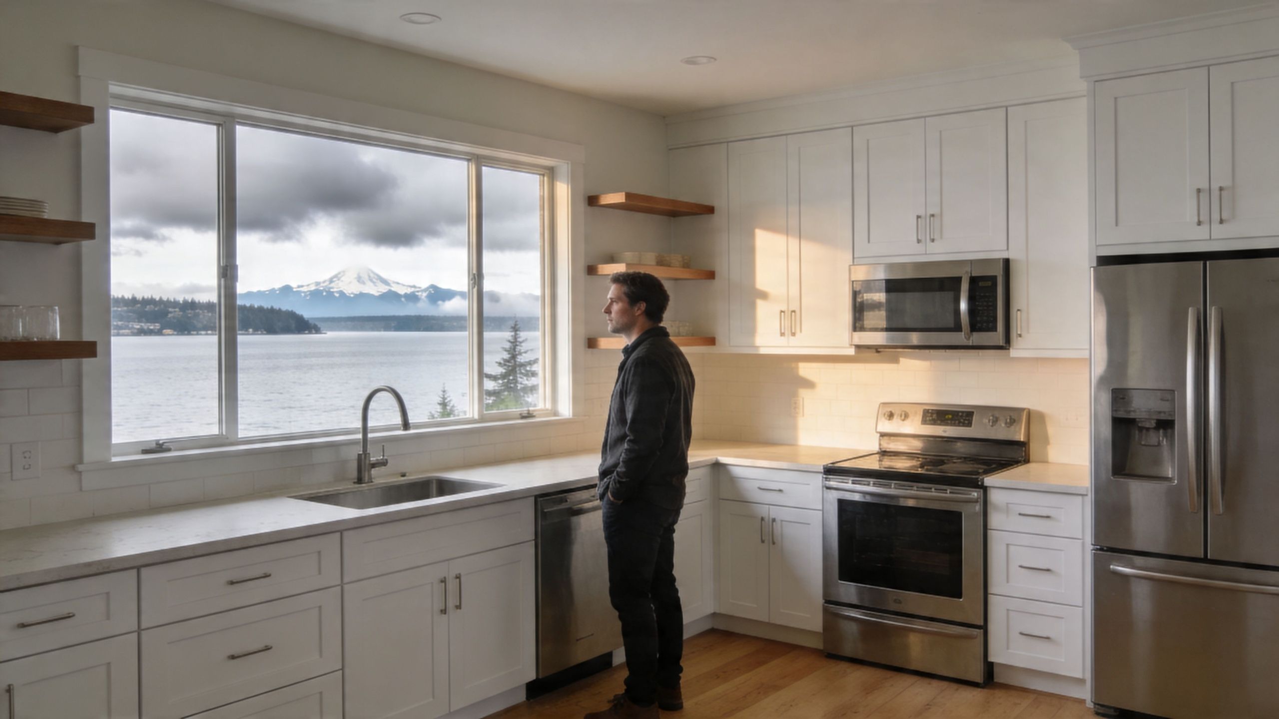
A man looking out of a large kitchen window at a serene lake and mountain view.

A kitchen has to do more than photograph well. In Western Washington, it has to hold up through gray winters, damp air, busy households, and the kind of daily wear that exposes weak materials fast.

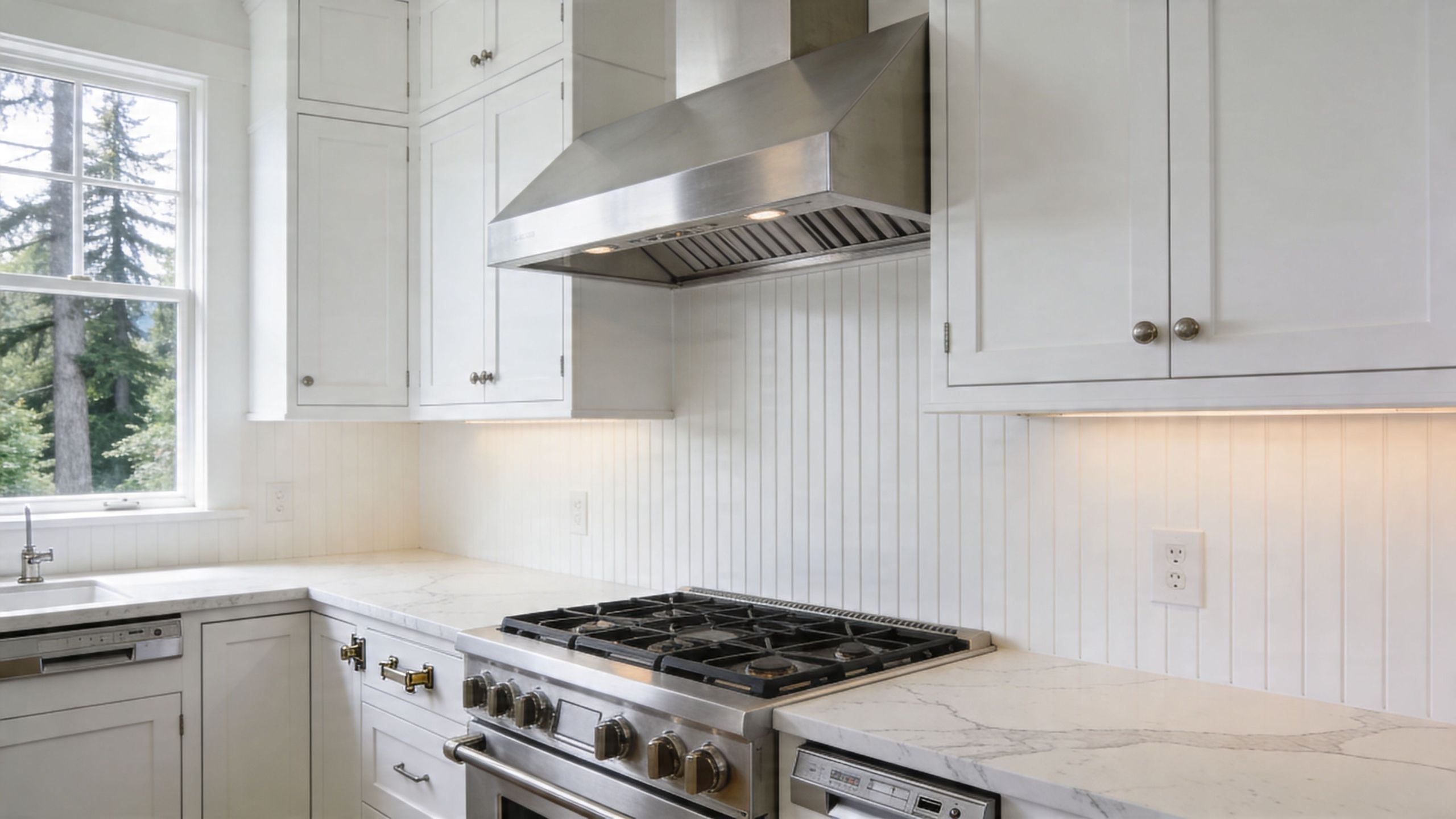
White shaker kitchens make sense because they cover both value and function. They look clean without feeling cold, and they fit older homes in Tacoma just as naturally as newer builds in Seattle or Kent. That flexibility matters when you're remodeling for long-term use, resale, or a tenant improvement that needs broad appeal.

Why buyers and owners keep choosing them

The market data is unusually clear here. According to this white shaker cabinet market summary, homes with white Shaker kitchens sold for about 4.5% more than expected in Zillow’s 2022 data. The same source notes a 2023 Houzz survey found 61% of homeowners upgrading cabinets chose the Shaker style, and white was the most popular color at 43%.

Those numbers line up with what contractors see on the ground. This style reaches a wide audience because it doesn’t box the kitchen into one narrow look.

A white shaker kitchen can lean:

  • Traditional with warm wood floors and polished hardware
  • Coastal with soft blue accents and brushed nickel
  • Modern with slab backsplash panels and simple pulls
  • Transitional with quartz counters and understated lighting

Practical rule: If a finish works with several design directions instead of only one, it usually ages better.

Why it works so well in Puget Sound homes

Natural light in this region changes all year. Many kitchens deal with cloud cover, tree shade, or narrow lot placement. White cabinet faces help bounce available light around the room, so the space feels more open without changing the footprint.

That matters in:

Property type Why white shaker works
Older homes Brightens compact layouts and pairs well with original trim details
Rental upgrades Appeals to a wide range of future occupants
Family homes Keeps the kitchen feeling clean and easy to update over time
Small commercial breakrooms Creates a professional, neutral backdrop

A lot of remodel decisions get harder the more options you compare. This one usually gets easier. White shaker kitchens are a durable design baseline. If the cabinets are built correctly and finished for local conditions, they rarely become the part of the remodel people regret.

The Anatomy of a Classic Shaker Cabinet

White shaker kitchens have lasted because the design starts with restraint. The style traces back to the Shaker religious communities established around 1774, where simplicity, utility, and durable craftsmanship shaped the furniture they built. Those principles still define the look today.

You can see that history in the door itself. Nothing is fussy. Nothing exists just for decoration.

What makes a cabinet door a shaker door

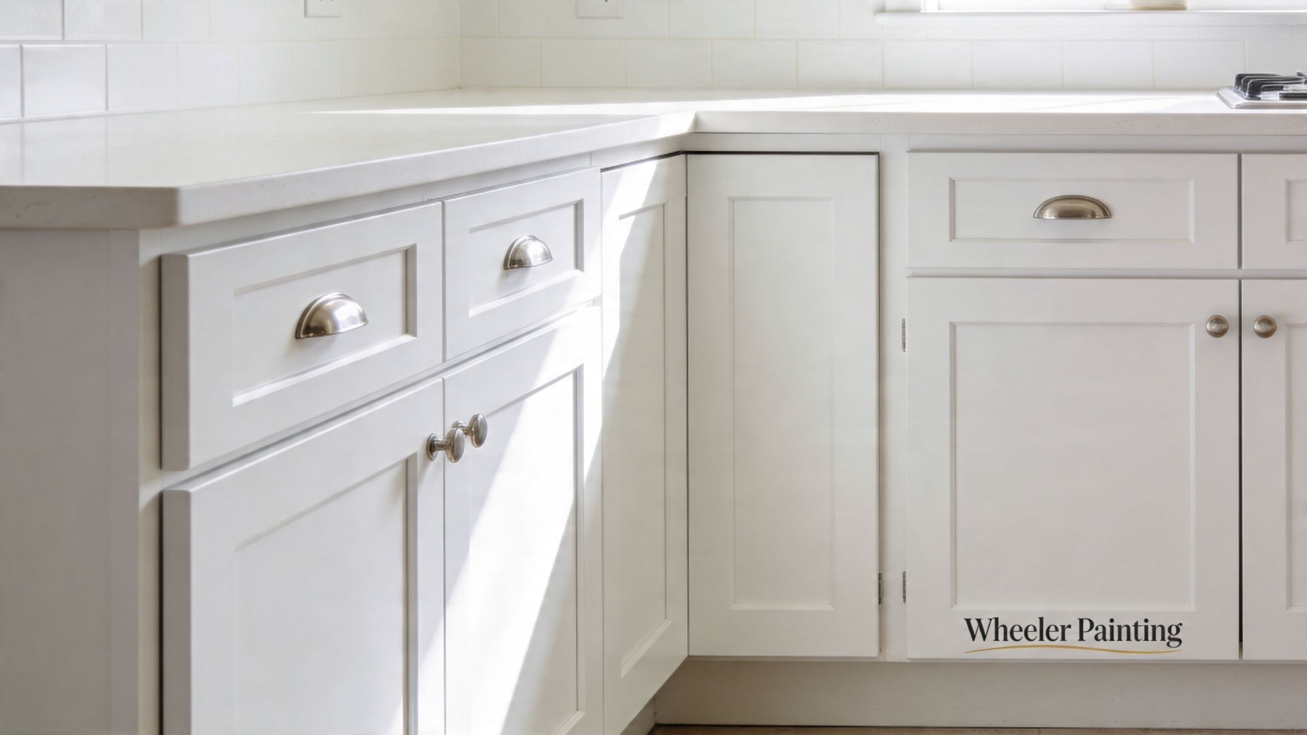
A classic shaker cabinet door has a framed face with a flat recessed center panel. That clean outline is the signature.

The basic construction uses 5-piece cope-and-stick joinery:

  • Two vertical stiles form the sides
  • Two horizontal rails form the top and bottom
  • One recessed flat panel sits in the middle

That five-part build is one reason the style looks balanced. The frame gives the door visual structure, and the flat center keeps it from feeling busy.

Why that simple look matters

Shaker design works because it gives the eye a break. In a kitchen with counters, tile, appliances, fixtures, and lighting all competing for attention, the cabinet face shouldn’t add noise.

That’s also why white is such a strong match. The profile creates enough shadow line to give the door character, while the painted finish keeps the room bright.

The best cabinet styles usually don’t need constant explaining. People understand them right away.

What to inspect before you buy or refinish

Not every shaker cabinet is built to the same standard. Two doors can look similar online and perform very differently after a few wet winters and a few years of use.

Look at these details first:

  1. Door construction
    Ask whether the door is a five-piece frame-and-panel build or a cheaper imitation.

  2. Substrate choice
    Wood species, center panel material, and box construction all affect movement, durability, and refinish potential.

  3. Edge quality
    Crisp, even profiles usually signal better machining and a cleaner paint result.

  4. Finish system
    A proper cabinet coating behaves differently than standard wall paint. It cures harder and stands up better to cleaning.

If you're comparing cabinet wood options, this guide on types of kitchen cabinet woods is a useful place to start. Material choice affects everything that follows, from paint adhesion to moisture response.

The difference between style and structure

Many homeowners focus on the face profile first. That’s natural. But in practice, structure decides whether the kitchen stays attractive.

A good shaker cabinet should feel steady when the door opens. It should close square. The corners should stay tight. The paint film should sit smoothly on the profile without pooling in inside edges.

When those details are right, the style feels effortless. When they’re wrong, white cabinets expose every flaw.

Designing Your Dream Kitchen with Shaker Cabinets

A white shaker kitchen gives you a strong starting point, not a finished answer. The final result depends on the choices around it. Countertops, hardware, backsplash, lighting, and the cabinet finish itself all push the room in a different direction.

A comparison chart illustrating four distinct interior design styles using white shaker cabinets in kitchen spaces.

Start with cabinet construction, not color swatches

Before choosing pulls or tile, make sure the cabinet door is worth finishing. White shaker cabinet doors are typically built with 5-piece cope-and-stick joinery, using two vertical stiles, two horizontal rails, and a recessed flat panel. That frame resists warping and racking, which matters in a working kitchen with regular moisture and temperature shifts, as shown in these white shaker cabinet specifications.

A white finish won’t hide poor construction. It highlights it.

What holds up better

Cabinet option What it looks like What to watch for
Painted wood shaker Crisp, classic, refinishable Shows brush marks or prep flaws if rushed
Thermofoil shaker Smooth and uniform Heat and edge failure can become the weak point if product quality is low
Low-cost imitation shaker Similar from a distance Details often soften, joints age poorly, finish may not last

Choose the right shade of white

Not every white cabinet should be bright white. In Puget Sound homes, light is often cooler and softer. Stark whites can feel flat in some rooms and too harsh in others.

A better approach is to test the cabinet color against:

  • Your flooring tone
  • Countertop undertone
  • Natural light at different times of day
  • Wall color and trim color
  • Appliance finish

Warmer whites and soft off-whites often sit more comfortably in Northwest homes than a pure, clinical white. If the house has warm wood floors or mixed metal finishes, the wrong white can make the whole kitchen feel slightly off.

A white that looks perfect on a sample card can turn gray, yellow, or blue once it meets your actual light.

Countertops change the personality fast

The cabinet style may be fixed, but the counters decide the tone.

Quartz

Quartz is the low-drama option for many households. It gives a consistent look, cleans easily, and works well with white shaker kitchens because it can either blend quietly or add contrast through veining.

Good fit for busy family kitchens and rental-ready upgrades.

Granite

Granite brings more movement and a more natural pattern. Some slabs look great with shaker cabinets. Others overwhelm the simple door style.

If the stone is busy, keep the backsplash restrained.

Butcher block

Butcher block can soften a white kitchen and make it feel warmer. It pairs especially well with farmhouse and coastal versions of the shaker look.

It also asks more of the owner. Wood counters need ongoing care and don't suit every use pattern.

Hardware is small, but it sets the tone

Cabinet hardware changes the room more than is often realized.

  • Black pulls give sharper contrast and a more modern edge.
  • Brushed nickel stays easy to live with and fits most homes.
  • Warm brass adds depth, especially with warmer whites.
  • Small knobs can feel more traditional.
  • Long bar pulls push the kitchen toward a cleaner, updated look.

Keep the choice consistent with the house, not just the mood board. A hardware finish that works in a downtown Seattle condo might feel out of place in a craftsman near Tacoma.

Backsplash and lighting finish the room

Subway tile remains a dependable match because it echoes the shaker cabinet’s straightforward geometry. If you want less grout and a quieter backdrop, a slab backsplash can make the kitchen feel more current.

Lighting deserves the same attention as tile. White cabinets reflect light well, but they also reveal shadows, glare, and uneven color temperature. If you’re planning the room from scratch, this explanation of layered lighting in a kitchen remodel is worth reading. It helps homeowners think through ambient, task, and accent lighting before fixtures are locked in.

A few design combinations that work

For a modern look
Use a softer white shaker door, simple pulls, pale quartz, and minimal backsplash pattern.

For a farmhouse kitchen
Pair white cabinets with wood accents, an apron-front sink, and lighting with a bit of texture.

For transitional homes
Blend shaker cabinets with quartz counters, mixed finishes, and cleaner pendant lighting.

The point isn’t to force one style. It’s to build around a cabinet form that can handle change without looking dated.

Protecting Your Investment in the Puget Sound Climate

Most design articles treat white shaker kitchens like they live in a controlled showroom. They don’t. Kitchens in Seattle, Kent, and Tacoma deal with damp air, cooking moisture, window condensation, and long stretches of overcast light that change how finishes age.

A bright white kitchen with shaker cabinets, marble countertops, stainless steel stove, and a farmhouse window view.

Generic advice misses the local problem. In humid environments like Puget Sound, with average relative humidity of 70% to 80%, standard painted MDF shaker doors can see a failure rate of up to 25% within 5 years, which is why region-specific options such as maple with marine-grade epoxy topcoats and specialty coatings matter, according to this discussion of white shaker cabinet durability in humid climates.

What usually goes wrong first

White finishes make moisture problems easier to spot. That’s a downside and an advantage.

Common trouble areas include:

  • Sink base doors that absorb repeated splashes
  • Cabinets near dishwashers where steam escapes during unloading
  • Upper cabinets by ranges that catch grease and humidity
  • Panels near windows where condensation and light combine
  • Lower toe-kick areas that take mopping moisture and minor impacts

The failure often starts small. A seam swells. A corner edge softens. Paint loses its tight bond around a profile edge. Once that begins, standard touch-up paint doesn’t solve the underlying issue.

What works better in this region

If the goal is long service life, material selection has to come before color.

Better substrate choices

Maple and other stable wood options usually give a stronger long-term base than low-grade MDF in moisture-prone kitchens. They cost more up front, but they reduce the chance of swollen edges and failed corners.

Stronger finish systems

Marine-grade epoxy topcoats and professional cabinet coatings make sense where kitchens see real humidity swings. A cabinet finish needs hardness, adhesion, and moisture resistance. Wall paint doesn't belong on cabinet doors.

One option homeowners compare during repaint projects is cabinet door painting services, especially when the existing boxes are sound and the layout already works.

Better ventilation

A good finish still loses if the room stays wet. Range hoods, bath fans in nearby spaces, and consistent airflow matter more than people think. For homeowners dealing with persistent dampness, this guide on how to avoid mold in your home is a practical companion to any kitchen planning conversation.

Moisture management starts long before you see mold. It starts with material choice, sealing details, and ventilation habits.

Maintenance that actually helps

White shaker kitchens don't need fussy care, but they do need the right care.

Use a soft cloth and a cleaner appropriate for painted cabinetry. Wipe standing water near sinks and dishwashers instead of letting it sit on lower edges. Check caulk lines and sink splashes before they become panel damage.

Avoid these shortcuts:

Bad idea Why it causes problems
Harsh degreasers used constantly They can wear down the finish
Soaking cabinet faces while cleaning Water finds seams and edges
Delaying small paint failures Minor breaches let moisture reach the substrate
Choosing cabinets by appearance alone The finish system may be wrong for local conditions

A white shaker kitchen is still one of the safest cabinet choices for this market. It just performs best when the build and finish match the climate.

Budgeting for Your White Shaker Kitchen Remodel

Kitchen budgets get easier to control when you separate the visible choices from the structural ones. Most overruns happen when owners price a kitchen by cabinet style alone and miss the labor, preparation, finishing, and correction work underneath it.

White shaker kitchens can be built at several budget levels. The trick is knowing which upgrades actually affect performance.

Where the money usually goes

Cabinets are the first major cost driver, but not the only one. Layout changes, electrical updates, plumbing moves, countertop fabrication, tile, flooring transitions, and finish carpentry all shape the final number.

A simple refresh usually costs less because the footprint stays in place. A full remodel costs more because every trade touches the room.

Cabinet tiers in plain terms

  • Stock cabinets
    Faster to source and often good for straightforward layouts. Fewer size options can mean more fillers and less customized storage.

  • Semi-custom cabinets
    A practical middle ground for many homes. Better flexibility on sizing, finish options, and details.

  • Custom cabinets
    Best suited for unusual layouts, high-end design goals, or projects where every inch matters.

Painting vs replacing

If the cabinet boxes are solid and the door profile works, repainting or replacing doors can be smarter than tearing everything out. If the boxes are failing, moisture-damaged, or badly laid out, refinishing won’t fix the underlying problem.

That’s why budgeting should start with an on-site evaluation, not a rough guess from photos.

The cheapest cabinet decision is often the one that avoids paying twice.

Questions that tighten the budget early

Ask these before requesting pricing:

  1. Are you keeping the current layout?
  2. Are the cabinet boxes worth saving?
  3. Do you need new countertops because of sink or appliance changes?
  4. Will lighting, outlets, or ventilation be upgraded?
  5. Are you trying to match the rest of the home, or create a different style?

The answers narrow the scope fast.

Why detailed proposals matter

A useful remodeling proposal should separate materials, labor, prep, finish work, and any likely repair items. Lump-sum numbers are hard to compare because they hide assumptions.

If you want a clearer picture of how remodeling costs are usually organized, this kitchen remodel cost breakdown is a helpful reference. It gives homeowners a better way to read estimates and understand what drives pricing up or down.

A good budget isn’t about chasing the lowest number. It’s about matching the cabinet system, finish quality, and scope of work to how the kitchen will be used.

Local Transformations by Wheeler Painting

A clean, modern white shaker kitchen featuring bright cabinets, metallic hardware, and a smooth countertop surface.

The strongest case for white shaker kitchens usually isn’t a trend report. It’s what happens when an outdated room finally starts working again.

In homes and small commercial spaces between Seattle and Tacoma, the same pattern shows up. The old kitchen or breakroom feels dark, cluttered, and harder to maintain than it should. White shaker cabinetry fixes the visual noise first, then supports better function when the layout and finish details are handled properly.

Kent home with a dated, heavy kitchen

One common remodel starts with dark doors, busy granite, and not enough reflected light. The cabinets may still be usable, but the room feels smaller than it is.

In that kind of Kent project, a white shaker approach works because it strips away the heaviness. Cleaner door profiles, quieter finishes, and updated hardware make the kitchen feel more open without forcing a dramatic architectural change.

The key is discipline. If every surrounding finish competes for attention, the cabinets lose their advantage.

Seattle tenant improvement with a breakroom upgrade

In a Seattle office or small commercial suite, the breakroom often needs to look professional without appearing sterile. White shaker cabinetry lands in that middle ground.

It feels finished. It also gives property managers a cabinet style that future tenants usually accept without asking for immediate changes.

A good commercial application keeps the lines simple, uses durable surfaces, and avoids trendy details that date the space too quickly.

Tacoma kitchen where durability mattered more than novelty

Some Tacoma remodels are less about style experimentation and more about replacing failing materials with something that will last. That’s where white shaker kitchens earn their keep.

When the homeowner wants:

  • a layout that still feels current years from now,
  • cabinet doors that can be maintained or refinished,
  • and finishes that won’t fight the rest of the house,

shaker construction gives a dependable foundation.

A successful remodel doesn’t just look newer. It feels easier to live with every day.

What these local projects usually have in common

The properties differ, but the decisions that lead to a good result are similar:

Good project choice Why it matters
Matching cabinet style to the building The kitchen feels intentional, not imported from another house
Choosing durable coatings The finish stands up better to use and cleaning
Resisting trend overload The room stays relevant longer
Planning for maintenance Small issues are easier to manage before they spread

That’s why white shaker kitchens keep showing up in both residential remodeling and smaller commercial renovation work. They solve real problems cleanly.

Finding the Right Residential Contractor in Washington

The cabinet style matters. The contractor matters more. A white shaker kitchen can fail because of poor prep, vague scope, weak coordination, or the wrong finish system just as easily as it can fail because of cheap materials.

Hiring well protects the whole investment.

What to verify before signing anything

Start with the basics, then get more specific.

  • License and insurance
    Confirm the contractor is properly credentialed for the work being done in Washington.

  • Itemized proposal
    Ask for a written scope that separates demolition, prep, carpentry, painting or finishing, installation, and cleanup.

  • Local references
    Talk to clients in Seattle, Kent, Tacoma, or nearby communities where weather and housing conditions are similar to yours.

  • Communication process
    Ask who you’ll hear from during the project, how changes are documented, and how scheduling updates are handled.

Questions worth asking in a kitchen consultation

Not every contractor is comfortable answering detailed finish questions. That’s useful information.

Ask things like:

  1. What cabinet material do you recommend for a damp kitchen?
  2. How will you protect areas around the sink, range, and dishwasher?
  3. What surface prep is included before painting or refinishing?
  4. How do you handle hidden damage if it appears after demolition?
  5. Who coordinates the different trades?

A solid contractor should be able to answer clearly without hiding behind vague language.

Warning signs to take seriously

Shortcuts usually show up in the estimate before they show up in the work.

Watch for:

  • Unclear allowances that leave major selections undefined
  • Verbal promises that aren’t included in writing
  • One-number bids with no scope detail
  • Rushed timelines that don’t match the amount of work
  • No discussion of moisture, ventilation, or substrate condition

A kitchen remodel is easier when one accountable team manages the moving parts. That matters for homeowners, and it matters just as much for property managers handling tenant improvements or smaller facility upgrades.

Start Your Kitchen Transformation with Confidence

White shaker kitchens stay relevant because they solve more than style. They brighten Northwest homes, fit a wide range of properties, and give owners a cabinet design that’s easier to maintain and easier to live with over time. In Puget Sound, the difference comes down to construction quality, finish selection, and climate-aware planning.

If you’re weighing a kitchen remodel in Seattle, Tacoma, Kent, or the communities between them, start with a practical conversation and a clear scope. Good results come from good decisions early.


If you're planning a residential remodel, cabinet repaint, or a smaller commercial renovation, Wheeler Painting & Restoration Services can help you review the condition of your existing kitchen, talk through material and finish options, and build a clear proposal for the work.

Top Outside Brick Colors for Seattle & Tacoma Homes

You’re probably looking at your brick house in Seattle, Tacoma, Kent, or somewhere in between and thinking the same thing a lot of homeowners think. The brick is solid. The house has good bones. But the color feels stuck in another decade.

That’s where people get hung up. Outside brick colors look simple until you have to choose one for your own home. Then every sample starts to look different in the morning than it does in the afternoon, and the gray Northwest sky changes everything again. Add moss, moisture, and trim that may already be fighting the brick, and the decision gets heavy fast.

The good news is that brick color doesn’t have to be a guessing game. If you understand what kind of brick you have, what undertones are sitting in it, and how Puget Sound weather affects the finish, you can make a choice that looks right and lasts.

Your Home’s Brick Exterior A Fresh Start

A lot of homeowners reach this point the same way. They replace the roof, update the landscaping, repaint the trim, and then the brick suddenly stands out for the wrong reasons. What looked “fine” before now looks too orange, too pink, too blotchy, or just too tired against the rest of the house.

That’s especially common in Western Washington. Our light is softer than what you see in national design photos. A brick color that looks warm and balanced online can turn muddy under overcast skies. A color that seems clean and modern on a sunny day can feel flat for most of the year.

I’ve seen homeowners pause for months because they’re afraid of making an expensive mistake. That caution makes sense. Brick is a major visual anchor on the exterior. Once you change it, every other element responds to it. Trim, siding, front door, roofing, and landscaping all start reading differently.

“If the brick feels off, the whole house feels off, even when everything else is in good shape.”

The right outside brick colors don’t just modernize a home. They settle it down. They make the roof make sense. They make the trim feel intentional. They help the house look like it belongs in its setting, not like it was assembled from five separate decisions.

Understanding Your Brick Foundation

Start at the wall, not the color fan deck. On Puget Sound homes, the condition and texture of the brick often matter just as much as the color you put on it, because damp air, moss, algae, and flat winter light change how that surface reads from the street.

A split-screen comparison showing modern smooth extruded bricks next to weathered, textured older bricks in sunlight.

I see this all the time in Seattle, Tacoma, and the older neighborhoods between them. Two houses can use a similar brick color, but the one with rougher, more porous faces looks darker, dirtier, and more uneven by February. The smoother brick beside it still reads fairly clean. That difference is not your imagination. Surface texture holds moisture differently, and our climate makes that show.

Shape tells you what kind of update will read well

Older brick often has softer edges, small size variation, and a handmade look. It brings depth and character, but it also exaggerates shifts in tone from brick to brick. If you coat or stain that kind of wall, the result usually looks best with some softness in the final color rather than a flat, stark finish.

Extruded brick is more precise. The corners are cleaner, the faces are more uniform, and the wall usually reads more consistent after staining or coating. That can work well for homeowners who want a sharper, more current look.

Mixed brick is where people get into trouble. An addition may be close in color but different in texture, density, or mortar profile. Under bright sun you might barely notice it. Under overcast Western Washington light, the mismatch often stands out more.

Texture affects maintenance, not just appearance

A rough, open-faced brick collects more biological growth. North-facing walls and shaded entries are the usual problem spots. If the brick already gets green in the wet season, a very light color can look tired faster unless the prep work is thorough and the product is right for masonry.

Dense, smoother brick usually stays visually cleaner longer, but it can make color look stronger than expected. I have seen homeowners sample a warm greige on a rough historic brick and get a soft, settled result. That same color on a smooth addition can read colder and more modern than they intended.

The Brick Industry Association explains common brick textures such as wire-cut, molded, and smooth finishes, and those categories are useful because each one reflects light and shows variation differently in its guide to brick textures.

What to check before choosing a color

Walk the house in dry weather and again after a few wet days. You are looking for how the brick behaves, not just what color it is.

  • Surface absorption: Does the face darken quickly after rain, or stay fairly even?
  • Growth patterns: Are there green or black areas near grade, under eaves, or on the north side?
  • Edge condition: Are the brick corners crisp, or softened by age and wear?
  • Existing variation: Does the wall already have a lot of movement, or is it visually uniform?
  • Patch history: Do repairs, additions, or replaced units already stand out?

Field rule: Test color only after you understand where the wall stays wet, where it stains, and where texture changes from one elevation to another.

That matters on homes that borrow from warehouse or loft styling, where homeowners like the look of exposed brick in industrial design. Exterior brick has a harder job. It has to handle rain, organic growth, and low-angle gray light for much of the year. A good color choice starts with the brick you have, not the brick in a sunny photo from somewhere drier.

The Science and Art of Brick Color

A brick wall can read one way at noon in July and another way after a week of October rain. That matters in Puget Sound, where overcast light cools color down and moisture brings out undertones you will miss in a bright showroom sample.

Brick gets its base color from the clay, the minerals in that clay, and how the unit was fired. Iron-rich clay usually fires into reds, russets, and brown-reds. More lime can push the result lighter, sometimes into buff or yellow ranges. The firing process changes the finish too. The Brick Industry Association’s overview of brick color explains how raw materials and kiln conditions affect the final look.

Why the same brick looks different on different houses

Age is part of it. Weather is the other part.

Older brick often has more visible variation because manufacturing was less uniform, but I also see homeowners misread brick because our climate keeps changing the wall surface. A damp north elevation can look cooler and darker than the south side of the same house. Moss, algae, and shaded mortar joints shift the whole color read. On a clear, dry day, the brick may look warmer again.

That is why color decisions made from one photo usually go sideways.

How to read undertones in real conditions

Start outside, not at the paint counter. Look at the brick in morning light, afternoon light, and after rain. Puget Sound skies flatten contrast, so subtle undertones show up more than they would in a sunnier climate.

Use this quick field check:

  • Warm brick shows orange, cinnamon, rust, or pink cast.
  • Cool brick shows charcoal, muted brown, violet-brown, or soft gray.
  • Mixed brick can swing warm or cool depending on the mortar, roof, and nearby trim color.

Set your samples against both the brick and the mortar. Mortar is often cooler than the brick itself, and that can make a trim color look cleaner or dirtier than expected. If you want a broader framework for coordinating those pieces, this guide on how to choose exterior paint colors is a useful next step.

Good exterior color work respects variation

Brick has depth because it is not flat or uniform. That is part of the appeal people respond to with exposed brick in industrial design, and it matters even more outdoors where moisture and cloud cover keep changing the surface.

On exterior brick, the goal is not to force a perfect single note. The goal is to choose colors that stay believable with the brick’s built-in range. If the wall carries warmth, trim that is too icy can feel sharp and disconnected. If the brick reads as cool and ashy for much of the year, creamy beige can look muddy under gray skies.

The best results come from working with the brick you have, in the light and weather your house gets.

Perfect Palettes for Puget Sound Homes

National color advice often misses the local issue that matters most. Puget Sound light is cool, filtered, and often overcast. A palette that looks crisp in Arizona or Southern California can look drained out here.

A guide listing five tips for choosing brick colors that harmonize with Pacific Northwest lighting conditions.

Colors that usually work well here

Muted, grounded combinations tend to hold up visually in Seattle, Kent, and Tacoma. They feel settled under gray skies and still look good when the sun does come out.

Good local pairings often include:

  • Red brick with charcoal trim: This gives traditional brick a cleaner frame without making it feel harsh.
  • Brown-red brick with deep forest green accents: Strong with mature landscaping and lots of evergreen backdrop.
  • Gray-washed brick with black details: More contemporary, especially on mid-century and simple ranch profiles.
  • Softened brick with taupe or warm greige trim: Helpful when the goal is to reduce visual noise, not create contrast.

The 60 30 10 rule still helps

For exterior color balance, use the brick as the main visual mass. One verified guideline notes that warm orange-red brick pairs well with taupe or beige paints when the 60/30/10 rule is respected, with brick carrying the dominant share of the palette from this brick color combination discussion.

On a house, that often looks like this:

  • 60 percent main field: the brick itself
  • 30 percent secondary support: siding, large trim areas, garage doors
  • 10 percent accents: front door, shutters, metal details, lighting, or fascia contrast

That keeps the house from looking chopped up.

Rain changes the maintenance side of color

In our region, appearance and upkeep are tied together. In rainy areas like Puget Sound, which see 150+ rainy days per year, regional contractor data shows that darker bricks can reduce visible algae growth and cleaning frequency by up to 40% compared with lighter brick, which shows efflorescence and mildew more quickly from this Pacific Northwest exterior color discussion.

That doesn’t mean every home should go dark. It does mean light cream or pale buff brick needs a more realistic maintenance conversation in Western Washington.

Homes near heavy tree cover usually tolerate mid-tone and darker brick finishes better than very light ones.

What works for common problem bricks

A lot of homeowners aren’t starting with ideal brick. They’re starting with dated brick.

If the existing brick reads too orange, avoid trying to “correct” it with bright white trim alone. That usually exaggerates the orange. A muted charcoal, earthy green, or soft greige nearby often calms it down better.

If the brick has pink or salmon undertones, black accents can sharpen it, but they can also make the pink more obvious if the field color is left untouched. In those cases, a more blended, toned-down finish usually looks more natural.

For homeowners sorting through paint relationships around the whole exterior, Wheeler has a useful guide on how to choose exterior paint colors that complements brick decisions well.

Painted Versus Stained Brick A Durable Choice

A lot of Puget Sound homeowners reach this point after one wet winter too many. The brick looks tired, the color feels dated, and the first instinct is to paint it. Before choosing a finish, it helps to know whether you need full coverage or a treatment that still lets the masonry breathe.

That difference matters here. Our long damp seasons, shaded walls, and slow drying conditions are hard on the wrong coating system.

What paint does

Paint forms a film over the brick. It gives you the biggest visual reset and can cover uneven color, past patchwork, or mismatched additions better than stain.

It also changes the maintenance pattern.

On a rainy Northwest exterior, any coating that traps moisture can become the spot where peeling, blistering, or edge failure starts first, especially on walls that get little sun. Once painted brick begins to fail, repairs usually involve more prep, more scraping, and more touch-up work than homeowners expected at the start.

What stain does

Brick stain soaks into the masonry instead of sitting on top of it. That usually leaves more of the original texture, variation, and character visible, which is why stained brick tends to look more natural from the street.

For homes in the Puget Sound region, that breathable finish is often the better long-term fit on sound, uncoated brick. It handles moisture movement more gracefully, and it is less likely to announce every future maintenance issue with peeling edges.

Side by side comparison

Feature Painting Brick Staining Brick
Appearance More opaque, larger color change More natural, keeps brick character visible
Texture visibility Can soften texture and visual variation Usually preserves both
Moisture behavior Surface film needs careful product selection and prep in wet conditions Works with the masonry instead of covering it with a film
Maintenance pattern More likely to need scraping, spot repair, and repainting over time Usually easier to maintain when the brick is a good stain candidate
Best use case Major color reset, mismatched areas, previously painted brick Tonal correction, muting orange, deepening color, updating without flattening

When paint makes sense

Paint has a place. I recommend it when the brick has already been painted, when different additions need to read as one exterior, or when the design goal is an opaque finish that stain cannot deliver.

It can also be the practical choice when the surface history has already pushed the house into a coating system. In that case, the job is less about preserving raw brick and more about managing that system correctly.

When stain is usually the better fit

Stain is often the smarter option when the brick is bare, sound, and worth keeping visible.

That usually includes:

  • Orange brick that needs to be toned down, not hidden
  • Red brick that needs more depth
  • Homes with good original masonry texture
  • Owners who want lower-fuss maintenance in a damp climate

Practical rule: If you like the texture and dislike the tone, stain is usually the first option to examine.

The catch is that not every brick can be stained well. Some brick is too dense, too damaged, or already sealed in a way that limits absorption. That is why surface testing and prep matter as much as color selection.

Wheeler Painting & Restoration Services handles exterior coatings, sealants, and waterproofing as part of that broader brick decision. On houses near tree cover, salt air, or persistent shade, those details often matter more than the color chip.

If you are weighing brick work against the rest of the exterior scope, this guide on the average cost of painting an exterior of a house helps put the budget in context.

Testing Colors Before You Commit

Small swatches lie. They’re useful for narrowing choices, but they’re not enough to make the final call on outside brick colors.

Brick has texture, shadow lines, mortar joints, and natural variation. All of that changes what a color does at scale.

A person testing paint color samples on an exterior brick wall of a house.

How to test the right way

Use larger samples directly on the house. A test area should be big enough to read from the street, not just from arm’s length.

A solid process looks like this:

  1. Choose more than one wall. Front elevation only isn’t enough if one side gets more light than another.
  2. Place samples near fixed elements. Test next to roofing, trim, and stone that aren’t changing.
  3. Watch them in different weather. Morning, afternoon, overcast, and the end of day all matter here.
  4. Stand in the street. Curb appeal decisions happen from distance, not six inches away.

What homeowners miss most often

They sample color but ignore the existing surface condition. If old coating is peeling or the masonry needs prep, the test won’t tell the full story.

A proper evaluation may also uncover old paint that has to come off before a new system is applied. If that’s part of your project, Wheeler’s overview on how to remove old paint is a helpful starting point.

Give a sample a few days before judging it. In Seattle weather, one cloudy afternoon can make a color seem flatter than it really is.

Wheeler's Portfolio Local Brick Transformations

A brick project in Puget Sound usually starts with a house that looks fine on a sunny listing photo and tired for most of the year in real weather. After a wet winter, the true issues show up. Orange brick turns louder under gray skies, shaded walls collect algae, and old repairs stand out more than the owner ever noticed before.

A split image showing a weathered red brick house compared to a restored grey painted brick home.

Tacoma rambler with strong orange cast

This mid-century rambler had solid brick and a good roofline, but the exterior read too warm for the rest of the updates. In our overcast light, that orange cast felt stronger, not softer. The owners wanted the brick to stay recognizable as brick, so a full paint system was the wrong fit.

A charcoal-leaning stain pulled the color back into balance without covering the masonry texture. That matters in wet climates. Once brick loses its natural variation under a heavy coating, every bit of moss, splash-back, and grime tends to show faster on the surface.

Kent commercial frontage with mismatched additions

This frontage had two problems at once. The original brick and the later addition did not belong together visually, and the owner needed a finish tenants could live with for years.

A breathable coating brought the elevations closer without forcing everything into one flat color. That trade-off made sense here. On a commercial building, perfect visual consistency matters less than a finish that handles moisture, cleans up well, and does not create constant maintenance calls.

Seattle traditional home that needed restraint

Some projects improve because the brick changes. Others improve because the surrounding colors stop fighting it.

This Seattle home had brick with good depth already, especially in the softer light we get for much of the year. The problem was the trim, accent colors, and exterior details pulling attention away from it. Instead of chasing a trend, the better move was to quiet the supporting palette. Cleaner trim colors and darker accents gave the brick room to do its job.

That is a common call around here. Under cloud cover, subtle brick usually ages better than high-contrast color schemes that look sharp for a month and harsh for the next ten years.

Why project photos help

Real project photos are useful because they show what brick looks like after weather, repairs, and daily life, not just right after installation. A strong portfolio of completed projects gives homeowners a better read on how stain, paint, mortar, and trim settle together on finished homes and buildings.

That matters more in Puget Sound than in drier regions. You need to see how a color holds up on north-facing walls, under deep eaves, and through long stretches of damp gray weather. The best brick transformations usually look settled, durable, and right for the house. Not flashy.

Frequently Asked Questions About Brick Exteriors

Is staining only for houses, or does it work for commercial buildings too

It works well for both when the masonry is a good candidate. That’s one reason more property managers are asking about it.

For commercial properties, stained brick is an emerging sustainable option. Verified data states that its use grew 35% in 2025-2026, offering 10+ year durability, 25% lower reapplication costs, and over 70% lower VOCs than traditional paint, making it a practical fit for tenant improvements and facility maintenance from this commercial brick color guidance.

Is painting ever the better option

Yes. If the brick has already been painted, if the facade is highly mismatched, or if the goal is a complete visual reset, paint can be the right tool. The key is going in with realistic expectations about prep and long-term maintenance.

How long does a brick exterior project take

That depends on condition more than color. Clean brick in sound shape moves much faster than brick that needs repairs, coating removal, moisture work, or careful masking around detailed trim.

Weather also matters in Western Washington. Scheduling needs to account for surface dryness and cure conditions, not just crew availability.

What color mistakes should homeowners avoid

The most common ones are:

  • Choosing from online photos only: Screen images don’t match local light.
  • Ignoring undertones: Brick that looks “neutral” can still clash hard with the wrong trim.
  • Going too bright in gray weather: Very light finishes can feel washed out here.
  • Thinking only about curb appeal: Maintenance matters, especially with moisture and tree cover.

Should I update the brick or the trim first

Usually, decide the brick direction first. Brick covers more area, carries more visual weight, and is harder to change later. Once that anchor is set, trim and accent colors fall into place much more easily.


If you’re weighing outside brick colors for a home or commercial property in Seattle, Tacoma, Kent, or the communities in between, Wheeler Painting & Restoration Services can help you evaluate the masonry, test practical options, and choose a finish that makes sense for Puget Sound weather as well as the look you want.

How to Fix Cracks in Drywall: A Puget Sound Guide

A wall crack has a way of pulling your eye every time you walk past it. One day the wall looks fine. The next day there is a thin line over a doorway, a split in a corner, or a diagonal crack near a window that makes you wonder whether this is a paint issue, a drywall issue, or something bigger.

Most drywall cracks are fixable. The key is not treating every crack the same way.

A small seam crack in a hallway often needs a careful, methodical repair. A wider crack, a recurring crack, or one paired with staining or sticking doors needs a different response. In Kent, Seattle, Tacoma, and the communities in between, that distinction matters because Pacific Northwest buildings move, absorb moisture, dry out, and sometimes shift just enough to reopen a weak repair.

That Unsettling Crack in the Wall and What to Do Next

The most common call starts the same way. A homeowner notices a crack that was not there a few months ago, usually in a living room corner, over a door, or along a ceiling seam. Property managers often spot the same thing during a unit turn or after a tenant mentions “a line in the wall that keeps coming back.”

That reaction is normal. Drywall cracks look dramatic even when the repair is straightforward.

The first job is to identify what kind of crack you are looking at. Some are hairline stress cracks caused by minor movement, seasonal expansion, or an old seam that was not reinforced well enough the first time. Others point to a larger problem, especially if the crack is wide, diagonal, or paired with moisture staining.

A good repair starts with restraint. Do not smear spackle over a crack just to make it disappear for the week. That is the repair equivalent of painting over rot. It may look better briefly, but it does not hold.

Practical takeaway: If the crack is small and stable, a careful repair can last. If it is growing, recurring, or tied to movement, the wall needs diagnosis before patching.

People searching for how to fix cracks in drywall usually want one clear answer. The solution is simpler than it seems. Match the repair to the cause, use the right materials, and take the finish work seriously. That is how you get a repair that blends in and stays put.

Why Drywall Cracks in Puget Sound Homes and Buildings

In the Seattle to Tacoma corridor, drywall cracks are not just about age. Local conditions play a big role in how walls move and why repairs fail.

A large diagonal crack in a wall near a window with visible water damage stains

Movement is normal, but not all movement is harmless

Washington sees over 1,000 earthquakes annually, and those minor shifts contribute to drywall cracking in 20 to 30 percent of older homes in seismic areas of Western Washington, according to the verified data tied to the Mr. Handyman drywall crack guidance. Many standard DIY articles skip this point. They show how to fill a crack, but not why the crack returned after the last repair.

That matters in older homes around Kent, Seattle, and Tacoma. A recurring crack may reflect ongoing settling, light seismic movement, or repeated stress around openings like doors and windows.

Moisture changes the equation

The Pacific Northwest adds another layer. Framing takes on moisture and dries back out. That movement may be subtle, but drywall seams and corners are often where it shows up first. A crack near a window or exterior wall can come from normal expansion and contraction, but it can also be tied to water intrusion or trapped moisture.

If you are also seeing paint bubbling, staining, or soft drywall, it is smart to look at moisture first. This guide on what causes paint to bubble on walls is useful when a crack and a finish failure are showing up in the same area.

The crack pattern tells you a lot

Different crack shapes suggest different causes:

  • Thin straight seam cracks often point to tape failure, poor prior repairs, or ordinary movement at a joint.
  • Inside corner cracks usually come from seasonal movement where two planes meet.
  • Diagonal cracks near doors or windows deserve closer attention because openings concentrate stress.
  • Cracks with staining or soft spots suggest moisture, not just movement.
  • Cracks that reopen after repair usually mean the wall is still moving or the original repair had weak prep.

Contractor’s rule of thumb: The more a crack reflects movement, the less likely a simple surface fill will last.

Pros sometimes use crack gauges or flexible backer methods in movement-prone situations because the underlying issue is not the surface line. The core issue is whether the structure behind the finish is still shifting. That is why a durable repair in Puget Sound often starts with diagnosis, not mud.

Gathering Your Tools and Materials for a Flawless Repair

If you want a repair that lasts, the materials matter as much as the technique. A lot of failed drywall repairs happen because the wrong product gets used for the wrong job.

An assortment of essential drywall repair tools including compound, a trowel, tape, and a sanding block.

What belongs in your repair kit

Keep the list simple and job-specific:

  • Utility knife for opening the crack and trimming loose paper.
  • 6-inch drywall knife for filling and first coats.
  • 10-inch or 12-inch knife for feathering wider finish coats.
  • Setting-type joint compound for the crack repair.
  • Fiberglass mesh tape for reinforcing movement-prone cracks.
  • Sanding sponge or fine sanding block for smoothing between coats.
  • Vacuum or brush for dust removal.
  • Primer before paint.
  • Matching paint and texture materials if the wall is not smooth.

What works better in Western Washington

Verified data shows hairline cracks often recur in 60 to 70 percent of DIY repairs that do not use fiberglass mesh reinforcement, and pros get about 95 percent permanence using mesh tape over cleaned fissures, versus 40 percent for spackle alone in movement-prone conditions, as summarized in the verified data tied to the CertaPro drywall cracking article.

That lines up with what contractors see in damp climates. Spackle is fine for tiny nail holes. It is a weak choice for an active crack. Mesh tape and proper compound give the repair some structure.

A few material choices make a big difference

Here is a quick comparison:

Repair item Better use Why it matters
Spackle Tiny dings and nail holes Sands easily, but not ideal for moving cracks
Setting-type compound Crack filling and base coats Harder, stronger, better bond
Fiberglass mesh tape Stress cracks Adds reinforcement and flex
Paper tape Flat seams on broader patch work Good for controlled seam finishing
Primer Before paint Seals the repair so paint finishes evenly

If you are patching raw drywall or fresh compound, primer is not optional. This page on whether you have to prime sheetrock before painting covers why finish paint alone will not hide a repair properly.

One practical option for homeowners and property managers who want the repair handled from patch through finish is Wheeler Painting & Restoration Services, which includes drywall repair and paint prep as part of broader residential and commercial work in the area.

A Step-By-Step Method for Fixing Hairline Cracks

Hairline cracks are often the focus of quick fixes with a swipe of filler. That is also why so many come back.

For this type of damage, the V-notch method is the better approach. Verified data says this method can achieve 95%+ long-term success rates when done correctly, and skipping the cleaning step causes 40% of repair failures from poor bonding, based on the verified data tied to the drywall crack repair guide from Drywall Repair Utah.

Use this graphic as a quick visual reference.

Infographic

Open the crack on purpose

This feels backward, but it is necessary. Use a sharp utility knife to widen the crack into a shallow V-groove. The verified method calls for a V-notch that is shallow and narrow.

Why do this? Because compound needs something to grip. If you smear mud over a closed hairline crack, you are only bridging the surface.

If the crack ends in a small spidered point, round that end slightly with the knife. That helps reduce future splitting at the tip.

Clean out all the dust

Vacuum the groove thoroughly or brush it out and then vacuum it. Dust inside the groove weakens the bond.

Tip: Most surface repairs fail at the prep stage, not the paint stage. Clean drywall dust out before compound goes in.

This is a good point to stop and inspect the crack. If you can press on the wall and feel movement, or if the crack is wider than it first looked, move to a more structural repair approach.

Fill the groove with setting compound

Mix a setting-type joint compound to a workable consistency. Press it firmly into the V-groove with a 6-inch knife and overfill it slightly. Firm pressure matters because shallow filling can leave air pockets.

The goal is not a pretty first coat. The goal is a solid fill.

A video walkthrough can help if you have not done this kind of knife work before.

Reinforce with fiberglass mesh tape

Lay 2-inch fiberglass mesh tape over the wet compound. The verified data notes that pros prefer mesh for cracks because it offers increased crack resistance in movement-prone conditions.

Keep the tape centered. Extend it slightly beyond each end of the crack. Press it down evenly so it beds into the compound without bubbles.

Build the repair in thin coats

After the base sets, add finish coats in widening passes:

  1. First skim coat over tape, about 6 to 8 inches wide.
  2. Second coat after drying, around 10 to 12 inches wide.
  3. Final feather coat out to about 14 to 16 inches.

Each coat should be thin. The wider knife comes into play on the second and third coats because it lets you blend the repair into the wall without leaving a hump.

Sand, prime, and paint

Sand lightly between coats with a fine sanding sponge or 120 to 220 grit abrasive. You are smoothing ridges, not grinding the repair down.

Prime the patched area before painting. Then apply your finish paint in a way that blends sheen as well as color. On many walls, the paint match is where DIY work starts to stand out.

If the wall has orange peel, knockdown, or another texture, duplicate that texture before final paint. A flat patch on a textured wall is still obvious, even with a perfect color match.

How to Tackle Large, Recurring, and Corner Cracks

Some cracks need more than tape and compound. If the crack is wider, keeps reopening, or has damaged board edges, the stronger fix is to remove the weak section and install a proper patch.

A construction worker applying adhesive mesh tape to repair a large crack on a white interior wall.

When a patch beats a fill

Verified data shows that for large cracks greater than 1/8 inch, the backing-plus-patch method yields 90 to 98 percent durability, and 65 percent of large patch repairs fail within a year without backing because the area flexes, based on the verified data tied to the Nations Drywall repair guide.

That is why big cracks should be treated like damaged drywall, not like a cosmetic seam.

The backing-plus-patch method

This is the sequence that holds up:

  1. Square the damage
    Mark clean lines around the crack and cut out the damaged section. Clean edges are easier to patch and finish.

  2. Install backing
    Slip 1×3 furring strips behind the drywall and fasten them so the new patch has solid support.

  3. Cut the patch to fit
    Match the drywall thickness and trim the patch for a tight fit. Large gaps make finishing harder and weaker.

  4. Secure the patch
    Fasten the new piece to the backing, keeping screws set properly without tearing the face paper.

  5. Tape and mud the seams
    Use tape at the seams, then build out finish coats in wider passes.

  6. Sand, prime, and paint
    Finish the patch like the surrounding wall, including texture if needed.

Why recurring cracks need a different mindset

If a crack has already been “fixed” once or twice, the wall is telling you something. Either the first repair had poor prep, or the assembly is still moving.

That is where trade-offs become real:

  • Fast cosmetic fill looks acceptable for a short time.
  • Cut-out and stabilization takes longer, creates more dust, and usually solves the right problem.

For owners who like to compare methods before deciding, this overview of DIY Gyprock repairs is a helpful outside resource because it shows the broader logic behind patching damaged wallboard instead of only surface filling.

Inside corner cracks need cleaner technique

Corners are their own category. They move more than field areas of a wall, and they are easy to overbuild with too much mud.

For inside corners:

  • Remove loose material first.
  • Re-establish the corner with tape, not just compound.
  • Keep coats thin and symmetrical on both sides.
  • Use a corner knife if you have one, or work each face carefully with a smaller drywall knife.

Key point: A bulky corner repair catches light. Even if it does not crack again, it can still look patched forever.

This comes up often in offices, multifamily properties, and tenant improvement work because corners take abuse from traffic, carts, furniture moves, and repeated repaint cycles. In those settings, durability matters as much as appearance.

When to Skip the DIY and Call a Drywall Contractor

Some cracks are repair projects. Others are warning signs.

The clearest line is width. Verified data states that cracks wider than 1/4 inch are a critical benchmark for potential structural problems and should get professional investigation rather than patching. That same verified data says superficial fixes often fail and reappear within a year, and that ignoring these issues in Puget Sound can lead to repairs in the $5,000 to $15,000 range, compared with $200 to $500 for early professional intervention. It also notes that 80% of recurring cracks come from unaddressed foundational issues, based on the verified data tied to the Proper Painting drywall crack article.

Red flags that move this out of DIY territory

Watch for these signs:

  • Crack width over 1/4 inch
  • Diagonal cracking above doors or windows
  • A crack that reopens after you repair it
  • Moisture stains, bubbling paint, or soft drywall
  • Doors or windows that start sticking near the same area
  • Long horizontal cracking or multiple cracks in one zone

A patch over any of those conditions may look tidy for a while, but it does not solve the cause.

Why paying for diagnosis is usually cheaper

Homeowners sometimes hesitate to make the call because they assume any professional visit means a major project. Usually, the opposite is true. Early evaluation can separate a manageable drywall issue from movement or moisture that will damage more finishes if left alone.

If water is part of the picture, this page on how to repair water damaged drywall is worth reviewing because wet drywall follows a different repair path than dry, stable board.

If you are hiring help and want a practical checklist first, these top questions to ask before hiring a contractor are useful for vetting scope, communication, and who will handle the work.

A simple decision rule

Try the repair yourself only if the crack is minor, stable, dry, and clearly cosmetic. Call a drywall contractor when the crack suggests movement, moisture, or repeated failure.

That is not about selling fear. It is about avoiding the common mistake of treating a structural or moisture symptom like a paint prep issue.

Frequently Asked Questions About Drywall Repair

Can I just paint over a crack

No. Paint does not bridge movement well enough to create a lasting repair. At best, the crack line telegraphs through. At worst, it opens again quickly and leaves a sharper visible line than before.

Is matching texture harder than filling the crack

Usually, yes. On smooth walls, the repair depends on flat knife work and good sanding. On textured walls, you also have to duplicate the surrounding pattern closely enough that the patch does not flash in side light.

What if the crack keeps coming back in the same spot

That usually points to ongoing movement or a weak prior repair. A recurring crack needs a different approach than a first-time cosmetic fix. Depending on the crack, that may mean reinforcement, a cut-out patch, or evaluation of the structure or moisture conditions behind it.

How disruptive is professional drywall repair

For a small crack repair, disruption is usually limited to dust control, drying time, and paint curing. Larger patching work takes more coordination, especially in occupied homes, offices, or tenant spaces, but it is still manageable when the work area is protected properly.

Will the repaired area always show

Not necessarily. A well-executed repair can blend very well. The places where DIY work usually gives itself away are ridges, poor feathering, texture mismatch, and paint sheen mismatch.

Is it worth repairing a small crack before repainting

Yes. Small cracks rarely look smaller after fresh paint. New paint often makes a weak repair more noticeable because the sheen becomes uniform everywhere except at the flaw.


If you have a crack that keeps returning, a damaged seam, or a wall issue tied to moisture or movement, Wheeler Painting & Restoration Services can evaluate the condition and handle the drywall repair and finish work for homes and commercial spaces in Kent, Seattle, Tacoma, and nearby communities.

Your Guide to the Commercial Painting Cost Estimator

As a facility manager or business owner, the last thing you want is a painting project that derails your budget. A bad estimate isn't just a minor headache; it can lead to project delays, surprise costs, and a lot of frustration. Using a commercial painting cost estimator is a great first step, but its real value comes from understanding what drives the numbers behind the scenes. This guide will help you feel less overwhelmed by the process and build your confidence in making the right choice for your property.

Why a Solid Painting Estimate is Non-Negotiable

Hands holding a tablet displaying a commercial painting cost estimator with paint samples and a roller.

Trying to budget for a commercial painting job can feel like guesswork. Whether you're refreshing a retail space, planning an office space renovation, or managing new facility construction services, a precise estimate is the bedrock of a smooth project. A flimsy budget doesn’t just strain your finances—it can throw off your entire operational timeline and create friction with stakeholders.

This is exactly why a detailed, professional approach to estimating is so critical. It goes way beyond just multiplying square footage by a generic dollar amount. A real estimate digs into the unique conditions of your property and the specific results you're aiming for, providing a clear and reliable plan.

Getting a Handle on the Financials

The U.S. painting industry has grown into a massive $49.0 billion market as of 2024, according to data from IBISWorld.com. For property managers and business owners in our local community, that context is key. It helps you realistically budget, knowing that a mid-sized commercial interior project of 10,000 sq ft can easily fall in the $30,000-$60,000 range when you account for quality labor and durable finishes.

This scale is precisely why a quick online calculator can't give you the full picture. It simply doesn't know the on-the-ground realities of your specific property that can swing a price one way or the other.

A professional estimate is more than a price—it's a project roadmap. It foresees challenges, allocates resources correctly, and ensures the final product meets both aesthetic and performance standards without costly surprises.

The Key Factors That Drive Your Budget

Several make-or-break factors will shape your final painting costs. We see it all the time—overlooking these details during planning is the number one cause of budget overruns. For a number you can actually count on, you have to factor in these variables:

  • Surface Preparation: What condition are the walls in? We're talking about more than just a few scuffs. Is there old, peeling paint? Water damage stains? Does siding replacement or significant drywall repair need to happen first? All that prep work is labor-intensive but absolutely essential for a finish that lasts.
  • Access and Logistics: High ceilings in a lobby, hard-to-reach exterior walls, or needing to paint around a fully operational business all add complexity. This often requires special equipment like lifts and careful, phased scheduling, which impacts the bottom line.
  • Type of Coatings: The paint for a standard office is completely different from what’s needed for a high-traffic warehouse floor demanding epoxy coatings. And for exteriors in our damp local climate, you need robust, waterproof coatings to prevent moisture intrusion.
  • Project Complexity: There's a world of difference between refreshing a simple, open-plan office and a complete retail build-out with a multi-color scheme. That intricacy translates directly into more labor hours.

When you understand these moving parts, you shift from making a rough guess to building a confident, data-driven budget. To get ahead of these issues, take a look at our guide on creating a construction quality control checklist to ensure no detail is missed. Adopting a proactive mindset, like we do at Wheeler Painting, turns what feels like an overwhelming task into a manageable process, setting your project up for success from day one.

Breaking Down a Commercial Painting Quote: What Are You Paying For?

When you get a commercial painting estimate, the final number can feel a bit like a mystery. But for a seasoned professional, that price is the result of a careful calculation, not guesswork. It’s far more than just slapping a cost per square foot on a room.

A truly professional quote breaks the job down into four key areas: labor, materials, surface prep, and equipment. Let's pull back the curtain on each one so you can understand exactly where your money is going.

Labor: The Biggest Piece of the Pie

Labor is almost always the single largest line item on any painting bid, and for good reason. Professional painting is a skilled trade. You're not just paying for someone to roll paint on a wall; you're paying for their efficiency, precision, and the huge amount of time spent on everything but painting.

So, how do we calculate those hours? It comes down to a few things:

  • Job Complexity: Painting a big, flat, empty warehouse wall is one thing. Painting a busy office with cubicles, trim, and high ceilings is another job entirely. Intricate work simply takes more time and focus.
  • Application Method: Spraying is incredibly fast for large, open spaces, but it demands a ton of time for masking off everything you don't want to be painted. Brushing and rolling are slower but give us the control needed for detailed areas.
  • Project Team: The number of painters we assign directly affects how long the project will take. We balance crew size to get the job done efficiently without getting in your way.

A good contractor looks at all these variables to estimate the total hours needed to deliver a finish that lasts.

Paint & Materials: The Foundation of a Lasting Finish

The specific primers, paints, and coatings chosen for your project directly influence the cost and, more importantly, the durability. Here in our local community, with our damp climate, skimping on material quality is a recipe for failure.

On an estimate, you'll see different materials listed, and each serves a critical purpose:

  • Primers: Think of primer as the essential foundation. It ensures the topcoat sticks, blocks stains, and gives you a smooth, uniform surface to work with. For new or repaired drywall, it's a non-negotiable step. You can learn more about why priming sheetrock before painting is crucial in our detailed guide.
  • Standard Paints (Latex/Acrylic): This is your workhorse for most interior walls and ceilings. The commercial-grade paints we use have much better coverage and scuff resistance than what you’d find at a big-box store for home use.
  • High-Performance Coatings: For tough environments—think warehouse floors, commercial kitchens, or healthcare facilities—we bring in the heavy hitters like epoxies and industrial urethanes. They stand up to chemicals, abrasion, and moisture but require specialized application, which affects both material and labor costs.

Now, let's look at how these components typically stack up in a commercial painting budget.

Breakdown of Typical Commercial Painting Project Costs

The table below gives you a general idea of how project costs are distributed. While every job is unique, this shows where the investment is concentrated.

Cost Component Percentage of Total Project Cost Key Factors
Labor 50% – 70% Project complexity, crew size, application method
Materials 20% – 30% Quality of paint, primers, specialized coatings
Surface Prep (Part of Labor) Condition of surfaces, level of repair needed
Equipment & Overhead 10% – 20% Lifts, scaffolding, insurance, project management

As you can see, the people doing the work are the biggest part of the equation. This is why a low bid often signals that corners are being cut somewhere—usually in the prep work.

The most expensive paint job is the one you have to do twice. Investing in the right materials and professional labor from the start saves you money and disruption in the long run.

Surface Preparation: The Work Before the Work

This is the part of the job clients often overlook but pros obsess over. Surface preparation can easily account for 40-60% of the total labor hours on a repaint project. It’s the unglamorous, meticulous work that determines whether your new paint job will peel in a year or look great for a decade.

If we don't do the prep right, even the best paint in the world will fail. This stage includes tasks like:

  • Pressure washing exteriors to blast away dirt and mildew.
  • Scraping and sanding all loose or failing paint.
  • Patching cracks and repairing damaged drywall.
  • Caulking gaps around windows and trim to seal out moisture.
  • Thoroughly cleaning walls to remove oils and contaminants that prevent adhesion.

Any detailed quote from a reputable local company like Wheeler Painting will clearly spell out the prep work involved. If a competitor's bid seems too good to be true, it’s often because they’re skipping these critical steps.

Equipment & Access: Reaching Every Surface Safely

Finally, the estimate has to account for the equipment needed to do the job safely and efficiently. For a simple, ground-floor office, that might just be ladders, plastic, and floor coverings.

But for more complex commercial projects, the needs change:

  • Scaffolding for working on multi-story building exteriors.
  • Scissor lifts or articulating boom lifts to reach high ceilings in warehouses, atriums, or gyms.
  • Containment and ventilation systems when working with strong coatings or in occupied buildings.

The rental, delivery, and setup costs for this gear are factored into the bid. By understanding these four core components, you can review any painting proposal with confidence, ask the right questions, and know exactly what you’re paying for.

How to Accurately Calculate Your Project's Square Footage

When you start thinking about painting costs, the first number that comes to mind is probably your building's floor space. But for a painter, that's one of the least important figures. What we really need is the paintable square footage—the actual surface area of every wall and ceiling getting a new coat.

Let's walk through how to calculate this yourself. Getting this number dialed in is the first real step in turning a vague project idea into a solid scope of work and a realistic budget.

Calculating Paintable Wall Area

Imagine you're looking at a 5,000-square-foot office space in our local area, with standard 10-foot ceilings. To get your wall area, you first need the perimeter, which is just the total length of all the walls you plan to paint.

For this, a laser measure is a professional's secret weapon. It’s dramatically faster and more accurate than a tape measure, especially when you’re navigating around furniture and cubicles. Once you have the perimeter, the math is simple.

Perimeter (in feet) x Ceiling Height (in feet) = Total Wall Square Footage

Let's say the main open area of our 5,000 sq. ft. office has a perimeter of 300 feet. The math looks like this:

  • 300 ft (Perimeter) x 10 ft (Height) = 3,000 sq. ft. of wall area

That gives you a great starting number before we refine it.

Accounting for Doors and Windows

Of course, you aren't painting over doors and windows, so we need to subtract them from the total. While some estimators might use a quick rule of thumb, taking a moment to measure them gives you a much more accurate figure.

  • A standard commercial door is about 21 square feet (3 ft x 7 ft).
  • A typical office window can be around 16 square feet (4 ft x 4 ft).

If our sample office has 10 doors and 20 windows, we can figure out the total deduction pretty easily:

  • Doors: 10 x 21 sq. ft. = 210 sq. ft.
  • Windows: 20 x 16 sq. ft. = 320 sq. ft.
  • Total Deduction: 530 sq. ft.

Now, we just subtract that from our initial wall area: 3,000 sq. ft. – 530 sq. ft. = 2,470 sq. ft. That final number is your true paintable wall surface. It's exactly what a pro uses to calculate the paint and labor needed for the job.

Don't Forget the Ceilings and Trim

Ceilings are easy to overlook but represent a massive surface area in most commercial jobs. The good news is that the calculation is usually straightforward—the ceiling's square footage is almost always the same as the floor's.

  • Ceiling Area = 5,000 sq. ft.

Trim, on the other hand, is a different beast. We measure things like baseboards, door casings, and window frames in linear feet, not square feet. This is always estimated separately because the detailed, precise work involved takes much more time and skill than rolling a flat wall.

These measurements all come together to form the basis of a complete quote, along with the crucial factors of labor and surface preparation.

A three-step process flow illustrating the components for a painting quote: labor, materials, and prep.

As you can see, a final estimate is a blend of the materials (which your square footage helps determine), the labor involved, and the prep work required to get a finish that lasts.

Pro Tip: Always plan for two coats of paint. Any professional-grade job is going to require two full coats to achieve the correct color depth, sheen, and durability. When you're estimating material needs, just double your final paintable square footage.

Putting It All Together for Your Estimate

Once you have these core numbers, you're in a great position. This "paintable square footage" is the key to understanding any commercial painting cost estimator or quote you might get.

Let's recap the totals for our example project:

  • Paintable Walls: 2,470 sq. ft.
  • Ceilings: 5,000 sq. ft.
  • Total Paintable Area: 7,470 sq. ft.

Having this figure, along with the linear feet of trim, provides the foundation for any professional estimate. When you come to a local contractor like Wheeler Painting with these numbers ready, it shows you’ve done your homework. It allows us to have a much more productive conversation from the get-go, focusing on other critical variables like surface condition, paint selection, and your project's unique logistical needs to build a truly reliable proposal.

How Property Type Shapes Your Painting Estimate

Three commercial buildings with different storefronts on a street, featuring retail, office, and warehouse spaces.

It’s a simple truth in our line of work: you can't price a warehouse paint job the same way you’d price a boutique retail store. The building’s day-to-day function is one of the biggest factors driving the final cost, influencing everything from the type of paint we use to how we schedule the work.

A one-size-fits-all estimate just doesn't cut it. An experienced local provider like Wheeler Painting knows that the materials, prep work, and techniques must be tailored to the building's use, foot traffic, and environment.

Retail Build-Outs and Renovations

In retail, looks are everything. A paint job is a core part of the customer experience, setting the mood and reinforcing the brand from the moment someone walks in. This is why these projects are often part of a larger commercial construction or renovation aimed at boosting sales, making it a critical service for any "commercial contractor near me."

Here’s what really drives the costs in a retail setting:

  • Durability and Finish: High-traffic hallways and checkout areas demand tough, scuff-resistant paints that are easy to wipe down. The specific sheen—from matte to semi-gloss—also affects material costs.
  • Branding and Color Schemes: Applying precise brand colors or complex, multi-tone designs takes far more skill, masking, and labor than a simple, single-color paint job.
  • Minimal Disruption: Painting almost always has to happen after hours or overnight. This premium scheduling avoids interrupting business but naturally increases labor rates.

For a retail project, a painter isn't just applying color; they're a partner in creating a space that attracts and retains customers.

Office Space and Corporate Environments

When painting an office, the goals are to create a productive atmosphere for employees and, crucially, to minimize downtime. An office space renovation in an occupied building adds a whole other layer of complexity compared to painting an empty new build.

Several factors will shape your final office painting quote:

  • Low-VOC and No-VOC Paints: Protecting employee health from harsh fumes is non-negotiable. We almost always use low-VOC (Volatile Organic Compound) or no-VOC paints, which can cost more than their conventional counterparts.
  • After-Hours Work: Just like in retail, office painting is typically a nights-and-weekends affair to avoid disrupting the workday. This scheduling requires careful planning and often comes at a premium.
  • Furniture and Obstacles: Maneuvering around cubicles, conference tables, and sensitive electronics is a huge time sink. The job involves tons of extra masking and shifting furniture, which adds significant labor hours.

A team that’s seasoned in office repaints knows the drill: get in, do flawless work, and have the space clean, fresh, and ready for the team on Monday morning.

A professional quote for a commercial property isn't just a price; it's a strategic plan. It considers how the space is used, who uses it, and what the paint needs to accomplish functionally and aesthetically.

Institutional and Industrial Facilities

Painting warehouses, schools, or healthcare facilities is a completely different ballgame. Here, aesthetics often take a backseat to performance, safety, and sheer durability. These projects are less about decoration and more about applying functional coatings as part of broader facility construction services.

Here’s what drives costs in these heavy-duty environments:

  • High-Performance Coatings: Industrial spaces often need specialized products like epoxy floor coatings for chemical resistance or safety markings. Institutional painting of a warehouse ceiling is a far cry from rolling drywall in an office.
  • Intensive Surface Preparation: Surfaces like concrete, steel, and cinder block are the norm. They frequently require heavy-duty prep work like pressure washing, sandblasting, or degreasing before any coating can be applied.
  • Accessibility and Scale: The massive, high ceilings in a warehouse mean renting scissor lifts or boom lifts. This adds equipment rental and specialized labor to the bottom line.

A generic online estimator might give you a rough idea, but it can't account for these critical details. Only a detailed, on-site assessment from an experienced local provider like Wheeler Painting can capture the nuances that ensure a project is done right and built to last.

Sample Commercial Painting Cost Ranges (Per Sq. Ft.)

To give you a better sense of how these factors translate into real numbers, here’s a look at typical cost ranges for different property types in our service area. Remember, these are estimates—your final price will depend on the specific conditions of your property.

Property Type Typical Cost Range (per sq. ft.) Primary Cost Drivers
Office Space $2.00 – $6.00 After-hours work, low-VOC paints, furniture/obstacles
Retail Store $3.00 – $8.00 High-durability paint, brand colors, off-hours labor
Warehouse/Industrial $1.50 – $5.00 High ceilings, specialty coatings (epoxy), surface prep
Medical/Healthcare $4.00 – $9.00+ Antimicrobial coatings, zero-VOC paint, strict containment

These figures show just how much the property's use can impact the budget. A medical facility, with its need for specialized coatings and strict protocols, sits at the high end, while a basic warehouse repaint is generally more straightforward and less costly per square foot.

When an Online Estimator Just Won't Cut It

Online painting cost estimators are a fantastic starting point. They can give you a rough ballpark figure for your budget and help you wrap your head around the potential investment.

But let’s be honest—these tools have a massive blind spot. They can’t see your building. And for a project that impacts your business's curb appeal and protects its very structure, a simple calculator can never replace a thorough, in-person walk-through with a seasoned pro from your community.

Calculators thrive on clean data: square footage, ceiling height, and generic surface types. The real world, however, is rarely so neat and tidy. An on-site evaluation is where a professional painter uncovers the hidden complexities that a digital tool will always miss.

What a Calculator Can't See

The real cost drivers in a quality paint job often have less to do with the paint itself and more to do with the prep work. This is where an experienced contractor earns their keep, spotting the subtle issues that can lead to paint failure and much more expensive repairs down the road.

An online form can’t ask about the faint signs of moisture seeping through a concrete block wall. It won't notice the hairline cracks in your stucco that, if ignored in our damp local climate, will inevitably become major headaches.

For example, when a Wheeler Painting expert is on-site, we’re trained to look for things a calculator can’t process:

  • Hidden Moisture Damage: We can spot the faint discoloration or slight bubbling paint that hints at a leak behind the wall. Just painting over it is a recipe for disaster—it traps the moisture, leading to rot and mold.
  • Substrate Condition: Is your siding getting that chalky film? Is the old paint peeling off in big sheets? The specific type of failure dictates the prep work, which could range from a simple power wash to extensive scraping, sanding, and priming.
  • Complex Architectural Details: An estimator might just see a wall. Our team sees the intricate trim, ornate cornices, or multi-level facades that demand painstaking handiwork and much more time.
  • Accessibility Challenges: A high ceiling is one thing. A high ceiling over an active production line or a grand staircase is a completely different logistical puzzle. We assess the real-world challenges of bringing in lifts and scaffolding while keeping your staff and our crew safe.

These are exactly the kinds of details that can turn a $30,000 online estimate into a $45,000 real-world project. A professional assessment is your best defense against those kinds of expensive surprises.

A professional contractor's most valuable tool isn't a paintbrush—it's their eyes. An on-site evaluation is your best investment for an accurate budget and a finish that actually lasts.

The True Value of an On-Site Evaluation

The goal of an on-site visit isn't to find problems just to drive up the price. It's about building a realistic project plan that guarantees a durable, long-lasting finish.

When one of our experts walks your property, they're shifting from being a simple painter to a problem-solver. Think of it as risk management for your investment.

This consultative approach is absolutely critical for larger jobs, especially those that might involve light construction. For instance, if we discover significant wood rot on an exterior during our assessment, our dual expertise as a general contractor comes into play. We can diagnose the root cause, propose a solid repair plan—such as siding replacement—and fold it seamlessly into the painting project. This saves you the headache of hiring and managing a separate company. If you're facing a more complex project like this, our guide on how to choose a general contractor can offer more insight.

At the end of the day, a free online calculator gives you a number. A professional, on-site consultation gives you a strategy, peace of mind, and a reliable partner. It ensures the quote you receive isn’t just a guess, but a comprehensive roadmap for getting the job done right.

Common Questions About Commercial Painting Costs

When you’re trying to budget for a major painting project, an online cost estimator can give you a decent starting point. But let's be honest, every building has its own quirks, and those ballpark numbers quickly lead to more specific questions.

Here at Wheeler Painting, we've had thousands of these conversations with clients in our local community. We believe in being upfront about costs from day one. To help you plan better, we’ve answered some of the most common questions that come up.

How Much Does It Cost To Paint A 10,000 Sq Ft Commercial Building Exterior?

This is probably the number one question we get, and the honest answer is: it depends entirely on the building. For a standard two-story commercial building in our service area, you could be looking at a range of $2.00 to $4.50 per square foot of the actual paintable surface—not the building's floor space.

So, why such a big window? A few key things will push the price to one end of that range or the other:

  • Building Condition: Is the paint peeling and bubbling? Is there mildew growing in the shady spots? We see a lot of that in our damp climate. Any good painter will tell you that extensive prep work like pressure washing, scraping, and spot priming is non-negotiable for a paint job that lasts.
  • Accessibility: This is a huge cost driver. If we can reach everything with ladders, the job is much simpler. But if the project requires scissor lifts or complex scaffolding to safely reach high or awkward areas, the cost for equipment and specialized labor goes up.
  • Material Choice: You can opt for a solid-quality paint, or you can invest in a premium, weather-resistant coating specifically formulated to stand up to years of Pacific Northwest rain. The better the product, the higher the material cost.

Ultimately, the only way to get a firm number is for a professional to see the building in person.

Does Working After Hours Or On Weekends Increase My Office Painting Cost?

Yes, it almost always will. When we have to work nights or weekends to avoid disrupting your business, our labor costs go up. This is a standard practice for "commercial painting services near me" in occupied spaces like offices, retail stores, or medical clinics where you can't have painters and wet paint around during business hours.

You can typically expect a labor premium of 20% to 50% for this off-hours work. While it adds to the budget, most business owners find the cost is well worth it to avoid any operational downtime and lost revenue.

A professional contractor should always be transparent about these premium rates. At Wheeler Painting, we work with you to create a schedule that minimizes disruption and will clearly outline any associated costs in our proposal so there are no surprises.

This way, you can make a clear-eyed decision that balances your budget with the needs of your business.

What Is The Cost Difference Between Standard Paint And Specialty Coatings?

The difference in price is significant, but so is the difference in performance. A gallon of a good commercial-grade latex paint might cost you $30 to $50. On the other hand, a gallon of a high-performance, two-part epoxy for a warehouse floor can easily run $80 or more.

But that’s just the cost of the materials. Applying specialty coatings is much more demanding and time-consuming. For example, prepping a concrete floor for an epoxy coating often involves heavy-duty machinery for diamond grinding or shot blasting—work that simply isn't needed for standard wall paint.

While the initial bill is higher, specialty coatings provide durability and chemical resistance that standard paints can't touch. For high-traffic areas or demanding environments like commercial kitchens, warehouses, or manufacturing plants, they are often the most cost-effective solution in the long run.

Why Is Surface Preparation Such A Large Part Of The Estimate?

Think of prep work as the foundation of the entire paint job. If the foundation is weak, it doesn't matter how great the rest of the structure is—it's going to fail. In painting, this phase is absolutely critical, and it's not unusual for prep to account for 40% to 60% of the total labor hours on a repaint project.

Proper preparation means we're doing the job right. It involves:

  • Thoroughly cleaning surfaces to get rid of dirt, grease, and mildew.
  • Scraping and sanding all failing paint to create a smooth, stable base.
  • Filling cracks, holes, and repairing other surface damage.
  • Applying the right primer to ensure the new paint bonds correctly.

Cutting corners on prep is the number one reason paint jobs fail prematurely. A low bid that skimps on prep might look good at first, but it will cost you far more down the road when the paint starts peeling in a year or two. A quality, trusted local contractor will never compromise on this step.


Ready to move from a rough estimate to a firm, reliable proposal for your commercial painting or construction project? The team at Wheeler Painting has been serving our local community for over three decades, delivering dependable craftsmanship on projects large and small. Contact us today to schedule your on-site consultation.